Saturday, February 28, 2015

Berlin in Incredible 3d


Wirtschaftsatlas Berlin is a map of Berlin which includes a pretty amazing isometric view of the city with fully textured 3d building models. The map also includes a more traditional OpenStreetMap 2d map view and Google Maps Street View.

To create the 3d map around 500,000 Berlin buildings were photographed from the air and their roofs were measured by Lidar. From this data photo-realistic 3d models of the buildings were created for the map.

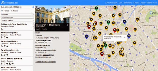
Mapping Wheelchair Accessibility


Accessible.net is a French Google Map of wheelchair accessible venues. The site provides an easily searchable map of categorized accessible venues, including restaurants, hotels, museums etc.

You can filter the results shown on the map by category. When you select a venue's marker on the map you can click through to view all the venue's accessibility information and other disability/accessibility facilities provided by the venue.

The map results automatically update as you pan and zoom the map. The map also support browser navigation, so you can use your browser's back button to return to previous searches and map interactions.

Accessible.net is provided as open data. Not only is the map free to use but the venue accessibility data can be used in your own applications.


Wheelmap is another interactive map dedicated to showing the locations of wheelchair-accessible public venues. Wheelmap uses three colors of markers to indicate the accessibility of venues, a green marker means the venue is accessible, orange means it is partially accessible and red means that the venue is not accessible to wheelchair users.

Wheelmap is a crowd-sourced project which means that anybody can add information to the map. Logged in users can also upload photos of venues listed on the map and add comments about the wheelchair accessibility of the venue.

Friday, February 27, 2015

The White and Gold Dress Map


Alan McConchie needs your help. He created this blue dress, white dress map and there seems to be some controversy over what color it is.

Is this map white and gold, or blue and black? Me and my friends can’t agree and we are freaking the fuck out.

It seems to be freaking a few other people out as well. The BBC created this video of Twitter activity on Trendsmap showing how #theDress has spread around the world.

Disclaimer: This trending topic may not be entirely concerned with the color of this map.

The Tokyo Metro in 3d


Metrogram3d is a hypnotizing WebGL powered 3d visualization of Tokyo's metro trains. Using data from the Tokyo metro timetable the map simulates the movement of the trains throughout the city.

Unfortunately this 3d visualization doesn't include the names of the stations, so it is doesn't really work as a map. This isn't helped by the fact that the map also doesn't seem to give you any control and appears to follow it's own tour of the metro network. As the tour plays out however it does indicate the metro line in view in the bottom left-hand corner.


If you want a more traditional interactive map view of Tokyo's transit system then have a look at Tetsudo Now. Tetsudo Now is a real-time Google Map of the Japanese public transit network. The map simulates the current locations of buses and trains in Japan's largest towns and cities.

The position of the vehicles on the map are animated based on the transit timetables. Users can select which city's transit map they wish to view from a drop-down menu. They can also select the time of day they wish to see simulated on the map from another drop-down menu.

Visualizing Ten Years of OpenStreetMap


Mapbox has released an animated map visualizing the growth of OpenStreetMap data over the ten years since the project started. Ten Years of OpenStreetMap shows how OpenStreetMap has grown in ten years from a map of a few London streets to one of the most detailed maps of the world.

The animated map reveals how OpenStreetMap has particularly developed in the last 5 years from largely a map of the United States and Europe into a truly global map.


Martin Raifer's OpenStreetMap Node Density also provides a general overview of OpenStreetMap's global coverage. Each pixel on the map shows the number of nodes at that location. Martin Raifer's map shows OpenStreetMap node density as of June 2014.


Of course OpenStreetMap is an ongoing project to map the world. The world is always changing and OpenStreetMap needs to reflect those changes. Therefore dedicated volunteers around the world are always working to improve the map.

OSMlab's Show Me The Way provides a real-time view of OpenStreetMap's contributors in action. Using satellite imagery from Bing Maps 'Show Me The Way' provides a captivating visualization of the ever improving OpenStreetMap project.

Thursday, February 26, 2015

Animated Heat Maps of Weather Data


A few weeks ago CartoDB released CartoDB Heat Maps. This new heat maps option in CartoDB leverages the power of the Torque library, which allows developers to efficiently render and publish very large datasets to the client.

CartoDB Heat Maps can also be used with Torque to create animated heat maps. Where this could be particular useful is in visualizing weather data and patterns. For example, check-out this map of historical Hurricane and Tropical Cyclone Track Density. The map animates the track density of hurricanes and tropical cyclones from 2000-2013, using data from the National Climatic Data Center - NOAA.


Not to be outdone Mapbox has been playing with the latest update of Turf.js to create animated heat maps of historical U.S. hail data. Turf now includes powerful new functions to aggregate dense point data into grids and heat maps. Mapbox has created a demonstration of this new heat map ability in a blog post, Animated Heatmaps and Grids with Turf.

The map not only shows an animated heat map of historical hail data but also allows you to view the data as animated hexbins, triangles, squares and points. The map also includes the option to view the animated data in three different speeds.

US River Mapping


Hydro Hierarchy is a map of the largest rivers in the United States and their monthly river flows. Select a river segment on the map and you can view a chart of its 2014 monthly river flow.

The horizontal red line on the bar chart represents the ten year mean monthly flow, which means you can compare each month's river flow to its yearly average. The 2014 drought means that on most river segments most months will be below the ten year average.

The radial chart to the left of the map is a hierarchical representation of the stream network. If you mouse over to the center of the chart you can view river terminations at the ocean or international borders.


Hydro Hierarchy only visualizes rivers and streams with a Strahler stream order classification of four or greater. Andrew Hill has created a map of all United States rivers in which the rivers are colored by the direction of flow. The U.S. Rivers Colored by the Direction they Flow map shows the colored river locations on a black background to create a visually striking map of the United States.

The map uses data from Nelson Minar's Vector River Map, which in turn uses river flow data from NHDPlus. Andrew has also used the same river data to create another beautiful map. Rivers with Rainfall. This map shows U.S. rivers and rainfall in the last hour. The rain data comes from a National Weather Service data feed.

You can read more about the Hydro Hierarchy map on the Esri Blog and download the source code on the Esri website.

Wednesday, February 25, 2015

The New York Time Machine


Every time I make a good map I soon find out that someone has done it better. Recently I've spent a lot of time creating vintage map browsers with the Leaflet mapping library. I used the New York Public Library's map collection to put together a map of New York Vintage Maps. I then used the amazing David Rumsey Map Collection to create a map of San Francisco Vintage Maps.

Well it turns out that Vestiges of New York has created a better collection of New York vintage maps, using vintage maps from both the NYPL and the David Rumsey collection of historical maps. Their NYC Time Machine is very similar to my map, except it has far more vintage maps of New York maps for you to browse through.

The NYC Time Machine includes 27 vintage maps of New York, ranging in date from 1660 to 1924. The map includes a neat option to quickly switch between your chosen vintage map and a modern map, allowing you to compare the vintage map to the modern streets of New York.

Mapping African Democracy


President Teodoro Obiang Nguema Mbasogo of Equatorial Guinea and President Jose Eduardo dos Santos of Angola have both been leaders of their respective countries for 35 years. According to the Economist neither country qualifies as a full democracy. There are 27 countries in Africa ruled by an authoritarian regime or a nominal democracy. The Economist claims that Mauritius is the only African country to qualify as a full democracy.

In a series of interactive maps The Guardian has mapped various indicators of democracy and government in Africa. Using data from the Economist Intelligence Unit Democracy Index 2014, the CIA Factbook, the World Intellectual Property Organisation and Intellectual Ideal the newspaper has mapped out the presidential term limits, voter turnouts and the longest serving leaders in African countries.

Power in Africa: Democracy Mapped uses CartoDB to present a series of interactive maps showing the state of democracy, the number of registered voters and the number of voters in African countries. It also includes maps of presidential terms limits and the lengths served by Africa's current leaders.

Mapping Shrinking Glaciers


Alaska Ice: Documenting Glaciers on the Move is an Esri Story Map which uses satellite imagery and comparisons of modern & vintage photographs to document Alaska'a glaciers.

The main focus of the map is the U.S. Geological Survey's Repeat Photography initiative. USGS has been comparing modern photographs of Alaskan glaciers with historical photos, both with the same field of view. The photographs are compared to document and understand the changes to glaciers resulting from changing climate.

The Alaska Ice Story Map visits 14 glaciers in the U.S. state. Each glacier can be viewed on a satellite map and a modern and an historical photograph of each glacier is compared in the map sidebar. Of the 14 mapped Alaskan glaciers only two are still advancing.


Disappearing Glaciers is another Esri StoryMap, this one is designed to highlight the alarming speed at which glaciers are disappearing around the world.

The map looks at recent aerial imagery of six different glaciers. Polylines have been overlaid on each glacier aerial image to show the glacier's size through time, demonstrating how far each glacier has reduced over the years.


Timelapse - aerial imagery of the Mendenhall Glacier in 1991 & 2012

Another interesting way to examine the loss of glaciers is with Google Timelapse. Timelapse allows you to compare aerial imagery over time for any location on Earth. You can therefore enter the name of any glacier into Timelapse and observe the effects of global warming for yourself.

Timelapse provides links to the Medenhall Glacier and the Columbia Glacier but you can use the search box to locate any glacier. You can therefore use Timelapse to search for the six glaciers used in the Disappearing Glaciers map and observe the highlighted loss of each glacier for yourself, using the historical aerial imagery.

Tuesday, February 24, 2015

Google Paper Maps of Europe


According to the UK's Ordnance Survey paper maps are beginning to make a comeback. This should be welcome news to USE-IT, creators of printable mapped city guides.

USE-IT has created a series of mapped guides to a large number of Europe's major cities. The maps are aimed at the young independent traveler and are full of fun things to see and do in Europe's cities. They are also free to print straight off the USE-IT website.

If you still prefer your maps to be interactive and digital then you don't need to worry. USE-IT has also used the Google Maps API to create zoomable versions of each of its paper maps.

3d Art View of the World


Culturalmap is trying to create a map of 3d scans of cultural objects around the world. The map consists at the moment of a few 3d scans, created with Sketchfab, which allow you to explore the 3d models of a number of historical statues and busts.

You can see an example in the screenshot above. On the map you can rotate the Colossal Bust of Zeus and explore this cultural artifact from all angles by interacting with the 3d scan.

It appears that I've caught this map at a very early in its release schedule. The map doesn't yet have many 3d scans and the linked Twitter account has yet to post any content. However, from reading the 'Learn' page, it appears that Culturalmap is planning to crowd-source the cultural 3d scans, which hopefully will eventually lead to a more populated map.

Map in GeoHipster Blue


Plain Tile Maker is a series of 675 blank map tile schemes, each one in a different color. Using the app you can serve simple block color map tiles to any of the major mapping libraries.

The tiles can be added to a map using the following URL:

http://plaintiles.herokuapp.com/[colorname]/X/Y/Z.png

The 'colorname' in the URL can be any of 675 different colors. The 'colorname' must conform to one of these ImageMagick Color Names.

At first I thought that the Plain Tile Maker was meant as a joke. However, thinking about it, these plain color tiles could be useful if you want to serve your own map data (for example river courses or building footprints) without any underlying map data. The Plain Tile Maker allows you to set your own background color scheme for your map data or could be used to give users a choice of background colors for your map data.

Just in case 'colors' are a new concept to you I've put together a small Leaflet.js map using a few of the different map tiles. Colors allows you to view a blank Leaflet 'map' in your choice of six different colors.

Iceland's Rival to Street View


Iceland's telephone and business directory company Já has released 360° panoramic imagery of the country's roads.

Já maps uses Samsýn map data with the Leaflet mapping platform. If you select the '360' link in the map menu the availability of Street View is displayed on the map with blue lines. The coverage rivals Google Maps Street View coverage in Iceland, with 360° panoramic imagery available in towns and cities and all major roads.


The date that the imagery was captured is displayed in the bottom right-hand corner of the map. Most of the imagery seems to date from August 2013. Most of Google Maps Street View imagery dates from the same time.


In fact we know that the Google Street View car and the Já maps car were on the streets of Iceland at the same time because the two cars were busy capturing photos of each other. Street View Fun managed to find this scene, where the Já maps car is happily following along behind the Google Street View car, while they both capture their panoramic imagery of Iceland (and each other).

Monday, February 23, 2015

The Race a Tiger Map


Do you think you could beat a tiger in a foot race? This new WWF Tiger Challenge map lets you find out.

The Worldwide Wildlife Fund are tracking the daily movements of a tiger in Russia. His daily track is visualized on a Google Map and shows the total distance traveled and his average speed over the course of the day.

To find out if you could beat the tiger in a running race you can connect your own data from a number of sports tracking apps (including Runkeeper, Nike+, Strava & Map My Run). Once you've added your data you will then discover whether you are as fast as a tiger or not. My advice is to cheat and at least use a bike when racing a tiger.

Animated Hurricane Maps


Two weeks ago CartoDB released CartoDB Heat Maps. This new heat maps option in CartoDB leverages the power of the Torque library, which allows developers to efficiently render and publish very large datasets to the client.

One of the first maps to use CartoDB Heat Maps was Placenames Heatmap. This excellent map allows you to view a heat map of words used in United States place names. Type a word into the map and it searches US placenames and creates a heat map of the results.

However CartoDB Heat Maps can also be used to create animated heat maps. Where this could be particular useful is in visualizing weather data and patterns. For example, check-out this map of historical Hurricane and Tropical Cyclone Track Density. The map animates the track density of hurricanes and tropical cyclones from 2000-2013, using data from the National Climatic Data Center - NOAA.

The Militarization of the Police


Mapping the Militarization of Law Enforcement in the United States is a map showing how much police forces have spent on 1033 Program military equipment. Police forces throughout the United States have used the program to purchase items such as cold weather clothing, sand bags, medical supplies, sleeping bags and flashlights.

The program has also been used by some police forces to equip themselves with grenade launchers, aircraft, watercraft and armored vehicles. This map allows you to view at county level how much money police forces have spent on the 1033 Program, the cost of this to tax payers (per household) and to view exactly what equipment has been purchased by local police forces.


Using the Pentagon's Excess Property Program (1033) police forces across the United States are equipping themselves with military grade guns, grenade launchers, vehicles, night vision and body armor.  The New York Times created this interactive map to reveal what surplus military equipment county police forces have obtained through the program.

Mapping the Spread of the Military's Surplus Gear uses data from the Pentagon to show where police forces have obtained surplus military gear. You can select a county on the map to view what equipment a local police force has obtained under the Excess Property Program and in what quantity. You can also select a category of military equipment to see which counties across the United States have been in receipt of that type of surplus military gear.

The map itself was created with D3.js. If you are interested in creating a similar map then Suffen.us has an easy to follow tutorial, Making a Simple Interactive Map Prototype with D3…For Total Beginners Who are Totally Impatient, explaining how to create a US counties map with D3.js, using a common separated values file to load the data.

The Street Pews of Ireland


If you spend any time traveling through Ireland you are sure to come across a number of religious shrines and grottoes situated next to the road. Ireland seems full of roadside shrines of the Virgin Mary, local saints or religious crucifixes.

Street Pew is a crowd-sourced map dedicated to mapping these roadside shrines. Using the map you can find the location of roadside shrines throughout the country. What's more if you select a marker on the map you can even check-out the shrine using Google Maps Street View.

If you know the location of a roadside shrine or grotto that isn't listed then you can add it to the map by clicking on the 'Add Shrine' link.

Hat-top: Google Street View World

The Oscars Twitter Map


You can't have a major event without a Simon Rogers animated Twitter heat map. There is a 2015 #Oscars on Twitter Map so the Oscars must qualify as a major event.

Because the data on these maps isn't normalized for the number of Twitter users in different countries it is almost impossible to accurately draw any meaningful conclusions about the popularity of the Oscars around the world. Judging by this map there is almost no interest in the Oscars in China, Russia and most of Africa. However this probably just reflects the lack of Twitter users in these areas.


The Oscars do seem particular popular in the Americas. It could be a time zone phenomenon that the Oscars seem incredibly popular in most of South and Central America whereas in Europe, outside of the UK (and to a lesser extent Spain & Italy), the Oscars seems to have been largely ignored by Twitter users.

Sunday, February 22, 2015

The Very Best Maps of the Week


My favorite map of the last seven days is this beautiful guide to Dashilar. Dashilar is one of Beijing's better conserved districts. The area, named after one of the city's most historical shopping streets, is known for its traditional shops, tea-houses and Chinese opera houses.

Unfortunately the district has suffered in the era of China's rapid economic development & modernization and has seen several years of neglect. The Dashilar Project is trying to regenerate the area, while also striving to sustain the district's historic character. The project includes this distinctive interactive map of Dashilar, showcasing many of the district's historical landmarks, shops and hotels.


This week I also really admired this great mapped visualization of earthquakes caused by gas drilling in the Groningen region of the Netherlands. The Earthquakes in the Groningen Gas Field map animates through the history of Groningen earthquakes in chronological order since 1987.

While the map animation plays a series of related facts and other information scrolls across the bottom of the map. The map also makes great use of sound effects to indicate when an earthquake appears on the map, with a different sound used for the more significant quakes.

It is worth viewing the whole of the animated visualization. When it finishes you are rewarded with a link to an in-depth investigation into the effect of the quakes on the people and buildings of Groningen.


Mapbox has a new Picture Book map style resplendent with illustrations of famous landmarks around the world and a custom font. If you like the look of the Picture Book map style you can fork it on GitHub.

But before you go forking willy-nilly you might want to give the map a quick look-see. To introduce the new map style Mapbox has released a fun map quiz. Your task in the Landmark Quiz is to answer fifteen questions, correctly identifying the locations of famous landmarks around the world. While you play the quiz you also get the chance to see some of the amazing landmark illustrations on the map.

The Oscar for Best Map goes to ....


The Wall Street Journal has been analyzing which Oscar nominated films have been receiving the most interest among Facebook users. It has created a series of maps showing where the films nominated for Best Picture have been most discussed across the United States.

American Sniper would be the clear winner of the Oscar for Best Picture if the award was based on Facebook conversations in the United States. The Oscars Nominees, Mapped allows you to view a choropleth map for each of the Best Picture nominees showing the percentage of the Facebook conversation for each film, down to county level.


Mapping Oscars Nominees by CBC shows which Best Film nominated films have been 'liked' by Facebook users around the world. Select a film from the dropdown menu and you can view the percentage of Facebook 'likes' the film received broken down by country.

According to the map India is very keen on The Theory of Everything, Canadians really liked Selma and Italy loved American Sniper.


The Birthplaces of Award-Winning Actors & Actresses is a Google Map that shows where all Oscar winning actors and actresses were born. For example, did you know Julie Christie and Vivien Leigh were both born in India? Or that Natalie Portman was born in Israel?

You can filter the results displayed on the map to view the best actors or the best actresses. You can also filter the results to view only those actors or actresses who have won the Oscar more than once.

Saturday, February 21, 2015

All the Presidents' Maps


Presidential Colleges is a map showing the alma mater of American presidents. The map shows that eleven presidents have attended Ivy League colleges and that many presidents didn't go to a university.

The map sidebar includes two main view which allows you to select either presidents or colleges. If you select the 'presidents' option you can click on any of the 44 president portraits (yes they included Grover Cleveland twice). The president's university is then highlighted on the map.


The Washington Post has been busy mapping the homes of US presidents. Where the Presidents Lived is a map showing where in Washington D.C. American presidents have lived, either before during or after their terms of office.

The map includes some nice custom sketched portraits of the presidents as map markers. If you select a president's marker on the map you can view details about their DC residence in the map sidebar. The Washington Post suggests that the earlier presidents had more modest requirements than the more recent presidents.

Via: Visualoop


The US Presidents and their Spouses map shows the birthplaces of all the American presidents - even the few not born in Virginia. The map also shows the birthplaces of the presidents' wives and shows in miles how far apart each president and wife were born from each other.

Friday, February 20, 2015

Tourists vs Locals in Bangkok


This week Eric Fischer's Locals and Tourists map has correctly been getting a lot of love again on social media. The map analyses Twitter data to highlight areas of cities popular with locals and the places where tourists visit.

His city maps show the locations of Tweets sent by locals (those who post in one city for one consecutive month or more) and tourists (whose tweets are usually posted in another city). The maps provide a fascinating insight into locations that are popular with tourists and into areas which are popular with locals but go largely unseen by tourists.

One thing missing from the maps is an actual street map. The result is that unless you are a local yourself you probably won't be able to identify the locations which show up as clusters (for locals or tourists) on the map.

Greg to Differ has tried to overcome this omission in Eric's maps by overlaying the Twitter data for Bangkok on a series of static Google Maps. In Tourists vs Locals: Mapping Where People Tweet in Bangkok Greg examines different Bangkok neighborhoods, using his local knowledge to examine the data in each map and explain the local locations that appear popular with locals and the locations favored by tourists.

Each static neighborhood map includes a transparency control which allows you to adjust the opacity of the Twitter overlay and compare it with the road map underneath,

Where Americans Watch Movies


People in Kansas, Nebraska, and Oklahoma aren't big fans of comedy films. People in the Northeast like serious drama, while if you live in a Southern state you are probably a fan of horror movies.

Where Do Americans Watch Movies is an Esri map of where popular movie genres are watched in the United States. The map shows down to county level how likely the local population is likely to go to see a particular genre of film.

Overall the map reveals that those who live in the south are most likely to visit a cinema at least once a week. The map also looks at where people watch movies online. This reveals that people who live in areas which are often seen as tech-hubs are the most likely to be streaming movies online.

Mapping Instagram


Whatsthere allows you to view a Google Map of a location while browsing nearby photos posted to Instagram.

You can use Whatsthere to browse through Instagram photos taken near a location by typing a location into the search box or by dragging the map marker around on the map. For example, you could enter 'Angkor Wat' in the search box to view Instagram photos from the world's largest religious monument.

After you have explored Ankor Wat you can then just drag the map marker to the nearby Bayon Temple to view photos taken at this temple.


Using The Beat it is possible to view photographs submitted to Instagram on top of a Street View of the location where the picture was taken. If you enter a hashtag search into The Beat you can just sit back and watch as a stream of Instagram images, placed on top of Street View, plays on your monitor.

The hashtag feature is a great way to search for interesting photographs around a theme or an event. For example, if you enter 'chinesenewyear' into the search box you can view a selection of Chinese New Year photographs submitted to Instagram.


Instahood is another Google Maps based application that allows you to view the latest photographs posted to Instagram by location. The app is a handy way to view the latest pictures posted around a location or taken at a specific event.

Thursday, February 19, 2015

Animated Flights on 3d Globes


Flight Stream is an animated visualization of worldwide flight routes on a WebGL globe. The globe visualizes great circle flight routes between major airports. The globe doesn't show real-time flights but is an interesting visualization of the most populated routes and destinations.


You can also view world-wide flight routes on this Airflow Globe. This WebGL globe visualizes worldwide flight-paths and airports. When exploring the Airflow Globe you have a choice of map base layers. The screenshot above shows a satellite imagery view. To view the blue flight-paths more clearly you can use the default 'Light Gray Canvas' map layer instead.

The globe itself was created using ArcGIS's 3d Scene Viewer and the data for the map comes from OpenFlights.

If you like these 3d visualization of flight data then you might also like this round-up of other Beautiful WebGL Globes.

Where Bears Fans Live


In the last year there have been a lot of maps about fans of various sports teams based on Facebook likes. You have probably already seen the New York Times' maps of the Basketball Nation, the College Football Fan Map and the Baseball Nation. These maps show the support of sports teams based on their number of Facebook fans.

Where Bears Fans Live is a new map of where Chicago Bears fans reside. The heat-map shows where Chicago Bears live based on the percentage of Facebook users who 'like' the team. I don't wish to imply this is a bad or unnecessary map but I couldn't help noticing a slight resemblance to the How Far Away is Ohio? map.


The How Far Away is Ohio? map featured yesterday in a post on Vox, entitled, 27 Hilariously Bad Maps that Explain Nothing. Vox frequently publishes long lists of maps that promise to (but hardly ever) explain the world. This is in fact the first list from Vox that I've seen which actually contains some useful maps - if only as examples of bad maps. To be fair to Vox they have included one of their own maps in the list.

Europe isn't Dying, It's Aging


This week the Daily Telegraph published an interactive map of birth rates around the world. The map provides a choropleth view of each country's birth rate and annual population growth percentage.

The article, How Europe is Slowly Dying, uses the map to argue that Europe is slowly dying because of the low birth rates. However hidden away in the article is the fact that "Europe's population is overall increasing".

It is true that in Eastern Europe many countries are facing a drop in the annual population growth percentage. It is also true that the map does seem to show a general pattern where birth rates are lower in countries with stronger economies and higher in countries with weaker economies. This appears to conform to the controversial theory of the Demographic-Economic Paradox which argues that the higher the degree of education and GDP of a country then the fewer children are born.


Although Europe isn't dying it is aging. The Slate's interactive map, The Aging World, shows that Europe and Japan in particular have an unusually high percentage of their population over 65 years of age. However, according to the UN (projected) data that the map uses, most of the developed world will experience similar aging populations by 2100.


Japan’s aging population is explored in more detail in the Japanese Population Map. The Japanese are living longer and having fewer children and later in life. By 2060 the Japanese government are predicting that over half the population will be over 65.

This Japanese Population Map visualizes the 2040 population predictions for every Japanese prefecture. Using the map you can explore the population predictions for the number of young females and a breakdown of the overall population by age group.