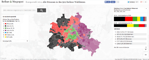
Maps from the Berliner Morgenpost

Over the last few years the Berliner Morgenpost has created an impressive number of mapped data visualizations. I'd say that at the moment only the New York Times matches the consistency and quality of the interactive maps being published by the Berliner Morgenpost.
You can view and learn more about some of the best of the Morgenpost's maps on Maps at the Berliner Morgenpost, an interactive slideshow highlighting some of the paper's amazing maps. The slideshow actually contains working embedded examples of each of the maps. The slideshow also contains a brief overview of the libraries used in some of the maps, links to GitHub, a mapping tutorial and links to view the maps in full on the Berliner Morgenpost website.


Comments