Find Your Neighborhood Twins
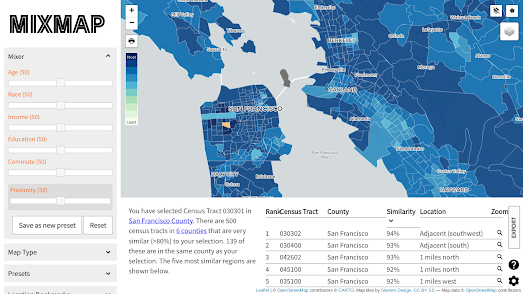
If you live in California you can find out which other neighborhoods in California are most similar to your neighborhood using the new MixMap tool. MixMap is a 'place-based semantic similarity platform'. Or, in more simple terms, it is an interactive map that can help you find census tracts which have very similar census data results.
To use the map simply click on any census tract in California. The map will then color all other census tracts based on their socio-economic and demographic similarities to your selected tract. A table beneath the map will list the top 5 census tracts in California most similar to the tract you have chosen (you can click on any of these listed tracts to see their locations highlighted on the map).
The socio-economic & demographic census data being used to calculate the tract similarity are age, race, income, education, commute and proximity. In the map sidebar you can adjust the weighting given to each of these individual metrics when calculating the similarities. For example if you just want to find the census tracts with the most similar age range distributions you can adjust the age mixer to 100 and set all the other metric mixers to zero.
You can also adjust the 'map type' in the map sidebar. The default view is a choropleth map which colors each tract based on similarity. You can adjust this to the 'Most/Least' view which changes the map to show just the most and least similar tracts - colored blue and red on the map.


Comments