Population Density Around the World
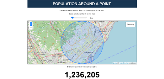
Tom Forth has released a new interactive map which allows you to explore how many people are living within a set distance from any point on Earth. The Population Around a Point tool is a great way to explore and compare the population density of different cities around the world.
The map includes a distance slider control which allows you to select any distance from 3 to 50 km. Once you have chosen a distance you can then click on the map to discover how many people live in the selected area. For example in the screenshot above I clicked on a point in Barcelona and discovered that there were over a million people living within 5 km of that point.
If you are interested in population density then you might want to read Alasdair Rae analysis of population density around the world (with a focus mainly on Europe). In Think your country is crowded? These maps reveal the truth about population density across Europe Rae has mapped Eurostat’s population density grid data for 2011. This map visualizes the population density in each square kilometer in Europe.
Alasdair has also created a table which shows the population density of each European country. This table includes a column showing how many people in each country live in the the most densely populated one square kilometer of that country. By comparing this figure for each country you can see where the most densely populated square kilometers are in Europe. In Barcelona more than 53,000 people inhabit a single 1km². This is the most densely populated area in Europe. Paris has the second most densely populated km², with a 1km² containing more than 50,000 people. Alasdair's article includes a brief discussion of some of the most densely populated areas outside of Europe.
These aren't the only maps which allows you to explore population density around the world. Duncan Smith's interactive map World Population Density uses data from the Global Human Settlement Layer (GHSL) to visualize the number of people living in each square kilometer of Earth.
Another interactive map which visualizes worldwide population data is the SEDAC Population Estimator (GPWv4).
This interactive map uses NASA's Earth Observing System Data and Information System (EOSDIS) data to show where the world's population lives.
The SEDAC Population Estimator map includes a tool to draw an area on the map to see an estimate of the population that live there. You can therefore draw a square kilometer on the map to make your own comparisons of population density. For example, I drew a square kilometer at random in Dhaka, Bangladesh and the map gave me a population estimate of 107,804. This is over twice as many people as the 52,000 people living in Europe's most densely populated 1km² in Barcelona.


Comments