Mapping the Slave Trade

The newly updated Slave Voyages website maintains databases of the Trans-Atlantic and Intra-American slave trade. These databases include information on 36,000 slave trading voyages from Africa to the New World carried out between 1514 and 1866; 11,000 voyages from one part of America to another; and personal details about 91,491 Africans who were forced into the slave trade.
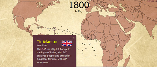
Slave Voyages provides an introduction to the Trans-Atlantic slave trade using a series of static maps. These maps are from the Atlas of the Transatlantic Slave Trade and help to illustrate the trade routes used to transport slaves, the countries involved in organizing the trade and the volume of people traded. A Timelapse animated map also plots 14,289 slave voyages crossing the Atlantic over time. This map shows the actual journeys of slave ships from Africa to the Americas by year. It provides a sharp illustration of the sheer scale of the slave trade.

This isn't the first mapped visualization of the Transatlantic Slave Trade Database. In 2015 Slate released the Atlantic Slave Trade in Two Minutes, a map which also animates the journeys of slave ship journeys over a period of 315 years. Slate's map reveals the patterns of the trade routes used and the destinations of the slave ships. The size of the ships on the map are scaled to represent the number of slaves on board. You can also click on each ship to find out under which country's flag the ship sailed.

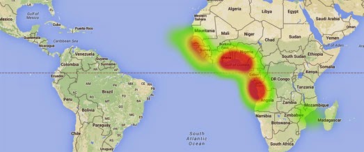
Professor Adam Rothman and Matt Burdumy of Georgetown University have also created a series of heat maps using data from the Transatlantic Slave Trade Database. These heat maps visualize the most important central locations in over 35,000 slaving voyages (from 1500 to 1870).
Their visualization of the Transatlantic Slave Trade Database consists of three animated heat maps showing the cumulative frequency of slave ship points of departure, the principal ports where slaves were purchased and the principal ports where the slaves were sold. During the animation on each map a cumulative heat-map appears, revealing the pattern of slave voyages over time. For example, the map of slave voyage departures reveals how Portugal and Spain's early dominance of the Transatlantic slave trade was quickly overtaken by the emergence of British slave traders.

The University College London's Legacies of British Slave-Ownership is a website dedicated to documenting the role of Britain in the slave trade and how the slave trade shaped modern Britain. The site includes a map section which maps estates and plantations profiting from slaves in Jamaica, Barbados and Grenada. It also includes a map of 4,840 addresses in Britain associated with a slave owner or someone who befitted from the slave trade.
When the British government abolished slave-ownership in 1833 it decided to award £20 million in compensation. That equates to about £16.5 billion in today's terms. It is impossible to argue that the British government were astonishingly generous in their compensation award.
The shocking fact is, however, that this £20 million was earmarked not for the individuals who were sold, abducted or forced into slavery but for those who profited from this immoral activity. In Victorian Britain many wealthy families owed their fortunes to the slave economy. Thanks to the British government these same families also profited from the abolition of slavery.
University College London has created two maps which really reveal how many Londoner's profited from their disgusting involvement in the slave trade. The UCL's Slaveowners in Fitzrovia and on the Portman Estate includes two maps showing the homes of individuals in these two London neighborhoods who received compensation from the abolition of slave-ownership.


Comments