Minard's Map of Worldwide Migration
Charles Joseph Minard is probably most famous for his visualization of Napoleon's march on Moscow. Charles Minard was a pioneer of the use of graphics in engineering and statistics and his flow map of the French army’s loss during Napoleon’s campaign against Russia in 1812-13 is rightly seen as a classic of data visualization. During his March on Moscow Napoleon faced freezing temperatures and starving conditions (the Russian army burnt anything that might feed or shelter Napoleon's army as it retreated). Minard's flow map visualizes this eastward march of Napoleon's army, showing where units split off and rejoined, the freezing temperatures and the ever declining size of his army.
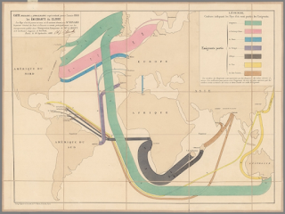
Perhaps less well known is Minard's flow map 'Emigrants of the World' (shown above) which visualizes the global movement of migrants in the year 1858.
This map was published at a very interesting time of global migration. Slavery had been abolished in Britain in 1838 and in France in 1848. Because of this there had been a reduction in migration from Africa to the plantations in the Americas and elsewhere. To compensate for the reduction in slave labor indentured workers from India and China were instead contracted to work in the plantations in the Caribbean and Indian Ocean.
Elsewhere the discovery of gold in Australia and California in the early 1850s was another driver of global migration. It led to a direct increase in migration from Europe and China to both California and Australia as poor migrants sought to make their fortunes overseas.
You can view my interactive version of Minard's 1858 Emigrants of the World flow map on Minard's Flow Map. On this interactive version of the data visualization I have displayed Minard's map using the Leaflet.js mapping library. Nearly all of the 'colored zones' on this map are interactive. If you click on any one of these colored flow lines you can read an explanation of why people in 1858 were moving from the origin country to the flow line's destination country.

You can explore an interactive version of Minard's March on Moscow on TASS's story map 1812 - When Napoleon Ventured East. This interactive map uses MapboxGL's oblique view and an extruded polygon to create a 3d version of Minard's flow-map on top of a modern map of eastern Europe. The shrinking height of the polygon as it moves eastwards visualizes the dwindling size of Napoleon's army. As you progress through 1812 this 3d flow-map is drawn directly on to the modern interactive map while the accompanying text provides an historical account of Napoleon's campaign.


Comments