How Map Projections Lie

Mathigon has created an interesting visualization of the distortions created by different map projections. In an online lesson on spheres, cones and cylinders Mathigon looks at the problem of trying to represent a 3D globe on a two dimensional flat surface.
Mathigon explains that it is impossible to open and flatten the surface of a sphere without 'squashing' or 'squishing' certain areas. It illustrates this very effectively with a synchronized map and globe. In the Surface Area of a Sphere you can drag a square around a two dimensional map to observe how this mapped area has been distorted by the chosen map projection. The Mathigon illustration includes examples using four different types of map projection.
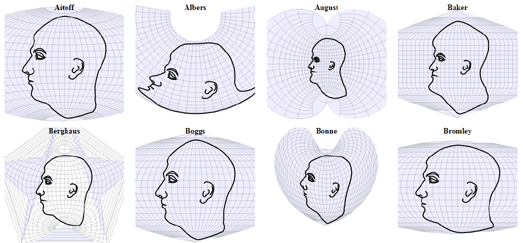
If you are interested in how different map projections distort the world then you will probably also like Projection Face. Projection Face is a great illustration of the distortions created by different map projections. The interactive shows how 64 different map projections effect our view of the world by showing each projection's effect when applied to something very familiar - the human face.
The distortions of each of the different projections can be illustrated further by clicking and dragging any of the mapped faces. This illustrates how the different map projections can be distorted themselves simply by changing the center of the map.
Projections Face is an interactive version of a 1924 illustration from Elements of Map Projection with Applications to Map and Chart Construction.

Comparing Map Projections is another clever visualization of different map projections. It allows you to directly compare different types of map projections and see the levels of distortions which each map projection introduces by visualizing a globe in two dimensions.
This interactive visualization provides a useful overview of the advantages and the disadvantages of specific map projections. For example if you select the much maligned Mercator map projection you can see that it scores very low for angular distortion. This means that all the lines of longitude are straight (compare the vertical lines of longitude on the Mercator projection to those on the Sinusoidal projection). The result is that a Mercator projection is really very useful for navigation.
However the Comparing Map Projections visualization also shows that the Mercator projection has very large overall scale distortion. A consequence of having a very low angular distortion is that the Mercator projection distorts scale (especially the further you move from the equator). The result is that the continent of Africa, for example, appears to be similar in size on a Mercator map to the territory of Greenland. You just need to compare Africa and Greenland on a globe to see that Africa is in fact far, far bigger than Greenland.


Comments