A Brief Atlas of Time
Nations and country borders are just as much historical entities as they are geographical. They exist in both time and space and can therefore be defined by both by their geography and by their chronology. In a couple of recent posts1 on Maps Mania I've reviewed a number of interactive maps which show how geography changes through history by plotting historical borders and movements by date. These interactive historical maps visualize how countries and borders change over time.
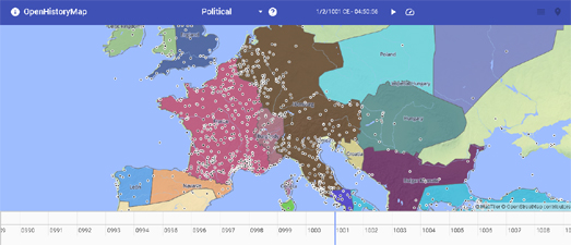
Open History Map is another example of an impressive interactive mapping platform which visualizes global spatial historical (and archaeological) data. The goal of Open History Map is to create an open interactive map of the past. One of the main differences between Open History Map and some of the other historical mapping platforms I've reviewed recently is that Open History Map isn't built so much on crowdsourced data, as on academic data and information.
The screenshot at the top of this post shows the Open History Map map view of Europe in the year 1001 CE. This map view includes an interactive timeline control which allows you to view the map for other dates in world history. The small black dots on the map represent historical place-names, which appear as you zoom in on the map.
Because Open History Map relies on academic data it relies on lots of different historical datasets. You can view and access all these datasets on the Open History Map Data Index. This allows you to view an index of the datasets used in Open History Map, a list of the sources for these datasets and the individual datasets (with links to the original sources).
If you like the Open History Map then you might also enjoy:
Comments