The Cartography Playground
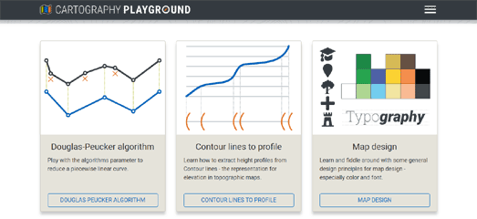
The Cartography Playground is a new interactive website where you can learn about many different aspects of map design, principles and cartographic algorithms. At the moment the Cartography Playground includes components on Map Design, the Douglas-Peucker Algorithm, Contour Lines to Profile, Clustering Methods and Cartographic Generalization. It also includes a quiz where you can test how much you have learned by completing the other five sections.
Each section of the Cartography Playground provides a simple introduction to a different element of cartography. These explanations are accompanied by examples and illustrations. Each section also includes links to further reading on the covered topic.
Cartography Playground includes a number of interactive exercises designed to illustrate, reinforce or test the mapping principles explained in each section. For example, the Map Design section includes an interactive which allows you to change the colors of different map features. While the Cartographic Generalization section includes an interactive map which changes to illustrate the different methods of generalization that cartographers use when making maps.
When you have finished every section of the Cartography Playground you can test how much you have learnt by completing the Cartography Playground Quiz. This multiple-choice quiz tests you on the different aspects of cartography you have explored in the previous five sections.
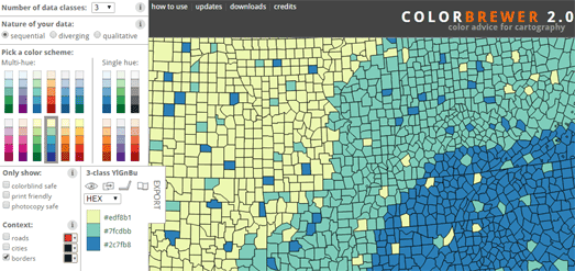
If you are interested in good map design then you should also bookmark ColorBrewer. Cynthia Brewer's ColorBrewer is an online tool to help cartographers choose good color schemes for their maps. The tool helps you to think about the type of data you are visualizing and the appropriate color scheme to use for visualizing that data.
The tool includes three types of color scheme, sequential, diverging and qualitative. You simply need to choose which scheme best fits your data, choose the number of classes in your data and then choose a multi-hue or single color palette range. As you make your design decisions you can automatically see the scheme being applied to a sample map.
When making your choice of color scheme it is worth reading the advice provided (using the information button) about when to use a sequential, diverging or qualitative color scheme with your data.
Carto has also provided a short explanation of when to used sequential, diverging, or qualitative data. color schemes. It has also provided a number of color schemes to use with each. You can view the palettes for Carto's sequential color schemes, diverging color schemes and qualitative color schemes at CartoColors.


Comments