America's Pink Migration Banana
The San Francisco Chronicle has published a fascinating map which visualizes net migration in US counties. On this map counties which have seen a net loss in migration are shown in pink and those that have seen a net gain are shown in blue. The map therefore provides a great overview of where Americans are moving to and from.
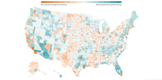
The Where People are Moving map reveals a pink banana running down the center of the United States. The majority of counties in North and South Dakota, in Nebraska, Kansas, western Oklahoma, and western Texas have seen a net loss in migration. Which means that more people are leaving these areas than are moving in (this isn't true in eastern Oklahoma and eastern Texas, where the majority of counties have seen a net gain in migration).
Maine appears to be one of the states in America where residents have no desire to leave. Only one county in the state on the Chronicle's map shows a net loss in migration. Every other county in the state showed a net gain in migration. Florida is another state which has a large majority of counties showing a net gain in migration. It is the only state where I would take a stab at guessing the reasons behind its current migration trend - namely it is a popular place for retirement for the baby boomer generation.
The Chronicle's accompanying article is concerned mainly with the 'urban exodus' (particularly from San Francisco). They see the map as showing that people are migrating out of cities to the suburbs in response to the Covid panademic. The Chronicle's map isn't a great visualization of this pattern as it shows migration loss and gains at the county level. The Chronicle could have added city boundaries to the map to more clearly reveal the migration gains and losses in cities.
The data for the map comes from the Internal Revenue Service, which records changes of addresses on people's tax returns. The "data is based on the reported mailing address on tax returns filed to the IRS for the 2020-21 tax year" and the map shows net migration loss and gains between 2020 and 2021.


Comments