Neon Maps

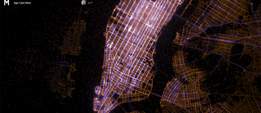
NYC Taxi Tiles is a map of 2013 New York City taxi data. The data for the map was obtained through a FOIL request (you can read the interesting story behind the request here). The blue dots on the map represent pick-up points and the yellow points show drop-off points.
I've been seeing a lot of these 'neon' style maps lately. These maps share some common features, such as dark or grey-scale map tiles and the data overlaid with lighter dots or lines. The name of this particular map provides a clue as to how these maps are created - with the data processed and added to the actual map tiles rather than being added in the browser.

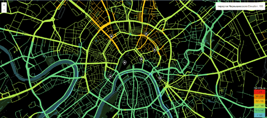
It should be possible to load smaller amounts of data to the map in the browser. I like this Moscow Hills OpenStreetMap of Moscow, using gradient colored roads to show elevation levels throughout the city. As well as using the color of the roads as a guide you can mouse-over any point on a road to view the elevation at that point.
I think again the data is actually a part of the map tiles rather than being overlaid on top of the map. Theoretically however you could use the Google Maps API and the Elevation Service to create a map with the data being loaded in the browser. In fact it should be fairly simple to draw a gradient polyline along a road using the Stroke Style feature with the Google Maps SDK for iOS. Unfortunately gradient polylines have yet to be added to the Maps JavaScript API.

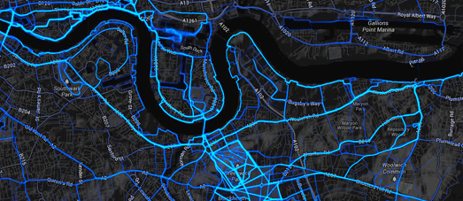
The Strava Global Heatmap is a really informative Google Map of where joggers like to run and where cyclists love to ride. The map allows you to view the most popular running and cycling routes by Strava users across the world.
The different colored neon lines (for the different Strava activities) appear to be added as map tile overlays. It makes sense to pre-process the data in this way rather that try to generate millions of data points in the browser.

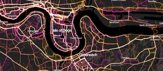
Mapbox has created a similar map using Runkeeper data. This map shows 1.5 million walks, runs, and bike rides undertaken by Runkeeper users.
The 1.5 Million Walks, Runs, and Bike Rides map includes some quick links to jump to the map of a few major cities around the world but you can pan and zoom the map to view the popular running routes at any location in the world.
1.5 millions tracks is a lot of data for the browser to process. With this amount of data it seems common sense to create map tiles with the data and create a mapped visualization with your custom mapped tiles.


Комментарии