The Maps of the Week

One of the most interesting uses of Street View imagery since its introduction on Google Maps has been by MIT. MIT's Place Pulse project is a crowd-sourced experiment examining people's perceptions of different urban environments using their reactions to different Street View images.
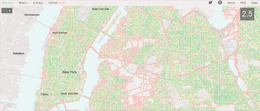
MIT has now taken the the crowd-sourced safety rankings for 3,000 street images from New York and Boston and created an algorithm to automatically create a perceived safety rating for Street View images. Using the Place Pulse scores MIT assigned attributes to features present in the images, associated with the image's textures, colors and shapes. They then used machine learning to associate image features with scores of perceived safety. MIT can then use the resulting algorithm to predict the perceived safety of a new image. They can therefore give any Street View image a 'StreetScore' based on the results of the Place Pulse survey.
StreetScore has now released a number of maps showing areas of perceived safety in New York, Boston, Chicago and Detroit. Using Street View images of the city StreetScore assesses the perceived safety of locations throughout the city. Green dots on the map represent the areas which StreetScore has assigned as having a high perceived safety rating and the red dots are the locations with a low perceived rating score.

BikeDistrict is a really great example of providing bike directions on an interactive map. The application allows you to search for and get cycling directions in Milan, Italy.
The application returns three suggested routes for any directions query: 'cycle', 'direct' and 'safe'. The 'cycle' option returns a route which preferences cycle paths and avoids the roughest roads. Milan has a lot of cobbled streets and selecting the 'cycle' route will return a route which tries to avoid these cycle unfriendly roads. The 'direct' option returns the most direct route and the 'safe' option will avoid the busiest streets and preference cycle paths.
The staged directions for each route are color coded on the map and in the step-by-step instructions to highlight the road conditions for every stage of the journey. If you don't like a particular road in the suggested directions you can select it on the map and BikeDistrict will automatically route around it.
As well as providing bike directions BikeDistrict can show the location of all bike stations (with real-time information on the number of bikes and docks available), bike parking locations, drinking fountains, bike repair shops and biking related events.

In the UK all the single people live in London, all the cyclists live in Cambridge & Oxford and all the old people live on the coast.1
I gleaned these nuggets of information from DataShine Census, a new census data explorer for the UK. A census map which I would be quite happy exploring all day. I've seen a lot of maps of census data over the years and I must say that this new map from DataShine ranks right up there among the best.
DataShine Census maps data from the 2011 UK census. What I really like about DataShine is the amount of data from the census that has been mapped. You can explore the data down to census tract level in a number of different demographic categories, including population, housing, education, employment and beliefs. Each of these categories include a number of sub-categories, so there really is a lot of data to explore on the map and a lot that can be learned about the UK and its people.
Footnote:
1 All the misreadings of the data here are the fault of the author and not the fault of DataShine Census.


Комментарии