The Magnificent Maps of the Week

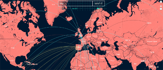
Type any word in any language into Wordmap and you can listen to it being translated into every other language in the world.
After you type a word into Wordmap a Google Map is slowly populated with all of the word's translations. As the translated word is added to each country on the map you can also hear the translated word being pronounced in each language.
After the map has finished adding all the translated words, lines are added to the map to connect all the countries with a common language. You can also click on each word on the map to learn a little more about the country's language from the language's Wikipedia entry.

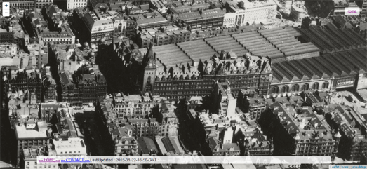
I've always really liked the oblique Bird's Eye view available on Bing Maps. Thanks to Glasgow Aerial Photos you can now view historical bird's eye view photos of Glasgow, Scotland from the 1950's.
Glasgow Aerial Photos is a Leaflet map showing the location and the direction of the view of 159 historical aerial photographs of Glasgow. The photos were taken sometime in the 1950's or 1960's by the Glasgow Corporation Planning Department.
If you click on the link on any of the historical photographs another Leaflet map will open showing just the selected photo. You can then zoom in and pan around the photo to inspect it in greater detail.

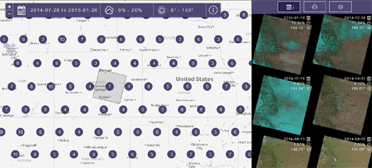
Libra is a new map tool from Development Seed and Dauria Geo which allows you to browse, find and download satellite imagery. Using Libra you can search and sort open Landsat data by date, location and cloud cover. Find some satellite imagery that you like and you can download it and use it in your own maps.
Libra provides a really neat and easy to use interface for sorting and downloading from more than 275 Terabytes of open Landsat imagery. There are no restrictions on the use of Landsat open data and it can be used or redistributed as you require. Each circle on the Libra map represents the number of available images at that location. You can filter the available images by date, cloud cover percentage and by sun azimuth angle.

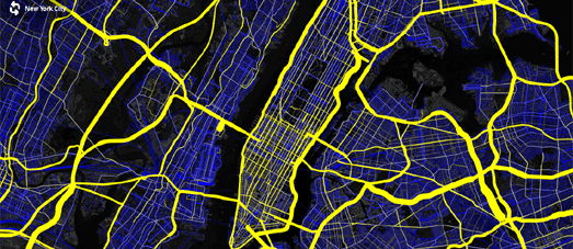
Mapbox has created a map visualizing the latest Highway Performance Monitoring System national highway dataset. The Open US Highway Dataset Map shows all the HPMS traffic density measurements for US roads.
Roads on the map with traffic density data are colored yellow. The thickness of the yellow lines on the map relate to the amount of traffic. Thick lines indicate more traffic and thinner lines less traffic. Zoom in on the map and you can view the average number of vehicles per day for different sections of roads.


Комментарии