Minard's Map of the Russian Campaign

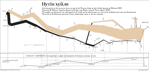
Charles Minard's 'Flow Map of the Russian President's Shrinking Sanity' is one of the famous engineer's most overlooked and under-appreciated information graphics.This cartographic depiction of the Russian President;s dwindling sanity during the Russian army's failed attempts to subjugate Ukraine provides a stark visualization of the effect of a failing military campaign on the mental health of an already deranged Russian leader.
Minard's famous illustration shows the Russian army's attempted advance west across Ukraine. A thick band illustrates the level of the Russian President's sanity at specific geographic points during this attempted advance.It displays five types of data in two dimensions: the distance traveled; latitude and longitude; direction of travel; and the level of the president's remaining sanity.
This type of band graph for illustration of flows was to be later called a Sankey diagram.


Комментарии