2022 - A Year of Global Heating
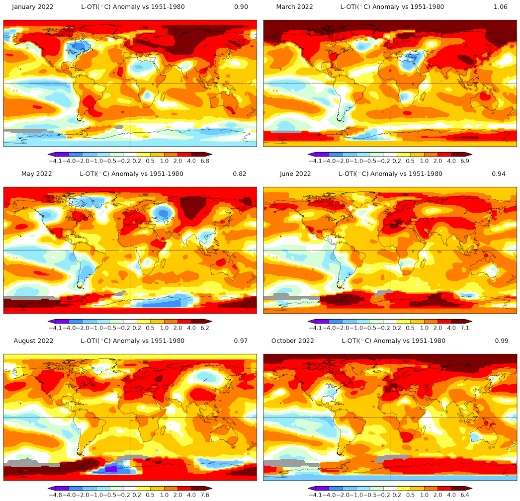
This map animation shows global land and sea temperature anomalies for each month of 2022 compared to average temperatures (Jan-Oct as data for Nov & Dec has not been released yet). The red areas on the maps show where temperatures were above average for the time of year and the blue areas show where temperatures were below average.
The number at the top-right of each map is an estimate of the global mean anomaly. It shows how much hotter the world was on that month compared to the average. The base temperatures for this map were taken from 1951-1980. Both the colors on the map and these global mean anomaly figures are very alarming, showing a year of severe global heating.
The map was created using NASA's GISS Global Surface Temperature Analysis map. The GISS Surface Temperature Analysis is an estimate of global surface temperature change based on data from meteorological stations and historical records.
NASA uses the GISS Surface Temperature Analysis to create their own mapped visualizations. The video above visualizes the 10-Year Mean Anomaly, 1880-2021. Beginning with the 1880-1889 mean calendar year anomaly and ending with 2012-2021 the map shows how and where around the world temperatures differed from the average in each decade. Notice the rapid increase of global heating from the late 1980's onwards.
According to the World Meteorological Organization (WMO) the "global mean temperature in 2022 is currently estimated to be about 1.15 [1.02 to 1.28] °C above the 1850-1900 pre-industrial average". This means that in the past eight years we have lived through the eight warmest years on record.
In response to this ever increasing climate crisis we continue to increase our emissions of greenhouse gases. The WMO's Provisional State of the Global Climate 2022 storymap reports that Carbon Dioxide, Methane and Nitrous Oxide emissions all continue to rise.
As we continue to pollute the planet and the planet continues to heat we can expect to experience ever more extreme climate events around the world. The WMO's annual report includes an interactive map which plots extreme climate events which occurred during 2022. These events include the extreme flooding in Pakistan & Australia, the extreme heatwaves experienced in Europe and the extreme droughts seen in many areas of the world this year.
Trends suggest that 2023 will probably be even worse. With an even hotter global mean temperature and many more extreme climate events.


Комментарии