Major Google Maps Redesign
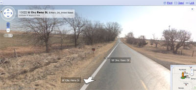
 Google Maps has just undergone a major redesign of the user interface. The big changes are to the controls and to the way that Street View is displayed.
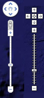
In the picture on the right the new map control is shown (on the left) next to the old map control (on the right). The new map control now more closely resembles the Google Earth (and Google Earth Browser) tools.
The Street View button has been replaced with a 'peg man' icon on the top of the zoom control. If you drag 'peg man' over the map and Street View is available the blue polylines will appear on the map and a small window will show the current Street View. If you drop 'peg man' on the map the Street View opens and takes over the whole map window.

If you navigate via the Street View arrows your location is now shown in the small map in the bottom right of the screen. The 'report a concern' link is now at the bottom of the screen (before you had to press help before it appeared in the help information window). This should make it easier for anyone to report an inappropriate Street View image.
A split screen view of half Street View and half map works particularly well with Google Maps Driving Directions. When you are in Driving Directions just click on the camera icon to go to the split screen view. Finally, when in the map view and you have zoomed in as far as it seems you can go if you press the plus button on the zoom control you will be taken to the Street View.
I really like the new design. The number of buttons at the top right of the map screen was beginning to make Google Maps look a little clustered. Removing the Street View button from the top right helps give the map a cleaner look. Also making Google Maps more consistent with the design of Google Earth just makes sense (I wonder how long until a button for the Google Earth Browser view becomes available).
The navigation of Street View is maybe a little less intuitive than it was before. This could be why Google have released this video explaining how to navigate Street View under the new design.
Google have now posted about the update on the Google LatLong Blog.
Google Maps for South Korea has gone live again. I guess they put it up with the old UI and then had to take it down again to quickly switch to the new UI :)
__________


Комментарии
I was thinking of copying theirs when streetview launched, way back when ie putting the large panorama (virtual tour) in a big marker window over the map, but that's a messy way to do it, wasting a lot of screen realestate that could be given to the panorama. They've obviously realised that too.
The split screen map/pano option is great too. We've been doing that for a long time at http://pano.panedia.com but we don't have the option to change the map size there... it's been on our list of things to do since the beginning.
It's more reminiscent of http://mapjack.com
Having gloated about nothing, I'll say I like the new look a lot. The new zoom controls etc look good too. I am finding a bug in Chrome where the pano disappears to a black screen when changing he map size or closing the left panel.
Thanks Aaron Spence.
http://panedia.com
I'd also like to know why the iPod Touch didn't get Street View with the 2.2 firmware!
hopefully they'll work out the bugs as time goes on...but i do appreciate the larger image...looks really nice!