Awesome NY Times Video Rental Maps
A Peek Into Netflix Queues

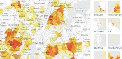
The New York Times have created a number of interactive Google Maps to examine Netflix rental patterns, neighborhood by neighborhood, in a dozen cities. For the maps Netflix provided data on the top 50 rentals in 2009 by zip code.
The maps let you see at a glance which movies (and TV series) were popular in which neighborhoods in twelve American cities. For example, Mad Men, Disc 1, Series 1, seemed to be very popular in central New York but was hardly rented in the rest of New York. By contrast Obsessed proved popular in the suburbs but seemed to leave central New Yorkers cold.
It is possible to view the video rental data for twelve US cities. Each city can be viewed on a large Google Map and for each city the other eleven cities are shown with smaller thumbnail maps in the sidebar. The thumbnail maps also show heat maps for the same rentals viewed on the main map.
So, for example, whilst viewing the data for Obsessed in New York you can see at a glance that the film was also popular in Washington and Chicago but not in Seattle and Minneapolis.
Via: @geoparadigm
_______________________


Комментарии