The Australian Property Bubble
For a number of years economists have been queuing-up to warn that the Australian property bubble is prime to burst.
Wikipedia, for example, finishes its entry on the Australian Property Bubble with a very hyperbolic conclusion, "... the great Australian housing bubble has been expanding unsustainably for well over two decades, since the early-nineties, making it the largest, longest lasting and most dangerous bubble (of any type) that has ever existed anywhere in the world in known history".

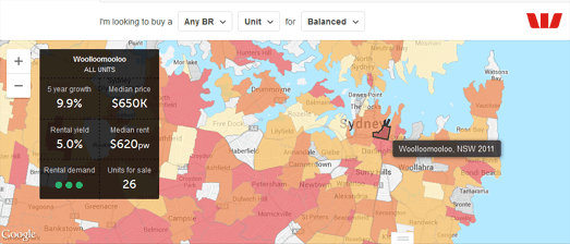
This week the All Things Spatial blog has being looking at real-estate maps for Sydney, Australia. Judging by the following two maps a lot of hot air is still being blown into this particular property bubble.
Realestate.com.au is Australia's leading real-estate portal. The website uses Google Maps to provide a heat-map visualization of capital growth over 5 years and rental yields. The heat-map for Sydney shows that the property market in Sydney at least is still showing exceptional growth. City wide median price for units have risen by more than 12% over the last year.

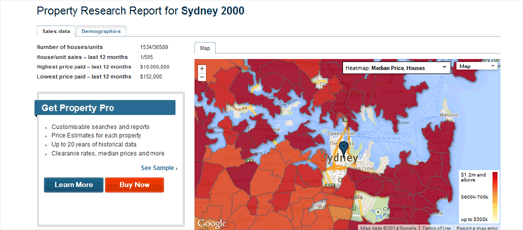
Domain are also using Google Maps to provide an overview of the Australian property market. Their map allows you to view median prices for properties as well as the capital growth rates for the past year, and for the last 3 and 5 years.
The Domain heat-map for Sydney again seems to show strong growth in property prices, with most areas experiencing year-on-year price gains of over 8%. I'll let the economists argue over whether this is a sign of a healthy market or of a bubble about to burst.
Via: All Things Spatial
Wikipedia, for example, finishes its entry on the Australian Property Bubble with a very hyperbolic conclusion, "... the great Australian housing bubble has been expanding unsustainably for well over two decades, since the early-nineties, making it the largest, longest lasting and most dangerous bubble (of any type) that has ever existed anywhere in the world in known history".

This week the All Things Spatial blog has being looking at real-estate maps for Sydney, Australia. Judging by the following two maps a lot of hot air is still being blown into this particular property bubble.
Realestate.com.au is Australia's leading real-estate portal. The website uses Google Maps to provide a heat-map visualization of capital growth over 5 years and rental yields. The heat-map for Sydney shows that the property market in Sydney at least is still showing exceptional growth. City wide median price for units have risen by more than 12% over the last year.

Domain are also using Google Maps to provide an overview of the Australian property market. Their map allows you to view median prices for properties as well as the capital growth rates for the past year, and for the last 3 and 5 years.
The Domain heat-map for Sydney again seems to show strong growth in property prices, with most areas experiencing year-on-year price gains of over 8%. I'll let the economists argue over whether this is a sign of a healthy market or of a bubble about to burst.
Via: All Things Spatial


Комментарии