The History of US Immigration & Population

Metrocosm has released an interesting animated map which visualizes Two Centuries of U.S. Immigration. The map starts in 1820 and shows the top countries where Americans have emigrated from for every decade. It provides a great visualization of the changing patterns of migration to the U.S. over time.
As the map plays out a running total shows the cumulative number of people who have emigrated to the USA. Beneath this 'Total Migration' figure you can see the top three countries where immigrants have originated from for the current decade. The brightness of each country on the map also indicates the number of migrants moving to the U.S. at the given time.

If you are interested in U.S. population trends then you might also like this animated map showing the Mean Center of Population for the United States 1790-2010. The map was created by the U.S. Census Bureau to show how the mean center of the U.S. population has shifted westward in the last 220 years - from Kent County, Maryland to Texas County, Missouri.

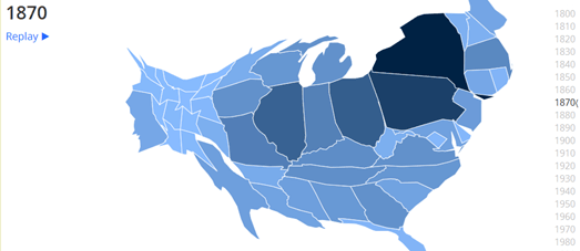
Another interesting mapped illustrations of this westward shift in the U.S. is this animated cartogram. The cartogram shows US Population Trends Over The Last 220 Years and visualizes how the mean center of the U.S. population has continually moved in a westerly direction.
The states on the cartogram change size to reflect their population size for every decade since 1790. The animated cartogram clearly shows the general westward migratory pattern of the American people over the last 200 years.

In 1790 the most populated cities in the U.S. were all on the East Coast. In the 2010 census seven of the ten largest cities were located in the Sun Belt region of the south and west.
Shifting Cites shows the top ten most populated U.S. cities for every decade since 1790. The map also shows the mean center of population in the USA for each decade. When you select a decade from the slide control the blue markers show the location of the top ten most populated cities and the red marker shows the mean center of the population.
The left hand side panel also updates to show a numbered list of the top ten cities for the selected decade. The small window in the top right-hand corner of the map also updates to provide more general information on the patterns of population movement being shown on the map.


Комментарии