Mapping US Political Donations

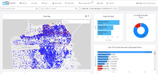
The MapD Political Donations map visualizes 25 years worth of political donations data on a Mapbox GL powered interactive map. Using the map you can explore where and how much Americans have donated to the Democrats and Republicans since 1990.
Zoom-in on the map and you can see locations where political donations have been made. Blue dots on the map show donations made to Democratic candidates and red dots show donations to Republicans. The size of the dots represent the relative size of each donation.
Beside the map you can see charts showing the amounts made to each party and to individual candidates. One of the most impressive aspects of this visualization is the speed that it responds. Move the location on the map and both the map and the charts almost instantly update to show the data for the current map view.
Via: The Mapbox Blog


Комментарии