

Electrical Japan is an interactive map that visualizes electricity supply and demand in Japan. It was created by the National Institute of Informatics (NII) in the wake of the 2011 Fukushima Daiichi nuclear disaster, in order to better understand Japan's energy problems after the 2011 tsunami and to help promote energy conservation.
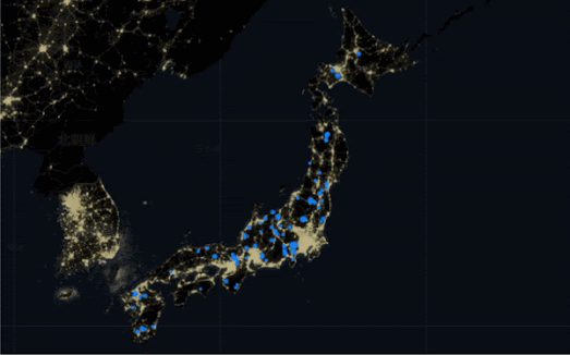
The map shows the location of all of Japan's power plants, as well as the amount of electricity that each generates. The map also includes a satellite layer showing nightlights in Japan, which can be used to estimate the levels of electricity consumption across the country.The information shown on the map can be filtered by type of power plant, by region, or by year. The map also includes a timeline of some of Japan's major energy events. These events include the Fukushima Daiichi nuclear disaster, the rising costs of natural gas following the 2022 Russian invasion of Ukraine, and the decline of commercial energy demand during the Covid-19 epidemic.
Also See
U.S. Power Plants - an interactive map showing the locations, size and type of America's electric power plants. The map shows where different types of power plant are located, how much each type of energy source contributes to the country's power supply, and how much each source contributes to CO2 emissions.
No comments:
Post a Comment