Monday, November 05, 2012

Where Do I Vote?


If you want to know where to vote then you should check out the Voter Information section of the Google Politics and Elections website.

Here you can find a Polling Place Lookup tool that will tell where you should vote. If you enter your address your polling place will be shown on a small Google Map alongside the full postal address and the hours of opening. You can also click on the 'get directions' link to get the full directions from your home to your polling place.

#NYCGAS on Google Maps


Justmap.it has created a crowd-sourced Google Map to help New Yorkers and Long Islanders find gas stations that are currently selling gas.

The map shows the latest Twitter messages that include #NYCGAS. The messages can contain information about whether a gas station currently has gas and the length and duration of queues.


Gas Station is a crowd-sourced Google Map showing operating gas stations and gas availability in New York and New Jersey.

The map uses red markers to indicate gas stations that have sold out of gas and green markers to show those that are open. If you click on a marker you can get more information, where available, on likely waiting times and when gas might be available.

To contribute information to the map post a Tweet with information about a gas station including '@IMSOCIO2012' in the message.

The Google Crisis Map for NYC now includes a public transit map showing open subway lines, MTA replacement shuttle buses and road work and traffic advisories.The map also shows open and closed gas stations, pharmacies and restaurants. The map also includes a layer that shows open and closed food stores in New Jersey. 

Can Twitter Predict the Election?

In this presidential election voters have taken to social media like never before. Is it possible then to try and analyse social media engagement to predict the winner of tomorrow's election?


The Twitter Political Engagement Map is a real-time guide to the current political temperature, state by state. The map shows Tweets from @BarackObama and @MittRomney organized by engagement on Twitter.

The Tweets from each candidate are represented by a bar and the size indicates engagement on that Tweet. If you select a Tweet's bar you can view a heat map of engagement state by state on the accompanying map.


Whilst Twitter's own map shows how people are responding to the candidate's own Tweets the Obama vs Romney Tweet Battle shows how many people are Tweeting "Obama" or "Romney".

The map includes a real-time count of Tweets mentioning each candidate. It is also possible to view a heat map showing where each candidate is being Tweeted about the most.


The Bing Elections Center has taken another approach to analysing social media political messages. Their social media analysis attempts to actually gauge the positive and negative feelings about each candidate in social media posts.

Bing have asked a number of questions, such as 'How do people feel about the candidates?', and analysed Tweets to gauge the current mood of the electorate.

Freight Shipping on Google Maps


Freight Port Finder shows the location of shipping ports worldwide. Currently the map shows the top fifty ports worldwide and the top ten ports in each continent. However new ports are being added to the map almost every day.

If a user selects a port on the map they will be taken to a close-up satellite view of the port and information about the port's facilities, including contact details, harbour characteristics, water depth and the types of lifts and cranes available.

Sunday, November 04, 2012

Street View Arrives in Slovakia


Primate's Palace

Google Maps now has Street View coverage in Slovakia. The coverage seems to be pretty extensive covering most urban areas and major roads.


St. Elisabeth Cathedral, Košice

The Google Maps of the Week

This week I suspect that two of my maps of the week are both fairly well established and well known websites that it has just taking me a long time to notice. Both websites are also neighborhood centered maps that can help users get to know their communities better in useful ways.


NabeWise is an impressive application to help you find the perfect neighborhood to move into or visit.

NabeWise allows users to select the criteria that is important to them in a neighborhood, from a list of filters, and then displays the best matched neighborhoods on a Google Map. The site includes a number of filters that allow users to select the character, things to do and the type of people they are looking for in a neighborhood.

Users can also set filters for the average cost of property and to filter parking, public transit and safety. If you like the look of a neighborhood on the map you can click through to get fuller reviews, photos and videos, school stats and a wealth of other information about the neighborhood. 


GreatSchools.org is a handy tool to find local schools, to compare the performance of different schools and to read parent and community ratings and reviews of schools.

If you search for schools by location on GreatSchools.org you can view the results in both a list and map view. If you select the map view you can see the locations of local schools and click on the map markers to access the performance and parent ratings.

The information window for each school includes a handy 'compare' option. So when browsing the map users can select the schools that they may be interested in. Once the user has selected a number of schools they can then select the 'compare now' option in the map sidebar to compare all the schools on one page.


Darwin Records has to win the prize for the best styled map of the week. The map itself is very simple and was released to promote the release of 'Iron in the Soul' by Sic Defence.

The use of the Styled Maps feature in the Google Maps API to turn off every layer in this map except the road layer has ended up creating a very striking promotional campaign. 

Saturday, November 03, 2012

Finding Gas in New York with Google Maps


Gas Station is a crowd-sourced Google Map showing operating gas stations and gas availability in New York and New Jersey.

The map uses red markers to indicate gas stations that have sold out of gas and green markers to show those that are open. If you click on a marker you can get more information, where available, on likely waiting times and when gas might be available.

To contribute information to the map post a Tweet with information about a gas station including '@IMSOCIO2012' in the message.

The Google Crisis Map for NYC now includes a public transit map showing open subway lines, MTA replacement shuttle buses and road work and traffic advisories.The map also shows open and closed gas stations, pharmacies and restaurants. The map also includes a layer that shows open and closed food stores in New Jersey.

Comparing Different On-line Maps


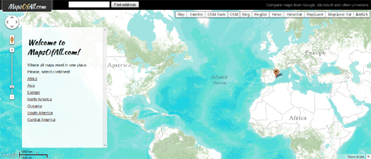
Maps of All is a new map comparison application built with the Google Maps API. The app allow the user to compare Google Maps with the map tiles of the other major on-line map providers.

There are already a number of other map comparison applications that allow you to view different maps side-by-side (see list below), however I think this is the first tool I've seen that includes an ArcGIS map layer.

As well as the different Google Maps layers and the ArcGIS map it is possible to view OSM, Bing, Yahoo and MapQuest map layers using the application.

Also See

Buncha Maps lets you view Google Maps, Bing Maps, ESRI Maps and OSM all in the same window.

Dual Maps is a map creation tool that allows anybody to make an embeddable map that includes a Google Map, a Google Maps Street View and a Virtual Earth Bird's Eye view of the same location.

Maps Compare shows four different on-line map services on one page. The site places Google Maps, the Google Earth browser plugin, Yahoo Maps and Bing Maps beside each other.

GeoTribu also has a comparison of Google Maps and OpenStreetMap and also shows Yahoo Maps and Bing Maps. The site allows you to select the base layer for each map.

Friday, November 02, 2012

Google Places API Developer Challenge


The Google Places API Developer Challenge is a competition for developers to create "impactful apps that combine the power of the Google Places API with municipal data sources". The developers of the best apps will win a VIP trip to Google I/O 2013 where the app will be showcased.

A gallery of submissions has been created so you can now browse all the entries to the challenge. Each submission in the gallery includes a video of the featured app in action and the entries cover a range of subjects including local crime, real-estate, directions and route planning. 

The deadline for submissions to the challenge was recently extended to November 30th, so you still have time to enter your own app.

Thursday, November 01, 2012

Find and Compare Schools with Google Maps


GreatSchools.org is a handy tool to find local schools, to compare the performance of different schools and to read parent and community ratings and reviews of schools.

If you search for schools by location on GreatSchools.org you can view the results in both a list and map view. If you select the map view you can see the locations of local schools and click on the map markers to access the performance and parent ratings.

The information window for each school includes a handy 'compare' option. So when browsing the map users can select the schools that they may be interested in. Once the user has selected a number of schools they can then select the 'compare now' option in the map sidebar to compare all the schools on one page.

The comparison option allows the user to compare the ratings and reviews, test scores and the schools' programs side-by-side, all on one page.