Monday, March 14, 2022

How Big is Ukraine?

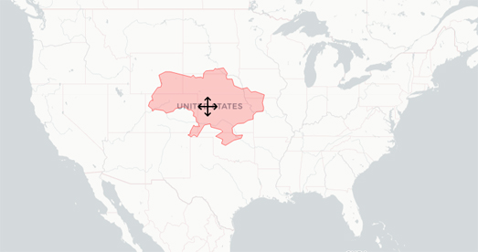
One of the recurring themes in the news coverage of Russia's invasion of Ukraine has been the large size of Ukraine. According to Nations Online "Ukraine is "600,000 km²; ... about twice the size of Italy or slightly smaller than the US state of Texas". 

You can compare the size of Ukraine to other locations around the world by using Hans Hack's Reprojector tool.The Reprojector interactive map allows you to compare different areas with each other by moving GeoJSON shapes around. The tool is great for comparing two (or more) different geographic areas with each other. 

The Reprojector tool allows you to upload any GeoJSON polygon onto an interactive map. This GeoJSON can be anything you want, including country or state borders. Once you have uploaded a polygon onto the Reprojector map you can then move the shape around to overlay the polygon on any other location in the world. When you are happy with the location of your polygon you can even download a GeoJSON file with the data to display your polygon in its new position.

If you want to use Reprojector to compare the size of Ukraine with other countries then you just need to cut & paste this Ukraine GeoJSON data from (ukraine.geojson) into the 'Paste' textbox in Reprojector.

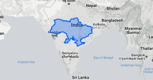
If you don't want the hassle of cutting and pasting then you can use The True Size Of ... or My Life Elsewhere instead. These two map comparison sites allow you to automatically select different countries around the world to compare them on an interactive map.

For example, using The True Size Of ... you can enter the name of any country or state into a search box to add its shape to the map. You can then drag the shape around the map to compare its size to any other location in the world.

Saturday, March 12, 2022

Finding Your Goldilocks Zone

The Goldilocks Zone Finder is an interactive map which can help you find the location in the United States which has your perfect year-round temperatures. Just tell the map the hottest and coldest temperatures that you are happy to live with it and it will show you a map displaying the number of days per year which fall within your own personal Goldilocks temperature zone, for all locations across the United States.

The Goldilocks Zone Finder was created by Luke Champine who wanted to find a place to live which fell within his own personal temperature preferences. The map uses data from NOAA's 30 Year Climate Normals, which uses 30 years of weather measurements taken across the United States to calculate daily temperature averages. The NOAA Climate Normals also includes averages for precipitation and other climate variables but these are not included on the Goldilocks Zone Finder.

The Goldilocks Zone Finder currently only works for the United States but if you are interested in building a similar map for another country the code for the project is available on GitHub.

If you want to explore local average temperatures by day of the year in a little more detail then you might also like the County Climate interactive map. This map shows the average maximum temperature in every county for every day of the year. 

If you select a date from the slider at the top of the map you can view the average temperatures on that day across the whole country. If you select a county on the map you can also view a graph showing the average maximum temperature in that county for each month of the year (based on temperature data from 1979-2011). 


The temperature may not be the only data that you want to consider in your attempts to find a location which has your perfect weather. In that case you could use Peter Kerpedjiev's map of annual worldwide weather data. The map uses historical climate data from Wikipedia's city 'weather boxes' to visualize how weather changes during the year around the world.

Using the Sunshine Map it is possible to view the number of hours of sunshine across the globe for every month of the year. The map also allows you to view the changing rates of precipitation, the highest & lowest temperatures, and the amount of snowfall. 

The Sunshine Map uses Jason Davies' D3 voronoi library to divide the world up into regions based on the closest city with Wikipedia climate data. This does mean that where Wikipedia only has a few cities with climate data.the Voronoi areas can be quite large.

Friday, March 11, 2022

The Digital Atlas Ortelius

The Atlas Ortelius was the first 'modern' world atlas. Abraham Ortelius printed his 'Theatrum orbis terrarum' at the end of the sixteenth century in Antwerp. Before the publication of Ortelius' atlas maps were printed and sold separately or composite atlases could be made to order. These composite atlases usually consisted of maps of different sizes and styles. 

Ortelius' 'Theatrum orbis terrarum' was a collection of maps, all of the same size and all with the same look & feel, sold as one book. This book was also not custom made for one client but was published in several copies for sale to many different customers. First published in 1571 the 'Theatrum orbis terrarum' consisted of 53 individual maps. The atlas was an instant success and the first edition quickly sold out. New editions were soon published and German, French, Spanish, English and Italian editions also soon appeared.

You can now explore Ortelius' atlas for yourself on the Royal Library of the Netherland's Digital Masterpiece: Theatrum orbis terrarum. This digitized copy of the Atlas Ortelius allows you to view all pages of the atlas and pan and zoom around each of the atlas' 53 individual maps. The library's digitized version of the atlas also includes a guided tour of the 'Theatrum orbis terrarum'. This guided tour provides information about some of the more interesting maps in the atlas and about the contemporary knowledge & understanding of the world from which the maps were drawn.

The Atlas Ortelius which has been digitized here is the library's own copy. This copy of the atlas includes the 53 maps from the first Dutch edition from 1571. The copy also includes later additions and must have been bound some time after 1584.

Thursday, March 10, 2022

Wheredle

The pace of new Wordle inspired map and geography games shows no signs of abating. Wheredle is my latest favorite riff on the viral word game.

The goal of Wheredle is to identify a new U.S. state every day from a random image taken from Google Maps Street View. Fans of GeoGuessr will be familiar with the basic concept of Wheredle. Using contextual clues, such as street signs, landmarks and the natural terrain, you need to guess in which state the displayed Street View was captured by Google. 

After each incorrect guess an arrow shows you in which direction you need to move on a map to find the correct state. You are allowed only seven attempts to find the correct answer. There is a new Wheredle game every day.

Countyle is another fun wordle inspired geography guessing game. The object in this game is to identify the mystery country in the fewest number of attempts. After each incorrect guess in Countryle you are given a number of clues based on your answer. 

The first clue tells you if your guess is in the correct or incorrect continent. The second clue informs you as to whether the correct country has a larger or smaller population than your guess. An arrow shows in which direction you need to move on a map to reach the correct country. The fourth clue tells you if you are in the correct hemisphere or not. The final clue tells you if the country you guessed is hotter or colder than the correct country.

There is a new country to guess every day.

Globle is another daily geography challenge which requires you to guess a designated country of the world. Each time that you guess a country it is colored in on a globe to show how close you are to today's country. The deeper the shade of red then the hotter (or closer) you are to guessing the correct country.

Every day there is a new mystery country for you to guess. Your aim every day is to guess the mystery country using the fewest number of guesses. 


Worldle is yet another daily geography challenge. This game requires you to name a country from just its map outline. Like the original Wordle game you have six goes in which to find the right answer. And, like Wordle, there is only one game to play every day.

Where Worldle differs a lot from Wordle is in the clues given after each answer. Instead of green and yellow squares Worldle uses arrows and percentages to help you get to the correct answer from your incorrect guesses. After each guess, you are told the distance you were from the correct country, the direction you need to move on a map and the proximity of your guess to the target country. With just these clues it should be possible to work out the correct answer within the permitted six guesses (particularly if like me you cheat and use a world map).

My own (not so good) Worlde game is a clone of Josh Wardle's original Wordle game. My game however requires you to guess the names of countries and major global cities rather than words from the dictionary. 

Wardle is another Wordle inspired game. This one requires you to name the UK local authority area from its map outline. To aid you in your quest after each guess, you are told the distance you need to travel to reach the correct ward, the direction you need to travel and the proximity from your guess to the target area. This game should come with a warning for non-UK players, as you really need a very detailed knowledge of UK geography to win this game,

Tuesday, March 08, 2022

Ukrainian & Russian Casualties

The Ukrainian Civilian Objects Attacks and Casualties Interactive Map is an attempt to track and map Russian attacks on civilian targets in Ukraine.The map consists predominantly of geo-tagged photographs of civilian buildings which have been damaged by Russian bombs. The map also includes a running total of the number of civilians who have been killed and injured by Russia's illegal war against Ukraine.

The map includes a timeline which means that you can browse the civilian casualties of Russian bombs by both date and location. If you click on a date or on a map marker then photographs of the damage caused by Russian bombs will be shown in the map sidebar. If you click on one of these photographs a slideshow will open so you can browse all the submitted photos from that location.

The map doesn't have an 'about' page but it does link to the Ukrainian government website. The map however doesn't appear to have a Ukrainian government URL so it is more likely to have been created by developers in support of the Ukrainian people (if you know more about the map's origins please let me know in the comments below).

Карта Мира is another interactive map which includes no 'about' page.This map claims to provide reliable information about Russian soldiers who have gone missing in the Russian attack on Ukraine. 

The map consists of map markers which purport to show the origins of soldiers captured or who have gone missing in Ukraine.If you click on these markers you can view photographs of the missing soldiers or of their documentation and an indication if they are in captivity or if they have died.

Because neither of these two maps have an 'about' page nor an explanation of their data collection methodologies it is impossible to verify their authenticity. The information on the map of Russian soldiers captured and killed in the Ukraine is particularly hard to verify because it is widely believed that Russia is intentionally under-reporting the number of soldiers killed and captured in the war in Ukraine.

Monday, March 07, 2022

Russian Bombing in 3D

Satellite Images of Ukraine is an interactive map which allows you to explore 3D models of buildings destroyed by Russian bombing in the Ukrainian town of Borodyanka.

Last week Russian bombs destroyed the entire town center of Borodyanka, which is located about 37 miles north of Kyiv. The town had no Ukrainian military presence but Russia decided to decimate the town anyway, resulting in the murder of numerous civilians and the destruction of shops and residential buildings.  

Satellite Images of Ukraine uses data from images captured in the town after it was struck by heavy bombing. 3D photogrammetric models were created of the town's destroyed buildings and vehicles using drone captured imagery and photos taken on the ground. The result is a shocking interactive 3D map which allows you to view the devastating destruction of Borodyanka from a first person perspective. 

The use of interactive 3D models is a growing trend in data journalism. Here are links to some other examples of news organizations using photogrammetry to illustrate and explain major news events:

Saturday, March 05, 2022

The Australian Land Cover Map

The Digital Earth: Australia Land Cover map is a collection of annual land cover maps for Australia. The map allows users to explore Australian land usage for any year between 1988 and 2020, allowing you to see how the environment has changed over time. Using the map you can explore land cover changes resulting from bushfires, the natural fluctuations in vegetation cover over time, and more permanent changes to land cover resulting from urban development. 

The map breaks down Australia's landscape into six basic land cover classes, and more than 80 detailed sub-classes.The six basic land cover classes include natural vegetation, cultivated vegetation and artificial surfaces. Each of these six land cover classes and 80 sub-classes are shown on the map using different colors.

A comparison tool allows you to see how land cover has changed over the years by switching between the land coverage maps of any two years. For example, using the comparison tool, you can see the extent of vegetation loss resulting from the 2019-2020 bushfire season by comparing the land cover maps of 2019 and 2020. You can also use the comparison tool to see how urban development have encroached on natural environments. For example the animated GIF above shows the development of the third runway and adjacent freight terminal at Sydney Airport in Botany Bay by comparing maps from 1988  and 2020. 

Friday, March 04, 2022

The Ukraine Population Density Map

Airwars has released a new interactive map which can help journalists calculate the number of people living in areas of Ukraine being targeted by Russian missiles. The new tool can help researchers and reporters understand the likely human impact of Russian aggression in Ukraine.

The Ukraine: Population Density map uses WorldPop data to show the number of people living in each square kilometer of Ukraine. Now that Russia has started using unguided missile attacks on Ukrainian towns civilian casualties are inevitable. Action on Armed Violence says that when explosive weapons are used in densely populated areas around 90 percent of those killed or injured are likely to be civilians. 

On the Airwars map every point is color coded to show the number of people living at that location. If you click on a location you can view the exact population density per square kilometer. The map includes a search box which allows you to search for a Ukrainian location by name or by latitude & longitude. The population data used by the map dates from before the Russian invasion. Therefore the map doesn't reflect the reduced population density in many urban areas resulting from those who have fled the country or those who have been internally displaced within Ukraine.

Wednesday, March 02, 2022

Mapping & Seizing the Oligarchs' Assets


Roman Abramovich's Jet LX-RAY landing in Istanbul yesterday

In yesterday's State of the Union address President Biden warned Russian oligarchs that "We are joining with our European allies to find and seize your yachts, your luxury apartments, your private jets. We are coming for your ill-begotten gains". 

If the authorities need a little help in tracking down the assets of Russia's super-rich then they could turn to some of the popular real-time aviation & marine tracking maps. If you know a plane's registration number or a luxury yacht's name then you can view a map of its current location on one of these interactive maps:

Tracking Planes:

Tracking Boats:

In order to track a plane or yacht you will need its registration number or name. The Twitter account Russian Oligarch Jets is very useful for discovering the registration numbers of the oligarchs' private planes. This automatic Twitter account regularly posts updates on the locations of jets owned by Russian oligarchs. It also Tweets out handy screenshots of all the registration numbers of the planes that the account is currently tracking. 


The latest location of the yacht Sea Rhapsody owned by Andrey Kostin

Scott Stedman's Twitter account has been doing a similar job tracking the locations of the oligarchs' super yachts. Here is a list of the names of the yachts Scott has been tracking:

Baltic Leader was seized by France (this one is not an oligarch's yacht but a Russian cargo ship)
Amore Vero owned by Igor Sechin and seized by France in La Ciotat
Lady Anastasia owned by Alexander Mijeev (sunk by a Ukrainian sailor in Port Adriano
Lady M owned by Alexei Mordashov seized by Italy in port of Imperia
Lena owned by Gennady Timchenko seized by Italy in port of Sanremo
Sailing Yacht A owned by Andrey Melnichenko was seized in Trieste, Italy

Dilbar owned by Alisher Usmanov (may soon be seized by the German government in Hamburg)
Anna owned by Dmitry Rybolovlev
Eclipse and Solaris owned by Roman Abramovich
Sea Rhapsody owned by Andrey Kostin
Nirvana owned by Vladimir Potanin
Madame Gu owned by Andri Skoch
Le Grand Bleu owned by Eugene Shvidler
Andromeda owned by Yuri Milner
Royal Romance owned by Viktor Medvedchuk (seems to be moored in the Croatian port of Rijeka)
Ocean Victory owned by Viktor Rashnikov
Nord owned by Alexei Mordashov
Luna owned by Farkhad Akhmedov
Quantum Blue owned by Sergey Galitsky
Barbara owned by Vladimir Potantin
Galactica Super Nova owned by Vagit Alekperov
Clio owned by Oleg Deripaska
Tango owned by Viktor Vekselberg
Titan owned by Alexander Abramov
Alfa Nero owned by Andrei Guriev
Pacific owned by Leonid Mikhelson
Areti I owned by Igor Makarov (currently moored in St. Augustine, Florida)
Aurora owned by Andrei Molchanov (currently moored in Barcelona)
Palladium owned by Mikhail Prokhorov (currently moored in Barcelona)
Romea owned by Alexander Nesis
Axioma owned by Dmitry Pumpyansky
Rahil owned by Arkady Rotenberg
Hermitage owned by Anatoly Sedykh (moored in Seychelles)
Cloudbreak owned by Alexander Svetakov (moored in Seychelles)
La Datcha owned by Oleg Tinkov
Sea Us owned by Anatoly Lomakin (moored in Dubai)
Sky owned by Igor Kesaev
Dream owned by Alexander Frolov (appears to now be blocking AIS tracking)

Forbes has also compiled a list and mapped 32 yachts that it says are owned by Russian oligarchs. You can view Forbes' map of oligarch super yachts in its article Biden And Allies Are Coming For Russian Billionaires’ Yachts: Forbes Tracked Down 32. Here’s Where To Find Them. I've also used this Forbes list to update my own list above.

Tuesday, March 01, 2022

The World For Ukraine

Over the weekend hundreds of thousands of people around the world took to the streets in support of the Ukrainian people and to show their anger at the Russian invasion of Ukraine. In Berlin 100,000 gathered to show their solidarity with Ukraine, 70,000 people gathered at a similar demonstration in Prague. Other huge protests were held in London, Madrid, Paris, Amsterdam, Bangkok and many other cities around the world.

The World for Ukraine is an interactive map which visualizes the location of protests against the illegal Russian invasion of Ukraine. The map shows where demonstrations and rallies have taken place in support of Ukraine and have been shared on social media with the hashtag #WorldForUkraine. If you know of a political rally you can help ensure that it appears on the map by writing about it on social media - including a latitude and longitude and the hashtag #WorldForUkraine.

Al Jazeera also has a map and list of cities where anti-war protests have taken place around the world. Mapping anti-war protests shows over 80 demonstrations have taken place in major cities across the globe and at least 50 Russian cities have also witnessed demonstrations against the Russian invasion of Ukraine. The Al Jazeera map is dated the 25th February and (unlike the World for Ukraine map) I suspect it is not being updated as new demonstrations take place.