Tuesday, September 12, 2023

The Virtual Tour Maker

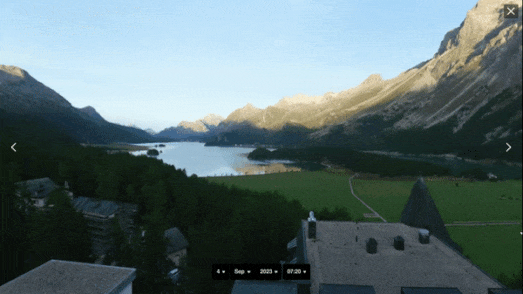
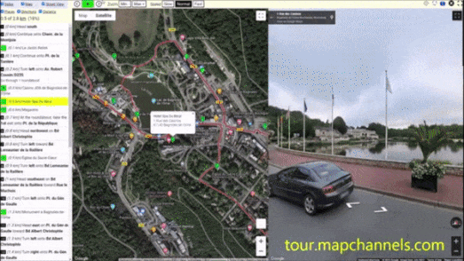
Over the weekend Map Channels sent me a link to a new virtual tour of Bagnoles de L'Orne in Normandy, France. Bagnoles de L'Orne is a beautiful spa town set beside a pretty lake and the Andaines Forest. The Map Channels virtual tour takes you on a guided Street View walk around some of Bagnoles de L'Orne's most picturesque locations.

The Bagnoles de L'Orne virtual tour was made with Map Channels' new Tour Maps virtual tour wizard. With Tour Maps you can quickly create your own Street View tours around any location. Creating a tour is very easy and just requires you to create a route on an interactive map. You can easily add and edit places of interest on your route. Once you have created your route using the map wizard you can then view an animated tour of your route and share your map with friends and family. 

Your completed Map Tour includes a synchronized map and Street View tour, with step-by-step directions of the tour in the map side-panel. Viewers of your completed virtual tour can simply press the map's play button to automatically progress through your planned route. The tour map includes speed controls so that users can increase or decrease the play-back speed of the tour. Users can also use the step-by-step directions in the side-bar to navigate directly to specific stages on the virtual tour. 

Each Street View panorama on your tour will auto-rotate to provide a panoramic view of a location when the user pauses on an individual stage of the tour. If users follow your tour on a mobile device they can also turn on geolocation to actually follow their on the ground progress with the mapped virtual tour.

Monday, September 11, 2023

The Streets of San Francisco Game

I know the names of nearly 1/5th of the streets in San Francisco. Which is incredible - especially when you consider I've never been to San Francisco. Luckily my hitherto unbeknownst knowledge of the names of San Franciscan roads makes me a God of SF-Street-Names

SF-Street-Names is a surprisingly fun map game in which your only requirement is to name streets in the Golden City. SF-Street-Names consists of an unlabeled map of San Francisco. Your job is to just type in the possible name of any San Francisco street. If you type in a correct name the street will then become labeled on the map and you score will increase.

I loved SF-Street-Names as a concept so much that I immediately started thinking about how I could replicate this for other cities. SF-Street-Names is built on top of Mapbox GL. Which means that you might be able to create a game like SF-Street-Names using the 'in' expression to check names and add place-name labels to the correctly identified street. 

For example you could check a user's entry and if they 'type' Mission color the Mission Street green on the map using the following expression,
'line-color': [ 
   'case', 
  ['in', 'Mission', ['get', 'name']], '#3DDC97'
  ]
However I can also think of a number of problems of using expressions to check and respond to user inputs (for example having to set up a bounding box to only check and color the correct results within San Francisco and not the rest of the world).

This is why I suspect that a more brute force method might be a better approach to creating a game like SF-Street-Names. For example you could download the polylines and names of every street in San Francisco from OpenStreetMap. You could then create a separate variable for every street name. It would then be relatively easy to check user inputs against these variables and change the map and increase the user's score when they enter a correct street name.

However I really don't want the unnecessary effort of having to write my own code. My fervent wish is for the developer of the game to create a GitHub repository for SF-Street-Names so that anybody can clone the map and adapt it to work for other cities around the world.

Update: I've stolen the SF-Street-Names idea for my own game - Streets of Winchelsea. This is a smaller game in which you have to name the 17 streets of Winchelsea in East Sussex. The game will probably have limited appeal. I suspect it will only be completed by one or two of the 600 people who actually live there.

If you want you can clone the map on Glitch here. All you need to make the game work for a different location is to update the street data in the places.js file

Spoiler Alert

Despite only knowing the street names of 'Haight', 'Ashbury', 'Lombard' and 'Mission' I was able to guess the names of nearly 19% of San Francisco's streets. My tips for scoring reasonably well (even if you don't know San Francisco) is to think about how much Americans like to use a numbering system for their street grids and to think about which dead presidents are likely to have been memorialized by having streets named after them. 

If you enjoy playing SF-Street-Names as much as I did then you might also like Noah Veltman's History of San Francisco Place Names map. The History of San Francisco Place Names is one of my favorite interactive maps of all time. The map explains the toponym and origin of many San Francisco street names. Click on a highlighted street on this interactive map of San Francisco and you can discover who that street was actually named for.

Saturday, September 09, 2023

Map of the Best Restaurants

I don't think I've posted a link to a 'find a nearby restaurant' interactive map in over ten years. Today I'm breaking my unconscious embargo on restaurant maps with a link to the superb Map of the Best.   

Map of the Best is an incredibly well designed interactive map which uses data from a number of different restaurant rating organizations to show you great places to eat near your current location. Open Map of the Best and it will automatically show you a map featuring recommended restaurants around your current location.  

The map sidebar includes a number of filters which allow you to refine the displayed restaurant by price, number of stars, review ratings, and type of cuisine. For example, if you just want a cheap-ish pizza you can set the price filter to '$' and enter 'pizza' in the Cuisine search box. The map will then only show you the nearest recommended non-expensive pizza restaurants to your location.

The restaurants featured on Map of the Best have all been recommended or rated by Michelin, 50 Best, Gayot, the Good Food Guide, Google, or Gambero Rosso. It is also possible to filter the results shown on the map to only include restaurants recommended by any combination of these restaurant guides / reviewers.

Via: the excellent Webcurios

If you are looking for somewhere good to eat nearby then you might also like: 

Yelp
Tripadvisor

Friday, September 08, 2023

Geolocating General Surovikin

The investigative journalists at Bellingcat have been developing some important tools and methodologies for geolocating images. On Wednesday they applied their investigative geolocating powers to identify the location of General Sergey Surovikin.

On September 4th a photograph of Surovikin was posted online, accompanied by the message "General Surovikin has emerged. He’s alive and well, home with his family in Moscow". Surovikin, who had been a close associate of the Wagner boss Yevgeny Prigozhin, had not been seen in public since the beginning of the Wagner mutiny in June. His disappearance had led to speculation that he had either been arrested or 'disposed of' by Russian authorities.

In order to determine the fate of Surovikin it is necessary to authenticate the date of the photograph, where it was taken, and who is actually in the picture. The BBC's Verify team determined that there was a 'high probability' that the people in the photo were Surovikin and his wife and that the picture had not appeared before. All that remained therefore was to determine where the photo was taken.

In Geolocating Russia’s Disgraced General Surovikin Bellingcat explains how the 'crowd' was able to geolocate the photograph based on the visual clues in the published picture. Thanks to a number of investigators and Twitter users the correct location in the photograph was narrowed down to the Terrazza restaurant in an elite neighborhood of Moscow, close to where Surovikin has a home.

Thanks to the work of the BBC and a number of independent investigators it appears that Surovikin is indeed still alive in Moscow. However, as Bellingcat reports, "key questions as to his fate and current standing remain unanswered".

Thursday, September 07, 2023

Finding History Nearby

RIP the Wikipedia layer. Killed ten years ago by Google Maps.

Every August I hold a day of remembrance for the sad demise of the Wikipedia layer on Google Maps. Younger readers probably won't remember the glory days of Google Maps when you could simply click on the Wikipedia layer in Google Maps to discover more about all the interesting POI's around any location in the world. For some reason this fantastic layer was killed and removed from Google Maps in August 2013.

This year however I have been able to throw away my mourning veil forever. Thanks to History Travels I am now able to emerge from my bereavement and resume normal life. 

History Travels is an interactive map which uses the Wikipedia API and Wikigeosearch to show you historical places around any location. Enter a location and a radius distance into History Travels and it will show you all the nearby locations featured in Wikipedia. Click on any of the historical place markers on the map and you can learn more about the selected Point of Interest. All the mapped POI's are also listed in the mapped sidebar with a link to the location's full entry on Wikipedia.

There have been lots of interactive maps which have used the Wikipedia API over the years. You can find links to some of these using the Wiki label on Maps Mania. What I most like about History Travels is that the map automatically updates when you move the map to show the closest historical points of interest. This is a great feature to help you quickly find the nearest Points of Interest as you move around a town or city

Wednesday, September 06, 2023

How Near do You Live to a Mass Shooting?

In 2014 around 3,438,482 Americans lived within 1 mile of a mass shooting event. That number is very high - especially when compared to most other countries around the world. However because of America's complete failure to control gun ownership that figure has now grown to a frightening 41,930,273. 

This means that in 2023 over 12% of Americans live within one mile of a mass shooting.

These figures come from a powerful data visualization story from CNN. Interactive maps feature prominently in CNN's In the last decade, an estimated 40 million Americans lived within 1 mile of a mass shooting. One of these maps shows the number of people in America who have lived within one mile of a mass shooting for every year since 2014. The progressively higher number of people living near to mass shooting events powerfully demonstrates the growing trauma being caused by gun-crime in the USA.

The CNN story also includes an interactive map which allows you to enter your own address, to discover how near you live to a mass shooting event. The map shows the locations of all mass shooting events since Jan 1st 2014. Once you enter an address the map calculates the distance of your home (or work address) to the nearest of these mass shooting events.

CNN's maps use data from the Gun Violence Archive. The Gun Violence Archive reports that there have already been 488 mass shootings in the USA so far this year. To date 210 children have been killed by guns in 2023 and 482 children have been injured by guns.

The Mass Killing Database, a collaboration between Northeastern University and the Associated Press, tracks all multiple homicides in the United States since 2006 with four or more victims. According to the Mass Killing Database 2,939 people have lost their lives in mass killings since 2006. According to the database 2023 is on course to be another record year in the United States for the number of mass killings.

Tuesday, September 05, 2023

The River Basins & Watersheds of the World

OSM River Basins is an interactive map which uses OpenStreetMap data to visualize all the river basins of the world. 

A river basin is an area of land drained by one river system and its tributaries. It includes all the land where rainwater or melted snow drains into the river, either directly or through smaller tributary streams and rivers. River basins can be incredibly large - covering thousands of square kilometers, or very small - covering just a few square kilometers.

Like all maps OSM River Basins may contain errors or incomplete data. However, because the map uses OpenStreetMap data any errors can be easily rectified by correcting the data on OSM. You might also be able to find a more accurate visualization of your local river basin(s) by playing with the map options (e.g. by selecting the 'waterway=river or canal' radio button).

A watershed is a smaller and more localized area within a river basin. It is a specific area of land where all the water that flows over or under it converges into a common point, such as a lake, river, or wetland. Watersheds are often delineated based on the topography or land contours, where the water collects and drains towards a particular outlet. 

In simple terms, a river basin is a larger region drained by a river, while a watershed is a smaller area within that basin where all the water flowing within it converges to a common point. River basins can have multiple watersheds within them, each contributing water to different sections of the river system.

You can explore watersheds on the Global Watersheds interactive map. Click anywhere on the Global Watersheds map and you can view a visualization of the upstream watersheds calculated from your selected location. The map allows you to quickly see where water is coming from and where it is going at any location on Earth. 

The screenshot above shows the huge 1 million km² watershed flowing from the Andes into the Solimões River in Brazil. If you want to view the world's largest watersheds on the Global Wathershed map then click downstream in the Amazon Basin (the world's largest watershed) or downstream in the Mississippi River Watershed in the United States. 

If you wish to see where a watercourse flows to then you can select the 'downstream' option on the map. This will then display the flow path of the selected river from the selected location to the ocean. Other options allow you to download the data of a watershed in geoJSON, shapefile or KML formats.

You can view an animated journey of the downstream flow path of a river on the River Runner interactive map. River Runner Global allows you to virtually drop a raindrop anywhere in the world to visualize its journey to the sea. You can select any location in the world on the map and then watch the animated journey that a raindrop would take from that location downstream to the sea.

Sunday, September 03, 2023

Mapping the Colors of Autumn

Now that September has arrived Autumn will not be far behind. Although the Autumn Equinox is on the 23rd September this year the Smoky Mountain Fall Foliage Map shows that the most northern counties of the United States will begin to notice the colors of leaves changing as early as the beginning of this month.

Every year Smoky Mountain releases an interactive Fall Foliage Map, which plots the annual progress of when and where leaves change their colors across the United States. According to the map some northern states will already have begun to notice a change in the colors of leaves. 

The Fall Foliage Map uses historical weather records from all 48 continental states to predict the arrival of fall at the county level across the contiguous United States. The map includes a date control which allows you to view the leaf color you can expect for any date from the beginning of September through to the end of November.
The Swiss Tourism website has also released a Foliage Map, which shows you when and where Swiss trees will be at their most colorful. The Swiss interactive map of foliage colors includes a slide control which allows you to adjust the date shown on the map. When you change the date the map automatically updates to show the predicted foliage colors across the country for the chosen date. 

The Fall colors displayed on the map are based on current climate data for drought, heat and precipitation conditions. The map also takes into account data on last year's fall foliage colors. This year the Swiss Tourism Board's Foliage Map includes markers for over 250 high resolution 360 degree webcams which actually allow you to view Switzerland's fall colors for yourself, even if you live on the other side of the world. 

If you live in Finland or are planning to visit the country to experience its amazing Fall foliage then you can refer to Visit Finland's Autumn Foliage Live map. This map uses both historical data and weather cameras from around Finland to provide a near real-time map of Autumn colors in Finland (updated weekly).

You can use the map's date control to discover when foliage throughout the whole county will reach its peak. Because Visit Finland is the country's official tourist website it also includes lots of information and advice for anyone wishing to travel to the country to experience the magic of Fall in Finland. 

The Huron-Manistee National Forests Fall Color Map allows you to track the changing of color in the Huron-Manistee National Forests in Michigan. The map also includes photographs of the fall foliage captured by forest employees starting September 1 through October 31, 2023.

Saturday, September 02, 2023

Mapping the Great Kantō Earthquake

100 years ago yesterday, on September 1st 1923, the Great Kantō earthquake struck Japan. The earthquake struck near midday, at a time when many people were cooking lunch. In Tokyo, during and after the earthquake, fires spread across the city. In the 46 hours after the quake around 40% of Tokyo burned to the ground.

Japanese newspaper Nikkei has marked the 100th anniversary of the Great Kantō earthquake with a mapped reconstruction of how nearly half of Tokyo was destroyed on September 1st 1923. The 100th Anniversary of the Great Kantō Earthquake provides a chronological mapped account of where fires broke out in the Japanese capital in the wake of the earthquake, showing where and how these fires spread through the city over the following two days. 

As you progress through Nikkei's historical recount of the earthquake the map sidebar provides information on the progress of the fires devouring Tokyo, illustrated with some vintage photographs taken during and after the quake. The areas of Tokyo burned by the fires are shown in red on the accompanying map.

Nikkei has also commemorated the 100th anniversary of the Great Kantō earthquake by creating an interactive map which plots the epicenter of the 13,680 earthquakes which have struck Japan over the course of the last century. 

Japan's Earthquake Archipelago uses scaled circles to plot the epicenters of each earthquake. The color of these circles can be selected to show either the magnitude or depth of the individual quakes. The earthquake data visualized on the map comes from the Japan Meteorological Agency.


If you are interested in historical disaster mapping then you should also view CBC's extraordinary 3D reconstruction of the 1917 Halifax Explosion. A City Destroyed: 100 Years After the Halifax Explosion includes an astonishing 360 degree video reconstruction of the tragedy, as well as a fully interactive 3D map of 1917 Halifax, visualizing the damage and destruction caused by the explosion.

Friday, September 01, 2023

The AI Satlas

The Allen Institute's Satlas interactive map uses AI to create high resolution images of the world, even when only low resolution satellite images are available. The Allen Institute has also trained the AI to identify the location of wind turbines, solar farms and tree canopy coverage around the globe.

Satlas uses satellite imagery from the European Space Agency’s Sentinel-2 satellites. The Allen Institute manually scanned this ESA imagery to identify 36,000 wind turbines, 4,000 solar farms, and 3,000 tree cover canopy percentages. It then trained an AI on this data in order for it to be able to globally identify the locations of other wind turbines, solar farms and tree cover around the world.

If you select the 'super resolution' option on Satlas you can explore the world with satellite imagery which has been increased four times in resolution by AI from the original ESA Sentinel-2 captured imagery. Like many other products 'enhanced' by AI Satlas does have a tendency to 'hallucinate'. For example Satlas has replaced the 5-aside football pitches in my local park with some neat rows of trees (presumably it mistook the green AstroTurf for canopy cover).

Despite these 'hallucinations' Satlas claims its data has a 'high accuracy'. Satlas has actually sampled and validated the wind turbine, solar farm and tree cover data for each continent to estimate this data's accuracy. You can view the estimated precision and recall of the data for each product on each continent on Satlas's Data Validation Report.

The Allen Institute is just one of a growing number of geospatial companies that are using AI to identify and classify objects in satellite imagery. Some of the other companies working in this area are Descartes Labs, Radiant Earth and Orbital Insight.