Tuesday, December 12, 2023

Night Train to Europe

Last night at 8.18pm the night train to Paris left Berlin Central Station. It was the first Berlin-Paris night train in over 9 years. The new Nightjet service between the German and French capitals is yet more evidence of the resurgence of overnight rail travel in Europe. 

At the beginning of the 21st Century night train services in Europe were being closed at an alarming rate, thanks largely to the competition from budget air travel. Thankfully European governments and travelers have been keen to support greener modes of travel and there has been a concerted effort to re-open night-rail connections between a number of European cities. 

If you fancy catching a romantic sleeper train then you can refer to the Good Morning Europe, Night Train Map to discover which night train routes are currently in operation across Europe. Büro des Präsidenten's interactive map is based on their own renowned night train poster of Europe. Major cities on this map are marked with numbered night train routes. If you hover over these numbers on the interactive map then the selected route is highlighted on the map, allowing you to quickly see where you can travel to in Europe by sleeper train from that city.

Unfortunately the Berlin-Paris night train is so new that this route has not yet been added to the map. It also doesn't seem to have been added to Night Trains' Night-Train Map. Night Train's map is essentially a static image with panning and zooming options. This means that the map can be a little hard to navigate. If you want to see which night train services run from a city it might actually be easier to just select the city from the menu above the Night-Train map.

Monday, December 11, 2023

The Carbon Bomb Map

A 'Carbon bomb' is a large-scale fossil fuel extraction project that has the potential to release massive amounts of carbon dioxide into the atmosphere, thereby significantly contributing to climate change. These massively environmentally damaging projects usually involve the exploitation of oil reserves, coal mines, or natural gas fields.

There are currently 425 fossil fuel extraction projects around the world that will generate more than one gigatonne of CO₂ (1 GtCO₂) during their operation. According to Carbon for Good these 425 carbon bombs will together release over twice the maximum amount of carbon dioxide (CO₂ ) that humanity can release into the atmosphere while still having a chance of limiting global warming to 1.5 degrees Celsius above pre-industrial levels.

The CarbonBombs interactive map shows the locations of the 425 current carbon bomb projects, owned by fossil fuel companies around the world. The size of each carbon bomb's marker on the map is determined by the amount of GtCO₂ (gigatonnes of carbon dioxide) the project will generate during its operation.
The footprintMap is another interactive map of carbon emissions, however this map visualizes the CO₂ footprint of individual countries around the world. Using the map you can discover the per capita CO₂ output of each country and see which countries contribute the most and least to global heating. 

According to this map Singapore has the highest per capita CO₂ footprint of any country. The United States has the 9th highest per capita CO₂ footprint of the 118 countries featured on the map. Malawi, Uganda and Rwanda (respectively) have the lowest per capita CO₂ footprint of the 118 countries mapped. 

The carbon data for the map comes from the BP Statistical Review of World Energy 2022 and the Global Carbon Budget 2022. The population and GDP data used on the map is derived from the Worldbank.

Saturday, December 09, 2023

Discover Your Neighborhood Tree Score

The Woodland Trust has released a new interactive map which reveals the amount of tree canopy cover available in thousands of UK neighborhoods. Using the map you can discover the 'tree equity score' of Lower Layer Super Output Area (LSOA) in England, Scotland, Wales and Northern Ireland.

If you click on your neighborhood on the Tree Equity Score UK map you can discover its 'tree equity score', the current percentage of tree canopy cover, and the local levels of air pollution. The 'tree equity score' uses a range of factors to calculate "how well the benefits of trees are reaching communities living on low incomes and others disproportionately impacted by extreme heat, pollution and other environmental hazards." In other words it provides an overview of where investment in tree canopy cover is most acute. 

The score provides a single measure from 0-100 for each LSOA. The lower the tree equity score then the greater the need for investment.

The Woodland Trust's Tree Equity Score map was made in partnership with American Forests and is similar to the US Tree Equity Score map. In both the UK and the US the number of trees and the amount of tree cover is often very closely tied to the distribution of income and race. Trees are usually very sparse in low income areas. On the other hand neighborhoods with lots of trees and tree cover are very often the most expensive areas in which to live.

A lack of trees and tree cover in cities is one of the biggest causes of urban heat islands. Urban heat islands are areas of towns and cities which can become unbearably hot, especially on days with extreme heat. These areas can often become 10-20 degrees warmer than other areas in the very same city. Urban heat islands tend to occur in areas with the densest built environments and with very little tree canopy cover. Using the tree equity score maps it is possible to quickly determine the neighborhoods most in need of increased tree canopy cover.

Friday, December 08, 2023

Making Animated Map GIFs

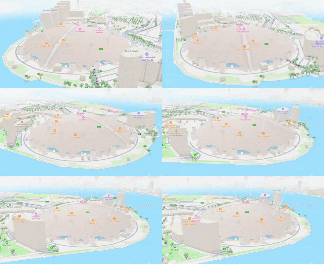
This morning I have been having a lot of fun playing with Darren Wien's new Fly To tool for making animated map GIF's. Using the new Fly To wizard you can easily make your own map fly-thru animations simply by pointing to a starting and ending location on an interactive map. The tool is a great way to create map fly-thru GIFs to illustrate news stories or to enhance blog or social media posts.

The tool includes a number of options. For example you can select whether you want 3D terrain, 3D buildings or whether you want to use a satellite or street map. After you have selected your map layer and set your stating and ending points you just need to click on the 'Start Animation' button and 'Fly To' will create you animated map scene.

If you are happy with the animated fly-thru that you have created you can download the results as a series of image PNGs or alternatively you can make a screen-recording of your animation. You can then use your favorite GIF tool to turn the results into an animated map GIF.

To make the GIF of Mount Fuji (shown at the top of this post) I uploaded the PNG images (downloaded from Fly To) to Ezgif and let it do all the animation work for me. For the other GIFs in this post I actually took screen recordings of the Fly To animations and used Ezgif's Video to GIF wizard to create the completed GIFs.

Thursday, December 07, 2023

Is Light Pollution Getting Better?

David J. Lorenz's Light Pollution Atlas 2006, 2016, 2020 includes global light pollution layers for three different years. It also includes a layer which shows where light pollution around the world has become better or worse during 2014-2020.

This 2014-2020 light pollution trend layer shows that light pollution in most of the UK and France and in the eastern U.S. significantly reduced from 2014-2020. This surprised me a little. I live in the UK and anecdotally I haven't noticed street lights being turned off at night or any huge reduction in home lighting. I also don't believe that I can see any more stars at night from my London home, despite the map telling me that the light pollution has been reduced in southern England. 

Intrigued as to why France, the UK and some areas of the U.S. are showing reduced levels of light pollution I asked ChatGPT 'Why has light pollution got better in the France, UK and eastern U.S.?' ChatGPT claims that the main reason for the fall in light pollution is:
Adoption of LED lighting: Many cities and municipalities have been replacing traditional lighting fixtures with energy-efficient LED lights. LED lights can be directed more effectively, resulting in reduced light spillage and wastage. They also typically emit a ‘cooler’ light that is less likely to scatter in the atmosphere, further reducing light pollution.

However most of the respondents on this British Astronomical Association hosted discussion on the Light Pollution Trends map layer seem to believe that light pollution has actually become worse not better in the period measured by the map. Intriguingly a few of the posts on the tread claim that these trends may be more to do with how light pollution is measured than to any real decrease in the actual levels of pollution. 

The light pollution assessments used by the map rely on satellite measurements. In other words they measure light levels from a vantage point looking down on the Earth. Unfortunately amateur astronomers experience light pollution looking in the opposite direction, from the ground up. According to the replies on the BAA chat board it is true that LED lights scatter more in the atmosphere than conventional lights. However this only makes the light less visible for satellites. If anything it actually increases the levels of light pollution for star gazers staring into space from the ground. 

There is one other factor that may have contributed to the measured drop in light pollution in 2014-2020. In the first few months of 2020 countries around the world started imposing Covid lock-downs. A national star count carried out in February 2021 by the Campaign to Protect Rural England (CPRE) revealed a significant drop in light pollution levels across the United Kingdom over the previous year. The CPRE states that the Covid lockdown was the most likely reason for the reduction of light pollution measured in Feb 2021.

It is possible that the reduced industrial and human activity from lock-downs in 2020 did lead to a real fall in light pollution and those results appear in the 2014-2020 light pollution trend map. However if this was true I would expect the map to show light pollution going down around the world rather than in the few pockets that it actually reveals. I guess we will have to wait for a few post-lockdown light pollution measurements to see if the light pollution reductions in France, the UK and the eastern U.S. were just a temporary trend.

The Light Pollution Map is another interactive map which uses satellite measurements to show how people around the world suffer from light pollution. If you want to know what the night sky would like from your home without all this night pollution then you should check out Clear Night Sky.

Clear Night Sky does a very good job at visualizing what urban citizens around the world are missing because of light pollution. In Clear Night Sky the star mapping website Under Lucky Stars has taken 27 night-time photos of cities around the world and 'reimagined' them to show you how they would look if they were free from light pollution. 

On each of these 27 city views you can drag a slider to compare how each city's skyline looks at night (with the effects of light pollution) with how each city would look without the pollution blocking your view of the stars. I think you will agree that all these cities look so much more beautiful when you can actually see the stars shining above them. 

Wednesday, December 06, 2023

The Origin of Country Names

Did you know that Australia got its name from the Latin australis' meaning 'southern', or that Spain derives its name from a small rodent ('España' coming from 'I-Shpania', meaning "island of hyraxes")?

Thanks to a new interactive map from Le Monde you can now discover the origin of every country's name in the world. If you hover over a country on the map in the article Discover the origin of all the country names you can find out the etymology of that country's name (the article is in French so the etymology is of the French word for each country).

Le Monde is also awarded bonus points for using a Buckminster-Fuller (Dymaxion) projection for its interactive map.

Le Monde's article includes an analysis of the different types of classifications Le Monde has discovered in country names. It has found that country names can be divided into four main categories: country names that derive from a geographical feature (a lake, river etc), those named after a group of people, those named after an individual person (a discoverer, sovereign etc), and countries that are named for their geographical location (east, west, south, north etc)

America falls into the 'individual person' category having derived its name from the Italian explorer Amerigo Vespucci. Russia is an example of a country that derived its name from a group of people (the Rus). Nigeria is an example of a country named for a geographical feature (the Niger river). China belongs to the smallest category (countries named for their geographical location). The name China means central land ("Zhongguo" (中国) literally translates to 'Middle Kingdom' or 'Central State).

Via: Data Vis Dispatch

Of course Le Monde's etymology of country names mainly uses the French names for each country. If you want an English version then you might like my own Planet Dirt interactive map. 

A few years ago I used Wikipedia's List of Country-Name Etymologies to create this literal atlas of the world (if you have any problems with the translated names on the map you should therefore complain to Wikipedia not me). I do have to admit that the translation of the word 'Earth' to 'Planet Dirt' is all mine. 

Like Le Monde, when I made my map I discovered four main categories or types of country name. The categories I detected however were slightly different in nature. I also spotted that many countries were named for geographical features and for groups of people. However I also decided that there were many countries which had names derived from religion and other countries that took their names from animals.

My four categories were:

Natural Features

Many countries around the world take their name from geographical or topographical features. These include Bahrain (Two Seas), Montserrat (Serrated Mountain), Chad (Lake), Croatia (Mountain People), Netherlands (Lowlands), Iceland (Land of Ice), Haiti (Mountainous Land) and Montenegro (Black Mountain).

Religion

We all like to believe that we are God's chosen people. For many countries this goes as far as believing you live in God's chosen country. Among the countries which have some kind of religious related name are Madagascar (Holy Land), Morocco (Land of God), Sri Lanka (Holy Island) Azerbaijan (Protected by Holy Fire), Djibouti (Land of the Moon God) and Uganda (Brothers & Sisters of God).

People

Around the world many countries are named after the people who live there (or who once lived there). In Europe we have England (Land of the Angles), France (Land of the Franks), Belgium (Land of the Belgae) and Switzerland (Land of the Swiss). In Africa we have Mauritania (Land of the Moors), Libya (Land of the Libu) and Senegal (Land of the Zenega). Elsewhere we have India (Land of Indus) and Russia (Land of the Rus).

Animals

Animals are also a common source for country names. Of these we have Spain (Island of Rabbits), Nepal (Those Who Domesticate Cattle), Somalia (Cattle Herders), Cameroon (Shrimp), Guadeloupe (Valley of the Wolf), Sierra Leone (Lion Mountain) and Mali (hippopotamus)

Tuesday, December 05, 2023

Historical Sanborn Maps of America

From 1866 to 1977 the Sanborn Map Company produced very accurate individual building level maps of U.S. cities and towns. The Sanborn maps provided detailed information about individual city buildings in order to enable fire insurance companies to accurately calculate fire risk. In the 1960s Fire Insurance companies stopped using maps to underwrite fire risk meaning that there was no need to create new Sanborn maps after this time. However the back-catalog of over one hundred years of detailed urban Sanborn maps still provide an invaluable resource for documenting  historical change in the built environment of American towns and cities.

Adam Cox's OldInsuranceMaps.net is a crowd-sourced project to geo-reference and digitize historical Sanborn insurance maps. It is also a great resource for anyone who is interested in exploring the history of American cities through detailed vintage maps. Using OldInsuranceMaps.net registered users can help to digitize the vast collection of vintage insurance maps owned by the Library of Congress. These digitized historical Sanborn maps of cities across the United States can then be explored by anyone on the site's map viewer.

The map viewer allows you to find and view Sanborn maps which have been geo-referenced and made into interactive maps. Select a city on the map viewer and you can view and explore that city's vintage Sanborn insurance maps using an interactive map interface. The historical Sanborn maps are overlaid on top of the modern map of the city, so it is possible to directly compare the historical maps with the modern city layout.

In some cities (for example New Orleans and Alexandria) Sanborn maps from different years are available. It is possible to use the map layer control to select the maps for different years and to use the opacity control to adjust the transparency of the selected vintage maps.


All the historical insurance maps digitized by OldInsuranceMaps.net are sourced from the Library of Congress. The Sanborn maps collection consists of over 50,000 historical atlases. Around 35,000 of them are currently available online.You can explore the LOC's digitized Sanborn maps for yourself on the Library of Congress' Sanborn Maps Collection. Using the Library of Congress Collection you can view each of the digitized Sanborn maps as an interactive online map.

You can also explore the LOC Sanborn Maps Collection using the Sanborn Maps Navigator. This map interface allows you to find and explore Sanborn maps geographically by selecting a location on a map of the United States. Select a location on the Sanborn Maps Navigator map and you can view the Sanborn atlases available for that area. The Sanborn Maps Navigator will also show you a random newspaper image from the selected area taken from the newspaper database of Chronicling America.

Once you have found and selected an individual vintage fire insurance map from the Sanborn Maps Navigator the individual map will open on the Library of Congress' website. This will allow you to explore the map in close detail using the LOC's interactive map viewer.

In the United Kingdom and Canada some fire insurance maps were created by the Charles Goad Ltd company. Unfortunately I don't think there is an extant digital interface to view the Goad maps. The British Library's Fire Insurance Maps and Plans does provide links to static Goad maps (it once used Flash to provide an interactive interface - which now no longer works). Unfortunately the British Library collection of Goad maps is difficult to search for individual maps and you can only view the maps as static images.

If you want to view the Goad maps of Scottish towns then you'll have more luck. The National Library of Scotland has geo-referenced Charles Goad Fire Insurance Plans of Scottish Towns, 1880s-1940s. This means that you can search for vintage fire insurance maps of Scottish towns and cities and view these individual maps using the library's own interactive map viewer.

Monday, December 04, 2023

Global Heating

In 2023 the Earth's global temperature was 1.05°C warmer than normal. This is extremely alarming as we are quickly approaching what many environmental scientists believe will be the tipping point for global heating. The Intergovernmental Panel on Climate Change (IPCC) has identified 1.5 degrees Celsius of warming above pre-industrial levels as a critical threshold. Beyond this point, the risks of severe, widespread, and irreversible impacts on the planet and its inhabitants increase significantly. 

You can explore global temperature anomalies across the world since 1880 on the Our Reddening Globe data visualization. This interactive globe shows annual temperature anomalies for every year from 1880 to 2023 at over 1,000 locations around the globe. If you use the globe's date control to explore this century's global annual temperature anomalies you can clearly see that the Earth is rapidly heating. The two accompanying temperature anomaly charts also clearly reveal a pattern of ever increasing temperatures around the world since the 1980s.

The temperature anomalies shown on the globe and charts show the difference between each year's observed temperature and the average temperature over a baseline period of time for each location.

You can explore more global warming and climate change visualizations using the environment tag on Maps Mania.

Saturday, December 02, 2023

Sea Level Rise Maps

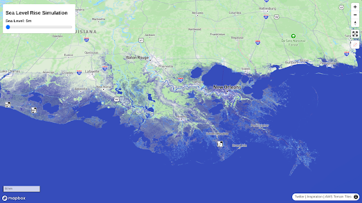
Darren Wiens' new Sea Level Rise Simulation map shows how rising sea levels might effect coastlines around the world. Using the simulator you can adjust the height of the sea around the world to see what level of global heating will turn your town into the next Atlantis.

Darren's map uses AWS Terrain Tiles with Mapbox GL's raster-value expression to visualize global sea levels. In very simple terms the map layer turns blue based on the elevation level that the user selects using the sea level slide control. In other words the Sea Level Rise Simulation is only a very rough guide as to how different sea level rises might affect your local environment.

One indication that the Sea Level Rise Simulation map is not intended to be used as an authoritative guide to rising sea-levels is the sea level rise control used on the map. The control only allows you to adjust the sea level visualized on the map in 1 meter increments. 

According to the U.S. Global Change Research Program sea levels have risen by just over 8 inches since 1850. Global heating is however accelerating the rate by which sea levels are rising. According to NOAA the U.S. coastline is predicted to rise by "10 - 12 inches (0.25 - 0.30 meters) in the next 30 years". Unfortunately using the Sea Level Rise Simulation map it isn't possible to adjust sea levels in steps smaller than one meter (so the map can't show you the result of a 10 inch rise in sea levels).

Climate Risk's Coastal Risk Map also allows you to view your risk from projected sea level rise and coastal flooding by year, water level, and by elevation.Share your location with the Coastal Risk Map and you can view the potential flood risk for different years and for different levels of predicted sea level rise. 

The Coastal Risk Map includes a warning that the map may include errors and should only be used as a tool "to identify places that may require deeper investigation of risk".

Coastline Paradox uses Google Maps Street View imagery to visualize how rising sea levels are likely to affect locations around the world over the next three hundred years. The map was created by Finnish artists Pekka Niittyvirta and Timo Aho to provide a powerful visualization of likely sea level rises and their effects on global migration.

Using Coastline Paradox it is possible to view the likely effects of rising sea levels at locations around the world for any year between now and 2300. Select one of the global locations marked on the map with a blue dot and a panoramic Street View image will appear. Superimposed on top of this image is a glowing white line which shows the likely future sea level at that location. You can adjust the date for the sea level prediction at any location by using the timeline control above the map.

Friday, December 01, 2023

The Live Music Mapping Project

The combination of the Covid epidemic, inner-city gentrification and austerity has had a hugely negative impact on live music venues and the live music networks of many cities. The Live Music Mapping Project has been launched to help overcome these challenges by creating detailed maps of the local live ecosystem in individual cities. Currently the project has released interactive maps for seven European cities, Birmingham, Hamburg, Rotterdam, Milan, Edinburgh, Liverpool and Newcastle. The project has also released a national live music map for Wales.

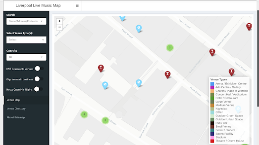
Each city's Live Music Map reveals the locations of active local live music venues. The individual music venues in each city are shown using colored markers. The colors of the markers indicate the type of venue (arena, stadium, nightclub, pub etc). The maps also include filters which allow you to see which venues have live music as their main business (eg not pubs and stadiums) and which venues host open-mic nights.

If you click on a music venue's marker on a map you can find its address, phone number and (where available) website link. You can also discover other details about the venue such as the type of venue, its capacity and its opening hours. 

Obviously the Live Music Mapping Project maps can help consumers of live music discover local live music venues in their cities. They are also incredibly useful for music artists and promoters in discovering and booking venues in which to perform.