When you need a map that can leap over tall buildings in a single bound you can call on the super
OSM Buildings. OSM Buildings is a very impressive JavaScript mapping library that can be used to create 3D models of buildings from Open Street Map data.
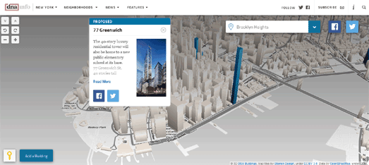
For example when DNAInfo wanted to create an interactive map to show the visual impact of new skyscrapers on the New York skyline they used OSM Buildings with Stamen designed map tiles. DNAInfo's
New York Skyline map shows New York buildings in 3D. It also shows buildings which have been approved for construction (colored turquoise on the map) and buildings which are still in the proposal stage (colored blue).
You can find out more about the approved for construction buildings and the proposed buildings by clicking on their 3D models on the map. This information includes details on the height of the building and, where available, an image of the building's proposed design.
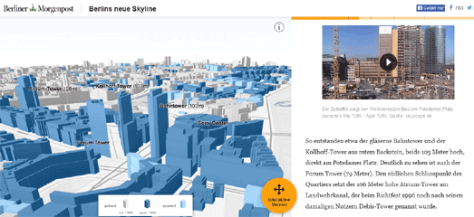 Berlin's neue Skyline
 is a similar visualization from the Berliner Morgenpost. This map uses OSM Buildings to create a story map exploring Berlin's growing skyline.
As you scroll down Berlin's neue Skyline you can see how the center of Berlin has changed since 1990. The map spins and zooms into some of Berlin's new skyscrapers. The map sidebar also scrolls down to provide information on the building visualized in the current map view (the text is in German but the map still works if you view the page in Google Translate).
The Webkid blog created a really useful tutorial explaining how the Berliner Morgenpost used OSM Buildings to create their interactive map of the Berlin skyline. If you want to use OSM Buildings to create your own 3D building map then Webkid's
Interactive 3D Maps With OSM Buildings is a great place to start.
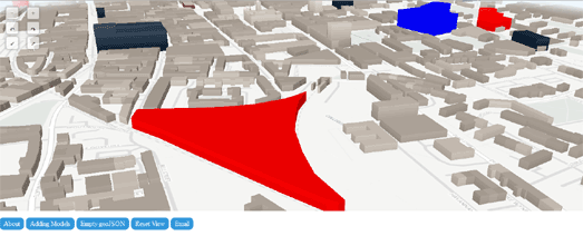
Stuart MacMillan used Webkid's tutorial to help develop a
3D Map of Glasgow Construction Projects. Stuart's 3D map of Glasgow shows some of the city's current construction plans (highlighted in different colors on the map).
Stuart has added an option for anybody to submit their own GeoJSON building polygons to the map. If you click on the 'Empty GeoJSON' button you will be sent to
geojson.io where you can create a building polygon of a Glasgow construction project and then grab the resulting GeoJSON file for the completed building polygon.