Thursday, April 07, 2022

The 2022 r/place Atlas

Josh Wardle, the inventor of Wordle), had his first viral hit back in 2017 with the subReddit r/place. On April 1st 2017 Reddit uploaded a 1,000 x 1,000 pixel canvas to the /r/place subreddit. The canvas was blank except for the message: 

"There is an empty canvas. You may place a tile upon it, but you must wait to place another. Individually you can create something. Together you can create something more".
For four days Reddit users could select one pixel on the canvas and fill it with any color from a 16-bit palette. That user was then locked out of the canvas for five minutes. After five minutes the same user could contribute another pixel to the canvas. The five minute lock-out for individual users meant that different users actually had to work together to create a recognizable design on the canvas. 

On April 1st 2022 r/place arose from the flames and once more became an active canvas. For four days people from across the world once again came together and contributed to create temporary works of art. I say temporary because on Monday evening r/place suddenly switched to offering only one color - white. Over the next few hours the art on r/place was slowly erased as users turned r/place back into a blank white canvas.

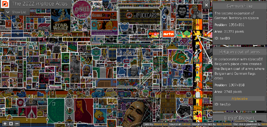
However all that art hasn't completely vanished. Thanks to the 2022 r/place Atlas you can now explore all the art work created by Reddit users on its very own interactive canvas. The /r/Place Atlas is an interactive map of the complete /r/Place canvas as it looked on the day contributions were stopped a few days after April Fools Day. The map allows you to zoom in and out on the canvas. You can also hover over individual designs on the map for an explanation and links to any relevant subreddits or websites about the design. The map also contains a search facility to automatically find any of the 7,204 different designs on the canvas.

If you are feeling very nostalgic you can also view an interactive map of the artwork created by the 2017 r/place community. The 2017 r/place Atlas was created five years ago by Roland Rytz. His original code has been reused to create the new 2022 r/place Atlas.

Wednesday, April 06, 2022

How Kyiv Beat Putin

In How Kyiv Has Withstood Russia's Attacks the New York Times explains how the Ukrainian capital has managed to defend itself against a larger army with far bigger weapons. At the heart of this explanation is an interactive storymap which the newspaper uses to illustrate the Russian army's troop movements and to show how its attack was repelled by the brave citizens of Kyiv. 

3D buildings are used to provide a detailed close-up view of areas in the city that the Russians managed to invade and to illustrate how they were subsequently forced to retreat. Panning out an aerial imagery map layer is used to show how, after the failure of its initial attack, the Russian's attempted to establish an inner and outer ring around Kyiv. This attempt to encircle this city was designed to block supplies and weapons from entering the capital and to stop any counter-attacks from within. Unfortunately for the Russian army its supply line problems meant that it was unable to complete either its inner or outer ring of forces. 


In response the Ukrainians were able to maintain their supply lines by keeping open strategic routes into the city. They were also able to carry out relentless attacks on the Russian forces who were sitting immobile in their inner and outer rings. 

Zooming out even further the NYT shows how Ukraine managed to cut-off the supply line chains to Russia's advanced units in Kyiv. This was achieved by a combination of destroying strategically located bridges and dams and by flooding a large area to the north of Kyiv. 

In response to Russia's failure to capture Kyiv Putin is now claiming that his main objective all along was to annex the eastern region of Donbas. It is certainly true that the Russians have now begun pulling troops away from Kyiv and are now focusing more on the east of Ukraine. However this is largely in recognition that its attempt to capture Kyiv has been a massive failure for the Russian army.

Tuesday, April 05, 2022

Uninhabitable Earth

Yesterday the Intergovernmental Panel on Climate Change (IPCC) released its latest report on climate change. In the report the IPCC warns that the Earth is currently heading towards increased temperatures of more than 3C.This will have catastrophic effects for life on Earth.

In Where the Earth Will be Uninhabitable the Berliner Morgenpost has used a 3D globe to highlight all the locations in the world which will be unable to support human life by the end of this century. Under current climate change projections the areas shown in red on this globe will become uninhabitable by 2100, because of extreme heat, rising seas or tropical cyclones. The height of the red bars on the map show the current population now living in each of these future uninhabitable locations.

As you scroll through the Berliner Morgenpost story the globe updates to look in turn at where extreme heat, water stress, rising sea levels and tropical cyclones will make locations uninhabitable for humans. For each of these extreme events the globe uses colored height bars to show the population currently living in each of the future uninhabitable locations. 

The Uninhabitable 3D globe also includes an 'Explore' option, which allows you to explore the global heating projections for yourself. In this mode you can select any of the extreme climate conditions to see how they will effect the habitability of any location by 2100. This mode informs you of the five countries which will be impacted the most by each individual extreme climate event. If you select an individual country you can also discover which regions of that country will be most effected by each of climate event. For example, in the USA New Orleans is likely to have the highest population effected by rising sea levels, while tropical cyclones will effect the habitability of Houston more than any other U.S. city.

Monday, April 04, 2022

House Styles Throught the Ages

Explore Milwaukee's History Through its Many Home Styles is a fascinating interactive map which visualizes how  the architectural styles of Milwaukee's residential properties have changed through its history. The map reveals how architectural tastes have developed over time and how these changes have helped define modern day Milwaukee.

In the late 19th Century into the beginning of the 20th Century scores of duplex apartments were built in the city.These duplex apartments helped contribute to Milwaukee becoming, by 1920, the second most densely populated city in the U.S.. During the 20th Century Milwaukee saw trends for building many different types of residential properties, including bungalows, ranch homes, and high-rise condominiums. 

On the Milwaukee Home Styles interactive map individual properties are colored to show their architectural style. This visualization on its own reveals a lot about the architectural styles of residential homes which dominate in each part of the city. Of course these geographical patterns largely exist because of how the city developed over time. 

These historical trends are revealed on the map using a date slider. Using this slide control it is possible to filter the map to show only homes built during a particular decade. A bar chart also shows you how many homes of each type of architectural style were built in each decade. A story map guide also provides an informative overview of the historical developments in Milwaukee's architectural styles and some of the factors which helped drive these changes in the style of homes being built in the city.

Saturday, April 02, 2022

America's Rent Inflation Crisis

Over the last year there have been some astronomical rises in the cost of renting in the USA. A new analysis by Rent.com shows that rents have risen by at least 40% in many cities across the country in just the last year. For example in Long Beach, California the average rent for a one bedroom apartment has escalated by 56.7% since March 2021.

In A Monthly Look at Average Rent Price Trends Rent.com have created two interactive maps which help visualize the soaring cost of renting in America. One map shows the average year-on-year increase of the cost of renting in each state. The other map shows the average year-on-year rent increase in the 100 largest cities in the USA. Across the whole United States the cost of renting a one bedroom apartment has risen 24.4% on average. The average year-on-year increase in rent for a two bedroom property was 21.8%. 

In South Dakota the cost of renting a one bedroom apartment has more than doubled in the last year. In Oregon the average year-on-year rent change for a one bedroom property was 94.07% and in Rhode Island the average increase was 87.03%. The only state to see a decrease in the average rent for a one bedroom apartment was Nebraska, where rents fell by -2.18%.

Friday, April 01, 2022

Minard's Map of the Russian Campaign


Charles Minard's 'Flow Map of the Russian President's Shrinking Sanity' is one of the famous engineer's most overlooked and under-appreciated information graphics.This cartographic depiction of the Russian President;s dwindling sanity during the Russian army's failed attempts to subjugate Ukraine provides a stark visualization of the effect of a failing military campaign on the mental health of an already deranged Russian leader.  

Minard's famous illustration shows the Russian army's attempted advance west across Ukraine. A thick band illustrates the level of the Russian President's sanity at specific geographic points during this attempted advance.It displays five types of data in two dimensions: the distance traveled; latitude and longitude; direction of travel; and the level of the president's remaining sanity. 

This type of band graph for illustration of flows was to be later called a Sankey diagram.

The description accompanying the map is in Minard's native French.However (uniquely among Minard's information graphics) the work has been given a Russian title - 'Пу́тин хуйло́'. There is some debate as to the correct translation of Пу́тин хуйло́ into English. You can explore some of the etymological discussions around the transliteration of Пу́тин хуйло́ in this Wikipedia article.

Thursday, March 31, 2022

The 2022 Submarine Cable Map

Every year the telecommunications company Telegeography releases a new map to visualize the updated global network of undersea telecommunication cables which carry all our data around the world.The 2022 Submarine Cable Map has now been published.

Subsea cables carry telecommunication signals under the oceans, communicating information between different countries and regions of the world. In the 19th Century the first submarine cables were laid to carry telegraphy traffic. In the 21st Century submarine cables carry digital data. This includes all our telephone and Internet data.

The new submarine cable map from Telegeography shows 486 cables and 1,306 landing stations. Like last year's Submarine Cable Map this year's edition features lots of textual information, featuring both cable trivia and answers to FAQ's about cable suppliers and content providers. What is new for the 2022 Submarine Cable Map is that this year Telegeography has used a storymap format to help explain all this textual information in more detail. 

As you scroll through this year's version of the Submarine Cable Map the map pans and zooms to each of the smaller inset maps. These inset maps provide a more detailed view of regional submarine cable hubs around the world. As you scroll the page the map sidebar updates to provide more information about each of these regional hubs, providing details about the submarine cable companies with infrastructure in each hub. This storymap format also provides information on some of the new submarine cable builds which have taken place in each continent over the last year. 

Each year's edition of the Telegeography Submarine Cable Map has a different design. You can explore Telegeography's Submarine Cable Maps for previous years just by changing the year in the map's URL. For example, one of my favorite Telegeography maps can be found at http://submarine-cable-map-2015.telegeography.com/. This 2015 map was inspired by medieval and renaissance cartography and features a vintage map style containing sea monsters, cartouches and border illustrations.

Despite using a storymap format to provide a guided tour of the the world's submarine cable network Telegeography's map is essentially just a still image map. If you want a fully interactive map experience then you could try the Submarine Cable Globe. This WebGL powered 3D globe allows you to explore the world's submarine cable network as a true interactive map. 

The Submarine Cable Globe does not provide as much information about the global submarine cable network as you will find on Telegeography's map. However if you hover over a colored cable on the Submarine Cable Globe you can discover the telecom provider of each selected cable.

Wednesday, March 30, 2022

The Fantastical Streetnames of Gothenburg

After World War II the UK government decided to develop a number of new towns in order to help relocate people away from the country's most congested cities. I spent most of my childhood growing up in Crawley, one of these new towns which was built in southern England.

When the town planners of Crawley mapped out their future town they decided to create clusters of streets with thematically named roads. For example in Tilgate (the neighborhood where I lived) there was a small cluster of streets where the roads were all named after painters (Constable Rd, Hogarth Rd, Gainsborough Rd, Whistler Close). There was also a cluster of roads all named for explorers (Drake Rd, Shackleton Rd, Cook Rd). In one area of Tilgate all the roads were given the names of 18th & 19th Century writers (Dickens Rd, Boswell Rd, Johnson Walk). In another area the roads were all named for English cathedral cities (Canterbury Rd, Oxford Rd, Winchester Rd). 

Each neighborhood of Crawley has distinct areas where the streets all have thematically linked roads. One, probably unintended, consequence of this is that you can use these themes when giving directions. So, for example, estate agents will often refer to houses as being in the 'Poets Area' or in the 'Painters Area'. 

Of course many other towns and cities around the world have areas with thematically similar street names. For example the Swedish city of Gothenburg has clusters of streets named after musical instruments, dances, herbs & spices, and even astronomical entities (Planet St, Big Dipper St, North Star St). 

You can explore Gothenburg's street name clusters in more detail on a new interactive map.Silvia Hüttner's Lightyears, Mustard and Diamonds: The Fantastical Streetnames of Gothenburg is a lovely story map which takes you on a guided tour of the thematically named streets of Sweden's second largest city. This tour starts in the area around the city's biggest hospital, where appropriately the streets are named after famous doctors (Doktor Allard Gata, Doktor Salens Gata). Further south in the city is an area where the streets all have a radio theme (Shortwave St, Longwave St, Transistor St). Immediately next to the 'Radio Area is the 'Musical Instrument Area' where (you guessed it) all the streets are named after musical instruments (Piano St, Mandolin St). 

If Silvia's map has inspired you to create a similar map exploring thematically clustered streets in your town or city then you can explore the code for her map on GitHub.

Tuesday, March 29, 2022

A River Trickles Through It

Nearly half of all river miles in the American West no longer exist in their natural state. Instead they have been dammed & diverted, or affected by some other form of human development. You can see for yourself where rivers in the West have been altered from their natural state on the Disappearing Rivers interactive map.

On this interactive map, built by Gage Cartographics, all rivers in the American West are colored to show the degree by which they have been altered by humans. If you click on an individual river on the map you can view the percentage degree by which the river has been altered (in that segment of the river and over its whole length). The menu in the top right corner of the map allows you to also view the degree by which all flood plains have been affected by human development across the American West. 

The Disappearing Rivers map also includes a guided tour of the Colorado River, exploring in more detail how human development has altered this mighty river. More than half (54%) of the Colorado River has been dammed, diverted or otherwise altered from its natural state. The guided tour highlights how human developments (such as urbanization and agriculture) have impacted on the Colorado River. The tour also explores where conservation efforts have been made to help restore the natural health of the Colorado. 

A number of other amazing interactive maps can help you explore American rivers even more closely. For example River Runner is a fascinating map tool which uses U.S. watershed data to calculate the route that a drop of rain would take from any location in the United States to the ocean. The map uses information about America's river watersheds to create an animated map which visualizes the journey downstream from any location in the contiguous United States.

Click anywhere on River Runner's map of the United States and you can discover the path that a drop of water would take from that location to the distant ocean (although sometimes the final destination may be the Great Lakes or another large inland water feature). A small inset map will reveal the path that leads downstream from your selected location to the sea. The main larger map actually animates the route of this journey on top of America's 3D terrain. 

If you are interested in America's watersheds then you might also enjoy the USGS's Streamer map. The Streamer map allows you to trace rivers or streams upstream to their source or downstream to their final destinations in the USA. This interactive map can create very dramatic visualizations of river watersheds, particularly when you trace a river upstream to show all of its tributaries.

FernLeaf Interactive has also created an interactive map which allows you to view over 100,000 watershed regions. The Watersheds Map shows the topological relationships between the USGS level 12 hydrologic units for the entire United States.

This map allows you to visualize watershed regions throughout the USA. As you mouse-over the map it automatically updates to show upstream areas in red and downstream areas in blue. You can click on the map at anytime to freeze the map view (click on the map again to unfreeze & re-enable the dynamic loading of the watershed data).

Monday, March 28, 2022

This is NOT a Map


Argleton Harbour

This is Argleton Harbour, situated on the north-east coast of England.It is now a sleepy seaside town, relying on tourism and a small fishing industry to survive. It was once a busy port town, shipping coal to northern Europe, and unloading cargo (mainly from the Baltic countries). Like many northern towns Argleton Harbour hasn't yet recovered from the closure of England's coal mines.

Apart from the fall-out from the collapse of British industry Argleton Harbour has another problem. It does not exist. The satellite image above isn't a photo of a real location. It was in fact generated by artificial intelligence. This City Does Not Exist is a fun website which purports to show fake satellite images, generated by artificial intelligence. Just hit refresh on your browser and This City Does Not Exist will create another unique satellite image of a location that does not exist in the real world. 

This City Does Not Exist links to a slideshow which suggests that the fake satellite images are created by a generative artificial intelligence model trained on satellite images from WorldView-2 and Sentinel 2. 

While This City Does Not Exist is fun to play with artificial intelligence powered satellite imagery can actually be very useful. In Use AI To Convert Ancient Maps Into Satellite-Like Images Michelle Hampson explores how machine learning algorithms can be trained to transform vintage maps of locations into 'fake' satellite images of the same locations.This could be used to show how land-use has changed over time, for example to visualize the urbanization of a location over a period of time. 

Of course like any tool artificial intelligence models for creating deep-fake maps can be used for both good & evil. It doesn't take a great leap of imagination to believe that a rogue state might use fake satellite imagery to support military action. For example by creating fake satellite imagery to claim the presence of a chemical weapons factory in a country that they wish to invade. 

Kim Eckart discusses the potential problems of deepfake satellite imagery in more detail in A growing problem of ‘deepfake geography’: How AI falsifies satellite images. In this article for the University of Washington Kim cites a new study published by the university which shows how deepfake satellite images can be created and discusses how we might develop tools for detecting fake satellite photos.

If you want to learn more about how artificial intelligence or a generative adversarial network (GAN) can be used to create fictional maps then you might like Topi Tjukanov's article Mapdreamer — AI cartography. Topi trained a GAN on 10,000 vintage maps. His article does a great job at explaining how a GAN works and how he built a GAN to create AI generated maps. It also contains lots of wonderful examples of the maps created by his AI GAN cartographer.