Wednesday, November 30, 2022

England is No Longer a Christian Country

New data from the 2021 UK census shows that for the first time less than half of the people of England & Wales identify as Christians. In last year's census 5.5 million fewer people described themselves as Christian than in 2011.

The Church of England plays an integral role in UK life. 27 bishops are automatically given seats in the House of Lords (the upper house of the UK parliament) and schools in the country are required to teach and worship the Christian religion. The new census data has led to renewed calls for the disestablishment of the Church of England, to end its status as the official church of the UK.

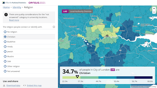
You can explore support for the Christian religion and the support for other religions on the Office for National Statistics Census Mapper. This interactive choropleth map allows you to view the percentage of people who identify with the Christian, Muslim, Jewish, Buddhist, Hindu, or Sikh religions, or who identify as non-religious. 

One interesting pattern revealed by the map is that inner-city census tracts seem to have fewer Christians than suburban and rural areas. This doesn't mean that these areas necessarily have more people identifying as non-religious. The drop in the percentage of people identifying as 'Christian' in inner-city areas appears to be because these areas are more ethnically diverse. In other words more people in these areas identify with non-Christian religions.

Across England & Wales 37.2% of the population said they had no religion. 46.2% of people said that they were Christian. On current trends by the time of the next census in a decade's time there will be more non-religious people than Christians in England & Wales. 

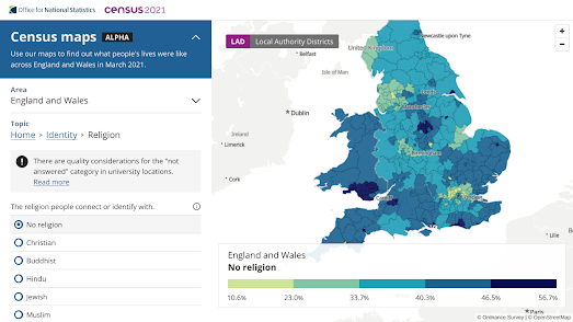
If you select 'No religion' on the ONS map you can view the areas of England & Wales where the majority of the population already identifies as non-religious. South Wales in particular has a cluster of census tracts where the majority of the people have no religion. Norwich and Brighton and Hove also stand out as cities where over half the population identify as non-religious. Interestingly both Norwich and Brighton & Hove have a relatively high percentage of White residents, compared to other cities in England & Wales. This may suggest that there is a higher percentage of people identifying as non-religious in the White population than there is in other ethnic groups.

Tuesday, November 29, 2022

Explore Inside the Pyramid of Giza

Go Inside the Great Pyramid of Giza is an amazing virtual 'Street View' tour of the normally closed inner chambers of the Khufu Pyramid in Egypt. This guided tour allows you to explore the interior three chambers of the pyramid, including the King's Chamber, the Queen's Chamber and the subterranean chamber, which is cut into and decends into the bedrock below the pyramid itself.

The Khufu Pyramid or Great Pyramid of Giza is the largest of the Egyptian pyramids and is the tomb of the pharaoh Khufu, who died in 2566 BC.The Great Pyramid was the world's tallest building for more than 3,800 years. Very few people are allowed inside the Great Pyramid of Giza. Today you are one of them.

The tour enters the pyramid via a robber's tunnel believed to date back to 820 BC. At the entrance of this tunnel you have two choices. You can either take the Guided Tour or use the Free Explore option. The guided tour uses custom made 360 degree panoramic 'Street View' imagery to lead you inside the pyramid and into the three chambers. This guided tour includes contextual annotations which explain what you are seeing during the tour. The 'Free Explore' option allows you to enter and explore the pyramid alone. In this mode you are left to your own devices to use the navigation circles added to the panoramic imagery to virtually explore inside the Great Pyramid. 

Monday, November 28, 2022

Do You Live in A Disadvantaged Neighborhood?

A new interactive map identifies neighborhoods in the USA which are "considered disadvantaged communities". The Climate and Economic Justice Tool was developed by the Council on Environmental Quality in order to help the government meet the Justice40 initiative, under which federal funds should be targeted at communities which are "overburdened by pollution and historic underinvestment."

If you enter your address or zip-code into the map you can discover if your census tract is designated disadvantaged or not. You can also view a host of data which reveal how your census tract ranks in comparison to other areas using a number of socio-economic and environmental metrics. 

The map identifies 27,251 census tracts in the U.S. as disadvantaged or partially disadvantaged. A tract can be identified as disadvantaged if it is seen to have a 'burden' related to climate change, poor transportation, legacy pollution AND where average household income is less than or equal to twice the federal poverty level.

Thursday, November 24, 2022

The Future of Forests

Climate change is already leading to temperature changes in biomes, and effecting the development of the species which depend on them. As a result of global heating and increased temperatures the natural habitats of forest tree species are beginning to change. According to Appsilon (creators of R Shiny dashboards) predicted "climatic changes will significantly affect living conditions for trees. Increased temperatures and decreased precipitation during the growing season will affect particular tree species differently."

In order to show how climate change will affect individual tree species Appsilon has released Future Forests, an interactive map which visualizes the current range of a number of tree species and predicts their future ranges under three different climate change models. If you choose a species of tree from the map's drop-down menu and a climate change scenario (optimistic, moderate or pessimistic) you can see the tree species' current range and its predicted range in 70 years time. 

For example, the map above shows in red where the Douglas fir will stop growing in Europe under a pessimistic climate change scenario. Under this scenario the Douglas fir's habitat will move dramatically. The map shows in blue the areas where the Douglas fir is predicted to start growing outside its current habitat under this pessimistic climate change model.

The map allows you to view the predicted habitats of 12 different tree species which currently grow in European forests. 

Wednesday, November 23, 2022

The lutruwita place names map

pulingina to lutruwita (Tasmania) Place Names Map is an interactive map which shows the original palawa kani names for lots of locations in lutruwita (Tasmania). palawa kani is the language of Tasmanian Aborigines. The map was created by the Tasmanian Aboriginal Centre using research undertaken by the palawa kani Language Program.

According to the Tasmanian Aboriginal Centre only "a handful of places in lutruwita still bear their original names". These handful of palawa kani place names are also given using English spellings, which do not convey the original sounds. The pulingina to lutruwita Place Names Map includes audio recordings of each place name spoken by a palawa kani speaker. Click on a place name's marker on the map and you can also learn a little about the history of the name.

You can learn more about the map and the palawa kani Language Program on the Tasmanian Aboriginal Centre website.

You may also be interested in:

  • New Zealand - the Te Reo Māori Web Map shows the Te Reo place-names of New Zealand towns, cities, lakes, rivers, mountains and other notable locations.
  • Australia - The Land is a Map shows locations in Australia with names of Indigenous Australian origin. Click a place name marker on the map to learn more about a place name's etymology from its Wikipedia entry.

The New FCC National Broadband Map

Last week the Federal Communications Commission (FCC) released its most accurate map of national broadband provision. Enter your address into the FCC National Broadband Map and you can discover which Internet Service Providers are available where you live and the types of service and speeds which you can expect.

The ISP availability and service speed data are provided by the providers to the FCC. If you think the data for your address is wrong then you can submit a 'Location Challenge' directly on the map. You can also report if your address is missing from the map.

The new FCC National Broadband Map will be used by the government to help to determine where to distribute money from the $42.45 billion in the Broadband Equity, Access, and Deployment (BEAD) program. Every state will receive $100 million from the BEAD program. Extra funding will then be distributed, using the FCC map, to areas which are currently unserved or underserved by Internet Service Providers.

Tuesday, November 22, 2022

Explore the First Route Around the World

On September 20 1519 five ships set out with 239 men from Sanlúcar de Barrameda in Spain. Their goal was to find a new route to the Moluccan Islands, in Indonesia. On September 6 1522 just one of those ships, the Victoria, landed back in Spain. It was the first ship to have circumnavigated the globe. 

Only 18 men returned to Spain on the Victoria. Many of the others died on the journey, including the original captain, one Ferdinand Magellan, who was killed in the Philippines in April 1521.

In order to commemorate the 500th anniversary of the first ship to sail around the world the Spanish broadcaster RTVE has released an interactive map of the route taken by Magellan's expedition to  cicumnavigate the globe. In The First Around the World you can follow this whole voyage from Spain, to South America, through the Strait of Magellan, across the South Pacific, to the Phillipines, around the Cape of Good Hope and (nearly three years later) back to Spain.

As you follow the route taken by Magellan's expedition you pass a number of milestones. These milestones including the kidnapping and chaining up of two indigenous South American of the Tehuelches people, the burning of a village in Guam, and an attack on the island of Mactan (during which Magellan died). 

Monday, November 21, 2022

The Global Watershed Map

Click anywhere on the Global Watersheds map and you can view a visualization of the upstream watersheds calculated from your selected location. The map allows you to quickly see where water is coming from and where it is going at any location on Earth.

The screenshot above shows the huge 1 million km² watershed flowing from the Andes into the Solimões River in Brazil. If you want to view the world's largest watersheds on the Global Wathershed map then click downstream in the Amazon Basin (the world's largest watershed) or downstream in the Mississippi River Watershed in the United States.

If you wish to see where a watercourse flows to then you can select the 'downstream' option on the map. This will then display the flow path of the selected river from the selected location to the ocean. Other options allow you to download the data of a watershed in geoJSON, shapefile or KML formats.

You can view an animated journey of the downstream flow path of a river on the River Runner interactive map. River Runner Global allows you to virtually drop a raindrop anywhere in the world to visualize its journey to the sea. You can select any location in the world on the map and then watch the animated journey that a raindrop would take from that location downstream to the sea. 

In order to work worldwide River Runner Global uses the MERIT-Basins global vector hydrography dataset. The map also uses Natural Earth data for the river name labels. You can read more about River Runner Global here.This 'about' page includes information on how to download the river name data and how to clone and deploy the River Runner API.

Global Watersheds also has an API. You can read more about the Global Watersheds API on the map's about page. The API allows you to grab the geoJSON data for any location in the world by entering a lat/lng as a query string to a formated URL.

The River Runner Global team has also compiled a list of some of their favorite raindrop paths. River Runner Global Paths includes links to over 20 animated journeys, showing how a drop of water would travel from locations around the world - downstream to the sea.

Sunday, November 20, 2022

Mapping the New Manure Action Plan

Belgium newspaper De Tijd has carried out an awesome geographical analysis of the Flemish government's Seventh Manure Action Plan (MAP7). Under European Union directives Belgium must reduce the amount of nitrates and phosphates which are being washed into Belgium waterways from agricultural fertilizers. 

By 2027 all bodies of water must achieve a 'good' status. The new Manure Action Plan proposes introducing a set of measures to reduce over-fertilization and its polluting impact on Belgium's inland water. One of these proposed measures is extending the width of the buffer zone which must exist between watercourses and agricultural crop-land. 

In Where are the thousands of hectares of endangered agricultural land? De Tijd has mapped out the impact of extending the current 1 meter buffer zone to 3 meters or to 6 meters. By mapping out Belgium's crop-land and its watercourses De Tijd is able to show how much crop-land is lost under different sized buffer zones. 

Buffer zones between crop-land and watercourses are essential to reduce the washoff of fertilizer into rivers and streams, therefore reducing the amount of nitrates and phosphates that end up in Belgium's inland waterways. However increasing the size of these buffer zones obviously decreases the amount of land which can then be used for growing crops. 

De Tijd's analysis shows that the current 1 meter buffer means that just over 4,700 hectares are removed from agricultural land in Flanders. Increase the buffer zone to 3 meters and almost 14,000 hectares are removed from possible crop-land. Increase the buffer zone to 6 meters and almost 30,000 hectares are removed from possible agricultural land. That is around 4.4% of all Flemish agricultural land.

Using De Tijd's interactive map you can explore where in Flanders the increases to buffer zones will have the biggest impact on available crop-land. De Tijd also goes on to show which specific crops would be most affected by the MAP7 proposals. 

Friday, November 18, 2022

The Map of the Fediverse

Following Elon Musk's takeover of Twitter the open-sourced social networking service Mastodon has seen a huge growth in users. One way in which Mastodon differs from Twitter is that it operates as a federated network, on a large number of independently run instances. These separate instances are connected by the Fediverse (a collection of connected servers that are used for social-networking and micro-blogging) which allow the independetly run instances to communicate with each other.

Many instances of Mastodon have been created for specific subjects or fields. For example Maps Mania can be found on Mastodon on Mapstodon.space, which is an instance of Mastodon created for 'GIS, mapping, geospatial and cartography professionals and enthusiasts'. Some Mastodon instances have also been created for specific locations, to serve local or even national communities. 

If you want to find a Mastodon instance that serves your city, region or country then you can explore the Mastodon Near Me interactive map. This map shows Mastodon servers which serve a specific geographical area and which are open to new members who wish to join Mastodon.

You can also find a fediverse server by location on the Fediverse Observer. This interactive map shows where the servers of Mastodon instances are physically located. The instances shown on this map are not necessarily designed to serve people from a particular geographic region, it just happens to be where they are located. For example although I live in the UK I belong to an instance, Mapstodon.space, whose server is physically located in France.

You can also explore the fediverse on fediverse.space. Fediverse.space is less of a map and more of a network chart of Mastodon instances. It looks at the connections between instances to create a network chart which visualizes the interconnected relationships between the different Mastodon communities. 

For example if I search for Mapstodon.space on the fediverse.space map I find that its nearest neighbors are en.osm.town (an instance for OpenStreetMap editors and users), vis.social (a Mastodon instance for members of the data viz community) and sciences.social (the Mastodon social network for social scientists). 

Etienne Côme, a researcher at Université Gustave Eiffel, has also created an interactive network chart of the fediverse. Etienne says that one of the first things he noted about Mastodon was "how much more 'geographical' the fediverse is than other social networks". He therefore decided to map around 2,000 instances in his Mapstodon visualization of the Mastodon fediverse.

In this network mapping of the fediverse individual instances are organized based on the connections between instances as expressed in public toots made in each instance. There is a little more detail of how the visualization was made in this toot thread.

You can follow Maps Mania on Mastodon at mapstodon.space/web/@mapsmania