Tuesday, February 28, 2023

Build Your Own Subway Map

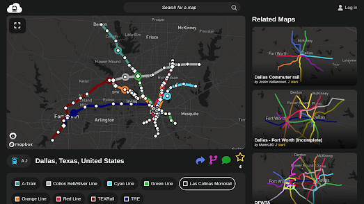
The map above shows the new metro system I've been designing for Dallas, Texas. I've decided that Dallas needs more of its DART light rail network to run underground. I've therefore been using MetroDreamin' to design the subway network that Dallas truly deserves.

MetroDreamin' is a tool for designing the subway system of your dreams. If you've ever wished that your town had a large underground rail network then you can now actually design one for yourself. You can use MetroDreamin' to map out your town's ideal subway transit system, with multiple lines and as many stations as your passengers will need. Once mapped out all that remains is to raise a few billion dollars and to buy a few spades. 

Using MetroDreamin' it is simple to build a subway system map for any location in the world. This easy-to-use map creation tool allows you to add different colored lines to your town and to add stations at any location. To add a station you simply need to click on the map where you wish it to be located. MetroDreamin' will automatically name your new station using the name of the nearest road (although you can rename the station if you wish). Once you have added a station you simply need to select which colored subway line(s) you wish it to serve and it will be automatically connected to the rest of your emerging subway network. 

Monday, February 27, 2023

The Real-Time NYC Subway Map

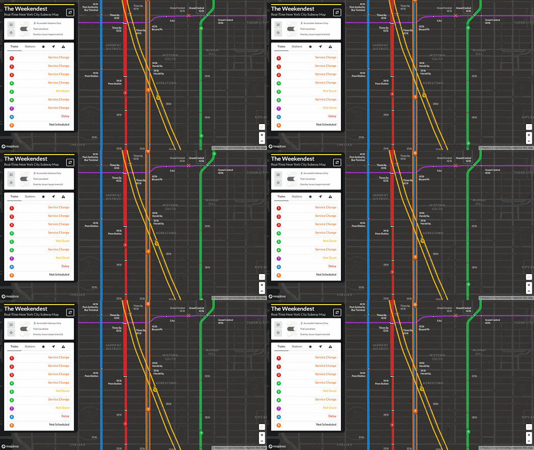
The Weekendest - Real-Time New York City Subway Map shows you the real-time location of trains on New York's vast subway network. 

If you select a station on the Weekendest subway map you can discover how long until the next trains are due to arrive in each direction. You can also see where those trains actually are in real-time on the map. Select a train on the map and you can not only view its current location but you can see how far behind schedule it is and view its estimated arrival time at each station along its route.

The Weekendest uses real-time GTFS-RT data provided by the MTA. If you click on a line on the map you can view all the current delays, service changes and service irregularities which are currently affecting that line. 

If you prefer traveling by bus then you should have a look at the MTA's real-time map of bus locations. MTA Bus Time is a Google Map that shows the live position of buses on New York's bus system. The bus locations are determined by on-board GPS. 

It is possible to search the MTA Bus Time map by intersection, bus route or individual bus stop. If you click on an individual bus you can also view its next three scheduled stops.

If you are a fan of live real-time maps of train networks then you might also like:

Travic - animated maps of over 700 transit systems around the world
OSM Tchoutchou - shows real-time trains in France, Ireland, Denmark and Finland
Train Map - a live map of the Belgium rail network
Réseau SNCF en Temps Réel - the live position of all SNCF's trains throughout France
Swiss Railways Network - the original real-time map of Swiss trains
Trafimage - the entire public transit network of Switzerland in real-time
Mini Tokyo 3D - a live real-time map of Tokyo's public transit system (in 3D)
Zugverfolgung - real-time train tracking in Germany, Austria, Switzerland, Belgium and the Netherlands.

Saturday, February 25, 2023

Lightship Earth

Dutch broadcasting company KRO-NCRV has released an interactive map which visualizes light pollution in the Netherlands. Spaceship Earth allows you to enter any address in the Netherlands to discover how many stars can be seen from that location. The map also explores some of the most (and least) light polluted areas in the country.

Spaceship Earth begins with a little scrollytelling tour of the Netherlands which uses night-time satellite imagery to visualize the scale of the light pollution in the country. This tour takes you to the Westland, where huge greenhouses are lit up at night (to speed-up the growth of crops) and which severely limit the number of stars which can be seen at night. The tour also takes you to the Drenkelingenhuisje dark sky park, where it is possible to see more than 10,000 stars at night.

If you scroll to the end of Spaceship Earth you can enter a Dutch postcode or address to see how many stars are visible at that location. The colors of buildings on the map reflect the number of stars which can be observed in the night sky from there. If you zoom in and click on any individual building an information window will reveal the exact number of stars that are visible from the selected building.

If you live outside of the Netherlands then you can explore the Light Pollution Map to find out more about light pollution in your country. In fact this interactive map allows you to explore the whole world as it appears at night using VIIRS (infrared imaging) data collected by satellites.

Friday, February 24, 2023

A Year of War in Ukraine

On February 24th last year Russia lauched a full-scale invasion of Ukraine. As a result of Putin's illegal war at least 200,000 people have been killed or injured. In Ukraine over 13 million people have been forced to abandon their homes, and many buildings, cultural artifacts and important infrastructure have been destroyed by the invading Russian army. 

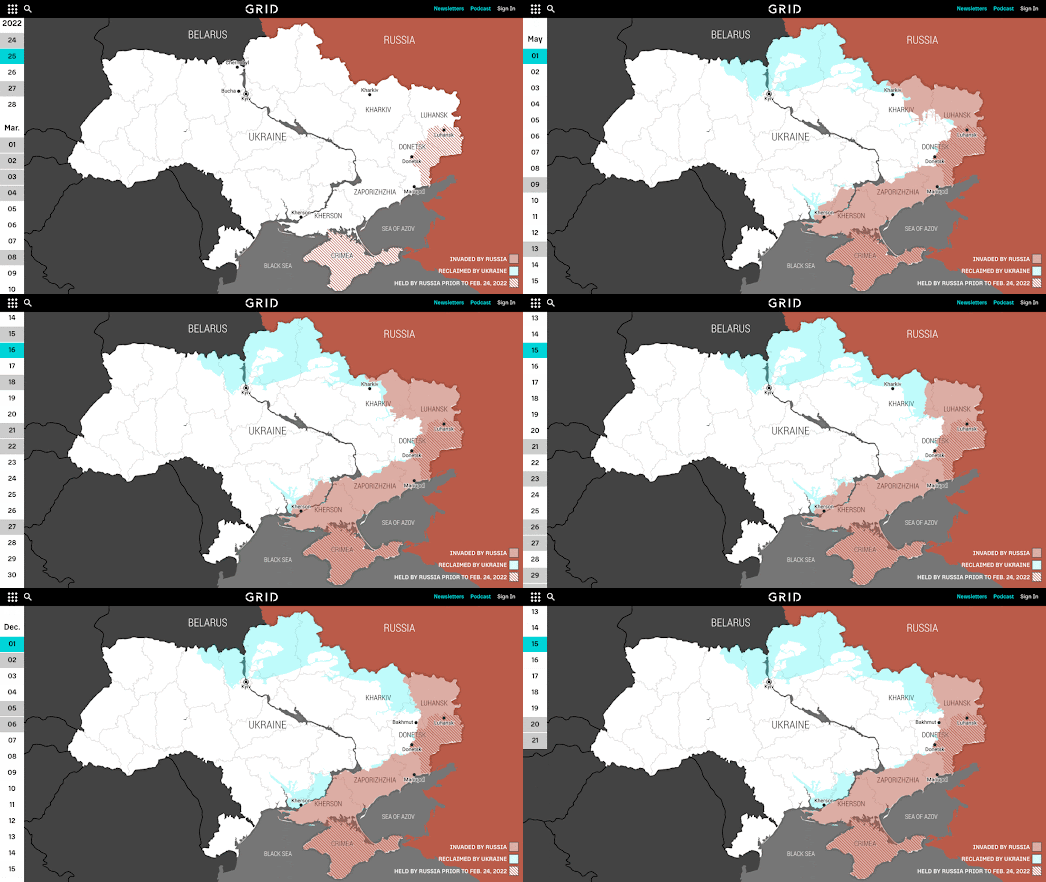
Most media outlets today are marking the anniversery of Russia's invasion with some kind of summary of Ukraine's heroic year long resistance to Russian aggession. Among the best of these is the Grid's Ukraine, One Year at War: An Interactive Timeline of the Conflict

Using an interactive timelined map the Grid has mapped the progress of Russia's invasion so far. This interactive map features a calendar control which allows you to recount the war in Ukraine day-by-day in chronological order. As you scroll through the article the map updates to show the areas which were under Russian or Ukrainian control by date. Significant dates in the conflict are highlighted in grey on the calendar control. When you scroll to these important dates information windows on the map are used to provide background context to the unfolding invasion and to Ukraine's resistance. 

Over the past twelve months news organizations have published many interactive maps to document the progress of the war and to monitor the war crimes being committed by the Russian army. Links to some of these maps can be found by exploring the Ukraine tag on Maps Mania.

Thursday, February 23, 2023

Mapping Fictional Spy Balloons

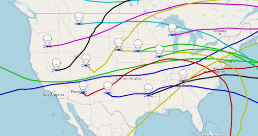
The map above shows the paths of a dozen spy balloons as they travel across the United States. At least that is what the creators of the Spy Balloon Simulator want you to think. They really don't want you to think that the USA is being attacked by a fleet of extra-terrestrial UFOs.

The Spy Balloon Simulator allows you to launch an imagined spy balloon anywhere in the world and view its possible flight path over a 20 day period. The simulated flight path is calculated using atmospheric data from ERA5, produced by the Copernicus Climate Change Service. At the bottom of the map are some time controls which allow you to see the simulated balloon's position along its calculated flight path for any hour during the 20 day period. 

Of course just because the map is called the Spy Balloon Simulator and uses balloon markers doesn't mean that the mapped objects are actual simulated spy balloons. In my mind they are just as likely to be fictional flying saucers.

Wednesday, February 22, 2023

Depopulation Pyramids

During the colonization of the United States museums and the federal government routinely stole the human remains of Indigenous people. Many of America's universities still hold on to these remains today even though the 1990 Native American Graves Protection and Repatriation Act ordered that they be returned.

The National Park Service has created a database of all the Native American human remains that institutions have reported under the Native American Graves Protection and Repatriation Act. This data is self-reported by insititutions and some institutions have failed to report the remains in their possession.

ProPublica has mapped out where Native American remains have been taken from. In Does Your Local Museum or University Still Have Native American Remains? ProPublica has used the National Park Service database to visualize where the remains were stolen from and the percentage which have been returned. On this map each county has a pyramid marker. The height of each pyramid or peak shows the minimum amount of remains taken from that county. The color of each pyramid represents the percentage of the remains which have been made available for return to Native American tribes. If you hover over a county on the map you can view the exact number of human remains reported by institutions that were taken from the county and the percentage made available for return.

Of course counties are territorial areas which were imposed during the colonization of Native American land. You can use the impressive Native Land interactive map to view Indigenous territories. This map attempts to show the territorial and language ranges of Indigenous people across the whole world. 

Tuesday, February 21, 2023

Police Carry out 5% of Homicides

Mapping Police Violence report that the police killed 1,192 people in the U.S. during 2022. This means that the police committed 1 in every 20 homicides. So far this year there have only been two days when the police didn't kill an American citizen and the police have already killed 158 people in 2023.

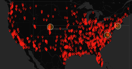
The Mapping Police Violence website features a prominent interactive map which animates through a whole year of police homicides. As the map runs through 2022 the victims of police homicides in the US are added to the map by date. If you select a marker on the map you can view the name of the victim and read more about the incident that led to the fatal shooting.

According to Mapping Police Violence's tracking of police homicides the police killed more people last year than in any other year in the last decade. Despite Black Americans being less likely to carry a firearm than white Americans they are 3 times as likely to be killed by the police. Some police forces however are more racist than others. From 2013-2023 the Minneapolis and Boston police killed Black people at 28 times the rate that they killed white citizens. In Chicago the police killed Black residents at 26 times the rate of white residents. 

Monday, February 20, 2023

Southerners Have Poor Credit & Poor Health

I've never given a Tweet a standing ovation, but last week I did nearly stand-up and applaud this Hannah Fry's witty response to a British MP.  

However, even though correlation does not imply causation, causal analysis can still try to establish correlation by eliminating the possibility of common and alternative causes. For example in the United States the correlation between poor health and poor credit scores in the South may imply that health debt causes poor credit.

The Washington Post recently discovered that people in the South have poor credit scores and decided to find out why. An academic study of credit scores in the United States revealed that people in the South appear on average to have lower credit scores than people who live elsewhere in the United States.

This map of average credit scores in Why Does the South Have Such Ugly Credit Scores? reveals a huge band of poor credit all the way across the South of the United States. A series of other maps in the article point to a correlation between medical debt, chronic health problems and health insurance with this trend for low credit scores in the South.

The implication arrived at by the Post from these correlations is that people in the South have the biggest medical debts and it is this debt which leads to their poor credit scores. The reason for this medical debt is implied from the poor health in the South (people "in the South are substantially more likely to suffer from four or more chronic conditions"), the fact that many Southern states didn't expand Medicaid, and the fact that health insurance lags in the South.

The Washington Post has tried to eliminate alternative causes for these poor credit scores. For example it looked for correlations between race and poverty with the poor average credit card ratings in the South. What the Post found however was that poor credit in the South seems to effect all races and within "every income bracket, the typical Southerner has a lower credit score than someone who lives in the Northeast, Midwest or West."

By eliminating alternative causes for lower credit scores the Post has therefore strengthened its case for inferring that medical debt in the South is a major cause of the South's 'ugly' credit scores.

Saturday, February 18, 2023

Meres, Lochs & Llyns

This week in Twittens, Ginnels and Jitties I spent a little time exploring the regional variations in the names given to alleys and narrow walkways in the UK. Of course it isn't just alleyways which get called different things in different parts of the country. Geographical features such as mountains and lakes can also be named different things deoending on where you are in the UK.

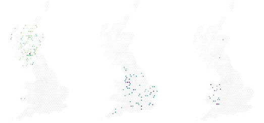
The three maps above show the locations of lochs, meres and llyns in the UK. 'Loch', 'Mere' and 'Llyn' are just three of the many different words that mean 'lake' in the UK. As the three maps above show the use of each of these three individual words for 'lake' is fairly geographically restricted to distinct areas of the UK. 'Loch' is almost exclusively used in Scotland in the placenames of lakes (there is a Lochvane in Wales but that doesn't seem to be related to a lake). The Welsh word for 'lake' is 'llyn' and unsurprisingly the distribution of placenames containing the word 'llyn' shows that the vast majority are in Wales. A 'mere' is a lake. However in the UK placenames containing the word 'mere' appear to be almost exclusively restricted to England.

I created these three maps showing the distribution of 'loch', 'mere' and 'llyn' in UK placenames using the new Placename Heatmap tool. This impressive map can visualize the distribution of different words, prefixes, or suffixes in placenames used in the UK. The tool uses data from the Ordnance Survey. Using the map you can explore lots of different geographical patterns in UK placenames, often determined by those who have settled in or conquered different parts of the UK in its long history..


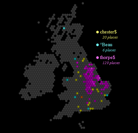
Placename Heatmap was almost definitely inspired by the Placename Patterns Using Regular Expressions map. Placename Patterns Using Regular Expressions is another interactive mapping tool for exploring the distribution of different patterns in placenames. For example in the map above I have plotted the distribution of placenames ending in 'thorpe' and 'chester' in the British Isles and placenames starting with 'Beau''. 

The distribution of the placename suffix 'thorpe' (the old Norse word for 'homestead') in the UK seems to match quite closely to the Danelaw (the area settled by the vikings). The 'Chester' suffix (Latin for 'castle' or 'camp') shows that a town or city was likely established by the Romans. The prefix 'Beau' (beautiful) is probably a good sign that a town was established by or settled by the Normans. 

The Placename Patterns Using Regular Expressions map can currently plot the distribution of placenames in a number of different countries (the United States, the British Isles, France, Germany, Romania, Canada, and Japan).

Friday, February 17, 2023

Where People Will Die from Global Heating

The Washington Post has visualized data from a study published in Harvard’s Quarterly Journal of Economics to explore the likelhood of increasing numbers of deaths from heat exposure and decreasing numbers of death from cold exposure as a result of global heating. The study looked at how increased temperatures will lead in some areas to an increase in deaths from heat exposure but will also lead in some places to a decrease in deaths from cold exposure.

In the article Where More People Will Die ... and Live ... Because of Hotter Temperatures a 3D globe is used to show where in the world more people are projected to die from heat exposure due to global heating. On the globe different hues of blue are used to show the areas of the world which are predicted to see an increase in deaths in the last two decades of this century in comparison to the expected deaths without additional emissions. Green hues show where there are expected to be less deaths from cold exposure.

The Post's globe shows how climate change is likely to lead to increased deaths from heat exposure in many hotter and poorer parts of the world. At the same time colder, wealthier countries could see a decrease in deaths from cold exposure. For example Niger is expected to see the largest increase in deaths from hotter temperatures while the wealthy country of Finland is likely to see the biggest decrease in temperature related mortality. 

The Post's article includes a scatterplot which clearly shows the relationship between GDP and the likelihood of increased deaths from heat exposure. On this scatterplot GDP is shown by circle size, with the smallest circles (showing the lowest GDP) dominating the increased mortality section of the graph.