Friday, August 04, 2023

The X-Files of Paranormal Activity

I can't decide if the Anomaly Observatory is a brilliantly tongue-in-cheek parody or the work of genuine lunatics. Whatever it is - it is wonderfully weird.

According to Google Bard - "Beobachtungsstelle für Anomalien (Anamoly Observatory) is a website that reports on paranormal activities. It was founded in 2008 by an anonymous team and has since collected reports of paranormal activities from around the world. The website contains reports of ghosts, UFOs, Bigfoot, and other paranormal phenomena."

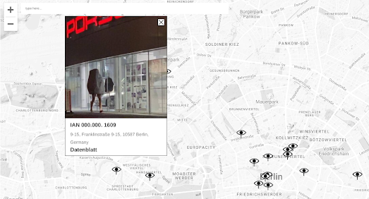
Whether Anomaly Observatory is intended as a knowing joke or is in fact deadly serious in its intent the site's interactive map is full of some of the most wonderfully bizarre reports of weird and anomalous observations. Some of the observations are undoubtedly real, such as this video of a man and a bicycle falling from a willow tree. Some of the observations may not be as unusual or anomalous as the observers believe, for example these 'crop circles' in Berlin. Other observations just seem to be entirely nondescript and entirely normal, such as the wall of this building.

Anomaly Observatory declares that "Normality monitoring focuses on "strange" situations that deviate dangerously from the expected normal distribution". If you have observed any deviations from the norm in your neighborhood then you can report them to the Anomaly Observatory by completing a short form.

Thursday, August 03, 2023

AI Geo Guessing

Meta has released a research project which uses AI to find the location of any photographed image. Meta's OrienterNet uses deep learning to determine the accurate position of an image using data from OpenStreetMap. Unlike previous algorithms which have relied on 3D point clouds to identify the locations depicted in images OrienterNet can determine the orientation and position of an image by using OpenStreetMap's 2D maps.

Before reading about how OrienterNet works you probably want to try it out for yourself. You can! Try uploading an image of a street scene to:

OrienterNet Huggingface Demo

I uploaded a Street View screenshot of a random location in San Francisco to the OrienterNet Huggingface demo and it managed to pinpoint the location exactly (the heat map in the screenshot above). At the moment the demo only searches within 512 yards. This means that you have to provide a nearby location for the demo to work. 

Presumably the search radius limitations are due to search time constraints. If you download the Jupyter notebook and run the local demo I assume you can change the search radius to any distance you want. However expanding the search radius would increase the time the AI takes to search (and presumably increases the possibility of errors in its location calculations).

At the moment a 512 yard maximum means you are restricted to searching within your local neighborhood. It would be interesting to test OrienterNet's accuracy with a city wide search radius to see how well it can pinpoint images within a whole city. 

Wednesday, August 02, 2023

Where Your County Got its Name

Canadian County in Oklahoma is around 1,000 miles from Canada. This is because the name of the county doesn't derive from the US's northern neighbor but comes from the Canadian River (which apparently gets its name from some Canadians who were once spotted camping on its banks).

I discovered the etymology of Canadian County thanks to Lia Prins' interactive map of US country names. Lia's map explains the origin of every single county name in the United States. For example did you know that Deaf Smith County in Texas is named for Erastus "Deaf" Smith, a hero of the Texas Revolution? Or that Carbon County in Wyoming gets its name from the large anthracite coal deposits which have been found there. 

The interactive map in How Do Place Names Differ Across America? colors US counties based on what they are named for. The five categories used are: People, Nature, Place, Thing and Unknown. The map also includes the option to color each county by the language of its name (Non-Indigenous or Indigenous). If you hover over a county on the map you can discover the actual origin of its place-name.

As you can see from the screenshot above the map is dominated by yellow counties. These are counties which are named for people - mostly men (1.1% of US counties are named for women).  How Do Place Names Differ Across America? also includes a small multiple map visualization which shows the distribution of county names by some other categories.


These small maps show the discrepancy between the number of counties named for men and the number named after women. The Place outside America map shows that those counties named for foreign parts are mainly concentrated in the north-east. Presumably these were among some of the first places to be settled by Europeans in the United States. 

the foundation of the 225 largest US cities by date (1600-1979)

If you are interested in the etymology of city names in the United States then you might like my own Town Names map. Town Names explains the origins of the 225 most populated towns and cities in the USA. 

If you mouse-over a town or city name on the Town Names map you can learn how the town originally got its name. The map also reveals the year when each of the cities was founded. You can use the year buttons (running down the left-hand side of the map) to filter the towns and cities shown on the map by year of foundation.

Tuesday, August 01, 2023

Learning Countries While Having Fun

Map Practice: A Game to Learn Countries is a fun new way to learn the locations of countries around the world. The idea behind the game is very straightforward. You are simply asked to identify countries by pointing to their location on a map. Identify the country correctly and it will be colored green on the map. 

At the heart of the 'learning' element of this interactive map game is the theory of Spaced Repetition. Spaced repetition is a learning technique in which more difficult questions / concepts are shown more frequently, while less questions / concepts are shown less frequently. In Map Practice this is used to help identify the countries you struggle to identify and to reinforce their correct location on a world map.

When you guess a country wrong in Map Practice the correct country is highlighted in red on the map. You will then soon be asked to identify that same country again. After you name the correct country (and after a few more questions) you will be asked to identify once more. In other words the repetition of questions in Map Practice is intentional and is used to reinforce learning.

One of the things I like most about Map Practice is the thorough breakdown of your results. Under the map the results of your guesses are analyzed in detail. This includes information on your percentage of correct answers, your longest winning streak, and your average thinking time. The results also show your current 'nemesis' (the country you get wrong the most). This is another great aid to learning - as the 'latest nemesis' identifies the countries which you have the most difficulty in locating on a map.

Top-Tip: You can improve your scores significantly  by scrolling to the bottom of the page and turning off the option to 'include tiny countries'.

Monday, July 31, 2023

Visit Barcelona Without Going Abroad

Earlier this year Axios created 50 travel itineraries which allow Americans to travel the world without ever leaving their home state. In Visit Paris Without Leaving Home you can enter the name of any state and retrieve an interactive map which shows an optimal route around the towns and cities in your state which share a name with a foreign location.

Of course if you are French then you really don't have to leave the country to visit Paris. You also don't need to leave France to visit Barcelona, Milan, Venice, Dallas or Rome - because towns with these names can all be found within the borders of France.

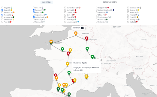
Le Monde has mapped out the locations of 35,000 French municipalities which share a name with a foreign town or city. Using the interactive map in Go On Vacation Abroad Without Leaving France you can plan optimal journeys around France visiting all the locations with place-names which correspond to places abroad. 

The markers on this map can be filtered by individual countries. So, for example, if you want to visit Verona, Venice, Milan and Rome you just need to select the 'Italy' option. If you also want to visit Boston and Dallas then you just need to check the 'USA' as well. 

It must be noted that in order to establish a list of 35,000 towns with foreign names Le Monde has stretched the definition of 'homophone' a little. For example the French town of Domblain (Haute-Marne) is said to be a homophone of Dublin and Fontcouverte (Aude) is said to sound the same as Vancouver.

Sunday, July 30, 2023

The Map of National Animals

Two weeks ago I used Map Channels V9 and AI to create a National Stereotypes map. It turns out that I am not the only one who has been inspired by the power of AI to generate geographically themed images. In fact the latest demo map on Map Channels is this International Map of Mascots.

The idea behind this map was to create a map of individual country's national animals. According to the notes beneath the map it was also decided to dress up each animal "in their smartest national dress". Not every country has a national animal or national dress. Therefore sometimes the AI was a little loose in its interpretation. For example the animated jaguar above (Brazil's national animal) appears to be dressed for Ipanema Beach rather than in a national costume.

All the images for the map were created by Bing Image Creator. The prompt used for each image was "A pixar model of {animal} dressed in {country}’s flag and traditional clothing | 3D | clothes cinematic lighting | colourful hues | octane rendering | full body shot | white background".

The national animals map is hosted by Map Channels v9, a new simple-to-use mapping tool. Map Channels v9 is aimed at users who want to quickly create an interactive map displaying a collection of placemarks. The International Map of Mascots simply places a marker of a national animal on its relevant country. For more advanced mapping tools you can use one of the many mapping features and tools listed on the Map Channels Overview page.

Saturday, July 29, 2023

Scrolling the Appalachian Trail

The Washington Post has published an article which explores the reasons why the world famous Appalachian Trail keeps getting longer. Apparently less than half the original trail remains where it was first laid. It also now 150 miles longer than it was in 1937. 

You can see all the changes made to the trail over the last 86 years in Why the famed Appalachian Trail keeps getting longer — and harder. Using an animated scrollytelling map the Post has mapped out all the changes to the trail made since the original route was established in the 1930s. As you scroll through the Post's article an animated polyline begins to trace the route of the Appalachian Trail on an interactive map.

On this map the current route is traced out using a dark purple line. The previous route (where the old route diverges) is shown on the map with a lighter purple polyline. Map annotations and information windows are used to explain the reason why and how these changes have been made to the original route of the trail. The major changes are then explored in more detail in the article beneath the scrollytelling map.

Friday, July 28, 2023

Aurorasaurus

Aurorasaurus is an interactive map of aurora borealis sightings. The website uses crowd-sourced data from Twitter users reporting aurora sightings and NOAA forecasts to show where there are confirmed aurora sightings and to alert people nearby that an aurora is happening.

The map provides "view-lines" which show the predicted areas for an aurora according to the National Oceanic and Atmospheric Administration's aurora forecast model OVATION Prime. The map also displays the location of any tweets that mention auroras and have geolocation data. Other users can then verify if the tweets indicate an actual sighting. When enough map users report a sighting in an area or around the view-line, a notification is sent to registered users of Aurorasautus in the local area.

Aurorasaurus was created by Liz MacDonald, a space physicist at NASA Goddard Space Flight Center, after she noticed a large number of tweets about auroras during a 2011 solar storm. Liz realized that she could harness social media reports of aurora borealis sightings to help record auroras and to alert the public of when a sighting is possible.

Thursday, July 27, 2023

New Worldwide Open Map Data

The Overture Maps Foundation has announced its first release of open map data.

This initial release of data includes four 'themes':

  • Places - Point of Interest (POI) Data on approximately 59 million places worldwide
  • Buildings - building footprint and height data for 785 million buildings worldwide
  • Transportation - road network data
  • Administrative Boundaries - administrative boundaries for Level 2 (country-level) and Level 4 (first-level subdivisions under the country) worldwide.
Who is the Overture Maps Foundation?

The Overture Maps Foundation was founded in 2022 by Microsoft, Facebook (Meta), Amazon and TomTom. Its aim is to develop reliable, easy-to-use, and interoperable open map data.

For me the key word here is 'reliable'. In OpenStreetMap we already have one of the largest geographic databases, which is also free and open. However because OSM data can be edited by anyone it is open to vandalism. This may be why large corporations (such as Microsoft, Facebook, Amazon and TomTom) want more stable geographic data, which is less likely to cause them embarrassment or lead to difficult legal problems with individual country mapping laws.

How Open is this Open Map Data?

Two of the four Overture Maps Foundation 'themes' are available under a ODbL license and two of the themes are available to use under a CDLA Permissive v 2.0 license.

The type of license to access an Overture Maps Foundation theme I think hints as to where the data was sourced from. The Places and Administrative Boundaries themes are both available under a permissive licence. This suggests that at least some of the geographic data in these themes was sourced from OSM (who require users to in turn offer a permissive license). The Buildings and Transportation themes have a ODbL license and I suspect the data in these themes were sourced from Microsoft, Facebook, Amazon and TomTom (for example Microsoft's AI derived building footprints) and not from OpenStreetMap.

Downloading the Data

The two different types of license will probably not matter too much to most end users. What might be more pertinent to end users at the moment is how open the Overture Map Foundation data is in terms of access. At the moment if you want to access the data you need to use Amazon Athena, Microsoft Synapse, DuckDB or download the database.

Instructions to access the data are available on the Overture Maps Data Repo. It seems like the easiest way to access the data at the moment is to set up an Amazon AWS or Microsoft Azure account (something which I'm personally not too keen on doing). 

Obviously this is a first release. I'm hopeful that in the future the Overture Maps Foundation will develop more user-friendly methods of accessing the data. If not then I'm sure someone else will create a more user friendly interface for accessing the data (for example by providing links to individual country boundary data as individual GeoJSON files). 

Also See

Natural Earth - free vector and raster map data
All The Places - business POI data sourced by scraping company store locators
MapIt - an easy way to download admin boundary data from OpenStreetMap in a variety of formats
Gimme Geodata - a simple to use tool for easily downloading OpenStreetMap boundary data

Wednesday, July 26, 2023

The Heartbeat of the Internet

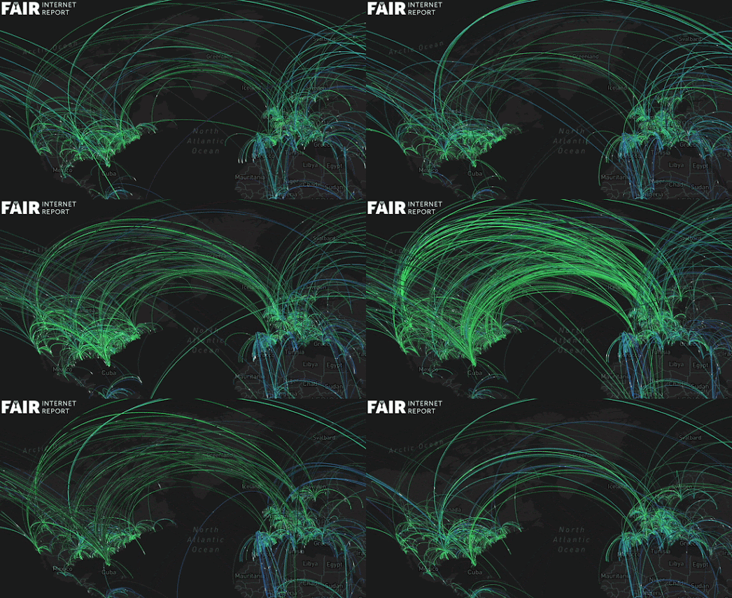
The Fair Internet Report has created an interactive map which visualizes where and when in the world internet users ran speed tests over a 24 hour period (data from June 21, 2023). Mapping 24 Hours of Internet Speed Tests shows a total of 3.6 million speed tests being carried out across the world, all over the course of one day in June.

Each line on the map represents a speed test carried out by an internet user. The line connects the individual's location to the location of the server where their download speed is being tested from. As the map plays out over the course of June 21st you can observe the diurnal patterns of global human activity as the internet usage in individual countries rises and falls during the night and day. 

This daily pattern of internet activity is probably more apparent if you select to view an individual country from the map's drop-down menu. You can then use the map's timeline control to see how the number of people running speed tests increases during the hours of daylight and falls during the night-time hours.