Monday, October 05, 2015

Domestic Violence in Los Angeles


Two weeks ago, in response to a crowd-sourced catcalling map from students at the University of North Carolina, I suggested that men should be banned from the streets. Judging by this worrying domestic violence map it appears that men should also be banned from the home.

The Domestic Violence in Los Angeles map plots reports of domestic violence made to the Los Angeles Police Department in 2014. The dot map view provides a terrifying insight into the scale of domestic violence across the city (locations are mapped to intersections to protect confidentiality).

The population density layer shows that there is a strong correlation between domestic violence and population density. If you select the Median Household Income layer you can see that there may also be a correlation between household income and domestic violence. Areas with the lowest household incomes also seem to be areas with the most domestic violence. However these areas also have the highest population density so you would expect a higher rate of crime in these areas any way.

The Jukebox Jury Map


Earlier this year the Wall Street journal created an interesting map which showed the most popular songs played on New York's e-jukeboxes. They have now created a jukebox map of the whole country,

America's Jukebox Heroes uses data from TouchTunes to show the most popular songs played on the company's e-jukeboxes across the United States. When you are zoomed out on the map the colored dots show you which genres are popular in different parts of the country. Zoom in on the map and you can see which artists were the most popular in each neighborhood.

Underneath the main map the WSJ explores some cities in more detail. Their general conclusion from the data appears to be that Hispanic neighborhoods often prefer Latin music and R&B/hip-hop is often popular in neighborhoods with a large African-American population.

Panoramic Street View Paintings


If you've ever wanted to step inside a painting and explore a landscape from the inside then you are in for a treat. Mobile Cyclorama is an amazing project which allows you to view paintings using Google Maps Street View technology.

Raúl Moya Do's Street View paintings have for a long time been my favorite use of the Custom Street View option from the Google Maps API. He has now taken this technology to a whole new level with the option to view his paintings with Google Cardboard.


Google Cardboard is a very cheap way to make or buy your very own virtual reality headset. Once you have your Google Cardboard VR player you can now step inside the wonderful Mobile Cyclorama 360 degree immersive paintings.

If you don't have Google Cardboard don't worry. You can still view all of the Mobile Cyclorama paintings on your desktop, using the Street View option on each landscape.

Mapping Car Sharing Traffic in Berlin


The Data Storytelling Group has mapped 24 hours worth of data from Berlin car-sharing company DriveNow. This animated map of car journeys made using DriveNow's shared cars helps to visualize the traffic flow contributed by car sharing in the German capital.

Mapping 24 Hours of Car Sharing animates each individual journey made in a DriveNow car over the course of one day. The routes for each journey are estimated based on the optimal routes between the origin and destination. If you turn on the 'heatmap' layer you can also view Berlin's streets changing color as the day progresses, the streets with the most car-sharing traffic becoming redder and redder on the map as the day progresses.

As the map animation plays you can also view a running total of the number of cars that have visited the top 5 most visited districts by DriveNow cars in Berlin.

Sunday, October 04, 2015

Out of this World - Maps of the Week


The best interactive maps of the past week have been out of this world.

The New York Times created two planetary globes from NASA's latest imagery of Pluto and Ceres. The NYT's Pluto GlobeCeres Globe are simple but impressive maps, but my two favorite maps this week were Discovering Liquid Water on Mars and Where on Mars?.

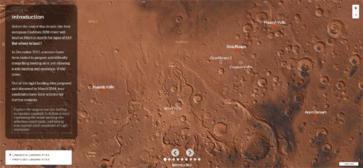
Where on Mars? is a superbly crafted story map which explains the various criteria being used to pick the perfect landing site for the European Space Agency's Mars rover. ESA's ExoMars programme plans to land a rover on the surface of Mars to search for signs of past and present life.

The Where on Mars story map shows the four possible landing sites for the ExoMars 2018 Mission. The map includes a number of different map views of the red planet. Using the forward and back buttons on the map you can progress through the different map layers to learn more about how the final landing site will be chosen.


On Monday NASA announced that 'recurring slope lineae' and hydrated salts discovered on the sides of craters are proof of water flow on 
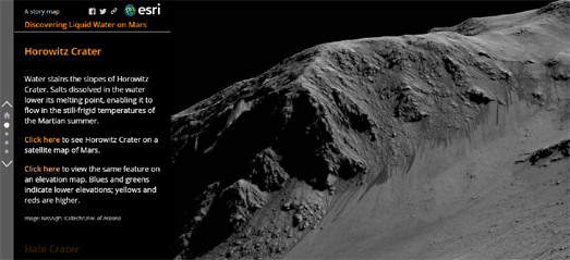
Mars. The Esri Story map, Discovering Liquid Water on Mars, provides a great illustration of these recurring slope lineae using NASA imagery and maps of Mars.

The story map uses imagery from the Horowitz, Hale, Garni and Palikir craters to show examples of these dark streaks which are caused by subsurface water flow. In particular the timelapse images from the Palikir and Horowitz craters do a great job at showing how the streaks appear, lengthen and vanish with the passing of seasons on Mars.


Back on Earth you can take an amazing virtual hot air balloon ride over the Swiss Alps with Suisse Mania. This stunning 3d map takes you on a journey over Switzerland and allows you to explore this beautiful country from the air.

Use your left mouse button to move around the map. The right mouse button rotates your view and you can use your scroll wheel to zoom in and out on the map. As you travel around the map you can click on buildings and other features on the map to listen to the history of the selected location. You can also add the selected locations to your own scrapbook. There are 54 special objects to collect in all. Good hunting ....

Saturday, October 03, 2015

Broken Bridges


1 in 9 bridges in the U.S. is structurally deficient, requiring significant repairs, maintenance or replacement. You can find out which bridges near you are deemed structurally deficient using the 2015 Bridge Conditions map from Transportation For America.

The map allows you to enter your address and view all bridges within a ten mile radius. All the bridges which were deemed structurally deficient in 2015 by USDOT are marked on the map in red. If you select a bridge on the map you can view when it was last inspected and what its ratings were for deck, superstructure and substructure.

Friday, October 02, 2015

Animated Noise Complaint Maps


Real-estate portal Trulia has used CartoDB's animated heat-map library Torque to show monthly heat-maps of registered noise complaints in Seattle, San Francisco and New York. The maps allow you to view the geographical spread of noise complaints made by the public for each month over the course of about five years.

Trulia themselves point to possible flaws in the data. Namely that the data could be skewed by population and that there could be reporting biases. There also doesn't seem to be much value in animating the data by month. It might be more interesting to view the data by time of day and by day of the week, to discover if there are more complaints during certain hours and on certain days of the week.

The Mapping Ear Plug Hotspots maps could possible have some limited value for those searching to buy a property. However you will probably have to search quite carefully among all that noise on the map to really identify areas which seem to have a recurring problem with noise.

The 3D Globe of Ceres


Last week the New York Times created a simple interactive 3d globe of Pluto from the latest NASA imagery. The NYT's Pluto Globe uses a number of images of the planet to create an interactive globe of Pluto. This week it is the turn of the dwarf planet Ceres.

Ceres is the largest object in the asteroid-belt which lies between the orbits of Mars and Jupiter. In September 2007 NASA launched the Dawn space probe on a mission to study the protoplanets Vesta and Ceres. Dawn is currently orbiting Ceres and has captured some amazing imagery of the planet.

The NYT's Ceres Globe uses imagery from Dawn to create an interactive globe of Ceres. The globe provides two map views, a false-color map and a gray-scale map.

Thursday, October 01, 2015

Pledge to Vote


Google has released a map which allows Canadian voters to pledge to vote in the 2015 Canadian election. The Pledge to Vote map allows you to pin a marker to the map and explain which issue you care most about and why.

To add your pledge to the map you just need to choose an issue you care about, enter your postcode or address and leave an optional message. It's hard to see what purpose the map serves, beyond promoting Google Maps and presumably an imminent Google Canada Elections website.

However, after you have left your pledge, you can explore which issues other Canadians care most about by using the map filters. At the moment it looks like taxes, energy and public safety are the issues people care least about. I wonder if taxes will be such a minor issue in next year's U.S. election.

Hat-tip: Google Street View World

The Optimal Indian Road Trip


Plotting optimal road trips has proved a popular mapping trend this year. In its most basic form the 'optimal road trip' provides the shortest route around a country, while also visiting each and every region at least once.

However there can be variations to this rule, in which the optimal route visits some other arbitrary locations. For example, earlier this year Randal Olson created a map of the Optimal Road Trip Across the United States. His map provides the shortest route across the United States which visits the top 50 major U.S. landmarks.

Randal Olson has also created the Optimal Road Trip Across Europe. This route provides the shortest route across Europe, visiting all the locations in Business Insider's '50 Places In Europe You Need To Visit In Your Lifetime'.

Apoorv Anand has now created a map providing an Optimal Road Trip Around India. Apoorv's map shows the shortest route around India which visits all 55 of the Indian locations in National Geographic's Short Breaks in India.

Of course an 'optimal road trip' is just an arbitrary traveling salesman problem. You can read either Randal Olson's or Apoorv Anand's blogs to discover how they set about solving the traveling salesman problem when creating their maps.