Friday, May 13, 2022

Mapping Rising Seas

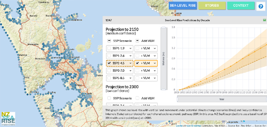
NZ SeaRise is an interactive map which reveals how rising sea levels might effect locations around the coast of Aotearoa based on different climate change scenarios. Using the map you can view the likely impact of sea level rises at 7,434 sites around New Zealand (covering every 2km of coastline).

Because New Zealand suffers from a lot of techtonic activity mapping the impact of sea level rises in the country also involves calculating where coasts are moving up (uplift) and down (subsidence) in relation to sea level. NZ SeaRise includes data on the likely rate and direction of vertical land movement for every 2 km of Aotearoa's coast. 

The colored dots on the map show the projections of vertical movement around the coast. If you click on one of these dots you can view a graphed projection of sea level rise at that location until 2150 or 2300. This graph uses different colored lines to show the projected sea level rises under different climate change models. 

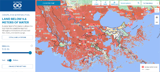
If you want to know how rising sea levels could affect other locations across the world you can use Climate Central's Coastal Risk Screening Tool. This interactive map allows you to see which areas around the globe are most threatened by sea level rise and coastal flooding. The map uses coastal elevation data with the latest projections for future flood levels to model how rising seas will impact all coastal communities.

The NYPD is Spying on You

There are thousands of surveillance cameras in New York which can track your movements around the city. The New York Police Department's facial recognition software can identify individuals as they move around New York and pass in front of any of the city's pervasive surveillance cameras. The system works using millions of profile pictures scraped from social media accounts without users' permissions. Black and minority communities are most at risk of being misidentified by facial recognition software and therefore most at risk of being wrongfully arrested.

Amnesty International, with the help of 7,000 volunteers, has analyzed Google Maps Street View imagery in New York to identify the locations of the city's security camera locations. Amnesty found and located over 15,000 surveillance cameras across the city.

In Inside the NYPD's Surveillance Machine Amnesty International has created a route finder which allows you to discover how many surveillance cameras you will pass on any journey in New York City. For example if you walk from the Empire State Building to the Museum of Modern Art you will be filmed by surveillance cameras on 80% of the journey. 

Amnesty claims that the pervasive level of surveillance in NYC coupled with facial recognition software means that you are 'never anonymous' in the city and that your movements can be tracked at any time. You can explore the density of the city's surveillance cameras on Amnesty's Decode Surveillance NYC interactive map. The Decode Surveillance heat-map shows the density of surveillance cameras across the city. You can view the locations of individual cameras by exploring the Inside the NYPD's Surveillance Machine interactive map.

Thursday, May 12, 2022

24 Hours of Global Flight Traffic

Google has released an animated map visualizing 24 hours of global flight traffic around the world. The WebGL Air Traffic Demo has been released to illustrate what can be achieved using the WebGL features of the Google Maps JavaScript API.

The WebGL overlay view in the Google Maps API allows developers to add and animate 2D and 3D graphics on top of a Google Map. In the WebGL Air Traffic Demo this feature has been used to create a visualization of one day's worth of flights longer than three hours between 645 airports around the world. The map is an impressive demo of the Google Maps API, animating thousands of data points at any one time. The map also includes an animated day/night layer which moves across the map to show the current time of day across the world. 

The WebGL Air Traffic Demo was demonstrated yesterday at Google I/O, where Google also gave a sneak peak of a new Immersive View' for Google Maps. Coming later this year for a number of global cities Immersive View combines satellite views, height data and Street View to create what looks like a truly impressive 3D map. The new 'Immersive View' hasn't been launched yet but Google did release a short video demo (shown above).

Wednesday, May 11, 2022

Global Plastic Watch

The world's plastic waste is now being mapped from space. Global Plastic Watch (GPW) has released a new interactive map which tracks the world’s plastic pollution in near real-time by using artificial intelligence to identify plastic waste sites in satellite imagery.

GPW's algorithms can identify plastic waste sites as small as 5x5 meters. By identifying and mapping sites where plastic waste is being dumped GPW can help governments and agencies around the world tackle the problem and help to prevent the flow of plastics into the oceans. 


one of 373 plastic waste sites identified in Indonesia

If you select a country on the interactive map you can view a country report which identifies the number of plastic waste sites found, the surface area of land being used for plastic waste, and the waste production per capita. Select an individual plastic waste site on the map and you can view the satellite imagery of the site for yourself, and (where available) even explore nearby Google Maps Street View of the site. 

You can see how plastic from individual waste sites is likely to reach the sea on an interactive map from Ocean Cleanup. The Plastic Tracker map allows you to track the probable journey that plastic waste is likely to take from any location to the ocean. Enter a location into the Plastic Tracker map and it will calculate the chances of a piece of plastic abandoned to the environment at that address reaching the ocean and will also map the journey that the plastic would likely take.

The Plastic Tracker map plots the journey that a single piece of plastic is likely to take from the moment it is discarded. It shows the possible route that the plastic would take to reach the sea based on data such as river flow, river mouth emissions and ocean currents. 

The Ocean Cleanup organization believes that between 1.15 to 2.41 million metric tons of the plastic in the oceans originates from the world's river systems. Two thirds of it from the rivers of Asia. The River Plastic Emissions to the World’s Oceans interactive map helps to visualize how and where that plastic ends up in the world's oceans.

This map shows river systems around the globe. The predicted input from each river system is shown at the coast using scaled circular markers. These predicted inputs are based on a model which looks at population density, waste management, topography, hydrography, the locations of dams and the reported concentration of plastic in rivers around the world.

Tuesday, May 10, 2022

Exposing the Horrors of War

Over the last two months reporters at the Washington Post have verified more than 200 videos documenting some of the atrocities carried out by Russia in its invasion of Ukraine. Since the beginning of the Russian attack on Ukraine ordinary citizens, soldiers, and officials have been using their phones to record the horrors carried out by the Russian army.

The Post has now organized these videos into a searchable database. Obviously many of these videos show the realities of war and can be distressing to watch. They record people losing their homes, their loved ones and even their own lives. All the videos have been uploaded in their raw format and the most graphic videos are clearly indicated as such by the Washington Post. 

The Post's Database of Ukraine Video can be searched by date and by keywords. An interactive map showing where each video was recorded also allows you to search the database by location. An animated map (shown above) also shows the location of all the videos, appearing on the map by the date of their recording.

You can also explore the terrible cost of Russia's invasion of Ukraine on the incredible 3D models created by Hidenori Watanave on his Satellite Images of Ukraine and 3D Data & 360 Panoramas Map of Ukraine.

These maps use data from images and videos captured in Ukraine to recreate incredible 3D models of some of the devastation caused by the Russian army. 3D photogrammetric models have been created of buildings and vehicles which have been destroyed during the war using drone captured imagery and photos taken on the ground. The result is two shocking interactive 3D maps which allow you to view the devastating destruction in Ukraine from an almost first person perspective.

Monday, May 09, 2022

A Still Life Map of the World

Jason Farago of the New York Times has published another close reading of a Dutch masterpiece. Over the last few years Farago has released a number of art essays which look closely at famous works of arts. Each of these art critiques owe a lot to the navigation and presentation techniques developed for online interactive maps. As you progress through one of his close readings an accompanying interactive zooms and pans around an image of the discussed painting to help illustrate Farago's observations of the artist's work.

In his latest close reading A Messy Table, A Map of the World Farago examines a still life by the 17th Century Dutch artist Willem Claesz Heda. In his essay Farago critiques Heda's painting 'Still Life With a Gilt Cup', while also exploring the wider context of the still life in art history and the genre's rising popularity in the booming economy of the Netherlands in the 17th Century.

By zooming in on each of the objects carefully arranged in Heda's painting Farago is able to illustrate the artist's skill. These opulent and exotic foods and objects also represent and signify a Dutch economy which is at the center of world trade.

Farago's previous critiques of individual paintings include:


If you are familiar with the Leaflet.js mapping library then you can create your own interactive painting critiques - using image tiles from paintings instead of map tiles. Museums and art galleries around the world use the iiif format to present artworks as zoomable images. This means that for many works of art, if they have a iiif manifest, you don't even have to create the image tiles for yourself.

The fantastic leaflet-iiif plugin allows you to seamlessly use iiif manifests with the Leaflet mapping platform.This means that you can quickly turn any painting with a iiif manifest into an interactive Leaflet map. You can view a demo of this in action on my The Drawing Lesson critique. In this scrollytelling examination of Jan Steen's painting (depicting an artist teaching two young pupils how to draw) I have used the Leaflet mapping library to take a close look at Steen's 17th century Dutch masterpiece. 

You can explore how my critique of the Drawing Lesson works by exploring the JavaScript code on its Glitch page. You can even clone the page if you want and use the page as a template for creating your own interactive scrollytelling painting essay. 

Sunday, May 08, 2022

Population By Latitude and Longitude

About 88% of the world's population lives north of the equator. One reason for this is that there is more landmass north of the equator and more ocean south of the equator. However the north of the planet has only around 68% of the world's landmass. This means that nearly 90% of the world's population is squeezed into the 68% of the world's landmass that lies north of the equator.

You can explore for yourself where the world's population lives in terms of latitude and longitude on Darren Weins' Lat/Lng Population Map. Hover over any location on this interactive map and a graph at the bottom of the map shows the population distribution along that line of longitude, while a graph running down the side of the map shows the population distribution along that line of latitude. 

The population data comes from Gridded Population of the World, Version 4 (GPWv4).


You can also view a distribution of the world's population by longitude and latitude on Andre Andersen's World Population Map. This population density map includes two graphs views, along the side and bottom of the map, which show how population is distributed across the world - both by latitude and by longitude. 

Engaging Data's World Population Distribution by Latitude and Longitude also creates a latitude and a longitude graph of the global population. This map shows the distribution of the world's population as a population grid. The map also includes two buttons which allow you to reorganize the population data. One button redistributes the world's population into a graph showing the population distribution by longitude. The other button organizes the population data into a graph showing the world's population distributed by latitude. 

Friday, May 06, 2022

Voice Controlled Maps

Steve Attewell's Voice Controlled Map is an interesting experiment in providing a more accessible interactive map with navigation controls that support vocal commands. This means that users are able to search and move around the map using a number of different spoken commands.

The map can be panned up & down and left & right, can be zoomed in and out, and can be moved to named locations all by spoken word. To enter a voice command just click on the 'listen for voice commands button' and speak to the map. If you want to know what actual words the map will understand then say 'commands' or 'instructions' to view a list of accepted commands. 

The Voice Controlled Map uses Ordnance Survey map tiles so can only be used in the UK. If you want to talk to an interactive map outside the UK then you can use Alex instead.

Alex is another interactive map which can be controlled by voice. Like Steve's map Alex can understand a number of different spoken commands. You can ask Alex to zoom in and out on the map or to switch between aerial and topographical map layers. You can even tell Alex a location and it will center the map on that area. 

Alex also talks back to you. As well as accepting spoken commands Alex can also speak. For example, for confirming when it has completed one of your commands. Or when Alex tells you a joke. Yes, ask Alex to tell you a joke and this interactive map will tell you a really bad cartographically themed joke.

Wednesday, May 04, 2022

The Importance of the Indian Ocean

The Strategic Importance of the Indian Ocean is a new interactive map which seeks to underline the strategic importance of the Indian Ocean as one region, stretching from the eastern coast of Africa to the western coast of Australia. The map provides an interactive tool for exploring the importance of the Indian Ocean to trade & global shipping, and to visualize the territorial claims of countries (some of which may provide barriers to that trade).  

The Indian Ocean holds a fifth of the world's waters and is critical to global shipping and to the economic fortunes of many countries. It is therefore a site of keen economic and strategic competition between many countries. One of the key layers on the interactive map shows the key shipping routes in the Indian Ocean and identifies key 'chokepoints' on these routes. These chokepoints are some of the most strategically important routes for world trade. As such disruptions at these chokepoints can have a dramatic impact on global trade.

The map also features layers on maritime boundaries, the important regional players and current maritime disputes in the ocean. There are currently 15 ongoing territorial disputes in the Indian Ocean. Some of which could have an impact on important shipping routes.

There are a number of territorial disputes on-going in the wider Asia Pacific region. The Asia Maritime Transparency Initiative has mapped out all these territorial claims in this larger area on its own interactive map.  The Maritime Claims of the Asia Pacific attempts to provide an as complete, accurate and up-to-date map as possible of all the competing maritime claims in the region.

On the map each country's territorial claims are shown using color-coded borders. The map includes a filter option which allows you to view any combination of countries' claims on the map. By selecting any two countries on the map it is possible to see exactly where they have territorial disputes.

The Asia Maritime Transparency Initiative map doesn't show territorial claims for the Spratly and Paracel Islands "due to a lack of clarity about what each country claims". 

Monday, May 02, 2022

Madagascator & Mexicator

xkcd has published another fun, map based cartoon. Bad Map Projection No. 248: Madagascator is a world map which uses the Mercator projection "but with the North Pole in the Indian Ocean so that it exaggerates the size of Madagascar instead of Greenland.' 

The map is a great way to visualize how the Mercator projection distorts size the more you move away from the equator. Because Mercator is so ubiquitous we are used to Greenland appearing as if it as large as the whole continent of Africa. Using the Madagascator projection Greenland appears much smaller than Africa (which it is). Unfortunately Madagascar now appears to be the size of Canada (Madagascar is 587,041 sq km, Canada is 9.985 million sq km).  

Mexicator - a Mercator projection map using Mexico as the North Pole

While Bad Map Projection is a great illustration of how the Mercator projection distorts our perception of the Earth much more fun can be had by actually clicking on the cartoon map. xkcd 2613 is also a hotlink to Mercator Extreme. Click on the Madagascator map and you will be taken to Drew Roos' interactive Mercator Extreme map.

Mercator Extreme is a fantastic interactive map which allows you to set any location on Earth as the North Pole and visualize the resulting Mercator Projection distortion created as an interactive map. Type in your address into the map and you can visualize what a Mercator Projection map of the world would like if your home was the North Pole. 

You can also play around more accurately with the Mercator projection on the Mercator Projection Explorer. The map above shows a world with Mexico as (approximately) the North Pole.

a Winkel Tripel map projection with the Indian Ocean as the North Pole

You can explore how other map projections distort the world using Jason Davies' Map Projection Transitions. Choose from any of the many different map projections provided in Map Projection Transitions and you can then drag the world map to explore how the chosen map distorts different countries. It is the perfect application for illustrating how all maps have to make compromises somewhere when trying to represent a three dimensional world in only two dimensions.