Wednesday, April 13, 2016

Mapping Stress Free Cycling


The Bicycle Stress Map visualizes the levels of stress experienced by cyclists on Montgomery County's streets. It allows cyclists to find and avoid the most stressful streets and provides a guide for planners as to where investment is needed to make Maryland a more cycle friendly county.

Each of the streets in Montgomery County has been given a Level of Traffic Stress score based on factors like traffic-speed & volume, the number of lanes, ease of intersection crossing and the frequency of parking turnover. The colors of the streets on the map show the Level of Traffic Score. If you select a street on the map you can also view details on the number of lanes, the speed limit and the availability of bike lanes on the road.

The Bicycle Stress Map also includes videos providing examples of the different levels of traffic stress for cyclists on the county's roads.

A Song of Ice, Data & Maps


Every Spring, as another series of Thrones approaches, we get to witness little buds of hope emerging from the thawing earth of Winterfell. Yes - it's time once again for a new crop of interactive maps all about A Song of Ice & Fire.

This year A Song of Ice and Data has emerged from Beyond the Wall to shed new light on George R. R. Martin's fantasy world. A Song of Ice and Data is a new REST API, interactive map and data store created by students at the Technical University of Munich. Most of the data for the project has been scraped from the Wiki of Ice and Fire.

The Song of Ice and Data interactive map shows the lands, borders and cities of the Known World. It also includes travel paths of all the major characters. If you select any of the marked locations on the map you can learn more about the location from the Wiki of Ice and Fire. If you want to view a character's travel path on the map just search for the character using the map's search box.

You can find more Game of Thrones interactive maps in Mapping A Game of Thrones.

The Panama Papers - Money Trail


Mexican news website Aristegui Noticias has created a story map which literally follows Juan Armando Cantu Hinojosa's money around the world as he tries to hide his fortune from the tax authorities.

The business tycoon Juan Armando Cantu Hinojosa is a close friend of the Mexican President Peña Nieto. Ever since Nieto's became president Hinjosa has made a fortune from the huge number of government contracts that he has amazingly secured. The Panama Papers leak has revealed how Hinjosa used the Panamanian law firm Mossack Fonseca to hide his wealth in an elaborate chain of offshore trusts and companies.

The Money Trail of Cantu Hinjosa is an informative story map which explains where and how Hinjosa moved his money around the world from Mexico City to New Zealand. As you scroll down the page you can follow Hinjosa's money around the world as it is moved from country to country and from offshore trust to offshore trust.

The Money Trail of Cantu Hinjosa is in Spanish.

Via: Visualoop

Tuesday, April 12, 2016

Mapping US Political Donations


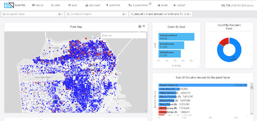
The MapD Political Donations map visualizes 25 years worth of political donations data on a Mapbox GL powered interactive map. Using the map you can explore where and how much Americans have donated to the Democrats and Republicans since 1990.

Zoom-in on the map and you can see locations where political donations have been made. Blue dots on the map show donations made to Democratic candidates and red dots show donations to Republicans. The size of the dots represent the relative size of each donation.

Beside the map you can see charts showing the amounts made to each party and to individual candidates. One of the most impressive aspects of this visualization is the speed that it responds. Move the location on the map and both the map and the charts almost instantly update to show the data for the current map view.

Via: The Mapbox Blog

The Video World Tour


Eleven years ago I created my first interactive map using the newly released Google Maps API. The map allowed you to watch YouTube videos of well known tourist locations around the world.

I can still remember the thrill I got when I first worked out how to get a video to play directly from a Google Map. I also remember how excited I was by the concept of being able to watch videos of locations around the world placed on top of close-up satellite imagery of the same locations on a Google Map.

This little personal history is probably why I'm such a big fan of video maps like TripGlimpse. TripGlimpse is an interactive map which allows you to explore famous locations around the world through curated videos.

It is not meant as a criticism of TripGlimpse when I say how little has changed over the last eleven years of interactive maps. In essence TripGlimps is almost exactly the same as my first interactive map. It consists of map markers showing the locations of tourist hotspots around the world. Click on any of the map markers and you can watch a video tour of the location without leaving the map.

The video map concept is such a great way to virtually explore the world. Using the videos on TripGlimpse you can preview places you might like to visit. If you like what you see in the video you can even click through on TripGlimpse to book a real-life tour of the selected location.

The Berlin House Numbers Map


Finding a house number on a Berlin street can be difficult. This is because Berlin has two completely different house-numbering systems; the horseshoe and the zizgzag.

Some streets in Berlin use the 'horseshoe' numbering system. This means that the first building at one end of the street is given the number 1. Each building on the same side of the street is then given a progressively higher number until the end of the street. At the end of the street you cross over the road and then work back to the beginning of the street giving each house a progressively higher number, again in consecutive order. The result is that the building with the highest house number on the street is opposite the building with the lowest house number,

Many other streets in Berlin however use the 'zigzag' numbering system. These streets have even numbered buildings on one side of the street and odd numbered buildings on the other side of the street.

If you are confused then you should check out Der Tagesspiegel's Berlin House Numbers Map. On this map all of Berlin's streets are colored red or blue to show whether they use the horseshoe or zigzag method of house numbering. If you zoom right in on a street you can see the house numbers on the map - so you can actually observe on the map how both systems work in reality.

Berlin changed to the zigzag house numbering system in 1927. Therefore the blue (zigzag) streets on the map are mostly the newer streets and the red (horseshoe) streets are the older streets. However even before 1927 some streets used the zigzag house numbering system. Therefore all the blue streets on the map are not necessarily the newest streets.

Monday, April 11, 2016

Spying on the Spy Planes - Live


Last week Buzzfeed released an interactive map showing the flight-paths of FBI and Department of Homeland Security airplanes flying over the USA between mid-August to the end of December last year. Spies in the Skies is an animated interactive map which plots the flights of the FBI & DHS planes, showing where these planes were operating during those few months of last year.

If you want you can also spy on FBI planes in real-time. ADS-B Exchange's live real-time map of aircraft allows you to track FBI planes as they fly over U.S. cities in real-time. To view the planes go to ADS-B Exchange's Global Radar View and then follow these steps:
  • Select 'Menu
  • Select 'Options
  • Select the 'Filters' tab 
  • Click on the 'Interesting' check-button
When you select the 'interesting' filter the map only shows 'interesting' planes on the map. This includes FBI planes. For example, at the time of writing I can follow live an FBI Cessna flying all over north-east Baltimore.

Via: Hacker News

The Interactive Hereford Map


The Mapping Mandeville project is an inspired idea to map medieval geographical knowledge on a medieval map of the world.  The project maps excerpts from The Travels of Sir John Mandeville onto an interactive version of the medieval Hereford Map'.

'The Travels of Sir John Mandeville' is a fourteenth century fantastical tale of the travels of a supposed English knight, called Sir John Madeville, throughout the knowm world. As a work of fiction the tales draw heavily from medieval ideas about geography and the world map as it was known at the time. The Mapping Mandeville Project therefore has plotted excerpts from the tales not on a modern map of the world but on the Hereford Mappa Mundi.

The Hereford Mappa Mundi is the largest medieval map in existence. The map dates from around 1300 and depicts the world as it was believed to exist at that time by most Europeans. Jerusalem sits at the center of this world, east is at the top and west is at the bottom.

The Mapping Madeville Map is an interactive version of the Hereford Map overlaid with information on cities, races, and geographic elements, as portrayed in The Travels of Sir John Madeville. If you click on the map markers or other interactive features on the map you can read how these locations are described by 'Sir John Mandeville' in his fantastical tales.

The Mapping Madeville Map therefore provides an amazing insight into medieval ideas about the world on top of an actual medieval map of the world.

Flâneur Poetry with What3Words


These days we allow computers to control out houses, drive our cars and beat us at chess and Go. It shouldn't be any surprise then that they have now become our poets as well. Welcome to the age of self-driving cars and automated wandering bards.

Sauntering Verse is a new location based computer generated poetry generator. Open up Sauntering Verse in your mobile device and go for a walk. Sauntering Verse will then compose a unique poem as you wander through the world.

At the heart of Sauntering Verse is the What3Words location addressing system. What3Words turns geographic coordinates into three word addresses. Every location in the world has a three word address that you can use to share your location. For example, if I tell you I'm currently at 'Joke, Pretty, Dated', all you have to do is append those three words to the what3words URL (map.what3words.com/joke.pretty.dated) and you can view a map of my location to within a few feet of accuracy.

Sauntering Verse uses these three word addresses to automatically generate a poem based on your location. You can create a short poem by just sharing your current location with Sauntering Verse. However, if you actually go for a walk the application will create more diverse poems as you continue to add more What3Word addresses to the application.


Sauntering Verse isn't the first application to use the What3Words addressing system to help create poems. what3words Poetry is almost Sauntering Verse in reverse. Where Sauntering Verse creates a poem from your mapped location, what3words Poetry maps your poetry based on the locations of words you use in the What3Words addressing system.

what3words Poetry starts you off with a random three word map address as the first three words of a poem. The last two words are then used to create the first two words of the next line of the poem.

Your task is to provide the third word of the second line of the poem. When you enter the word the three words of the second line of your poem is then used as a What3Words address and you are shown that location on a Google Map. You can continue in this manner adding a word to every line and receiving another new location on your Google Map.

This sounds far more complicated than it actually is. In fact it is very simple to use. It is also pretty good fun. Here's a poem that I created (you can see the map it creates above),

  unlikely ants trilogy
  ants trilogy reread
  trilogy reread twice

My poem isn't going to win any literary prizes. Why not see if you can do better.

You can read more about the what3words Poetry map, including a link to a whole tumblr blog on what3words inspired poetry, on Darren Wien's Blog, Darren's Side Projects.

Sunday, April 10, 2016

Maps of the Week


My favorite map this week was Buzzfeed's Spies in the Skies map of US government spy planes. It really is great example of how a little known story can be illustrated and explained with a mapped visualization of publicly available data.

The map plots the flight-paths of FBI and Department of Homeland Security spy planes over American cities. Buzzfeed took a few month's worth of data from Flightradar24 and mapped the tracks of around 200 federal aircraft.

If you zoom-in on the map you can see the distinctive circular flight paths of the planes, presumably as they monitor a single location on the ground. If you zoom-out you can get an overall picture of where in the USA the FBI & DHS planes seem to be most active. The DHS appears  to be most active around towns and cities near the Mexican and Canadian borders. The FBI planes seem to regularly operate all over the USA.


The OSM Global Noise Pollution Map uses OpenStreetMap data to map the levels of noise pollution across the world. At the heart of the OSM Global Noise Pollution Map is the very clever but simple idea of assigning noise pollution levels based on OpenStreetMap tags.

The OSM Global Noise Pollution Map use OSM tags and values to assign a noise pollution level based on general assumptions about these mapped features. For example highway, trunk, primary and secondary roads are deemed to be noisier than normal street or service roads. The OSM Global Noise Pollution Map also assumes that railways and retail & industrial zones will also have a significant level of noise pollution associated with them.


This map of Miami's future skyline is another great example of how interactive maps can be used to visualize important news stories. The Miami DDA 3D Map shows you how the city's skyline will look once 116 building projects (proposed, under construction and recently completed) are constructed

The Miami DDA 3D Map used the Cesium mapping platform to present a 3d map of downtown Miami which allows you to explore the effect of the new buildings on the skyline from any angle. You can even click on the individual buildings on the map to learn more about its developer, construction status and building type.

The colors of the buildings on the map indicate whether the project is planned, proposed, under construction or already completed.