Monday, August 14, 2017

DC's Historical Street View


From 1948 to 1952 John P. Wymer systematically photographed every single neighborhood in Washington DC. The result is an incredible historical record of the American capital in the mid-twentieth century.

Wymer's DC allows you to view all 4,000 images in the John P. Wymer Photograph Collection superimposed on top of Google Maps Street View. This allows you to directly compare the Washington DC documented by Wymer to the city today as captured by Street View. A Google Map shows where each photograph was taken, so it is possible to browse the collection by location. You can also use the 'Filter' option to browse the collection by different themes, such as 'Places of Worship', 'Government Facilities' and 'Residential'.

If you enjoy exploring how American cities once looked then you will also like OldNYC and OldSF.
OldNYC is a Google Map locating 80,000 NYPL historical photographs of New York to the closest intersection. OldNYC was created by the same team that built OldSF. OldSF is a similar map for San Francisco, which allows you to browse historical photos from the San Francisco Public Library collection.

How Does Your Neighborhood Rank?


Last week Beñat Arregi released a series of interactive maps showing how Airbnb customers rank  the neighborhoods where they have stayed. After staying in a Airbnb property visitors are asked to give feedback on the property and on the neighborhood where it is located.

The aggregated ratings made by guests for each listing on Airbnb is publicly available. This means that you can use the Airbnb ratings to find out how visitors rate neighborhoods in your city. It also means that you can create interactive maps for cities around the world showing how tourists rate neighborhoods in each city. Which is exactly what Beñat has done in City Maps from Tourists’ Feelings.

Beñat's series includes interactive maps of New York, San Francisco, LA, San Diego, New Orleans and Austin. This wasn't enough American cities for Nathan Yau of Flowing Data so he has created another 16 city maps looking at Airbnb neighborhood ratings in U.S. cities. How Airbnb Visitors Rate Location in Major US Cities uses colored dots to show the aggregate neighborhood ratings made by guests visiting 16 different cities. The distribution of the different colors gives a fairly good overview of how visitors feel about different neighborhoods in each city.

Saturday, August 12, 2017

Mapping Cabs in NYC


Back in 2014 Chris Whong created an impressive interactive map using New York Taxi Data. Chris' map provided a great insight into the daily life of one New York taxi driver. The impressive amount of data released by the NYC Taxi & Limousine Commission however has other stories to tell about life and people in the Big Apple.

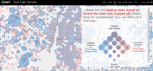
For example, Esri's John Nelson has created a story map looking at Yellow Cab trip data in New York City from July 2015 - June 2016. By mapping the data Nelson has been able to pick out how different New York boroughs use and pay for taxi cab journeys. He then looks at the underlying socio-economic data in those neighborhoods to see if they help explain the differences in how inhabitants of different New York neighborhoods use and pay for cabs.

In Taxi Cab Terrain Esri has mapped out the locations where the most New York cab rides begin, the pick-up locations where cab drivers can expect the largest tips, where in the city passengers pay in cash & where they pay by credit, the number of passengers and the length of journeys.

Chris Whong's original map, NYC Taxis: A Day in the Life is a MapBox visualization of the journey of one New York taxi over the course of 24 hours. You can also view the NYC Taxi Holiday Visualization, which animates taxi journeys from New York's airports over the course of a month and half, and Hubcab, a mapped visualization of 170 million taxi trips over one year in New York.

Friday, August 11, 2017

Subway Specs


New York architect Candy Chan was amazed to discover that there are no three-dimensional plans of New York subway stations. She therefore decided to create her own. The result is X-Ray Area Maps, a series of beautifully drawn bird's eye view illustrations of subway stations which reveal the tunnels, platforms and escalators which exist under New York's streets.

Each of the five 3d plans completed so far can be explored on its own Leaflet.js powered interactive map. This allows you to zoom in on details in the plans. If you like Candy Chan's illustrations you can buy prints of each of the 3d subway station plans.

Unfortunately if you live in London there doesn't appear to be any interactive mapped 3d plans of underground stations. However Transport for London has created a series of axonometric diagrams for each station on the London Underground network. You can view the axonometric diagrams for all of the stations at IanVisits.

Thursday, August 10, 2017

Transgender Laws and Persecution


The Trans Murder Monitoring (TMM) project has mapped laws affecting the lives of trans people in countries around the world. The map allows users to better understand both the legal situation and the actual social application of these law in 126 countries across the globe.

If you select a country on the Legal and Social Mapping interactive map you can read a detailed overview of the legal, healthcare and social situation affecting trans people in that country. The map also provides an overall global view of the selected legal, health or social situation in each country.

This global choropleth layer provides a simple color coded view of different laws and social practices affecting trans people in different countries. The map uses red and green to show where trans people are directly affected or protected by legal measures. It also uses other colors to show countries where there are laws that specifically target gender-diverse/trans people but where these laws are no longer enforced. In contrast it also shows countries where there aren't specific laws targeting trans people but where prosecution occurs anyway without any legal basis or using other non-related laws.

The TVM also monitors, collects and analyses reports of the murder of trans and gender-diverse people across the globe. The Trans Murder Monitoring map reports on the results of TVM's monitoring of the homicides of trans and gender-diverse people in countries around the world.

The choropleth layer on this map shows the number of trans people murdered in each country. If you hover over a country you can view the total number of recorded homicides of trans people in that country. If you click on a country you can read a detailed breakdown of the legal, social and health care situation affecting trans people in that country.

North or South? The Fast Food Decides


After centuries of causing untold misery around the world the British have finally struck on a way to settle territorial disputes in a fair and disinterested manner.

It's called the 'Fast Food Method'.

Let me explain ...

In recent years British geographers have discovered that most geopolitical issues can be solved by plotting the geographical distribution and density of fast food restaurants. For example, in How to know if where you live is “up and coming” heat maps of coffee & fried chicken shops were used to identify geographical areas which are undergoing gentrification in the UK. Similarly in Fast Food England the density of fast food restaurants was used to determine which areas of the country are economically deprived.

After the fast food method proved its efficiency in these two studies it was decided that it should also be used to settle England's longest unsolved territorial dispute - the border between North & South. For centuries unfortunate 'midlanders' have been mocked by southerners for being Northern and teased by northerners for being Southern. They need suffer no longer.

The Tab has applied the Fast Food Method to the north-south border and determined once and for all where the border lies. To determine the border's exact location the Tab mapped the location of Greggs bakeries across the country. In We’ve figured out exactly where the North is by plotting every single Greggs store on a map the Tab plotted the location of all 1,823 Greggs throughout the country.

We all know that northerners love their Greggs pies. This means that there are far more Greggs bakeries in the north of the country than there are in the south. It also means that you can determine if a location is in the north or south of England by looking at the number of people per each Greggs bakery. 25,000 people per Greggs is the Tab's benchmark. If a town has less than 25,000 inhabitants per Greggs then it is in in the north. More than that and the town is in the south.

Using this methodology the Tab has drawn a dividing line across the UK.

A wall will be built soon.

Wednesday, August 09, 2017

Stinking Neighborhoods on Airbnb


Have you ever wondered how visitors from out of town rate your neighborhood? There is an easy way to find out. You just have to ask Airbnb customers.

The Airbnb feedback section includes an option for guests to rate the area in which they have been staying. After their visit Airbnb guests rate the neighborhood using a star based system. The aggregated rating made by guests for each listing on Airbnb is publicly available. This means that you can use the Airbnb ratings to find out how visitors rate neighborhoods in your city.

If you are like Beñat Arregi this means that you can also create interactive maps for cities around the world showing how tourists rate neighborhoods in the city. In City Maps from Tourists’ Feelings Beñat has created a series of maps showing how Airbnb customers have rated the neighborhoods where they have been staying. Each point on these city maps represents an Airbnb listing. The color of each point shows the rating of that neighborhood.

Each city map provides an interesting overview of which neighborhoods in a city are rated highly by visitors and which neighborhoods out of town visitors tend not to like. If you know a city quite well it is quite good fun to see if your opinions match with those of Airbnb users.

The Sound of Global Protest


Cities and Memory has created the first sound map to document the different soundscapes of political protest around the world. The map includes sound recordings made during protests in 27 different countries. It allows you to listen to Americans protesting against Donald Trump, Icelanders demonstrating against the collapse of the country's banks and the English protesting against Brexit.

You can explore the sound recordings, made during political protests around the globe, on the simple Protest and Politics interactive map. Just click on a map marker and you can then listen to the selected political protest directly from the map.

Protest and Politics is just one of a number of sound maps created by Cities and Memory. If you find the sounds of protest a little discordant then you could always try the Sacred Spaces sound map instead. This map allows you to listen to more spiritual recordings made in churches, temples and other sacred spaces around the globe.

You can also explore how other organisations and people have mapped sound with these other Sound Maps that have featured on Maps Mania.

Tuesday, August 08, 2017

Spying on the Spy Planes - Part Two


Some of the most memorable interactive maps of 2016 were the ones created by Buzzfeed to illustrate their Spies in the Skies investigation into the use of spy planes by the FBI and the DHS.

The FBI and the Department of Homeland Security make daily flights over American cities in spy planes equipped with high-resolution video cameras and cell phone tracking equipment. In their investigation into the use of spy planes Buzzfeed used data from Flightradar24 to identify around 200 federal aircraft. Using the Flightradar24 data Buzzfeed was then able to map out some of the flights undertaken by these federal planes as they spy on American cities.

Now Buzzfeed has also used this data to train a neural network to search for other FBI, DHS, police and military spy planes. The Buzzfeed neural network was fed data from the spy planes identified in their initial investigation and from normal commercial flights. The neural network was then tasked with identifying distinctive flight patterns found in the spy plane flight paths and not in the flight paths from the other planes. The Buzzfeed algorithm identified patterns (such as the tight turning rates of spy planes circling areas of interest) which could be used to identify other spy planes.

Once the neural network had learnt how to identify spy planes from flight path data Buzzfeed set it loose on the flight-tracking data compiled by Flightradar24.

You can learn more about the project in BuzzFeed News Trained A Computer To Search For Hidden Spy Planes. This Is What We Found. The article includes information on some of the spy planes identified by the Buzzfeed algorithm and static maps showing where these planes have been spying.

A Game of Thrones Filming Locations


It is said that long ago, before the Doom when dragons still flew above the towers of Tyria, Valyrian wizards could use the magic of obsidian candles to see across vast distances. A wizard could light a candle in the Valyrian Freehold in Essos and instantly spy on the Hand of the King, across the Narrow Sea in the Red Keep of King's Landing.

With the rebirth of the dragons the magic of obsidian candles is active once again. To use this ancient magic you must own the ancient scroll called Game of Thrones Filming Locations in Causeway Coast and Glens. Used properly the spells in this ancient text can instantly transport your sight to the Dothraki Grassland, the Coast of Dorne, the Stormlands or to many other locations throughout the lands of Westeros and Essos.


Dragonstone, as shown with dragon's view on the magic map of Esri

Each location that your inner vision visits is highlighted upon the magic map of Esri and shown from above with magical 'dragon's view' images. The magic map of Esri also includes ancient words of wisdom about each of the locations that you visit on your magical journeys. These words of old provide a brief history of each location and the role it has played in the long history of this Land of Ice and Fire.


There is also an ancient spell of 'Street View' which can bestow the gift of long vision onto anyone who owns the 'Map of Google'.

Game of Thrones: The Old Views and the New gives you the vision to stare straight as the dragon flies into King's Landing, Winterfell or the mysterious continent of Essos. Google's collection of magical Street Views is split into three main Houses, the Starks, Lannisters and the Mother of Dragons. This allows you to direct your gaze to any of your favorite locations on either of the continents of Essos or Westeros.

If you wish to explore the lands of A Game of Thrones even more then you might also want to consult The Five Maps of Westeros.