Friday, December 31, 2021

The 50 Best Maps of the Year

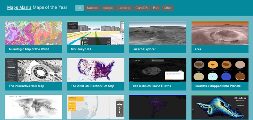
The Maps Mania round-up of the best Maps of the Year 2021 is out now!

Before you view this round-up of the 50 Best Maps of the Year I have a small disclaimer: 

  • There aren't 50 maps in this list. 
  • The maps listed are not the best maps of the last 12 months. 
  • Some of these maps probably weren't even released in 2021. 

The Maps of the Year 2021 could more accurately be described as 'a collection of the 48 interactive maps  which made the biggest impression on me during the last 12 months'. 


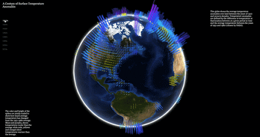
If I was forced to pick one interactive map which made the biggest impact in 2021 I would probably choose Sam Learner's River Runner. River Runner is a very clever map which uses U.S. watershed data to calculate the route that a drop of rain would take from any location in the United States to the ocean. The map uses Mapbox's elevation data and the USGS's national hydrology data to animate the incredible journey of a single drop of water to the sea. 

Although River Runner might be my personal pick for Map of the Year it wasn't the most popular map on Maps Mania in 2021. That award goes to the Magic Mushroom Map. I probably wouldn't pick this map as one of my favorite maps of the year but for some reason the Maps Mania post on the Magic Mushroom Map was by far the most read on this blog during the past year. For some reason (especially in the Fall) a lot of people were interested in exploring a map which shows where and when magic mushrooms are in season near their homes.

My Maps of the Year 2021 list allows you to filter the interactive maps displayed by the map library used to create each map (Mapbox, Google Maps, Esri, Leaflet and Other). When I first used this filter on my Maps of the Year list in 2014 a small  majority of maps were created using the Google Maps API. This year only one map in my Maps of the Year list was created using the Google Maps API (Moving Hamburg). The fact that the vast majority of the interactive maps in this year's Maps of the Year list were created on the Mapbox GL platform is obviously a reflection of the dramatic shift in the use and influence of these two mapping platforms in the last few years. 


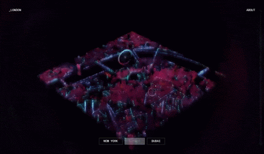
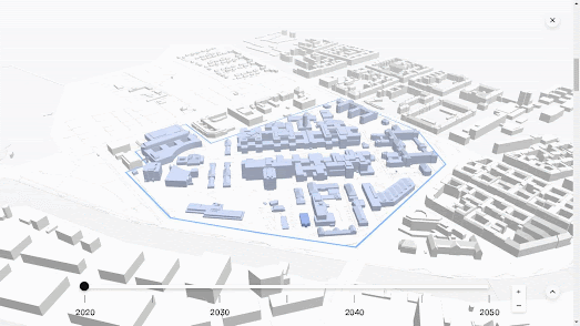
This year's list also includes a significant number of maps made by 'Other' mapping libraries. Among these are a number of very impressive animated 3D maps / models which were created by online news websites to illustrate important stories. These include:

To this list I could have probably added a number of other 3D animated maps created by the New York Times (however those maps are all hidden away behind a paywall).

If I've failed to link to your favorite interactive map of 2021 feel free to berate me in the comments below and leave a link to your favorite map(s).

Real-Time Map Annotations

The JavaScript image annotation library Annotorious has created a demo application which allows you to annotate a map in real-time in collaboration with other users.

You can view the Annotorious real-time annotation demo in action on this Thayer's Map of New Mexico. Using the drawing tools provided you can highlight any area on this vintage 1880 map and add your own annotations. Share the URL of the map with your friends and they can then click on the areas that you have highlighted to read your annotated notes. They can even add their own annotations to the map. 

The Annotorious demo works with any map which has a IIIF manifest (for example most of the maps in the David Rumsey Map Collection). Here is an example using the 1633 Nova Yirginiae Tabula from the David Rumsey Collection. To create this map I just cut & pasted the id number of the map (from the map's IIIF manifest) into the Annotorious demo URL. Each time you add a new manifest ID to the URL you create a new instance of the Annotorious demo.

The map doesn't have to be from the David Rumsey collection. You can use any IIIF manifest with the Annotorious demo. You don't even have to use a map, as you can use the IIIF manifest of any image. For example here is an image annotation demo using a Van Gogh self-portrait.

Wednesday, December 29, 2021

Mapping the Weather Around Me

I'd quite like to get out of London for New Year's Eve. Consulting WhereTo shows me that many of the cities within a 200km drive from London are expecting rain on New Year's Eve and /or New Year's Day. Birmingham and Bristol are forecast rain on both days. Coventry and Leicester are forecast rain on New Year's Eve, and Southampton and Portsmouth are forecast rain on New Year's Day. 

If I want to avoid the rain this weekend then I need to head to Reading or Nottingham. These are the only two cities within a 200km radius currently forecast to have no rain on either New Year's Eve or New Year's Day. 

If you are thinking of taking a mini break in the next week then you can also use WhereTo to find the city with the best forecast weather within a defined distance of any location. WhereTo is an interactive map which allows you to check the weather forecast in the largest cities within a given radius of the location of your choice. 

Click on the WhereTo interactive map and it will find the ten biggest cities in a radius around that location. The map sidebar will then display the weather forecast in those cities for the next eight days. A slider control at the top of the map sidebar allows you to adjust the size of the radius within which you wish to search. WhereTo uses the Openweathermap API to display weather on a Leaflet.js interactive map. You can explore the mechanics of WhereTo in closer detail for yourself on the map's GitHub page.

Tuesday, December 28, 2021

Mapping the Polar Heat Cap

Kenneth Feld of Cartoblography has published his list of his Favourite Maps 2021. His selection of some of the best maps of the past year includes Greg Fiske's visualization of the Polar Heat Cap for the Woodwell Climate Research Center. 

Update: Greg has now released an interactive version of his Warming of the Arctic by 2060 map. This interactive version of his polar heat cap visualization uses the Esri mapping platform to show the disproportionate warming of the Arctic compared to the global average.

In Understanding the global threat of a rapidly warming Arctic the center explains how Arctic regions are warming at a much faster rate than the global average. Greg's distorted 3D globe uses elevation to visualize the disproportionate effect of climate change on the Arctic compared to the rest of the world. On this globe elevation visualizes projected global temperatures in 2040-2060.

Temperatures in the Arctic have already warmed at a faster rate than the global average. This can be seen on Aodhan Sweeney's visualization of A Century of Surface Temperature Anomalies. Sweeney's webGL globe uses NASA GISTEMP v4 data to show how temperatures on Earth have changed over the past century.

On Aodhan's interactive globe height bars are used to show global temperatures. Again the use of a 3D globe provides a very effective visualization of the Polar Heat Cap. The red height bars on this webGL globe clearly show how the Arctic is already warming at a faster rate than in most other regions around the world.


The Maps Mania round-up of the best Maps of the Year 2021 is also out now!

Wednesday, December 22, 2021

Hologram Cities

Digital City is an impressive experimental map which uses OpenStreetMap data to create a 'hologram style' map "showcasing the connectivity of people within a modern urban area'. 

Visit Digital City and you can choose to view hologram style maps of either New York, London or Dubai. As you can see from the GIF above each city is visualized with pulsating colors to create a hologram style effect. This sci-fi ambience is enhanced by the addition of a spectral sound-track to each map. You can actually pan around each city map and even click on certain city landmarks to view contextual information.

The three city maps were created using OpenStreetMap location data with three.js.

Monday, December 20, 2021

Mapping the Global Climate Crisis

Last week I reviewed CrisisGroup's interactive map How Climate Change Fuels Deadly Conflict. On this map CrisisGroup shows where in the world climate issues, like water scarcity and climatic volatility are leading to conflicts between different communities and countries.

You can also explore the impact that climate change is already having on people across the world on the Communities in Crisis interactive map. Communities in Crisis is a new online book which looks at the impact that climate change is having on communities around the globe. The book consists of 12 chapters, each of which deals with a specific threat from climate change, including threats such as rising sea levels, drought, extreme heat waves and food and water insecurity.

Each chapter on a specific climate change threat is made up of a collection of essays, written by students at Penn University. These essays examine individual communities around the world which are being impacted by global heating. For example the opening chapter looks at communities which are suffering from drought. This chapter includes a number of essays, including an essay outlining the conflicts between farmers and the Mexican government in the State of Chihuahua, Mexico. Two people have already been killed by the National Guard during protests against the La Boquilla Dam and the exporting of scarce water supplies to the USA.

The interactive Communities in Crises Map at the beginning of the book provides an overview of communities around the world who feature in the online book. It also allows you to navigate the individual essays featured in the book by location. If you select a marker on this map you can click through to read the climate crisis essay written about that specific community.

Saturday, December 18, 2021

Santa's Wish Tracker

Have you written to Santa yet? Don't worry if you haven't because you can now send your wishes to Santa on a Google Map.

Enter your wish into the Ubilabs Christmas Wish Tracker and you can follow its journey all the way from your home to Santa's post office in Finland. After you share your wish and location with the Wish Tracker you can view an animated map showing the journey of your wish being transported around the world on its way to Finland. 

On this journey your wish will be transported by plane, boat, bluebird, train and reindeer. Your wish will also stop at a number of different locations around the world before it arrives in Finland. These locations include a Christmas Tree Nursery, a biscuit market, and a matryoshka workshop.

The Christmas Wish Tracker virtually sends your wishes to Santa's Post Office in the Santa Claus Village in Rovaniemi, Finland. You can pay a virtual visit to the Santa Claus Village for yourself using Google Maps Street View. Google Maps actually has  Street View imagery from inside Santa's Post Office (which receives up to 32,000 letters from children around the world every day).

Friday, December 17, 2021

Vaccine Rollouts by Country

The Guardian has mapped out the rollout of the Covid vaccine around the world to explore which countries have vaccinated faster and why some countries have been able to vaccinate their populations much faster than others. Which countries rolled out vaccines faster – and why includes two maps which visualize the rollout of vaccines around the globe.

The first map in The Guardian article uses data from Our World in Data to show the rate of the vaccine rollout in countries around the world over the last year. It shows the number of vaccine doses administered per 100 people over time. The second map in the article quickly tweens into a graph which plots country GDP against the number of people vaccinated in a country. This graph shows that  there is a clear correlation between a country's wealth and the rate and scope with which a country was able to rollout vaccinations. 

Wealthy countries, such as the UK and the USA, have in general managed to rollout vaccines more quickly and to more people than poorer countries. The Guardian suggests however that wealth is not the only factor in the speed and expanse of vaccine rollouts. Supply issues have also been a factor in vaccine rollouts. Some wealthier countries may have been able to afford to rollout nationwide vaccine programmes early on but were hampered by limited supplies. 

Over time supply issues have become less extreme and as a result some countries in the Asia-Pacific region have overtaken some European and North American countries in the percentage of the population vaccinated. However, as you can see from the map above, many countries in Africa still have very low levels of their populations vaccinated. This could be dangerous for the whole world. If some countries are left vulnerable to large Covid-19 outbreaks then new variants are more likely to develop. It is therefore clear that wealthier countries around the world have to do more in supporting poorer African countries both economically and through the supply of vaccines.

Thursday, December 16, 2021

Searching for the Big Bang

The James Webb Space Telescope's launch date is currently set for the 22nd December. The telescope's destination is the second Lagrange point, some 930,000 miles from Earth, directly opposite to the Sun. When in position the space telescope will be able to see into the furthest reaches of space up to13.8 billion light-years away. It will be able to detect light from the oldest stars and galaxies in the universe.

You can learn more about the James Webb Space Telescope (JWST), how it works and what it might detect in the LA Times' Finding the Big Bang. In this impressive scrollytelling visualization the Times not only explains the JWST's mission but uses 3D modelling to show where the telescope will be positioned. As you scroll through the article a 3D map of the Solar System reveals the location of the Hubble telescope and the Lagrange point (L2) from where the JWST will observe the universe's oldest stars.  

This model of the Solar System then rotates to show how the JWST's orbit will be synchronized to the Earth's orbit around the Sun, in order for the telescope to be able to maintain constant communication with the Earth. Towards the end of the article 3D models of the telescope and the Ariane rocket in which it will be travel to its L2 point show how the JWST will be launched and deployed into space. These animated 3D models also show how the JWST will unfold its sun shield in space in order to block light and heat from the Sun and protect the telescope from radiation.

The JWST should begin to send data back to Earth six months after its deployment. It will be operational for up to ten years. The telescope needs fuel in order to maintain its orbit. The JWST therefore does have an upper limit to its operational life.

Wednesday, December 15, 2021

Mapping Future Construction Plans

The Charité university hospital in Berlin has ambitious expansion plans. Over the next few years, under its 'Rethinking Health' strategy, the hospital plans to develop its four campuses in order to further support health care in Berlin and to provide the hospital with cutting edge research facilities. These construction plans for the hospital can be viewed on an impressive new interactive map.

The interactive map in Building the future. The new Charité includes four map insets, showing the building footprints of each of the hospital's four Berlin campuses. The map also includes a timeline control which allows you to view how each campus will be developed over the next thirty years. Move the timeline forward and blue building outlines are added to the map to show where the hospital plans to erect new buildings. 

If you click on one of the four inset maps you can view the chosen campus in full-screen mode. In this full-screen mode you can click on any of the blue 3D building outlines to learn more about that individual construction plan. It is also possible to rotate the map and to change the map's pitch by clicking and dragging on the 3D map.

The hospital was able to visualize its Rethinking Health vision with the help of the location intelligence company Ubilabs. You can learn more about how Ubilabs used three.js and WebGL to turn the hospital's architectural plans into a fully interactive 3D map on their blog post, Interactive 3D architecture models bring Charité's building plans to life.