Saturday, May 31, 2025

Is it Hot Right Now?

Is the UK hot right now? is a new interactive map that displays live, hour-by-hour temperatures across the country and shows how these temperatures compare to the historical average.

On the map, colored numbered markers indicate how much the current temperature is above or below the average at various locations. Clicking on a location’s marker opens a chart showing all recorded temperatures at that site since 2000. This chart includes a line representing the mean temperature, along with an evaluation of how the current temperature compares to the long-term average.


The UK version of the temperature comparison map was inspired by the Australian website Is it hot right now?. The concept offers a powerful visualization of climate data, and by comparing current temperatures with historical norms, it succeeds in making global warming feel far more tangible and relatable.

Is it hot right now? has proven to be a compelling, data-driven communication tool in the climate change conversation, prompting versions to emerge in other countries. In addition to the Australian and UK versions, there is a Spanish version - Es hoy un extremo? - and a German version - Ist es heiss? - (limited to the city of Bochum).

Friday, May 30, 2025

How the US Arms the Mexican Drug Cartels

There are only two gun stores in Mexico, and both are located on military bases. Yet the country still suffers from a major gun homicide problem. So where are the guns coming from?

In 2015, a Mexican military helicopter was shot down by cartel fighters using a Browning machine gun and a Barrett .50-caliber rifle. Both weapons were traced back to legal purchases in U.S. gun shops. This stark example highlights a brutal reality: Mexico’s gun violence crisis is fueled by American guns.

Mexico’s biggest challenge is that it shares a border with a country where almost anyone can legally purchase a gun. A significant number of these firearms are then trafficked across the border, primarily into the hands of violent drug cartels. According to The Conversation, an estimated 135,000 guns are smuggled annually from the U.S. into Mexico.

The Conversation, in Mexican drug cartels use hundreds of thousands of guns bought from licensed US gun shops, has been investigating the flow of illicit weapons trafficked from the U.S. to Mexico. The map at the top of this post shows that the majority of the firearms trafficked to Mexico came from cities and small towns that are close to the Mexican border. The article also features an interactive map showing the widespread presence of drug cartels across Mexico. This visual data underscores that trafficked American guns are contributing to violence in nearly every region of the country.

The gun violence crisis in Mexico cannot be fully understood without acknowledging the role of the United States as a major source of illicit firearms. While Mexico maintains some of the strictest gun control laws in the world, they are undermined by the easy availability of weapons just across the border. This cross-border flow of guns from the United States empowers criminal organizations, destabilizes communities, and fuels a cycle of violence that affects both nations.

Thursday, May 29, 2025

Belt & Road vs TACO

In 2013, China launched its Belt and Road Initiative (BRI) to boost trade with the rest of the world. Today, China is the world’s largest trading nation.

A key component of the BRI has been major investments in strategic overseas ports and airports. The Council on Foreign Relations has tracked these developments through two interactive maps:

These maps highlight the global reach of China’s infrastructure investments, showing the locations of ports and airports with Chinese investment or partial ownership. In total, 129 ports worldwide now have some degree of Chinese ownership, and 46 airports have received Chinese investment.

China’s overseas port and airport investments reflect the broader ambition of the Belt and Road Initiative - to reshape global infrastructure in ways that advance both its economic and strategic objectives. While these projects can bring development opportunities, they also raise important concerns about ownership, sovereignty, and influence. The Council on Foreign Relations’ maps reflect these complexities, particularly through assessing each port's suitability for use by the Chinese military.

While China expands its global reach through the Belt and Road Initiative, the United States’ trade policy has taken a more erratic turn. Some Wall Street traders have dubbed it “TACO”,  short for “Trump Always Chickens Out”, a reference to the pattern of aggressive tariffs being announced, only to be walked back or removed shortly afterward. This inconsistency stands in stark contrast to the long-term infrastructure strategy China is pursuing.

Wednesday, May 28, 2025

Taxing for War

The average American spends nearly $3,000 a year funding the military. In contrast, if those Americans lived in Haiti, they would contribute just $1.70 per year to military spending.

The World BEYOND War's Mapping Militarism project presents a series of maps that illustrate how much individual countries spend on their militaries. The site’s “Money” map includes two key views: one showing the total military expenditure of each country and the other displaying per capita military spending. Both views offer a compelling way to compare global military budgets.

In 2024, the United States spent approximately $997.31 billion on its military - an amount that far surpasses the spending of any other country. By comparison, China, which has the second-largest military budget, spent $313.66 billion. However, when it comes to per capita spending, Israel ranks first, with an average of $4,988 per citizen. The United States follows, at $2,895.10 per person.

This disparity highlights not only the vast scale of U.S. and Israeli military investments but also the priorities and impacts of military funding across different societies.

Tuesday, May 27, 2025

The Largest Gathering in Human History

The Maha Kumbh Mela is one of the largest religious gatherings on Earth. It is a Hindu pilgrimage festival that occurs every 12 years. The 2025 Maha Kumbh Mela, held in Prayagraj, was particularly significant because it was a “Maha Kumbh”, an event that takes place only once every 144 years, due to a rare celestial alignment.

During the 2025 Maha Kumbh Mela, an estimated 663 million pilgrimages were made over a 45-day period. That’s equivalent to the combined populations of Russia, Japan, Vietnam, Brazil, Italy, and Australia. In fact, according to Reuters, “If this amount of people formed their own country, they would be the third largest behind China and India.”

It’s hard to envision the sheer number of people who attended this year’s Kumbh Mela in Prayagraj. However, Reuters attempted to visualize it. In their feature Faith in numbers: The unprecedented scale of India’s Maha Kumbh festival, the news agency used satellite imagery to explore the vast site of the gathering. The imagery takes viewers on a visual tour of the Ganges River and several key pilgrimage locations - including the site where 30 pilgrims tragically lost their lives in a stampede on January 29.

Reuters also uses flower petals as a creative way to illustrate the massive scale of attendance. During the festival, flower petals are traditionally showered on devotees and used to welcome spiritual leaders. In Reuters’ visualization, one petal represents 10,000 people. These petals are grouped into squares, each symbolizing 1 million people, to represent the 663 million pilgrimages. Let’s just say - it takes quite a bit of scrolling to see the full 663 million in the Reuters' visualization.

Monday, May 26, 2025

Unlocking Google’s Hidden Maps

Google's My Maps is a free tool that allows users to create custom maps. It's particularly useful for planning trips, visualizing geographic data, or sharing directions and locations with others.

Given the popularity of My Maps, there are likely millions of maps containing valuable local knowledge created by users around the world. Unfortunately, Google does not provide a centralized directory or searchable index of all public My Maps. While some public maps are technically indexed by Google, they are not easily discoverable through standard search methods.

This is where mapShare steps in - to fill in what the developers believe is a major gap. mapShare is a new platform designed to help users share and discover custom Google Maps. It acts as a community-powered discovery engine for My Maps, allowing users to tap into the vast but often hidden world of public custom maps.

🔍 Search by Location or Subject

You can use mapShare to search for maps based on either geographic location or topic. Whether you're looking for coffee shop guides in Tokyo, historical walking tours of Edinburgh, or national park maps in the U.S., mapShare makes it much easier to uncover useful and relevant maps created by Google's My Maps users.

📂Create and Curate Lists

Found a bunch of amazing maps about cycling in Europe or vegan eats in New York? With mapShare, you can create your own lists of favorite maps, organized however you like. These lists become personal libraries of curated knowledge - ideal for trip planning, research, or just collecting inspiration.

👥 Share With Friends and Family

Planning a group trip? Exploring your city with a partner? With mapShare, you can share your map lists with others, via a direct link or through social media, making it easy to collaborate or simply pass along helpful info.

Drawbacks

At the moment, when I search my neighborhood on mapShare, I’m met with a "results not found" message. This highlights one of the current drawbacks of relying on the crowd to curate Google’s My Maps. As an early adopter of mapShare, you may also encounter gaps in coverage - gaps that will only begin to close as the platform gains more users and contributions.

Saturday, May 24, 2025

The Google Maps Platform Awards

To mark two decades of mapping innovation, Google has announced the Google Maps Platform Awards, a new program created to celebrate the developers and innovators who have shaped the digital mapping landscape over the past 20 years. For those who build with geospatial tools, APIs, and data this is your opportunity to showcase your best work.

Google aims to recognize the impact that developers have made with an awards program designed specifically for the community that made it possible. Submissions are now open for both new and past projects, and the deadline for submissions is 31st July. 

Submit your projects on Devpost.

A range of prizes is on offer for award winners, including physical trophies, digital badges, promotional opportunities, and some exclusive Google Maps swag.

You can learn more about the Awards, the ten award categories, and how to enter on the Google Maps Platform website.

Friday, May 23, 2025

Underwater Weather Forecasts

Current Map by Current Map is a powerful tool for visualizing ocean dynamics. This interactive map uses animated streamlines to depict tidal currents in coastal areas of the United States, offering high-resolution, real-time, and forecasted ocean current data. It's a practical, visually striking resource for sailors, scientists, and anyone with an interest in the ocean’s ever-changing tidal forces.

Animated streamlines are often used on interactive maps to visualize real-time and forecast wind currents. This is the first time I've seen them used for actual water currents. The use of animated streamlines on a map was I believe first demonstrated on Fernanda Viégas and Martin Wattenberg's Wind Map. Cameron Beccario further developed the concept by utilizing animated streamlines on a fully interactive map in his popular Earth Nullschool visualization of global weather conditions.

Behind the scenes of Current Map, sophisticated physics models simulate real-world ocean conditions, taking into account factors like tides and wind forcing to produce accurate short-term forecasts. Users of the map can explore these tidal forecasts directly in their browser, or download GRIB files for use with navigation software, making the data accessible even when offline. 

Thursday, May 22, 2025

Is Flying Becoming More Dangerous?


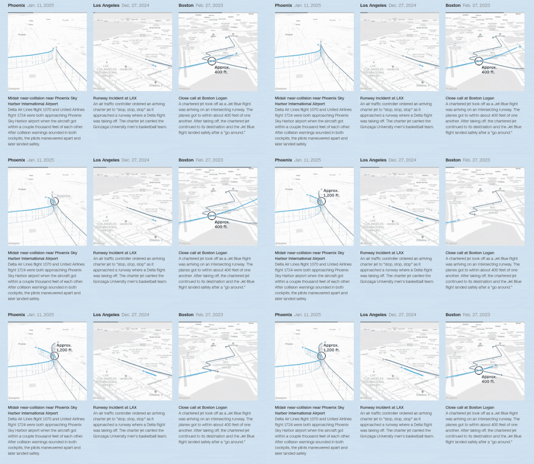
CNN has used the Mapbox mapping platform to create a number of impressive animated mapped visualizations of recent 'plane close calls' at major U.S. airports. These animations are part of the interactive article Visualizing airplane safety: Are close calls and crashes really that common?, which investigates recent aviation incidents and public concerns about flight safety.


One of the most striking features of CNN’s visual storytelling is the use of Mapbox’s 3D tilt setting, which provides an oblique, dynamic viewpoint of each incident. This allows viewers to see aircraft movements not just across the map, but also through vertical space - highlighting changes in altitude, flight paths, and the proximity between planes. The animations use real flight data to reconstruct moments when aircraft came dangerously close to one another, often just seconds or hundreds of feet apart. These visualizations very effectively translate the technical aviation data into a clear picture of what would otherwise be mere abstract descriptions.

If you are concerned about whether flying is becoming more dangerous, CNN ultimately concludes that the underlying data does not support an increase in plane crashes or close calls. While the visualizations may appear alarming, the article reminds readers that these incidents are still statistically rare, and commercial air travel remains one of the safest modes of transportation. 

Wednesday, May 21, 2025

Map Any Event in History (or Fiction)

The Battle of Hastings mapped by th Map Simulation Platform

The Map Simulation Platform is a hugely ambitious project that uses AI to simulate text prompts in 3D on an interactive map. It employs natural language processing to interpret a prompt and render it on a geographical canvas. It's similar to a text-to-image AI tool, except here the output is a dynamic, map-based scenario rather than an AI generated image.

Using the tool, you can simulate historical events such as the Battle of Hastings, the Battle of Goose Green, or virtually any other historical event you'd like to see replayed on a map. It's also possible to simulate hypothetical scenarios, such as an earthquake in New York or a global nuclear war.

The Map Simulation Platform clearly has enormous potential as a tool for chronologically simulating important historical events. At present, it does a commendable job of extracting locations from historical narratives, geolocating them accurately, and plotting them on the map. However, from the examples I’ve explored so far, the playback options can feel a little chaotic, making it difficult to follow the sequence of events in a clear, chronological order.

One improvement that would greatly enhance the experience is the ability to view the timeline of a simulated historical event in distinct stages. If users could move forward and backward through the timeline using simple navigation buttons - and see an information window explaining and contextualizing each stage - it would make the platform a truly powerful historical tool. Allowing users to edit and expand on these events would also be essential for users who want to share their simulations. This would enable corrections of any AI “hallucinations” or factual inaccuracies, as well as the addition of missing but important events.

The platform does already offer the ability to download simulation data as a GeoJSON file. This means that users proficient with popular mapping platforms can export simulation data and build their own guided maps for historical events - adding customized context or supplementing any missing information.