Is Flying Becoming More Dangerous?
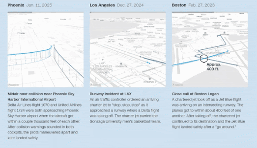
CNN has used the Mapbox mapping platform to create a number of impressive animated mapped visualizations of recent 'plane close calls' at major U.S. airports. These animations are part of the interactive article Visualizing airplane safety: Are close calls and crashes really that common?, which investigates recent aviation incidents and public concerns about flight safety.

One of the most striking features of CNN’s visual storytelling is the use of Mapbox’s 3D tilt setting, which provides an oblique, dynamic viewpoint of each incident. This allows viewers to see aircraft movements not just across the map, but also through vertical space - highlighting changes in altitude, flight paths, and the proximity between planes. The animations use real flight data to reconstruct moments when aircraft came dangerously close to one another, often just seconds or hundreds of feet apart. These visualizations very effectively translate the technical aviation data into a clear picture of what would otherwise be mere abstract descriptions.
If you are concerned about whether flying is becoming more dangerous, CNN ultimately concludes that the underlying data does not support an increase in plane crashes or close calls. While the visualizations may appear alarming, the article reminds readers that these incidents are still statistically rare, and commercial air travel remains one of the safest modes of transportation.


Comments