Friday, February 10, 2012

Hand Drawn Google Maps


With the help of over 200 students from University College London, the Centre for Advanced Spatial Analysis created this UCL Hand-Drawn Map of London.

The hand-drawn map has been imported into Google Maps, presumably using the department's own GMap Image Cutter. It is interesting to zoom and pan around the map and explore how the students' perceive the world around them and how they view London's many suburbs and areas.


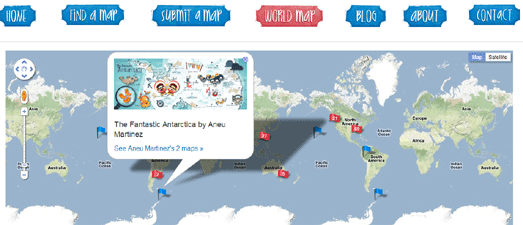
They Draw & Travel is a collection of wonderful user submitted hand-drawn maps.

A Google Map of submissions lets you browse the hand-drawn maps submitted to the They Draw & Travel website. You can click on any of the map markers to view the hand-drawn map submitted for that location.


Claire Murray;s Map of Edinburgh

Claire Murray is the creator of a hand-drawn map and guide to Scotland's capital city, which you can buy for only $10. The guide includes: where to find the best breakfasts; real pubs; fancy cocktails; what to do on a rainy day; how to conquer Arthurs Seat and a hell of a lot more.

Claire has used the Google Maps API to present her hand drawn map of Edinburgh on-line. The map uses the Google Map controls so it is possible to zoom in on the lovely detail of Claire's map, for example the naked ladies next to the Blue Blazer.

Thursday, February 09, 2012

The Canadian Census on Google Maps


Global News has been busy mapping the 2011 Canadian census for 15 cities. Mapping the Census, Tract by Tract maps the population data captured by the 2011 census down to individual tract level.

Users can click on any of the individual tracts displayed on the Google Map and view the 2005 and 2011 population at that location and the population change in those five years. Individual tracts are also colour-coded on the map so users can tell at a glance which areas in each of the cities mapped are showing population growth or loss.

Wednesday, February 08, 2012

Martian Street View


A couple of week ago I started working on creating a Martian Street View Map using panoramas of Mars captured from NASA's Mars' missions.

I ran into a few problems with the map and more or less gave up on the project until Rob of Map Channels stepped in and kindly offered to help. Thanks to Rob we now have a working Martian Street View Map

There are a few problems with the map - all of which are due to me and are not a result of Rob's excellent work. I had a lot of difficulty working out where the panoramas should be located on the map - in fact I'm fairly certain I've actually put nearly all of them in the wrong place (if you spot errors in the geo-location of the images and know the correct latitude and longitude for Google Mars please let us know in the comments).

There are also some problems in the way different browsers display the panoramas. I think the Street Views should display properly in Firefox but may look strange in some versions of Chrome and Internet Explorer.

John Snow's Cholera Map on Google Maps


CartoDB is a great platform that allows you to map data and develop location aware applications quickly and easily. In CartoDB's demo gallery you can find this example of John Snow's Cholera Map of London presented with CartoDB.

The map demonstrates how CartoDB is able to quickly combine different data-types and display them on a map. John Snow's spot map of a cholera outbreak in Soho, London in 1854 helped to prove that the disease was caused by water (coming from one pump in Broad Street).


If you want to see John Snow's original map using the Google Maps zooming and panning tools then you should check out Hypercities.

Hypercities is a Google Maps mashup of historical maps available for many of the world's cities. Hypercities allows the user to navigate a selection of historical maps using the familiar Google Maps navigation tools. If you zoom into London on Hypercities you can choose to view John Snow's map overlaid on top of the modern map of London.

Syrian Tweets on Google Maps


The Syrian city of Homs is entering its fifth day of heavy bombardment from President Bashar al-Assad's Syrian regime.

Mibazaar has rolled out his popular Tweet mapping format to show Twitter messages posted from within a 400 mile radius of Damascus, Syria. His Syria Protests map animates through the latest Tweets with the hashtag #Syria, showing a new message after every 4-5 seconds.

Tuesday, February 07, 2012

New 45° imagery for 24 cities


San Sebastian City Hall, Spain

Google Maps just got a huge new update of 45° imagery (Bird's Eye View) for 24 cities.

The update includes oblique aerial view imagery for 15 U.S. and 7 international locations, including San Sebastian and Pamplona in Spain and Buenos Aires in Argentina.

Here's the full list of updated imagery:

US:
Charleston-Folly Beach, SC; Lee’s Summit, KS; Lexington, SC; Magna (Salt Lake City), UT; North Charleston, SC; Pine Island Center, FL; Plymouth, MN; Salinas CA; Santa Rosa, CA; Shawnee, KS; South Hill, WA; Spanish Springs, NV; Killeen, TX; Decatur, AL

Europe:
Torrelavega, Spain; Pamplona, Spain; San Sebastian, Spain; Bailen, Spain; Rolle, Switzerland; Ponferrada, Spain; Wachtberg, Germany; Weinheim, Germany

South America:
Buenos Aires, Argentina

Via: Google Lat Long

Congressional Nepotism on Google Maps


The Washington Post's Mapping the Earmarks uses the Google Maps API with some custom map tiles to show where congressional representatives have directed earmarks and other public projects next to or within about two miles of their own property.

The data for the map comes from public records on the holdings of all 535 members. The Post's investigation also found examples where tax dollars were given to companies, colleges or community programs where representatives' "spouses, children or parents work as salaried employees or serve on boards".

The History of Weather on Google Maps


Weather Underground's WunderMap now allows the user to view historical weather records on a Google Map.

A calendar control above the map allows the user to select a date and view the historical weather records for that day. The records include radar, storm reports and even weather related photographs and webcam images taken on that day.


WeatherSpark also lets you view historical weather on a Google Map, giving you access to the historical records of over 4,000 weather stations.

If you want to know what the weather was like in Honolulu on the day of Barack Obama's birth in August 1961 all you have to do is use the time-line to bring up the correct date, and centre the map on Honolulu. You can then view the recorded weather for that day (a balmy 30 degrees centigrade).

As well as the map view WeatherSpark has an impressive time-line interface that allows the user to visualise changing temperatures, precipitation and cloud cover through time.

Monday, February 06, 2012

Fun Flight Guides with Google Maps


I've been a long time fan of The Royal Geographic Society's Hidden Journeys website. The Hidden Journeys Project enlivens the flying experience and transforms it into a fascinating exploration of the people, places and environments being flown over.

Hidden Journeys has just released their latest journey guide for those flying over the mountainous landscape that lies between Denver and Seattle, including the rugged Wind River Range in Wyoming; Craters of the Moon National Monument and the Salmon River Range in Idaho, the picturesque Palouse Region and the Cascade Mountains of the Pacific Northwest.


You can view the flight path on a Google Map and use the guide to learn how the power of glaciers, rivers and the wind have shaped these mountains into some of the highest peaks in the continent. See the classic cones of the Cascade Mountains as you descend towards Seattle, and discover the influence these active volcanoes have on the Pacific Northwest, from the impact of devastating eruptions to the ash-fall deposits that have created the most productive farming region in the country.

If you are planning a flight any time soon then make sure you check out the Hidden Journeys website to see if they have a guide for your journey.

Get an Uberlife with Google Maps


Uberlife is a website and iPhone app that helps you discover and join 'hangouts' taking place around you.

Using uberlife it is possible to find nearby events and hangouts happening right now or that are occurring soon. Users can add their likes and interests to their profile to ensure that they receive suggested hangouts from like-minded people. Users can also 'follow' other users to receive their 'hangout' suggestions.

To add a suggested hangout simply involves suggesting a venue (with the help of Google Maps), entering the time and date and adding some information about the hangout. If you find a hangout that you wish to attend you can view the location of the venue with the help of the Google Map added to the hangout page.