Tuesday, September 05, 2017

Halibut Mapping


The International Pacific Halibut Commission (IPHC) carries out annual surveys to assess halibut stocks in eleven regulatory areas, from northern California to the Bering Sea. A new interactive map has used this survey data to visualize how the numbers and size of halibut in the Pacific Ocean have drastically fallen since 1998.

Mapping change in weight, length, and abundance of Pacific Halibut: 1998 - 2015 visualizes two quantifiable facts about halibut stocks in the survey areas. The colored circular markers show both the total pounds of halibut (size of marker) and the percentage of halibut over 32 inches (color of the marker). This means that users are able to easily visualize the falling numbers of halibut and the reduction in size of the fish.

This reduction in size and numbers of Halibut in the Pacific is reinforced by the overall numbers in each survey area. If you hover over a regulatory area on the map you can view the number of halibut, the total pounds of halibut and the percentage over 32 inches for the selected year. A bar graph also dramatically highlights the shrinking numbers of halibut since 1998.

The good news is that halibut numbers in the last few years have improved in many of the regulatory survey areas, especially in those along the west coast of Canada and the USA. This is probably due, to some extent, to the conservative management of fish stocks over the last decade.

This halibut stocks map was created by Lis Fano. You can view more of her maps on her online portfolio.

Mapping Animal Migrations


The Military Mutual has created an interactive map showing the incredible migratory journeys undertaken by animals around the world. The map shows selected journeys made by species which every year travel incredible distances by land, sea and air.

The lines on the Strength in Numbers map show the direction and locations of the selected animal migrations. The circles represent the size of the migrating population. You can click on each of these circles on the map to view the featured animal species and the total number of miles completed in its annual migration.

Below the map you can view some interesting statistics about animal migrations. For example, Arctic Terns fly around 55,923 miles on their migration. To put that in perspective that's more than twice the circumference of the Earth. In terms of numbers the Silver Y moth stands out. 250,000,000 Silver Y moths migrate every year.

Strength in Numbers goes on to look at how animal migrations compare to notable journeys made by humans; the ‘manpower’ of the British Armed Forces; and also takes a quick look at the animals who work alongside the British Armed Forces.

Monday, September 04, 2017

Mapping Aboriginal Place Names


I linked earlier today to the Muru View application which superimposes the original indigenous place-names of Australian locations on top of Google Maps Street View. That application uses data  from historical surveys from the Royal Anthropological Society of Australasia. The work recovering the data used in Muru View was undertaken by the State Library of New South Wales.

The library has used this 100 year-old survey data to create their own map showing the location and meaning of Indigenous Australian place names. The Weemala map allows you to browse the surveys and letters of the Anthropological Society of Australasia Survey. Each time you open a survey page or letter in Weemala any indigenous place-names in the text are also geo-located on a Leaflet map. If you click on any of the locations marked on the map you can find out the aboriginal place-name's meaning in English.

You can learn more about how the map was created in this Building Weemala blog post.

You might also like:

Muru View - Aboriginal place-names in Street View
Singing the Country into Life - exploring indigenous songlines
Colonial Frontier Massacres in Eastern Australia 1788-1872 - a map of aboriginals killed in the frontier wars

On the Road 2.0


If Jack Kerouac was alive today he could avoid all that budget travel, teenage angst and broken dreams by traveling across the USA on Google Maps Street View. That's what Lionel Tardy did. And he's documented his virtual journey in A Road Trip Through West USA.

A Road Trip Through West USA is a hyperlapse journey using Google Maps Street View images. It animates a roundabout journey from LA to San Francisco (via Las Vegas) as seen on Google Maps Street View. You can experience the whole 3,500 km journey by watching this animation of 344,118 Street View images. Alternatively you can take a short-cut by jumping to locations along the route by clicking on the route plan along the bottom of the screen.

If you want to make your own Street View road-trip then you can use the same script that Lionel used to make his journey. Lionel's Roadtrip script is available on GitHub. The script automatically downloads the links to all the Street View images from your chosen starting location to your destination (it actually gets one every 10 meters but you can change that to any distance you want). The road-trip script will then load one image every 40ms and display it as an animated Street View journey.

Also see: Hyperlapse - another JavaScript hyperlapse utility for Google Maps Street View

How Will East & West Berlin Vote?


German newspaper Tagesspiegel has been investigating how Berlin neighborhoods have voted in all general elections since the fall of the Berlin Wall. With the next Federal Election just a few weeks away the paper wanted to explore how Berliners have voted in previous elections and in particluar whether East and West Berlin are still generally supporting different political parties.

The Wie Berliner Kieze seit der Wende wählten interactive map allows you to view the votes for each political party in each of the last seven federal elections in each electoral district in the city. The map includes visualizations and detailed analysis of the performance of each of the parties in each election in Berlin.

You can view the performance of each of the political parties separately in each election by selecting the party and the year of the election. You can read the Tagesspiegel's analysis of the party's performance in each of the federal elections in the map side panel. The article below the map examines in more detail the different voting histories of East and West Berlin in each election since the reunification of Germany.

Aboriginal View


Muru View superimposes the original indigenous place-names of Australian locations on top of Google Maps Street View - in 3d! The application uses place-names used in historical surveys from the Royal Anthropological Society of Australasia to map the original indigenous place-names of locations in New South Wales. It superimposes the place-name labels for each of these locations on top of its Google Map's Street View.

The actual implementation of Muru View is frustrating and inspiring in equal measure. I love the implementation of 3d text on top of Google's 360 degree panoramic imagery. There is something magical in watching the 3d Aboriginal (& English translation) place-names spin around as you rotate the Street View image.

However navigating to individual place-names on Muru View is incredibly frustrating. The only way to find individual place-names is to sit patiently while they all slowly scroll past you on your screen. I've no idea why Muru View doesn't have an overall map view. This world allow the user to navigate to the individual place-names by location, selecting them directly from the map.

You might also be interested in:

Singing the Country into Life - exploring indigenous songlines
Colonial Frontier Massacres in Eastern Australia 1788-1872 - a map of aboriginals killed in the frontier wars

Sunday, September 03, 2017

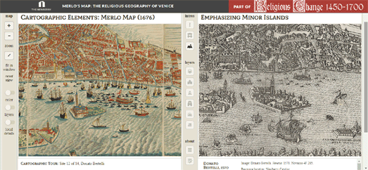
Merlo's Map of Reformation Venice


The Newberry library in Chicago has a major exhibition on Religious Change and Print, 1450-1700 opening on September 14th. In support of this exhibition they have put together an online collection of the Newberry's manuscripts, maps and images from the Reformation. This includes a superb interactive presentation of Giovanni Merlo’s engraved map of Venice from 1676.

The Newberry's interactive version of Merlo's Map includes information about the engraving and some of the Venetian locations depicted in the map. The colored circles on the map pick out some of Reformation Venice's most important churches, monasteries and printing centers. You can click on these circles to learn more about each highlighted location and view other illustrations of the location from the Newberry collection.

If you select the 'toggle maps' button (from the navigation buttons running down the center of the interactive) you can directly compare Merlo's Map side-by-side with other vintage maps of Venice. These other maps include Jacopo de Barbari 1500 map of Venice, Benedetto Bordon's map of 1534 and Paolo Forlani's Venetia from 1566.


If you like historical vintage maps then you might also like these interactive maps:

The Mappa Mundi (the largest surviving medieval map of the world)
The Gough or Bodleian Map of Great Britain (the oldest surviving route map of Great Britain)
The Oxford Outremer Map (a thirteenth-century map of Israel and Palestine)

Saturday, September 02, 2017

Before & After Harvey


This week the Washington Post wondered what would happen if you dropped a huge volume of water on other locations in the United States. It has put together a number of mapped visualizations which imagine the effect historic levels of flooding could have on other cities. Meanwhile Esri has used NOAA aerial surveys to show images of Houston before and after Hurricane Harvey.


The Washington Post's map What the Harvey deluge would look like where you live allows you to enter any location to view a visualization of the effect a 51.88-inch deluge of rain might have if it fell on that location. The map places a number of blue circles around your searched location. You can click on these circles to view the depth of flooding you could expect at that point based on its elevation.


The Washington Post also created a number of more realistic looking maps visualizing what the levels of flooding in Houston might look like in other cities. In What 500-year flooding could look like around five cities the newspaper has five interactive maps showing how Harris Co, New Orleans, Tampa Bay, Miami-Dade Co. and New York might look if they experienced "a once in 500-year flood". These five maps are based on population data from the 2010 Census and FEMA National Flood Hazard maps.

Of course we don't have to imagine what the effect a "once in 500 year flood" might have on a city. We can see the effect it has had on Houston.  Esri has released an interactive map which allows you to compare side-by-side aerial imagery of Houston taken before and after Hurricane Harvey.

Hurricane Harvey Post Event Imagery - Houston allows you to compare before and after imagery of a city devastated by flooding. The post flooding imagery comes from NOAA's storm damage aerial surveys of Houston.

Friday, September 01, 2017

New Cloudless Satellite Map


EOX has released an interactive cloudless satellite map of the world using imagery from the European Space Agency's Copernicus Sentinel-2 satellites. The Sentinel-2 Cloudless Map
uses satellite imagery of the Earth captured between May 2016 and April 2017.

EOX's Sentinel-2 Cloudless Map includes a labels layer which allows you to view country borders and place labels on top of the satellite map. The map also includes a 'tour' feature, which takes you on an animated tour of some selected locations around the world.

You can read more about the technical challenges EOX faced in creating this cloudless map on the Sentinel-2 Cloudless blog post. Interactive map developers can use the Sentinel-2 Cloudless map layer in their own interactive maps. The Sentinel-2 cloudless layer is provided under a Creative Commons Attribution-ShareAlike 4.0 International License.

800,000 Street Views of Amsterdam


The City of Amsterdam has added 800,000 panoramic images of Amsterdam to Mapillary, the crowd-sourced alternative to Street View. This new 360 degree imagery includes lots of Street View imagery of the city's canals captured by canal boat.

The best way to view the new imagery is by zooming in on Amsterdam on Mapillary. You can then select 'filters' and turn on the "Only show 360 panoramas" option. The green dots on the map show the locations of all the street panoramas and the blue dots show where the canal panoramas are located.

Mapillary has been analyzing the new Amsterdam imagery to help improve its base map of the city. Mapillary's neural networks are able to scan the imagery and pick out 80 different types of objects. These include large structures, such as bridges and buildings, and street furniture, such as benches and trash bins. This data can then be used to improve the map of Amsterdam on OpenStreetMap.

You can explore this data yourself in Amsterdam in 360: From Imagery to Map Data in Seven Days. This article includes a link to an interactive map which allows you to filter the panoramic imagery by object. For example you can select the 'bikes' object and view all the panoramic images in Amsterdam with bikes in them (it's most of them!).