Tuesday, July 12, 2022

In a Galaxy Far, Far Away

Today NASA has released the first images captured by the James Webb observatory. These include incredible pictures of the SMACS 0723 cluster, the Carina Nebula, Stephan's Quintet and the Southern Ring Nebula.

Professor Brant Robertson from the Astronomy and Astrophysics department at UCSC has released an interactive Leaflet.js powered map of the James Webb Telescope's first Deep Field image of SMACS 0723. SMACS 0723 is a huge cluster of galaxies in the Southern Hemisphere constellation Volans. 

You can also view interactive zoomable images of the newly released images on the dedicated Webb Space Telescope website. Their Gallery section includes high-resolution zoombale images of SMACS 0723, the Carina Nebula, Stephan's Quintet and the Southern Ring Nebula.

All four images can also be downloaded in high-resolution from the Image Resources page of the Webb Space Telescope website. This means that you can easily create your own interactive Leaflet.js maps of these galaxies far, far away. If you want to create a zoomable image map with Leaflet.js then you might find the image overlay section of the documentation helpful. 

The Migratory Journeys of Birds

eBird collects and documents data on bird distribution, abundance, habitat use, and trends. It has detailed information on more than 1,000 bird species around the world. This week eBird has updated its Bird Status maps so that they are now all interactive. 

Select a species of bird on the eBird Status and Trends webpage and you can view an interactive map which shows the species' 'Abundance', 'Range' and 'Habitat'. If you select the 'Weekly' option you can actually watch an animated map showing the species' relative abundance for every week of the year, revealing the species' migratory patterns.

If you are interested in bird migratory journeys then you can dive deeper into different bird species abundance patterns on eBird's Abundance Animations page. This section of the eBird website provides examples of abundance animations for a number of different bird species. For example the animation above shows the weekly abundance of the Gray-cheeked Thrush over the course of one year. Gray-cheeked Thrushes migrate to northern South America in winter. They then spend the summer months in Alaska and Canada.

The Globe of Bird Migration is a mapped visualization of the migratory paths of 11 different species of birds around the world. The simplified migratory paths of each of the 11 bird species are animated on a 3d globe over the course of twelve months. 

You can select to view the path of any of the 11 species using the menu on the left of the globe. When you select a species from the list you can view a few details about the birds' estimated population and conservation status. You can also discover where it breeds and winters and how far the species migrates.

The 3d globe was custom coded for the visualization using the Unity WebGL engine and 3DS Max.

Monday, July 11, 2022

Mapping the Health Effects of Climate Change

 
The Wellcome Trust has mapped out 120 years of climate data in order to explore the health effects of climate change. In Tracking the health effects of climate change you can see where around the world drought, flooding, extreme heat and climate-sensitive disease have affected the health of the local populations.

Select one of the four climate metrics and you can see how every country in the world has been affected by these climate events over the last 120 years on an interactive map. For example if you choose 'Drought' the interactive map will show the number of people affected, the total number of events and the damage caused by flooding in countries around the world.


You can also explore the health effects of climate change over time for individual countries. If you select a country from the drop-down menu you can view a map which shows climate anomalies by area and over time. For example if you select to view the flooding data for India you can see a map  showing where flooding anomalies have most occurred and a timeline of flooding anomalies by year (shown in the screenshot above). The timeline of flood events in India over time clearly reveals the growing problems of flooding in the subcontinent over the last few decades.

Friday, July 08, 2022

Climbing the Sierra Nevada Mountains

Climbers Nathan Longhurst and Travis Soares are both attempting to climb all 247 peaks in the 'Sierra Peaks Section' of the Sierra Nevada Mountains in the fastest time ever. You can follow along as they complete their challenge on their amazing SPS 2022 Live Tracking Map.

In February of this year Nathan Longhurst set out to climb 247 mountain peaks in under six months. He plans to finish that challenge today by climbing the last seven northern Palisade peaks he has yet to climb. The SPS 2022 Live Tracking Map allows you to follow Nathan and Travis' progress in real-time on a 3D map. The tracker uses GPS to show the live position of the climber's on top of a three.js powered map of the Sierra Nevada Mountains.

The tracker includes a playback option (the small play button) which allows you to view a sped-up animation of the last few hours of the climb. The map uses a completely customized 3D terrain renderer based on open aerial data (USDA NAIP), elevation data (USGS NED), and named locations (USGS BGN). 

Today (July 8th 2022) Nathan and Travis will be climbing Temple Crag, Gayley, Sill, North Palisade, Thunderbolt, Winchell, and Agassiz. These are the last seven peaks in Nathan's challenge (Travis started his attempt a little after Nathan so has a few more peaks to climb after today).

Thursday, July 07, 2022

Mars & Moon Globes

Like lots of other developers I've been having a lot of fun playing with Mapbox's new 3D globe view. The new globe projection option in Mapbox GL and Mapbox mobile SDKs allows you to turn your 2D maps into fully interactive 3D globes. 

This new 3D globe view isn't restricted to terrestrial maps. It can also be used to turn maps of other planets into interactive 3D globes. For example here is a 3D Moon Globe, created by adding a Moon basemap to Mapbox GL and using the new globe projection.

You can travel even further out into the Solar System on this 3D Mars Map. Both the Moon and the Mars interactive globes use map tiles from OpenPlanetary. The OpenPlanetaryMap project has released a collection of basemaps that can be used for creating planetary web maps (currently this includes basemaps only for the Moon and Mars). All the OpenPlanetaryMap basemaps are XYZ-based Web Mercator projected tiles, so they can easily be used with mapping libraries such as Mapbox, Leaflet, Google Maps and OpenLayers.

Both my Moon & Map globes are hosted on Glitch. This means you can clone these 3D globes by simply pressing the 'remix' button. If you have a basemap source for any other planet you can then simply cut & paste the map tiles URL into my code and you will instantly have a 3D globe of that planet.

If you want to explore more 3D globes then have a look at the Twitter hashtag #mapboxglobe, which Mapbox has been using to share some of the globes that developers have been creating with this new projection option.

Wednesday, July 06, 2022

The Energy Industry Map

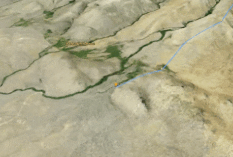
The European Commission's interactive map The Energy and Industry Geography Lab provides an overview of Europe's energy infrastructure and the potential for developing cleaner energy.

The inital map view of The Energy and Industry Geography Map shows the location of the various types of power plants and their individual capacity. This layer provides a wonderful overview of how individual countries generate electricity. For example, the number of red dots (indicating coal fired power stations) in Germany and much of Eastern Europe shows that the continent still has a long way to go in eradicating greenhouse gas emissions.

The number of large green dots in France shows its reliance on nuclear energy (in 2021 69% of France's electricity production was generated by nuclear power). Norway is dominated by hydro-electric power plants (hydropower plants generate around 90 % of Norway's electricity). A large number of hydro plants are also located in north Italy, in the Italian Alps.

The Energy and Industry Geography Map includes a number of other map layers. These include a layer displaying energy infrastructure networks - showing the location of the continent's gas pipelines. The map also includes layers which show the locations of planned future energy projects in Europe and assessments of the continent's renewable energy potential. 


You can explore how America generates power on the U.S. Power Plants map. 
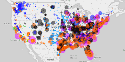
U.S. Power Plants is an interactive map showing the locations, size and type of America's electric power plants. The map shows where different types of power plant are located, how much each type of energy source contributes to the country's power supply and how much each source contributes to CO2 emissions. 

The number of map filters on U.S. Power Plants means that the map can provide lots of different insights into American power supply. For example the individual fuel filters allow you to see where different power sources are concentrated in America. Select hydro power and you can see that hydro power plants are concentrated in the north-west and north-east of the country. While solar power plants are mainly located in California. 


Esri's Atlas of Electricity is another great way to explore where the USA gets its electricity from and how it distributes power across the country. At the heart of an Atlas of Electricity is an interactive map plotting the location and size of the grid's power plants and transmission cables. This map allows you to explore the location and capacity of the country's electricity producing power plants and how they connect to the national grid. 

As well as mapping the physical infrastructure of the electricity grid Esri's story map examines the primary energy sources used to generate electricity in the USA. It maps the size and capacity of coal-fired power plants, natural gas power plants and petroleum power plants. Alongside these fossil-fuel sources of power An Atlas of Electricity plots the size and capacity of the U.S.'s nuclear power plants, hydroelectric power plants and solar & wind power plants.

Tuesday, July 05, 2022

The World's Crookedest Street


Driving up Lombard Street

Both Lombard Street, San Francisco and Snake Alley, Burlington, Iowa have at various times been announced as the bendiest, least straight roads in the world. It is debatable whether either road can truly claim to be the crookedest street in America, let alone the world. However we can perhaps settle the argument over whether Lombard Street is less straight than Snake Alley or whether Snake Alley is actually more crooked than Lombard Street.


Snake Alley is 292 feet long

Using FreeMapTools to measure the length of each street (as the crow flies) I calculate that Snake Alley is 292 feet long and Lombard Street is 466 feet long (measuring only the bendy intersection between Hyde St & Leavenworth St). Snake Alley has 5 switchbacks, so has 1 switchback for every 58.4 feet. Lombard Street has 8 switchbacks, so 1 switchback for every 58.25 feet. There really isn't much in it but using this very crude method of calculation Lombard Street is just a little bit more crooked than Snake Alley.

Unfortunately neither Lombard Street or Snake Alley are measured on Curvature, which uses a more sophisticated method of measuring the relative straightness of different roads. 

Curvature color-codes the world's roads based on how many curves they have. The amount of curvature of individual roads is determined using OpenStreetMap data. Individual roads are divided into sections and the radius of curvature at every segment of road is calculated. To get a final curvature score the lengths of the most curvy segments on a road are then added together.

Unfortunately there is no score for either Lombard Street or Snake Alley.

Street View Animations

I created the Street View animation of Lombard Street at the top of this post using Map Channels' Team Maps. Using Team Maps it is very easy to create a Street View animation for any route. On Team Maps you just need to create a map with an empty feed. In the map editor you can then use the 'route drawing tool' to create a route. Once you have saved your route you can then press the 'play' button to follow the route on Google Maps Street View. If you get stuck you can follow this Team Maps tutorial on YouTube

Monday, July 04, 2022

Small Multiples of Global Heating


Germany is heating up. Mean hot days per year in the districts

In response to the recent extreme heat which has been experienced in much of the northern hemisphere a number of data visualization practitioners have turned to small multiple maps in order to show how climate change is leading to hotter temperatures over time.

A small multiple is a series of maps (or graphs or charts) using the same scale, which allows a series of data to be easily compared. Like climate stripe visualizations small multiple visualizations of average annual recorded temperatures can be very effective in showing the effect of global heating over time. 


More and more extremely hot days

For example Spiegel (paywalled) recently published this small multiple visualization to show where weather stations across Germany have recorded temperatures over 35 degrees centigrade since 1971. The series of maps clearly shows that extreme temperatures are becoming much more common in Germany, particularly over the last decade. 

The small multiple visualization at the top of this post was published by Zeit (paywalled) last week. This data visualization shows the number of hot days (over 30 degrees) recorded since 1951. Again this small multiple provides a very clear and very easy to understand visualization of how global warming is leading to ever more days with extreme temperatures in Germany.


Germany's Heating Up. Number of Days above 30 Degrees

The same data has been used by Marco Sciani in his visualization Germany's Heating Up. His GitHub page Germany's Heating Up uses R to create a small multiple visualization of the effect of climate change on German temperatures. 

Back in 2020 Zeit also released Too Warm Here, a tool which allows you to generate the climate stripes for any German town. Zeit's Too Warm Here included a small multiple maps visualization of how temperatures have changed in the whole of Germany over the last 137 years.


In this small multiple maps visualization Germany is colored for every year since 1881 to show the average annual temperature for that year. The map visualizes very clearly how in the last 22 years Germany has experienced temperatures which are far hotter than the previous average annual temperatures.

Saturday, July 02, 2022

Mapping Local Population Changes

The UK's Office of National Statistics has released a wonderful data visualization of the UK's latest population change statistics. Earlier this week the latest population and household estimates for England and Wales was released based on the 2021 census. You can discover how the population has changed near you on the ONS's How the Polpulation Changed Where Your Lived.

One of the most impressive features of How the Population Changed Where Your Lived is that the visualization can be customized to each and every one of the 331 local authorities in England & Wales. If you pick your local authority area from the drop-down menu you can learn all about how the population has changed in your local area and how that compares to population changes across the whole country.

As you scroll through the ONS' data story you can find out how much the population has increased (or decreased) both locally and nationally. You can discover which age groups have increased or decreased in both your local authority and in all of England & Wales. You can also view a visualization of how population density in your area compares to other areas of the UK.

Friday, July 01, 2022

The Climate Shift Index

The Climate Shift Index shows you how much global heating has influenced today's weather. Every day the Climate Shift Index map reveals where in the United States temperatures have been affected by climate change. The map reveals just how much global warming could be affecting the weather on any given day.

The colors on the Climate Shift Index map where that day's temperatures are more or less likely due to climate change. The darkest areas on the map indicate those areas where climate change has had the greatest effect on the day's weather. For example, an area shaded dark red, with a CSI score of 5, is experiencing weather which climate change and global warming has made five times more likely. In other words the local temperatures being experienced in those locations would be nearly impossible without carbon pollution creating global heating.

The Climate Shift Index is updated daily in order to show the local influence of climate change, every single day. The map provides a 3-day CSI forecast for US weather, which means you can view the CSI forecast for the current day and for the following two days.

You can learn more about the Climate Shift Index and how it is calculated on Climate Central's Introducing the Climate Shift Index.