Tuesday, August 10, 2021

50 Years of Change

The UK's Office of National Statistics has been comparing data from the 1961 and 2011 censuses to see how life in England & Wales changed over the course of those 50 years. In Census unearthed: explore 50 years of change from 1961 a number of interactive maps allow you to directly compare how life has changed in the UK over half a century.

According to the 1961 census returns around 7% of people in England & Wales didn't have an indoor toilet. However in some rural areas over 50% of homes didn't have an inside flushing toilet.In 1961 the majority of the population lived in renting accommodation and only 42% of households owned their own home. By 2011 the majority of people owned their own homes in England & Wales (64%).

60 years ago marriage was much more popular than it was in 2011. In 1961 68% of people aged 16 years and over were married and only 0.8% were divorced. In 2011 the number of people married had fallen to 49% and 9% were divorced. The population of the UK has also become older since 1961. In nearly every area of England & Wales the proportion of people over 75 has increased. 

The Office of National Statistic's comparison of the 1961 and 2011 censuses has been made possible by the digitization of historical census returns. This digitization process was done by optical character recognition (OCR). OCR was able to digitize around 95% of the characters and numbers in the original census returns. A citizen science project was then developed to digitize the remaining 5% of characters and numbers not able to be read by OCR.

Monday, August 09, 2021

A Scrollytelling Climb of Mt Fuji

Hiroya Kato has written up an interesting tutorial on how to create a Scrollytelling map which uses Mapbox's Free Camera API to follow a route on a 3D map. You can see what this scrollytelling approach involves by viewing Hirova's demo map Climbing Mount Fuji.

As you scroll through Climbing Mount Fuji you are taken on a journey along Mt Fuji's Yoshida route from the fifth station to the summit. What is clever about Hirova's scrollytelling template is that it uses two different GeoJSON files. One GeoJSON file is used to draw the Yoshida route on top of the map as a white polyline. The other GeoJSON file actually controls the free camera - or the actual scrollytelling. This second GeoJSON file contains a simplified version of the same Yoshida route to ensure that the camera follows the route to the summit of Mt Fuji but doesn't take every twist and turn.By not following every little deviation in the route the camera pans much more smoothly up the mountain while still following the actual route on the map.

If you want to create your own scrollytelling route map then you can follow Kato's tutorial Building ScrollyTelling with Free Camera API in Mapbox GL JS v2. One thing missing from Kato's scrollytelling map is any textual context. If you want to add a story element to the map then you will need to add some scroll driven events. This might be possible by combining Kato's scrollytelling template with some of the code from Mapbox's own Scrollytelling template. Which you can learn more about on Mapbox's tutorial How to Build a Scrollytelling Map.

Bike Collisions in London

Every week the Makeover Monday community works on creating data visualizations of a different data set. This week the community is working on visualizing London's Bike Collisions in London (2005-2019). This means that if you explore the Twitter hashtag #MakeoverMonday over the next few days you will find lots if links to interactive maps which show where and when bike accidents occurred on London's roads from 2005-2019.

Most of the visualizations, like Michelle Frayman's Cycle Danger in London, use interactive maps to visualize London's bike collisions. Many of these maps breakdown the bike collisions by borough to reveal that Westminster is the most dangerous borough (in terms of the total number of bike collisions 2005-2019). I like Michelle's visualization because she also looks at when bike accidents occur. Her analysis of the data by time reveals that 8 am is when the most accidents happen and July is the most 'dangerous' month (although the data isn't normalized by the amount of bike traffic and I suspect these trends reflect the number of bikes on the road during rush hour and during the summer months). 

Takafumi Shukuya's Bike Collisions in London orders the top ten boroughs in terms of severity, allowing you to explore which ten boroughs had the most fatalities (Westminster & Hackney), the most 'serious' accidents (Westminster) and the most 'slight' accidents (Westminster).Takafumi's visualization also allows you to view a zoomed in map of each of the most dangerous boroughs, allowing you see which roads in each borough had the most bike accidents.

You can already find many more interactive map visualizations of the London bike collisions data under the Twitter hashtag #MakeoverMonday. As the day progresses I suspect even more will be created and linked to on Twitter using the #MakeoverMonday hashtag.

Saturday, August 07, 2021

The Global Heating Predictor

Climate Impact Lab's Climate Impact Map shows you how climate change is likely to effect the climate where you live. Using the map you can see how global heating will increase annual temperatures where you live in the nxt 20 years, by the middle of this century and by the end of the century.

The Climate Impact Map uses a number of global climate models to show predictions as to how the climate is likely to change around the world for the rest of this 21st Century. As well as showing the expected rises in average annual temperatures the map allows you to view the expected mortality costs of global heating. The mortality costs layer on the map shows how death rates across the globe will be effected by global heating and other climate changes.

If you live in the USA you can also discover how climate change will effect you on a ProPublica interactive map.In New Climate Maps Show a Transformed United States ProPublica show how different parts of the U.S. are likely to be affected by global heating. Their map shows where extreme heat will become commonplace, where growing food will become very difficult and where dangerous 'wet bulb' conditions will become the norm.

The New York Times has also released an interactive map which attempts to explain how global heating will effect the climate where you live. If you enter your county into Every Place Has Its Own Climate Risk. What Is It Where You Live? you can find out which climate risks will become most extreme in your area.

The NYT's interactive map colors areas of the United States to show the climate risks which will be most extreme in different part of the USA. For example most of the East Coast will face increased risks from severe hurricanes, much of the Midwest will experience extreme heat, the Western states will face extreme droughts and the Western states will see higher risk from wildfire. If you hover over your county on the map you can see the risks that your county will face in six different categories; hurricane risk, extreme rainfall risk, water stress risk, sea level rise risk, heat stress risk and wildfire risk.

Friday, August 06, 2021

The Big Butterfly Count

So far over a million butterflies have been counted in this year's Big Butterfly Count. Every year in the UK the Butterfly Conservation organization asks the public to take part in a national survey into the health of the UK's butterfly species by spending 15 minutes counting butterflies. This year's Big Butterfly Count is from the 16th July to the 8th August.

Since 1976 76% of UK butterfly species have declined in either occurrence or abundance. This is of concern both for the health of these butterfly species but also for other wildlife species and the overall environment. It is therefore important to continue to monitor the health and abundance of the UK's different species of butterfly. 

You can view the progress of the Big Butterfly Count for yourself on the project's interactive map. Using the Big Butterfly Count map you can explore the butterfly sightings submitted by citizen scientists across the UK. You can filter the butterflies by species and by date to view where and when different butterflies have been spotted across the country. So far this year the Small White has been the most common species of butterfly reported to the map. Closely followed by the Big White and the Meadow Brown.

The Big Butterfly Count is a fantastic example of the advances being made in lepidopterology. Unfortunately the earliest lepidopterist were not so humane in their surveying methodology. In the early days of lepidopterology the main way to study and categorize butterflies was through capturing and pinning examples of butterfly species. 

This practice is evident on the Natural History Museum's Big Butterfly Count map. This interactive map shows the locations of a selection of the digitized butterfly and moth specimens in the Natural History Museum's collection. If yo click on a marker on this map you can view a picture of the butterfly collected from this location and click through to read more about the species and the date of its collection.

Thursday, August 05, 2021

Moving Away From Work

Lock-down and the rise of home-working is having a big impact on the property market as home-owners begin to change their property expectations and priorities. Online real estate company Zillow has been looking at where house prices are rising fastest, in order to determine where it is that people now want to live.

The simple assumption that many people have been making is that the flexibility of working from home means that people are less interested in inner city properties close to job centers. This is certainly true in many expensive metro areas where property prices have been rising the least. However it isn't true of less expensive metro areas where property prices are rising at an increased rate. Zillow's analysis of property prices is that people have been inspired by lock-down to move to more affordable places - which could be outside city centers or in some case close to city centers. 

Zillow's The Great Reshuffling Is Changing How Far Americans Are Willing to Commute includes an interactive map which allows you to compare the median home value by commute time in major U.S. cities. Choose a city and the map uses you an isochrone layer to show traveling times and median house price values. The different polygons represent ten minute steps in commuting time from the downtown core. The colors of these polygons reflect the median home price in that area. 

According to Zillow affordability is the key driver of recent increases in property prices. Commuting time is no longer such a big a factor in deciding where to live.

The Morphocode Explorer

The Morphocode Explorer is a useful interactive mapping tool for visualizing spatial and demographic data in New York. The tool allows you to drag a pedshed circle (a circle with a walking distance as the radius) around a map of New York City to explore multiple different data sets at the same time.Using the tool you can explore different social and spatial aspects of New York neighborhoods, such as land use, development intensity, transit links, demographics, and the urban morphology.

One of the data options available in the Morphocode Explorer is the 'Figure Foreground'. This option (which you can see in the animated screenshot above) allows you to view all the buildings outlines within your pedshed circle.The map sidebar also provides a data overview, reporting on the total number of buildings in your pedshed, and the ratio between building footprints and open space in the pedshed.

Other options in the Morphocode Explorer allow you to visualize a breakdown of land-use within your pedshed circle. This includes a breakdown of the residential and commercial mix, the amount of open spaces, and the number of industrial and manufacturing units.You can also use Morphocode Explorer to view the number of public transit stops, lines and routes within your pedestrian shed. The Demographics option allows you to view a colored dot map showing the population density in your pedshed area and the racial breakdown. You can also view data on the age breakdown of the local population and the percentage of males and females.

Using all the different data options in Morphocode Explorer it is possible to explore the different built environments and demographics in each New York borough. Currently the map only works in New York City but there are plans to make Morphocode Explorer tools for other cities across North America, Europe, and Australia.

Wednesday, August 04, 2021

516 Million Building Outlines in Africa

Google’s Open Buildings is a new open dataset containing the location and geometry of 516 million buildings across Africa.The data includes the polygon outline of each building, its size in square meters and a confidence score of it being a valid building.

Anyone can download the full dataset of over 500,000,000 buildings or download smaller datasets for individual level 4 S2 cells. The full data can be downloaded in CSV format or the tile geometry and URLs in GeoJSON format. 

 It is hoped that the data will help refine an understanding of where people live, helping authorities to identify where infrastructure and vital services are required. It is also hoped that the data will contribute to a better understanding of population density, help authorities plan emergency responses, help with the rollout of digital address systems, and help with national planning.

The buildings were detected from satellite imagery by AI. The building data in some areas may be more accurate than in others. These confidence differences can emerge for a number of reasons. For example geological or vegetation features may have been confused with built structures. In some areas the delineations between individual buildings may not be clear in the satellite imagery. Buildings which are the same colors as the surrounding environment or terrain may be difficult to identify. Also very small buildings may be difficult to determine at the satellite resolution.

No Fly Zones for Drones

The Federal Aviation Authority receives over 100 reports a month of unauthorized unmanned aircraft (UAS). Flying drones around aircraft and airports is both dangerous and illegal. Which is why there is mounting concern over the dramatic increase in incidents involving authorized drones over the last two years.

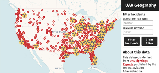
UAV Geography's Map of Drone Incidents plots the location of all the UAS sighting reports made to the FAA by pilots, citizens and law enforcement officers. The red markers on the map indicate the location of sightings of unauthorized drones. You can click on these markings to read the actual sighting report.

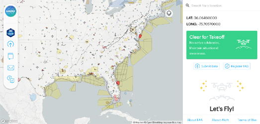
If you want to fly a drone then you should bookmark the B4UFLY interactive map. The B4UFLY map shows you where you can and can't fly your drone. The map provides clear status indicators which show you where it is safe to fly or not. For example the map shows that you cannot fly in the Special Flight Rules Area around Washington, DC.

If you are flying a drone outside the United States then you might want to bookmark the Fly Safe Geo Zone Map which provides a guide to where drone flying may raise concerns and where it is restricted around the world.

Tuesday, August 03, 2021

Where You Should Still Wear A Mask

Last week the CDC updated its Public Health Recommendations for Fully Vaccinated People. This guidance includes the recommendation for "fully vaccinated people to wear a mask in public indoor settings in areas of substantial or high transmission."

You can use the CDC's own COVID-19 Integrated County View interactive map to find out if your county is currently one of these areas of 'substantial' or 'high' transmission. On the map counties are colored to show the level of community transmission. Counties colored red are areas of high transmission, meaning that the number of new cases per 100,000 persons in the past 7 days was over 100. The orange colored counties are areas of substantial transmission meaning that there were between 50 to 99 new cases per 100,000 people.

If you live in a county colored red or orange then you should still wear a mask in public indoor settings. Of course, to be safe, you could wear your mask in indoor public spaces whatever your county's current community transmission rate.