Sunday, May 07, 2023

Cinematic 3D Space Simulations

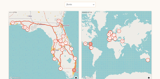
Online astronomy has now entered the space age. Thanks to advances in online 3D modeling articles on the web can now be illustrated with amazing cinematic 3D animations.

One recent example of this can be viewed in Le Figaro's article Starship, to the Moon, Mars and Beyond .... This introduction to Space X's Starship rocket is accompanied by a fantastic 3D simulation of an actual Starship launch. 

SpaceX's Starship spacecraft is a fully reusable two-stage-to-orbit heavy-lift launch vehicle. It is intended to be the successor to the Falcon 9 and Falcon Heavy launch vehicles, and will be capable of carrying both crew and cargo to Earth orbit and, as the Le Figaro article suggests, to the Moon, Mars, and beyond. Le Figaro's 3D animation shows the launch of a Starship and the relanding of both the 'Super Heavy' rocket booster and the second-stage 'Starship' rocket.  

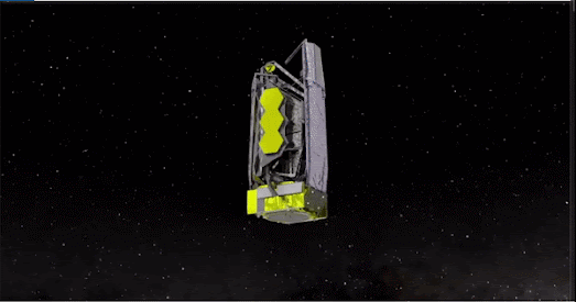
Another great example of astronomical 3D modeling is RTBF's How the James Webb Telescope Opens the Gateway to the Stars, which includes a truly impressive 3D animated illustration of NASA's newest space telescope. As you scroll through the beginning of this online article a 3D model illustrates how the telescope's solar panels, heat shield and 6.5m diameter mirror were unfurled in space. Information windows are also used in this 3D simulation to explain the purpose of each of these components and to explain how the telescope actually works. 

ZDF's Mission Artemis also includes some amazing 3D illustrated animations. ZDF's interactive introduction to the Artemis mission includes 3D models of the Earth, the Moon, Mars and even the Gateway Space Station.

NASA's Artemis program will build a Lunar Gateway space station which could be used to establish a permanent home base on the Moon and to launch human missions to Mars. The Lunar Gatway Station will be the first space station in orbit around the moon. It will serve as a communication hub, science laboratory, and habitation module for astronauts. The station will also be used as the staging point for human missions to the Moon and hopefully in the future as a staging point for NASA's Deep Space Transport manned missions to Mars.

ZDF's introduction to the Artemis program includes an animated 3D simulation of an Orion transport module docking with the Lunar Gateway Station. It also shows the location of the Shakleton Crater at the Moon's South Pole, where a future Moon base station could be built.

Germany's Zeit newspaper has also created an amazing 3D space simulation to model and illustrate the destruction of the Iridium-33 satellite in 2009.

On Feb 10th 2009 a malfunctioning Soviet-era satellite smashed into Iridium-33 at ten times the speed of a flying bullet. The crash shattered both satellites and turned them into two clouds of debris containing more than 1,700 pieces of space junk. Even now, 13 years later, that debris is still orbiting the Earth, and makes up just a tiny part of the garbage that is now littering Earth's near space.

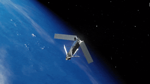
The 3D modelled simulation in the article Space Junk: Our Garbage is Space is used to help illustrate the growing problem of space debris and the danger that it creates to other space missions. The article also includes a 3D visualization of the millions of pieces of space debris now in low Earth orbit, in medium Earth orbit and further out in geo-stationary orbit around the Earth.

Saturday, May 06, 2023

The Rise & Fall of the Irish Railway

Irish Railway Stations 1834-2000 is a simple interactive map which plots all the Irish train stations which are / were open for every year from 1834 to 2000. By scrolling through all 166 years on the map you get a great overview of the rise and fall of the railway in Ireland.

The first railway line opened in Ireland was the Dublin and Kingstown Railway (D&KR), which ran between Westland Row in Dublin and Kingstown (DĂșn Laoghaire), a distance of 10 km (6 mi). It was opened on 17 December 1834. In 1839 a second railway line, the Ulster Railway, opened between Belfast Great Victoria Street and Lisburn. 

If you use the map's timeline to progress through the years from 1834 you can see how the railway spread across Ireland, largely emanating out from the initial lines built in Dublin and Belfast. For almost a century after 1834 the railway in Ireland continued to grow, reaching out to all parts of the island of Ireland. 

When you reach the late 1930's on the map you can begin to see railway stations disappearing off the map. The Great Depression and the rise of the motor car obviously had an effect of freight and passenger traffic resulting in the closure of a number of stations. In the 1950s and 1960s you can begin to see the closure of many branch lines on the map. This significant reduction in the rail network in Ireland means that even in the 21st Century the Irish rail network consists of only around 1,698 miles, or around half of the 3,480 miles of line that existed in the early 20th Century.

Also See

A Journey Through the History of Swiss Railways - mapping 175 years of Swiss rail
Zeitlinie Vienna - Vienna's tram network since 1865
Zeitlinie Graz - an animated map of Graz's tram network since 1878
Citylines - mapping transit systems around the world over time

Friday, May 05, 2023

The First Images from EUMETSAT MTG-I1

The first high quality image from Europe's newest weather satellite has been released. 

The European Organisation for the Exploitation of Meteorological Satellites (EUMETSAT) operates a fleet of satellites with which it monitors weather, climate, and the environment from space. EUMETSAT's newest satellite, Meteosat Third Generation – Imager 1 (Meteosat-12) was launched in December 2022 and is designed to provide continuous, high-quality imagery and sounding data for weather forecasting, climate monitoring, and environmental protection.

Meteosat-12 is in stationary orbit with a permenant view over Europe, the Middle East and Africa. It captures new imagery every ten minutes. The first of these images can now be seen on the EUMETSAT website (including the 24 hour animation shown above). Another satellite is due to be launched in 2026, which will enable EUMETSAT to capture new imagery every 2.5 minutes.

EUMETSAT will continie to test Meteosat-12 and ground systems over the course of 2023. Later this year the images will be produced every 10 minutes and will be released operationally for use in weather forecasts. The images should then also appear in EUMETView, which provides public access to EUMETSAT satellite imagery. Using the EUMETView interactive map you can search for and browse European satellite imagery by date. It is also possible to create animations from the imagery for any selected time period.

Thursday, May 04, 2023

Trees are Moving North

In the last few years, in response to global heating and climate change, a number of interactive maps have been created which attempt to show how temperatures in your home town will change over the course of the 21st Century. The traumatic climate changes that we are beginning to experience will have a huge impact on our local ecosystems, effecting the natural habitats of our native flora and fauna.

The Washington Post has decided to map out how global heating will affect the habitat ranges of trees in the United States. As the United States warms the ranges of tree species in the U.S. are beginning to drift northwards. In Trees are moving north from global warming the Post has created a series of maps which show the future growing ranges of American trees.

The Post's article starts with an animated map which shows how plant hardiness zones are likely to drift northwards over the course of this century. As these zones move north the habitats of individual tree species will also migrate northwards. The Post article includes an interactive map which allows you to enter the name of a species of tree to view how its growing habitat is likely to change over the course of the next 80 years. In most cases the southern edges of a species' hardiness zone will become inhabitable due to global heating and the species will become more suited to more northern latitudes.

Animal species are also at risk from global heating. Two-thirds of birds in North America are at risk of extinction from global heating. That is 389 different species of birds. Conservation group Audobon has mapped out the North American habitats of 604 different species of birds. They then applied the latest climate models to these habitats to project how these habitats will be affected by global heating.

Survival by Degrees: 389 Species on the Brink includes a number of different maps which allow you to find out which birds are at risk in each state and the predicted climate effects on each species of bird. The individual maps for each bird species show the current habitat range of the species. These maps allow you to view how the bird's range will be affected by different global heating scenarios. Under each of these scenarios the map shows where range will be lost and gained and provides an overall vulnerability status for the species.

Wednesday, May 03, 2023

Exploring Mars in 3D

Traveling along the bottom of the Mamers Vallis canyon on Mars

Imagine being able to drive through the Mamers Vallis canyon on Mars, traveling along the canyon floor while marveling at the canyon walls which were formed 3.8 billion years ago. Better still don't imagine it. Instead use AreoBrowser to actually explore Mars in 3D. 

The AreoBrowser allows you to explore over 2000 Martian locations in full 3D. The map uses data from the HiRISE camera (on-board NASA’s Mars Reconnaissance Orbiter) and the HRSC (on-board ESA’s Mars Express) to create full 3D terrain model of locations visited by NASA's Mars rovers on the red planet.

To explore the 3D terrain models on AreoBrowser select the 3D Models option on the site's home page. You can then browse through and explore in 3D any of the current 2,204 locations featured on AreoBrowser. While in one of the 3D terrain models you can navigate by using your keyboard arrow keys to move the camera. You can rotate the camera by holding your mouse's right-hand button. Zoom in and out using your '+' or '-' keys or by using a mouse scroll wheel. 


You can find many other interactive maps of the red planet (including Caltech's recent Global CTX Mosaic of Mars) interactive by checking out the Mars tag on Maps Mania.

Tuesday, May 02, 2023

The Map of 52,000 Books

A Visual Book Recommender is an interactive map of 51,847 books organized by similarity. Using the map you can discover new books to read by searching for your favorite books and exploring other 'similar' nearby books.

Books are shown on the map using their cover sleeves. If you click on a book's cover on the map an information window will open containing a short introduction to the novel's plot. The map also comes with a handy search option which allows you to enter the title of a book and zoom to that book's location on the map. All the nearby books on the map are then likely to be fairly 'similar'.

It is also possible to search the map by genre. The map's creator has also made a handy genre map which allows you to select individual genres (e.g. Sci-Fi, Crime, Romance etc) to see where these types of books are clustered on the map.

The map was created from scraping book reviews. Books are clustered on the map based on reviewers liking the same books. For example if lots of reviewers liked book A and book B then those two books are very likely to appear near each other on the map. The actual clustering algorithm is a lot more complicated than that and is explained in a lot more detail in a 'technical details' section beneath the map. 

In 2019 The Pudding created a very similar interactive map from the covers of 5,000 books. However on The Pudding's map all the books were arranged by their visual similarity. 


All 5,000 books mapped on 11 Years of Top-Selling Book Covers, Arranged by Visual Similarity have appeared on the New York Times' 'Best Selling' or 'Also Selling' lists since June 2008. Color seems to play a very prominent role in determining 'visual similarity' in the machine algorithm used by The Pudding. If you zoom out so that you can see all 5,000 book covers you can see that a lot of the grouping and organization appears to be strongly influenced by the dominant color of each book. 

The Pudding's map comes with a number of filters which allow you to explore the book covers by genre and by visual motif. The visual motif filter allows you to highlight on the map images which contain 'faces', 'landscapes', 'smiles' etc. Therefore the motif filter provides another way to explore the book covers by visual similarity.
An Ocean of Books is an interactive map of over 100,000 authors and 145,162 books. On this map every island is an author and every city is a book. If you search the interactive map for your favorite writers you can find other writers that you may enjoy based on how near they appear on the map to your favorites.

The size of an author's island on An Ocean of Books is determined by the amount written about them on the internet. The more times they are mentioned on the world wide web then the bigger their island on the map. The position of the islands and the proximity of authors to each other is determined by the number of connections between them on the internet. If two authors are mentioned in lots of the same articles on the web then the closer they will be on An Ocean of Books.

The connections between authors and therefore their proximity on the map is determined by a machine learning algorithm. If you select an author's name on the map then you can read a short biography. If you zoom in on an author's island then all the writer's books will appear as cities on the map. Click on a book's title and you can read a short introduction to the selected book.

Monday, May 01, 2023

Where Students Travel to Study Abroad


The European Commission's Erasmus programme allows university students across Europe to study abroad as part of a continent-wide student exchange scheme. Under the programme students can study at a foreign university for up to one year of their undergraduate studies. Over the years more than 9 million European students have used the scheme to travel and study abroad.

The Erasmus Network interactive flow map visualizes where 3.3 million students have studied abroad as part of the Erasmus programme from 2008 to 2020. If you enter a city or town into the map you can view where students from the city have traveled to and from as part of Erasmus. For example if you enter Paris you can view a flow map showing where in Europe students from Paris have studied abroad and where exchange students studying in Paris have traveled from (London, Berlin and Madrid appear to be the most popular destinations for students from Paris). The map also includes a timeline option which allows you to filter the map by a specific period of time. 

Because of how the data is collected by Erasmus the map only shows travel between towns and cities rather than individual universities. This means, for example, that it is not possible to view a flow map for any of the individual universities in London. You can only explore where students studying in London as a whole have traveled to and from. 

The Erasmus Network map was created using FlowmapBlue. FlowmapBlue is a great tool for creating interactive flow-maps. To create a flow-map with FlowmapBlue you just need to save your data to a Google Spreadsheet. FlowmapBlue will then automatically create a flow-map from the data in your spreadsheet.

Many universities make a huge amount of money from enrolling and teaching students from overseas. In the USA a very large number of overseas students come from China. India sends the second largest number of students to study in America.

UNESCO's Global Flow of Tertiary-Level Students is an interactive map which visualizes the flow of students around the world. The map allows you to view the number of overseas students studying in every country around the world and where those students come from. It also allows you to see the most popular destinations for students from each country choosing to study abroad.

China exports by far the most students of any country in the world. The USA is the most popular destination for Chinese students studying abroad (309,837 students). Australia (128,498) is the next most popular country for overseas students from China, followed by the United Kingdom (89,318) and Japan (76,537).

According to the map nearly 73,000 Americans choose to study abroad. The most popular destination for Americans studying abroad is the United Kingdom (15,654), followed by Mexico (11,109), Canada (8,355) and Grenada (4,855). 

Without wishing to upset Grenadians I was a little surprised that Grenada was such a popular choice for Americans studying abroad. I therefore Googled "Why do Americans study in Grenada?". Although I couldn't find a direct answer to the question I did receive a lot of results about studying for a medical degree in Grenada. It is therefore possible that Grenada is a popular choice for students who wish to become doctors but who might struggle to be accepted at one of the U.S.'s hugely competitive medical schools.

Friday, April 28, 2023

The Noisiest Cities in America

Which is the noisiest city in America. According to Esri (using 2018 data from the US Department of Transport) the town of Elizabeth in New Jersey has the highest levels of noise pollution in the United States. However a recent study by Apple and the Univeristity of Michigan disagrees and says that the city of Saginaw, Michigan actually ranks as the noisiest place in the US.

The Apple Hearing Study team, a partnership between the University of Michigan and Apple, has collected noise level data from 130,000 Apple watches across the United States. The study aims to measure people's explosure to noise and its impact on health. The study is looking at exposure to sound over time in order to help uderstand the impact of excessive noise on people's hearing.

During the study environmental sound levels were collected by Apple Watch wearers. This data was then used to "calculate an average daily environmental sound exposure level". The data from the study can be explored in the Interactive US Maps of Noise Exposure. The nationwide map visualizes the percentage of the population exposed in each state to excessive noise, while individual state maps show the percentage exposed to excessive noies in each metropolitan and nonmetropolitan area of each state.

Of the 52 states and territories mapped in the study Puerto Rico has the highest percentage of people exposed to excessive noise levels (44%). Delaware (39%) has the second highest level and Rhode Island (38%) has the third highest percentage of the population exposed to excessive noise. Of the 531 metropolitan areas in the United States Saginaw, Michigan ranks first, as the area with the highest percentage of the population exposed to excessive noise. Jonesboro, Arkansas (52%) has the second highest percentage of the population living with excessive noise. Hinesville, Georgia (52%) ranks third.

According to data from the Department of Transportation the city of Elizabeth in New Jersey is actually the noisiest town in America . On average noise pollution in Elizabeth is higher than any other city in the United States, with the city of Inglewood, California coming in a close second.

The Department of Transportation (DOT) has released a noise model map showing the noise pollution around airports and roads in the United States. Esri has added DOT's data as a layer in its Living Atlas interactive map. The USA Transportation Noise - Road and Aviation 2018 layer allows you to look up any American address to see how much noise pollution is likely to be present from road and airport traffic.

Esri has also used the DOT data to determine which are the noisiest cities in America. Using the DOT noise model data Esri has compared the predicted noise levels in all towns and cities with a population greater than 50,000. Elizabeth, Jersey tops the list of the noisiest cities. This may be partly due to the heavy freight traffic generated by the container port, Port Newark–Elizabeth Marine Terminal. Inglewood, California (America's second noisiest city) is on the flight route into Los Angeles International Airport. Low flying planes coming into land contribute to the high levels of noise pollution experienced by the citizens of Inglewood.

You can view all the results from Esri's analysis on its interactive map Sensory Overload: Lights and Noise for Cities and CDPs greater than 50k. This map not only ranks all cities with a population over 50,000 for their levels of noise pollution but ranks all cities based on their levels of light pollution. The light pollution rankings are based on the mean light pollution from the nighttime lights annual composite map by the Earth Observation Group.

Traveling without a Passport

In the United States there are 34 different towns and cities called Springfield, 31 cities called Franklin and 29 called Clinton. Recently The Pudding devised a geolocation search engine which is able to determine which location a person is searching for when they are looking for a town which shares its name with many other towns in the US. 

The Pudding's Most Likely Town map calculates "what place someone is most likely referring to (in the United States), depending on where they are". However many American towns and cities also share placenames with locations which are outside the United States. It probably isn't that surprising that a country settled by immigrants has numerous towns and cities named after places abroad. 

Axios has decided to celebrate these international toponym homonyms by creating 50 travel itineraries which allow Americans to travel the world without ever leaving their home state. In Visit Paris Without Leaving Home you can enter the name of your state and retrieve an interactive map which shows an optimal route around the towns and cities in your state which share a name with a foreign location. 

For example the map at the top of this post shows a route around Florida which takes in Venice, Naples and Melbourne (among other places). However you won't need a passport to visit these locations because this Venice, Naples and Melbourne are all situated in Florida.

The Axios article also includes a number of heat maps which show the "concentration of U.S. cities with names from different regions of Europe". Who would have guessed that New England is full of towns named after towns in old England?

Thursday, April 27, 2023

Google Updates Satellite Imagery of Ukraine

Google Maps has updated some of its satellite imagery of Ukraine, revealing some of the devastating damage caused by the illegal Russian invasion. 


During the siege of Mariupol the theatre was used as an air raid shelter by civilians. On March 16th 2022 Russia bombed the theatre, killing over 600 people. The new Google Maps satellite imagery shows the theatre after the Russian bombing. You can still make out the word 'ДЕбИ' (children) painted on the ground in front of the theatre, which was written in the hope that Russia wouldn't bomb civilians or children. 

On the first day of the Russian invasion of Ukraine on the 24 February 2022 Hostomel Airport was attacked by the Russian military. Ukraine retook the airport in April 2022, but as you can see the airport has been extensively damaged.


The Mayor of Mariupul, Petr Andryushchenko, claims that the new satellite imagery also reveals new mass graves dug in the Novotroickoe Cemetery in Mariupul.

Also See: 

Undeniable Street View - custom made Street View imagery of just some of the damage that Russia has inflicted on Ukrainian infrastructure.
War Up Close - Street View and 3D imagery of the war in Ukraine
Culture in the Crosshairs - 3D photogrammetry models documenting the destruction of culturally important Ukrainian buildings 
360 War - more panoramic 'Street View' imagery from Ukraine 
3D Models of Ukraine - Hidenori Watanave's photogrammetry models of destroyed buildings & vehicles The Virtual Museum of War Memory - custom made Street View panoramas captured at different locations in the Kyiv Oblast.