The Average Color of the Earth
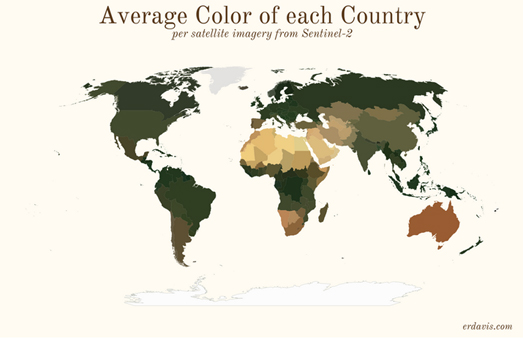
Last week Erin Davis published a series of interesting maps showing the average colors of countries around the world based on Sentinel satellite imagery. The Average Colors of the World includes maps of each continent and a map of the world on which each country is colored based on its average satellite color.
The results are very interesting and clearly reveal the Sahara desert in Africa and the Australian outback. Erin's map showing the average color of each county in America also clearly visualizes the deserts of the Southwest and the greenery of the Midwest breadbasket.
Erin doesn't provide much information about the satellite imagery used to determine the average colors for each country, beyond that they were sourced from Sentinel-2.I can't help thinking if you sourced a different set of satellite imagery you would probably arrive at different average colors for each country. You would probably also achieve different average colors for each country of the world if you used satellite imagery taken in the different seasons of the year or taken at different times of the day. It seems obvious that the average color of a country will be very different in the summer than it is in the winter.

Mindhue Studio has also determined the average color of each continent based on satellite imagery. In Average Continent Colors each continent is given an average color as derived from "a NASA true-color cloudless satellite montage of the world".
Comparing Mindhue Studio's average color of Australia with Erin Davis's average color for the country we can see that there is a quite a difference between the two average colors. This may have something to do with the different methodologies used to determine the average color. However it is also likely to be influenced by differences in the sourced satellite imagery. Arriving at a definitive average color for a country is likely to be impossible as the 'color' of a country is dynamic and changes with the seasons (and probably with global heating). However to get a more accurate average color we could sample satellite imagery taken throughout the course of a year ...

The Average Earth Map 2020 is an interactive satellite map which is constructed from imagery captured by NASA satellites over the course of last year. The reason why it is called the 'average' Earth map is because each pixel on the map shows the average color of that location over the whole of 2020.
In order to create the map cartocalypse used 365 daily satellite composite images of the Earth. All 365 satellite images (one for every day) were then merged together and the average color of each pixel was determined. The result is a satellite view of the Earth which shows cloud patterns, permafrost and prevailing wind patterns. Although, as cartocalypse warns, the map isn't "a true representation of the typical weather or cloud cover throughout the year". The daily satellite images were captured at the same time every day by NASA - so the rest of the day isn't a part of this 'average' Earth image.
You can read more about how the Average Earth Map was created, including how the satellite images were downloaded, processed and analyzed on this Satellite Composite of Earth 2020 blog post. This isn't the first time that cartocalypse has created an average Earth map. You might also enjoy his interactive Average Earth from Space 2018 map.

Comments