Friday, January 13, 2023

Earthquakes with Depth

The World EQ Locator is an interactive map which visualizes the locations of historical earthquake data. The map also uses USGS data to show the locations and strengths of recent earthquake activity around the world. 

The map uses the ANSS Comprehensive Earthquake Catalog to plot the locations of historical earthquakes around the world. The marker for each earthquake on the map is colored to show the depth of its epicenter. The depth of each earthquake is also shown by its location on the 3D map in relation to sea level. Earthquakes can have depths from very near the Earth's surface to around 700 km deep. You can determine the exact measured depth of any earthquake by hovering over its marker on the map.

You can view the locations of recent earthquakes around the world by selecting the clock icon on the map. This will load a list of recent earthquakes recorded by the USGS. If you select any earthquake from this list its location will be shown on the map. The depth of selected earthquakes is also shown by the relative size of the vertical line shown above the earthquake's location on the map.

Another map which visualizes the depth of earthquakes is Earthquakes with Exaggerated Depth. Earthquakes with Exaggerated Depth is an interactive globe which visualizes one year's worth of earthquake activity around the world. The map was created by Esri's Raluca Nicola using data from the USGS.

On Raluca's transparent globe earthquakes which occurred between July 2017 and July 2018 are shown with their depth exaggerated by a factor of eight. Each earthquake is shown on the map using a colored circular marker. The color and size of the markers indicate the displayed earthquake's magnitude.

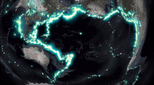
More than 75% of the world's volcanoes and around 90% of earthquakes occur in and around the basin of the Pacific Ocean. This area is commonly called the Ring of Fire. The reason for all this seismic activity in the Ring of Fire is the presence of converging tectonic plates.
The Pacific Ring of Fire can also be clearly seen on John Nelson's Seismic Illumination visualization. This map uses historical earthquake data going back to 1898 to show how earthquake activity reveals the Earth's tectonic plates. By concentrating on the Pacific Ring of Fire the map is able to show how continental drift causes seismic activity where the world's tectonic plates meet each other.

The Seismic Explorer interactive map also uses historical earhquake data to visualize 40 years of earthquake activity on Earth, including information on the magnitude, depth, and location of each recorded quake. The map uses data about recent seismic activity from the United States Geological Survey (USGS), and data from the Smithsonian Institution Global Volcanism Program on historical seismic activity around the world. 

On this map individual earthquakes are shown using colored and scaled markers. The colors of the markers represent earthquake depth and the size of the markers indicate the magnitude of the quake.The timeline control below the map allows you to view the seismic activity around the world for any date range. You can also press the play button to view an animation of global earthquakes from 1980 to the present day. 

Seismic Explorer also includes a cross section tool which allows you to view the depth data of earthquakes in a 3D view. You can use this tool to view an area of the globe as a cross-section, providing a three-dimensional view of the earthquake activity in that region. This allows you to view the depths of the earthquakes in that cross-section for any selected date range.

Thursday, January 12, 2023

Beyond Snowfall

In 2012 the New York Times published a groundbreaking online article about the 2012 Tunnel Creek avalanche. The NYT's Snow Fall managed to seamlessly incorporate animated maps and other multimedia into its account of the avalanche in a way that didn't distract from the narrative flow. This integration of media and data within an online narrative was one of the first examples of the scrollytelling format.

William Davis's interactive map Snowfall owes more than just its title to the NYT's groundbreaking 2012 article. Davis's map is a fantastic visualization of snowfall in the United States over this winter. As you scroll the map visualizes 6-hour snowfall accumulation across the country from October 13 to December 18, 2022.

Like the NYT's original Snow Fall article William's Snowfall map seamlessly integrates the visuals within the emerging narrative. However while the Times employed an 11 person team for six months to produce Snow Fall William Davis single-handedly created Snowfall in a matter of days. Of course data visualization technologies have developed significantly in the decade since the Times published Snow Fall and I suspect William Davis was aided quite significantly by being able to adapt Mapbox's Scrollytell ing Template.

Which shouldn't distract at all from the beauty of William Davis's Snowfall map. As you scroll through Snowfall you advance chronologically day by day through the winter of 2022. As you do so it is amazing to be able to see daily snowfall accumulations instantaneously visualized on the Snowfall map. As you scroll information windows are also used to provide context about some of the significant and unusual snowfalls seen at locations across the United States over the course of the last few months.

I don't know if Davis's Snowfall is an intentional homographical homage to the NYT's 2012 Snow Fall article but it is a fantastic example of how data can be visualized on an interactive map.

Wednesday, January 11, 2023

The Campaign for More Winter Sun

Today the residents of New York will see less than nine and a half hours of daylight. This lack of sunlight can lead to many people feeling SAD. Which is partly why every year there are calls to end the annual switch to standard time from daylight saving time, the result of which is that the sun sets even earlier every cold winter day.

It is also why FiveThirtyEight  has asked the question Can You Make Winter Less Dark? Obviously the answer is no but FiveThirtyEight have produced an interactive map which can help you find the best place to live in the United States if you would like a later sunset (or if you are an early riser where you should live for the earliest sunrises).

Percent of days with late sunsets

Essentially the FiveThirtyEight interactive is a map of the United States showing each time zone and colored to show the percentage of days with early sunrises and late sunsets. This map also includes the option to color the map only by the percentage of days with early sunrises OR to color the map only by the percentage of days with late sunsets. 

Percent of days with early sunrises

If you select to view the percent of days with late sunsets then you can see how this percentage increases as you move east and south of each time zone line. Conversely if you select to view the percent of days with early sunrises then you can see how this percentage increases as you move west and south of each time zone line. 

Obviously the actual number of hours of daylight remain the same with or without Daylight Saving. However the time you get up in the morning could affect how many hours of daylight you see. If you are an early riser then putting the clocks back in the Fall will probably result in you being awake for all the hours of sunlight. If you are a late riser then the clocks going back means that you are likely to miss some daylight time during the winter months.

The Daylight Saving Time Gripe Assistant Tool is an interactive map which allows you to play around with a number of different settings to explore whether Daylight Saving suits your sleeping patterns. Using the map you can explore how the geography of sunrise and sunset is affected by Daylight Saving across the United States. If you enter the time that you would like sunrise or sunset to be then the map will show you where in the United States it is best to abolish or always keep Daylight Savings (and where it is best to keep the current system).

If you live in Europe you can use Logan Williams' Daylight Saving Time Gripe Assistant Tool, Europe Edition. Logan has tweaked Andy Woodruff's original Observable notebook so that it works with a map of Europe. Again to use the tool you just need to enter your favorite time for sunrise or sunset and the map will then show you where in Europe it is best to abolish or always keep Daylight Savings (and where it is best to keep the current system).

Tuesday, January 10, 2023

All the Maps at Once

Hundreds of thousands of historical maps have been digitised by museums, libraries and organizations such as the David Rumsey Historical Map Collection. A very large number of those digitized maps can be accessed and viewed using IIIF

IIIF is a set of open standards for sharing and viewing online high-quality digital images. It is a format which is increasingly being used to digitize and share online historical vintage maps. For example I have recently used the IIIF manifests of vintage maps created by the John Russell Bartlett Library and the David Rumsey Historical Map Collection to create interactive annotated maps of:

&

Another great example of using IIIF to explore vintage maps is the Allmaps WebGL2 Preview. This interactive map uses the IIIF manifests of lots of different historical maps to overlay a number of different vintage maps on top of a modern map. 

You can use the location links on the WebGL2 Preview map to view vintage maps of Amsterdam, Boston, Delft and Harold Fisk's 1944 Meander Maps of the Mississippi River. The map also contains controls which allow you to adjust the opacity of the vintage map overlays and the underlying modern map.

The WebGL2 Preview was created using Allmaps. Allmaps is a fantastic platform which can be used to georeference vintage maps from a IIIF manifest and to display IIIF manifests as interactive maps. All you need to georeference or view a vintage map with the Allmaps Editor is the URL of a IIIF Image or Manifest. These manifest URL's are often freely shared on museum and library websites. 

The Allmaps Editor and the Allmaps Viewer both include links to lots of examples of vintage maps which have been georeferenced or which can be viewed using the Allmaps platform. 

Monday, January 09, 2023

The Gendered Streets of Porto

Ruas de Genero is a wonderful data visualization of the sexist toponymy of the second largest city in Portugal. By comparing the number of streets named for men and women in Porto and the length of streets named for each gender Ruas de Genero (Streets of Gender) explores how men and women are commemorated differently in the city's toponymy. 

In this interactive mapped visualization streets named for men and streets named for women are colored in order to highlight the disparity in representation in Porto's street names. On the map the light blue streets (named for men) clearly outnumber the purple streets (named for women). In fact 44% of Porto's streets are named after men and only 4% of the streets are named for women.

This sexist disparity of representation isn't only apparent in the number of streets named for each gender. It is also apparent in the names given to the city's most important streets. Ruas de Genero also analyzed the length of streets in Porto named for both men and women. It discovered that the most important gendered streets (determined by length) were all named after men. Whereas streets named for women tended to be shorter. According to Ruas de Genero 'the total length of streets named after men is 14 times bigger than the ones named after women'.

If you are interested in exploring the disparity of representation in street names in other major cities then you might like the maps created by Geochicas and EqualStreetNames. You can also find more examples under the toponym tag on Maps Mania. 

Saturday, January 07, 2023

The Cost of Locking Up Americans

The United States houses around 1 in 5 of the world's prisoners. In fact 1.07% of all working age Americans are currently in jail. One obvious disadvantage of locking-up 1 in every 100 adults is the financial burden. The other 99 working age adults have to pay the huge financial cost of incarcerating so many Americans.

The largest jail system in the USA is in Los Angeles County and Million Dollar Hoods has mapped out how much is being spent on incarceration in every neighborhood in Los Angeles County. The name of the project should give you a little clue as to how much it costs to lock-up the residents in some LA neighborhoods.

The Million Dollar Hoods Map Room visualizes "the neighborhoods where LASD and LAPD spent the most on incarceration between 2012 to 2017." If you set the map filter control to $1 million you can see all the neighborhoods in LA County where the cost of incarceration is over one million dollars. 

According to the map locking-up the residents of Lancaster cost the county the most money. The Los Angeles Sherrif's Department spent $80,471,600 (2012-2017) to jail 19,910 people from the neighborhood. By my calculations 19,910 is nearly 12% of the entire population of Lancaster. Which means the Sherrif's Department locked up over 1 in 10 of the neighborhood between 2012 and 2017 (although I guess some of the residents may have been locked up more than once during that period - which would mean the percentage of the population jailed could be smaller). 

At the other end of the scale only 15 people in Angeles Crest were arrested in the same period. However the population of Angeles Crest is only just over 1,000 people. Therefore the Sherrif's Department still locked-up around 1.5% of the local population.

Friday, January 06, 2023

Weather Whiplash Animated Map

Weather Whiplash is a little experiment in overlaying a video on top of Mapbox's globe projection.

Earlier this week NASA released an impressive animation of the recent extreme weather conditions that have been experienced in North America. NASA's Weather Whiplash animation visualizes surface air temperature across North America, for December 2022 and the first few days of January 2023. The animation shows the extreme swings in temperature (from 36°F to 72°F) that many locations in the United States experienced in a very short period of time.

To create my video overlay map I cropped NASA's video and used Mapbox GL's video overlay capabilities to add the video as a layer on top of a globe projection. The Weather Whiplash map includes the option to pause and play the video by clicking on the actual video overlay. 

I'm far from happy with my map. I had to crop the map in order to be able to add to the globe projection which means I lost the date label from NASA's original video. I also had to use clideo.com's cropping tool to crop the video which is why the video has an ugly watermark. I also had to georeference the video by eye (which is why it is positioned so poorly). If anyone has a link to an online rubbersheeting tool for videos (like MapKnitter for images) that would be much appreciated.

Thursday, January 05, 2023

The Land of Generation X

Modal Age by Neighbourhood is an interactive map which visualizes the median age of the population in English and Welsh neghborhoods (middle-layer super output areas), using data from the 2021 census. The map provides a fascinating insight into the average ages of the countries' towns and cities (a Median Age map is also available).

By area of land (but not necessarily by population) England and Wales belongs to Generation X. According to this map in most rural areas of England and Wales the average year of birth comes between 1965 and 1980. However in most of the large towns and cities of England and Wales the largest generational group is Millennials (1981-1996). 

Boomers born 1946-1964 appear to like to retire the coast. The coastlines of Somerset, Devon and Norfolk all contain neighborhoods where the average age is over 56. At the other end of the scale, if you want to find neighborhoods dominated by Gen Z (born 1997-2021) you need to look in University towns.

Alasdair Rae has also been publishing a number of visualizations of census age data to his Twitter stream, including this impressive animated map showing the percentage of people of every age (0-100).

Tuesday, January 03, 2023

Mapping Police Killings

The animated map above shows people being killed by the police over the course of 2022. 1,176 people in the United States were killed by the police last year. That means that on average 3.2 people a day were killed by the police during 2022. 

The map and the data comes from Mapping Police Violence. Mapping Police Violence collects and publishes data on police violence across the United States. Unfortunately they aren't very good at mapping. The animated map shown above, which visualizes police killings in 2022 by date and place, has been produced to convey the scale of police violence against U.S. citizens. However it isn't very effective at showing the per capita rate of police killings across the country.

The Cities page on Mapping Police Violence does provide graphs which allow you to compare the rate of police killings by population in major U.S. cities. This data seems to suggest that the St. Louis Metropolitan Police Department has lost complete control. The St. Louis Metropolitan Police Department rate of 15.9 killings per 1m (2013-2022) is way ahead of the Tulsa Police Department, who have the second highest rate (9.4) of police killing of American police departments.

Monday, January 02, 2023

SatellitExplorer

Esri's Geo Experience Center has released an awesome interactive map which plots the locations of satellites orbiting the Earth. This 3D celestial map also does a very good job at explaining what satellites are used for, who owns them and the various types of orbits that the satellites follow.

The Satellitexplorer 3D map shows the Earth surrounded by thousands of satellites and tens of thousands of space debris. Along the bottom of the map are four options which allow you to explore the 'Purpose', 'Orbits', Owners' and 'Debris' of Earth's satellites. Select one of these options and you can learn everything you ever wanted to know about how and why satellites are used.

If you use the map's search facility you can also search and track individual satellites on the map. For example if you search for 'ISS' you can view the current location of the International Space Station and follow the satellite as it travels around the Earth in its low Earth orbit.


You can get a first person view from the ground of all these orbiting satellites on See a Satellite Tonight. James Darpinian's See a Satellite Tonight can tell you at what time tonight satellites will fly over your house. It can also show you exactly where to look in the night sky if you want to see a satellite passing overhead.

Share your location with See a Satellite Tonight and you can view an interactive 3D Cesium Earth map, showing your current location highlighted on the globe. The globe also features an animation of any satellites passing over your home tonight. The map menu (running down the left-hand side) tells you at what time a satellite will be flying overhead. It also includes, in chronological order, options to view any other satellite passes over your house tonight and on subsequent nights.

You can find more interactive satellite maps by exploring the Astronomy tag on Maps Mania.