Ukrainian journalists working for Radio Liberty have released an interactive map which shows the locations of more than 200 military facilities located in Crimea. The map shows over 200 Russian military locations in Crimea categorized into 10 different categories, documented using Planet Labs satellite imagery and terrestrial photography.
Ukraine is soon expected to launch a counteroffensive against Russian troops in Ukraine. Crimea itself is probably not a realistic objective in Ukraine's forthcoming counterstrike. However as Russia is using Crimea as a staging area for its operations in southern Ukraine all Russian military locations in Crimea are likely to be attractive targets for long-range Ukrainian missiles.Thursday, May 11, 2023
Mapping Russian Military Facilities in Crimea
Wednesday, May 10, 2023
Mythical Creatures of the World
The Mythical Creatures of the World interactive map allows you to learn more about some of the strange and wonderful monsters that exist in cultures around the world. Mythical creatures appear in the folklore of nearly every culture. Some, like Scotland's Loch Ness Monster or Tibet's Abononimable Snowman, you have probably heard of before. Many of the monsters on this map, however, you have probably never heard and they have consequently never featured in your nightmares before. Until now!
This interactive map of the world's most terrifying creatures was made almost entirely by Artificial Intelligence, with only a little help from me. The data for the map came from Map Channel's new AI Search Map. I typed in 'Mythical Creatures' into AI Search Map and asked it to search the whole world. The result was this map of mythical creatures.
I grabbed the KML created by that AI Search Map and then used this KML to GeoJSON Converter to turn it into a GeoJSON file. This GeoJSON file I then converted to a map tileset using Mapbox Studio. The image for each creature featured on the map was generated using Bing's AI Image Creator. The information text for each creature was produced by Google's Bard AI.
Using AI to create the data, text and images for the map saved me hours of time. In fact the whole Mythical Creatures of the World map only took me about three hours to make from start to finish. Most of this time was actually spent manually entering prompts into Image Creator and Bard. Automating this process would mean that I could actually create a map like Mythical Creatures of the World in a matter of seconds.
Tuesday, May 09, 2023
AI Map Search Finds Atlantis
Sunday, May 07, 2023
Cinematic 3D Space Simulations
Online astronomy has now entered the space age. Thanks to advances in online 3D modeling articles on the web can now be illustrated with amazing cinematic 3D animations.
One recent example of this can be viewed in Le Figaro's article Starship, to the Moon, Mars and Beyond .... This introduction to Space X's Starship rocket is accompanied by a fantastic 3D simulation of an actual Starship launch.Another great example of astronomical 3D modeling is RTBF's How the James Webb Telescope Opens the Gateway to the Stars, which includes a truly impressive 3D animated illustration of NASA's newest space telescope. As you scroll through the beginning of this online article a 3D model illustrates how the telescope's solar panels, heat shield and 6.5m diameter mirror were unfurled in space. Information windows are also used in this 3D simulation to explain the purpose of each of these components and to explain how the telescope actually works.
ZDF's Mission Artemis also includes some amazing 3D illustrated animations. ZDF's interactive introduction to the Artemis mission includes 3D models of the Earth, the Moon, Mars and even the Gateway Space Station.NASA's Artemis program will build a Lunar Gateway space station which could be used to establish a permanent home base on the Moon and to launch human missions to Mars. The Lunar Gatway Station will be the first space station in orbit around the moon. It will serve as a communication hub, science laboratory, and habitation module for astronauts. The station will also be used as the staging point for human missions to the Moon and hopefully in the future as a staging point for NASA's Deep Space Transport manned missions to Mars.
ZDF's introduction to the Artemis program includes an animated 3D simulation of an Orion transport module docking with the Lunar Gateway Station. It also shows the location of the Shakleton Crater at the Moon's South Pole, where a future Moon base station could be built.The 3D modelled simulation in the article Space Junk: Our Garbage is Space is used to help illustrate the growing problem of space debris and the danger that it creates to other space missions. The article also includes a 3D visualization of the millions of pieces of space debris now in low Earth orbit, in medium Earth orbit and further out in geo-stationary orbit around the Earth.
Saturday, May 06, 2023
The Rise & Fall of the Irish Railway
Irish Railway Stations 1834-2000 is a simple interactive map which plots all the Irish train stations which are / were open for every year from 1834 to 2000. By scrolling through all 166 years on the map you get a great overview of the rise and fall of the railway in Ireland.
The first railway line opened in Ireland was the Dublin and Kingstown Railway (D&KR), which ran between Westland Row in Dublin and Kingstown (DĂșn Laoghaire), a distance of 10 km (6 mi). It was opened on 17 December 1834. In 1839 a second railway line, the Ulster Railway, opened between Belfast Great Victoria Street and Lisburn.Friday, May 05, 2023
The First Images from EUMETSAT MTG-I1
The first high quality image from Europe's newest weather satellite has been released.
The European Organisation for the Exploitation of Meteorological Satellites (EUMETSAT) operates a fleet of satellites with which it monitors weather, climate, and the environment from space. EUMETSAT's newest satellite, Meteosat Third Generation – Imager 1 (Meteosat-12) was launched in December 2022 and is designed to provide continuous, high-quality imagery and sounding data for weather forecasting, climate monitoring, and environmental protection.
Meteosat-12 is in stationary orbit with a permenant view over Europe, the Middle East and Africa. It captures new imagery every ten minutes. The first of these images can now be seen on the EUMETSAT website (including the 24 hour animation shown above). Another satellite is due to be launched in 2026, which will enable EUMETSAT to capture new imagery every 2.5 minutes.
EUMETSAT will continie to test Meteosat-12 and ground systems over the course of 2023. Later this year the images will be produced every 10 minutes and will be released operationally for use in weather forecasts. The images should then also appear in EUMETView, which provides public access to EUMETSAT satellite imagery. Using the EUMETView interactive map you can search for and browse European satellite imagery by date. It is also possible to create animations from the imagery for any selected time period.Thursday, May 04, 2023
Trees are Moving North
In the last few years, in response to global heating and climate change, a number of interactive maps have been created which attempt to show how temperatures in your home town will change over the course of the 21st Century. The traumatic climate changes that we are beginning to experience will have a huge impact on our local ecosystems, effecting the natural habitats of our native flora and fauna.
The Washington Post has decided to map out how global heating will affect the habitat ranges of trees in the United States. As the United States warms the ranges of tree species in the U.S. are beginning to drift northwards. In Trees are moving north from global warming the Post has created a series of maps which show the future growing ranges of American trees.
The Post's article starts with an animated map which shows how plant hardiness zones are likely to drift northwards over the course of this century. As these zones move north the habitats of individual tree species will also migrate northwards. The Post article includes an interactive map which allows you to enter the name of a species of tree to view how its growing habitat is likely to change over the course of the next 80 years. In most cases the southern edges of a species' hardiness zone will become inhabitable due to global heating and the species will become more suited to more northern latitudes.
Animal species are also at risk from global heating. Two-thirds of birds in North America are at risk of extinction from global heating. That is 389 different species of birds. Conservation group Audobon has mapped out the North American habitats of 604 different species of birds. They then applied the latest climate models to these habitats to project how these habitats will be affected by global heating.Survival by Degrees: 389 Species on the Brink includes a number of different maps which allow you to find out which birds are at risk in each state and the predicted climate effects on each species of bird. The individual maps for each bird species show the current habitat range of the species. These maps allow you to view how the bird's range will be affected by different global heating scenarios. Under each of these scenarios the map shows where range will be lost and gained and provides an overall vulnerability status for the species.
Wednesday, May 03, 2023
Exploring Mars in 3D
Imagine being able to drive through the Mamers Vallis canyon on Mars, traveling along the canyon floor while marveling at the canyon walls which were formed 3.8 billion years ago. Better still don't imagine it. Instead use AreoBrowser to actually explore Mars in 3D.
The AreoBrowser allows you to explore over 2000 Martian locations in full 3D. The map uses data from the HiRISE camera (on-board NASA’s Mars Reconnaissance Orbiter) and the HRSC (on-board ESA’s Mars Express) to create full 3D terrain model of locations visited by NASA's Mars rovers on the red planet.Tuesday, May 02, 2023
The Map of 52,000 Books
A Visual Book Recommender is an interactive map of 51,847 books organized by similarity. Using the map you can discover new books to read by searching for your favorite books and exploring other 'similar' nearby books.
Books are shown on the map using their cover sleeves. If you click on a book's cover on the map an information window will open containing a short introduction to the novel's plot. The map also comes with a handy search option which allows you to enter the title of a book and zoom to that book's location on the map. All the nearby books on the map are then likely to be fairly 'similar'.
It is also possible to search the map by genre. The map's creator has also made a handy genre map which allows you to select individual genres (e.g. Sci-Fi, Crime, Romance etc) to see where these types of books are clustered on the map.
The map was created from scraping book reviews. Books are clustered on the map based on reviewers liking the same books. For example if lots of reviewers liked book A and book B then those two books are very likely to appear near each other on the map. The actual clustering algorithm is a lot more complicated than that and is explained in a lot more detail in a 'technical details' section beneath the map.
In 2019 The Pudding created a very similar interactive map from the covers of 5,000 books. However on The Pudding's map all the books were arranged by their visual similarity.The size of an author's island on An Ocean of Books is determined by the amount written about them on the internet. The more times they are mentioned on the world wide web then the bigger their island on the map. The position of the islands and the proximity of authors to each other is determined by the number of connections between them on the internet. If two authors are mentioned in lots of the same articles on the web then the closer they will be on An Ocean of Books.
The connections between authors and therefore their proximity on the map is determined by a machine learning algorithm. If you select an author's name on the map then you can read a short biography. If you zoom in on an author's island then all the writer's books will appear as cities on the map. Click on a book's title and you can read a short introduction to the selected book.
Monday, May 01, 2023
Where Students Travel to Study Abroad
The European Commission's Erasmus programme allows university students across Europe to study abroad as part of a continent-wide student exchange scheme. Under the programme students can study at a foreign university for up to one year of their undergraduate studies. Over the years more than 9 million European students have used the scheme to travel and study abroad.
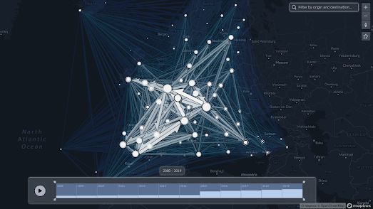
The Erasmus Network interactive flow map visualizes where 3.3 million students have studied abroad as part of the Erasmus programme from 2008 to 2020. If you enter a city or town into the map you can view where students from the city have traveled to and from as part of Erasmus. For example if you enter Paris you can view a flow map showing where in Europe students from Paris have studied abroad and where exchange students studying in Paris have traveled from (London, Berlin and Madrid appear to be the most popular destinations for students from Paris). The map also includes a timeline option which allows you to filter the map by a specific period of time.
Because of how the data is collected by Erasmus the map only shows travel between towns and cities rather than individual universities. This means, for example, that it is not possible to view a flow map for any of the individual universities in London. You can only explore where students studying in London as a whole have traveled to and from.
The Erasmus Network map was created using FlowmapBlue. FlowmapBlue is a great tool for creating interactive flow-maps. To create a flow-map with FlowmapBlue you just need to save your data to a Google Spreadsheet. FlowmapBlue will then automatically create a flow-map from the data in your spreadsheet.
Many universities make a huge amount of money from enrolling and teaching students from overseas. In the USA a very large number of overseas students come from China. India sends the second largest number of students to study in America.UNESCO's Global Flow of Tertiary-Level Students is an interactive map which visualizes the flow of students around the world. The map allows you to view the number of overseas students studying in every country around the world and where those students come from. It also allows you to see the most popular destinations for students from each country choosing to study abroad.
China exports by far the most students of any country in the world. The USA is the most popular destination for Chinese students studying abroad (309,837 students). Australia (128,498) is the next most popular country for overseas students from China, followed by the United Kingdom (89,318) and Japan (76,537).
According to the map nearly 73,000 Americans choose to study abroad. The most popular destination for Americans studying abroad is the United Kingdom (15,654), followed by Mexico (11,109), Canada (8,355) and Grenada (4,855).