Monday, October 09, 2023

Guess Thy Neighbor

Can you name the four countries which border Greece? If you can then you should head straight over to Neighborle.

Each day on Neighborle you are shown a different country on an interactive map. Your daily challenge is to name all the countries which border that day's highlighted country. Every time you name a correct bordering country it will be shown in green on the map. If you enter an incorrect country then that country will be colored grey on the map. You are allowed to make five incorrect answers every day. Once you have made five incorrect answers you aren't allowed any more guesses.

Don't worry if you can't name Greece's four immediate neighbors there will be a new challenge tomorrow. A challenge centered on a completely different country.

Neighborle is just one of a number of daily geography map challenges inspired by NYT's daily Wordle game.

Worldle was one of the first daily geography challenges to emerge in the wake of the Wordle craze. Worldle requires you to name a country from just its map outline. Like the original Wordle game you have six goes in which to find the correct answer. And, like Wordle, there is only one game to play every day. Where Worldle differs a lot from Wordle is in the clues given after each answer. 

Instead of green and yellow squares Worldle uses arrows and percentages to help you get to the correct answer from your incorrect guesses. After each guess, you are told the distance you were from the correct country, the direction you need to move on a map and the proximity of your guess to the target country. With just these clues it should be possible to work out the correct answer within the permitted six guesses (particularly if like me you cheat and use a world map).

Light, Shadows & Fog

Brody Smith has written a couple of useful tutorials on how you can customize lighting, building and terrain shadows, and fog settings in Mapbox GL powered maps.

In Mapbox Lighting, Shadows, and Fog - Part 1 Brody looks at how lighting can be used to change the visual appearance of a map. In Mapbox Lighting, Shadows, and Fog - Part 2 Broady explores how tinkering with a map's fog settings can create depth and atmosphere, and how ambient and directional light can be used to simulate different light sources. 

Both posts include impressive demo maps. Part Two contains a 3D map view of Uluru. This map includes a number of filter controls which allow you to adjust the range, color, and star intensity settings. The map allows you to instantly observe the visual effect of adjusting these settings. This is very useful for anyone who wants to quickly experiment with the Mapbox fog settings to find the best configuration for their own maps. Part Two also includes an interactive map which allows you to adjust the ambient and directional light settings and instantly observe the effect that changing these parameters has on the visual appearance of the map.

Part One includes a beautiful interactive map of Sydney Opera House. This map includes a control which allows you to select from each of the four preset light settings in Mapbox GL. This allows you to see how the 3D building of Sydney Opera House and its immediate environment look with Mapbox's default day, dawn, dusk and night settings. When creating your own maps you aren't restricted to these four presets and you can use the Mapbox Lighting API to create custom lighting effects for your own maps.

Sunday, October 08, 2023

Mapping the Barassi Line

The Barassi Line is an imaginary line across Australia that approximately divides areas where Australian rules football or rugby league is the most popular football code. The line is named after Ron Barassi, a former player and coach in Australian Rules Football. The term the 'Barassi Line' was first used by historian Ian Turner in his 1978 Ron Barassi Memorial Lecture. 

The Barassi Line represents a cultural divide in Australia, with different regions showing a preference for one sport over the other. The line is generally accepted to run from Eden on the south coast of New South Wales, through Canberra and Broken Hill, and into the north-east of the Northern Territory. However like many borders around the world the exact location of the Barassi Line is a matter of some contention. Which is why The People's Republic of Couch has decided to settle the matter for good. 

An interactive map in The Barassi Line shows the location of Ian Turner's original border between Australian rules football & rugby league, and the Republic of Couch's new definitive Barassi Line. This new more accurate border was calculated by plotting the locations of all Aussie rules and rugby league football clubs in Australia. Then each suburb in the country was marked as either Aussie rules or rugby league depending on which code had the most clubs. Then by Voronoi mapping this data it was possible to plot a more detailed Barassi Line, showing the real divide between Aussie rules and rugby league supporting Australians.

Back in 2019 Zeit attempted to map the popularity of a number of different sports around the globe. In the article Little Sports Atlas Zeit used OpenStreetMap data to plot where different types of sport are actually played across the globe. 

The popularity of many different sports has a geographical basis. For example ice hockey is most popular in a thin band of latitude in the northern hemisphere - a thin band of latitude which is often cold in the winter and where water often turns to ice. Cricket on the other hand is popular in a few different countries - countries which were all at one point part of the British Empire. 

The one true world sport in the Little Sport Atlas is football. In fact Zeit claims that the map of where football is played could almost double as a map of the world's population.

Saturday, October 07, 2023

The Ring of Rain

X-Rain is an interactive map which visualizes the average amount of rainfall around the globe. The precipitation data used on the map is derived from historical satellite observations. This remote sensed data is not as accurate as data recorded by rain gauges but it is able to provide a more global view of precipitation levels as it is not limited to only those locations with rain gauges.

The X-Rain map provides a very clear visualization of the ring of rain around the Earth's equator. Areas near the equator receive higher levels of rainfall due to convectional rainfall. Because the equator is located in the tropical region where the sun is most direct and intense it can receive more rain than other latitudes. The intense heat of the sun at the equator causes warm, moist air to rise rapidly, resulting in convectional uplift. As the air rises, it cools, condenses, and forms clouds. This process leads to heavy precipitation and frequent rainfall in equatorial regions.

NASA's Earth Observatory has created an animated map of annual Total Rainfall. This map shows total monthly rainfall using data from NASA’s Integrated Multi-satellitE Retrievals for GPM (IMERG). Again you can see that most areas near the equator receive above average levels of precipitation, due to convectional rainfall.

NASA's animated map of monthly rainfall totals also does a great job of visualizing the seasonal patterns in precipitation. According to NASA "about two-thirds of all rain falls along or near the equator, and countries in those latitudes often have several months of near-daily rain followed by months of dryness as the rain band moves north and south." These seasonal changes are why many parts of Asia experience monsoon conditions between April and September and South America experiences a rainy season from October to May.

Friday, October 06, 2023

The London Underground Map Quiz

The London Underground consists of 269 stations. I bet you can't name them all.

London Underground Names is an easy map game which simply requires you to name all 269 stations on the London Underground network. Naming all 269 stations is a little tricky so I've provided you with a couple of aides to help you remind you of some of the station names. 

Due to my personal commuting history I can name all the stations on the Victoria Line and the Jubilee Line. However if you asked me to reel off the names I'd probably omit a couple of stations on each line. I've therefore added an option to the map to view the locations of all the stations on a chosen line. I find this helps me to see which stations on a line I've missed out and still need to name.

There are lots of London Underground stations I couldn't name without a little help. I've therefore added a clue to every station's name for those who need it. If you need a clue to a station's name simply click on the station's marker on the map.

London Underground Names was inspired by the brilliant SF Street Names, which requires you to name the streets in San Francisco. I decided that London had far too many streets for a similar game in the English capital and decided that London Underground stations was a far more manageable challenge.

If you want to create a similar game for your own city's transit network then you can clone and adapt London Underground Names on its Glitch page.

Thursday, October 05, 2023

Your Perfect Weather Map

We all have our own ideas about what the ideal weather conditions actually are. myPefectWeather is an interactive map which can help you find the locations in the United States which most closely match your own preferred temperatures, precipitation levels and /or amount of snowfall.

If you select the 'options' button on the myPerfectWeather map menu you can begin to discover the locations across America which most resemble your ideal climate zone. For example - if you select 'the average high temperature' filter then you can enter your desired range of maximum temperatures. The map will then adjust to visualize the places that most closely match your preferred temperature range. 

You can also filter the map by average daily precipitation, average daily snowfall and comfortable weather days. You can also view a detailed breakdown of the annual weather conditions in any city by using the map's search box.

The Goldilocks Zone Finder is an interactive map which can help you find the location in the United States which has your perfect year-round temperatures. Just tell the map the hottest and coldest temperatures that you are happy to live with it and it will show you a map displaying the number of days per year which fall within your own personal Goldilocks temperature zone, for all locations across the United States.

The Goldilocks Zone Finder was created by Luke Champine who wanted to find a place to live which fell within his own personal temperature preferences. The map uses data from NOAA's 30 Year Climate Normals, which uses 30 years of weather measurements taken across the United States to calculate daily temperature averages. The NOAA Climate Normals also includes averages for precipitation and other climate variables but these are not included on the Goldilocks Zone Finder.

The Goldilocks Zone Finder currently only works for the United States but if you are interested in building a similar map for another country the code for the project is available on GitHub.

If you want to explore local average temperatures by day of the year in a little more detail then you might also like the County Climate interactive map. This map shows the average maximum temperature in every county for every day of the year. 

If you select a date from the slider at the top of the map you can view the average temperatures on that day across the whole country. If you select a county on the map you can also view a graph showing the average maximum temperature in that county for each month of the year (based on temperature data from 1979-2011). 


The temperature may not be the only data that you want to consider in your attempts to find a location which has your perfect weather. In that case you could use Peter Kerpedjiev's map of annual worldwide weather data. The map uses historical climate data from Wikipedia's city 'weather boxes' to visualize how weather changes during the year around the world.

Using the Sunshine Map it is possible to view the number of hours of sunshine across the globe for every month of the year. The map also allows you to view the changing rates of precipitation, the highest & lowest temperatures, and the amount of snowfall. 

The Sunshine Map uses Jason Davies' D3 voronoi library to divide the world up into regions based on the closest city with Wikipedia climate data. This does mean that where Wikipedia only has a few cities with climate data.the Voronoi areas can be quite large.

Wednesday, October 04, 2023

The 10 Day Fall Color Forecast

The Fall Foliage Map 2023 is an interactive fall foliage map which is updated daily to provide you with both an accurate progress report of fall colors and a forecast of how fall colors in the United States are likely to change over the next ten days.

According to Explore Fall the main factors influencing fall colors are the temperature and daylight. The Explore Fall predictive fall color model uses real-time weather conditions and user submitted fall foliage reports to forecast fall foliage colors throughout the Lower 48.

The Fall Foliage Map shows the observed fall foliage colors for every day since September 1st. You can use the map's date control to view the observed fall colors for any day. You can also use this control to explore Explore Fall's ten day forecast of how fall colors are predicted to progress in the next few days.

Every year Smoky Mountain releases their own interactive Fall Foliage Map, which plots the annual progress of when and where leaves change their colors across the United States. The Fall Foliage Map uses historical weather records from all 48 continental states to predict the arrival of fall at the county level across the contiguous United States. This map also includes a date control which allows you to view the leaf color you can expect for any date from the beginning of September through to the end of November.

Tuesday, October 03, 2023

Shilling for Putin

The Insider ('fully committed to investigative journalism and to debunking fake news') has created a new interactive map which exposes the 'fake experts' around the world that are spreading pro-Kremlin fake narratives and Russian propaganda. The Insider claims that what "unites the individuals featured on this map is their attempt to portray Putin's policies positively while disseminating outright misinformation."

If you click on a country on the Fakesperts map you can view a list of the individuals in that country who are used by Russia to spread fake news. In the United States one of the pro-Kremlin fake experts exposed by the map is the disgraced Tucker Carlson. Carlson is a well-known Putin fanboy, who frequently espouses lies about Ukraine and has bent over backwards to support the Russian invasion of Ukraine. 

In the UK ex-goalkeeper and self-proclaimed 'son of God' David Icke appears on the map. Although seen as a figure of ridicule in the UK he often appears on Russian television venting anti-Semitic conspiracy theories centered on George Soros.

Often the individuals identified by the map are little known in their own countries. For example the map identifies Daniel Patrick Welch in the United States as a 'fakespert'. Welch is the manager of a small daycare center in Boston, who is often used by Russian television as a political analyst. This is probably because he will say anything he is paymasters wish, for example that Ukraine sold weapons to ISIS and that the war in Ukraine will lead to the end of the European Union and NATO.

Monday, October 02, 2023

The October Solar Eclipse Map

In 12 days time people in North, Central, and South America will be able to experience a solar eclipse. On Saturday, Oct 14 an annular solar eclipse will occur which will be visible in some areas of the United States, Mexico, and a number of countries in Central and South America.

NASA's 2023 Solar Eclipse Explorer is a new interactive map which visualizes the path of the solar eclipse on Oct 14 down to the second. The map shows a darkened strip, which visualizes the path of the umbra, the area in which people can experience a total eclipse. You can also turn on a penumbra layer which visualizes where people can experience a partial eclipse.

Everyone living in the contiguous United States should be able to see at least a partial solar eclipse on the 14th. NASA's map allows you to view the percentage of the eclipse you can see from your location. Citizens of New York will be able to see a 23% eclipse. Los Angeles will see about 70% of the sun covered by the moon, and in San Francisco you will get a roughly 75% eclipse.

If you click on a city's place-name label on the map you can view a simulated image of the eclipse from that location, the current weather conditions in the city and the times of the beginning, fullest and end of the eclipse at the selected location. A countdown is also provided showing how much time remains until the moment of maximum coverage for your city.

The map's time slider allows you to see at which times the Antumbra will be visible. This is when the moon passes in front of the sun at your location and you should be able to see a 'ring of fire' around the moon. If you adjust the map's slider you can see the progress of the solar eclipse over the course of Oct 14 and discover when the solar eclipse will occur at any location.

Sunday, October 01, 2023

Inside the Tombs & Pyramids of Egypt

Ramesses I was the founding pharaoh of ancient Egypt's 19th Dynasty. Ramesses burial tomb was rediscovered in the Valley of the Kings by Giovanni Belzoni in October 1817. The tomb is decorated with the Book of Gates. The Book of Gates tells the story of how a newly deceased soul travels into the next world by passing through a series of 'gates'. It is believed that the depiction of this journey was placed in tombs in order to help the deceased soul navigate through the afterlife.

You can learn more about the Book of Gates in Mused's virtual tour of The Tomb of Ramesses I. The tour explains who Ramesses I was and guides you through the amazing scenes from the Book of Gates which adorn the walls of the tomb. Using custom created 'Street View' panoramas the funerary text of the Book of Gates is retold through a narrated guide of the tomb's decorated walls. Following the tour you can follow the journey that Ramesses I's soul hoped to take into the next life.

If you select the 'Free Explore' button at the start of the tour then you can explore the tomb of Ramesses I for yourself without the narrated guide. Just click on the circles to move around the tomb and pan around and zoom in and out to view the decorated walls in more detail. 

If you register with Mused you can experience many more guided virtual tours of important archaeological sites in Egypt, including the tombs of Tutankhamun, Ramesses II, and Queen Meresankh III.

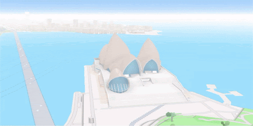
Mused's Inside the Great Pyramid of Giza is an amazing virtual 'Street View' tour of the normally closed inner chambers of the Khufu Pyramid in Egypt. This guided tour allows you to explore the interior three chambers of the pyramid, including the King's Chamber, the Queen's Chamber and the subterranean chamber, which is cut into and decends into the bedrock below the pyramid itself. 

The Khufu Pyramid or Great Pyramid of Giza is the largest of the Egyptian pyramids and is the tomb of the pharaoh Khufu, who died in 2566 BC.The Great Pyramid was the world's tallest building for more than 3,800 years. Very few people are allowed inside the Great Pyramid of Giza. Today you can be one of them. 

The tour enters the pyramid via a robber's tunnel believed to date back to 820 BC. At the entrance of this tunnel you have two choices. You can either take the Guided Tour or use the Free Explore option. The guided tour uses custom made 360 degree panoramic 'Street View' imagery to lead you inside the pyramid and into the three chambers. This guided tour includes contextual annotations which explain what you are seeing during the tour. 

The 'Free Explore' option allows you to enter and explore the pyramid alone. In this mode you are left to your own devices to use the navigation circles added to the panoramic imagery to virtually explore inside the Great Pyramid.

Of course Egypt isn't the only country with ancient pyramids. If you travel south down the River Nile through Egypt to Sudan, just before you get to Khartoum you will come to Meroë, the ancient capital of the Kushite Kingdom. Here you will discover an ancient city which is home to more than 200 pyramids.

Google Arts and Culture's Pyramids of Meroë is a fascinating virtual tour of the Nubian pyramids located in the Sudanese desert. The Pyramids of Meroë were constructed in the Kingdom of Kush during the Meroitic period (542 BC–4th century AD).

As you scroll through the Pyramids of Meroë you are taken on a virtual tour of a 3D model of the pyramid of King Arkamani the First. This tour explains how these distinctly steep sided structures were built over 2,500 years ago. Keep scrolling and you can dive inside the pyramid, explore the hieroglyphs on the Offering Chapel's walls and view a 3D illustration of the pyramid's underground tomb. 

After exploring the 3D model of King Arkamani the First's pyramid you can explore Meroë for yourself using Google Maps Street View. This Street View tour includes interactive panoramic images of the partially buried pyramid of King Kalka Kaltaly, the pyramid of Queen Amanitore and the pyramid of King Adeqetali.