Monday, October 31, 2016

San Francisco LIDAR data in 3D


Over the last couple of weeks quite a few interactive maps have been released which have made use of the new extrude property in Mapbox GL. All of these maps have used the extrude property to create 3d buildings on a map. All of the maps therefore have (or could have) used the extrusion property with the building height data which is already available in the default map styles in Mapbox Studio.

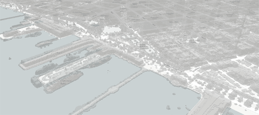
The Mapbox GL extrude property however can also be used to create 3d features out of your own data layers. For example this San Francisco Lidar Map applies the extrude property to San Francisco tree and building Lidar data. This Lidar data has been added to the map in Mapbox Studio from a GeoJSON file (presumably downloaded from the City of San Francisco). The result of using this Lidar data is that as well as visualizing buildings in 3d the map also extrudes other features, such as ships and individual trees.

If you want to use the extrude property with your own data in Mapbox GL then you need to start by adding your own data layer in Mapbox Studio. If you look at the JavaScript code for the San Francisco Lidar Map you can see that the extrude property is being applied to the 'DN' property of the GeoJSON Lidar data. In other words the map is changing the style of the Lidar data layer based on the data properties (in this case the 'DN' property).

In simple terms - if you want to extrude a property on your map you need to have a property in your data layer which can be extruded.

You can learn more about how to use the Mapbox GL style specification to define the way in which the data relates to the map style in the Mapbox GL Data-Driven Style Reference section of the Mapbox documentation. In particular you should look at the paragraphs headed the 'Required style sheet objects for data-driven styles' and the 'Fill layer extrusion, identity function'.

The Geography of Employment


Jobs in Boston is a dot map of jobs in Boston categorized by employment sector. It shows where people work in Boston and what type of jobs that they do. It also provides a really interesting insight into how different job sectors in the city tend to be concentrated in different Boston neighborhoods.

The Jobs in Boston map uses Longitudinal Employer–Household Dynamics (LEHD) data from the Census Bureau to map jobs to workplace locations. The concentration of different colored dots on the map reveals that a number of locations in Boston serve as hot-spots for specific sectors of employment.

For example MIT is obviously an important center of jobs in the education sector. A lot of health care jobs are centered around the Longwood Medical and Academic Area. The Massachusetts State House and a few other nearby buildings host a significant number of public admin jobs.

If you like this map you might also be interested in these other dot maps, visualizing census and demographic data from countries around the world.

City Zoning Maps in 3D


Sarah Michael Levine has used Mapbox GL's new extrude property to create a Jersey City Building Census complete with 3d buildings. The map visualizes the city's buildings in 3d with zoning, ward and parcel information available for each building.

The Jersey City Building Census map colors each building in the city based on how it is zoned. You can click on a building footprint on the map to view ts zone and parcel information. These details include the building's age, number of stories and owner information (where available).

You can read a detailed explanation of how and why the map was created on Sarah's blog, Sarah Makes Maps.

The new extrude property in Mapbox GL is proving very popular for city zoning maps. You can also see it in action on the Vancouver Zoning Map and the Toronto Zoning Map. The ability to add 3d building polygons to a map is also effective for building age maps. You can see a neat example of this on the Catalonia Building Age Map.

Sunday, October 30, 2016

The Elevated Maps of the Week


The development of WebGL and vector map tiles has led to some interesting experiments in visualizing elevation and depth data on interactive maps. For example this week we saw a couple of creative mapped visualizations of bathymetry and Lidar data.

Contours.org has used historical depth data of Scotland's lochs to create a series of 3d WebGL maps of four of Scotland's biggest lakes, including Loch Ness.

The depths of most of Scotland's lochs were not measured until the mid-Nineteenth Century. The first real systematic survey of the lochs was started in 1897 by the oceanographer Sir John Murray. From 1897 to 1909 Murray carried out 60,000 soundings and produced the first ever detailed charts, with depth data, of Scotland's major lochs.

Contours.org has digitized the bathymetry data from Murray's survey for four of Scotland's lochs and created 3d bathymetry maps. These maps allow you to explore the bathymetry contours of Loch Ness, Loch Lomond, Loch Levan and Loch Morar in 3d. Contours.org also allows you to view the bathymetry contours of each loch in 2d overlaid on an aerial map.


The Cartographic and Geological Institute of Catalunya has developed a prototype terrain explorer for their 2 meter Digital Elevation Model of Catalonia. The Institute's Relief and Shadow map, created from Lidar data, uses vector map tiles to allow you to interact in real-time with a relief map of the area.

Using Relief and Shadow you can explore the DEM model of Catalonia in an interactive Leaflet & Mapzen powered map. The map includes an impressive tool which allows you to color the terrain by elevation and by the direction of the sun. This tool allows you to change the appearance of the map in real-time by painting within an interactive compass rose.

Using the color-picker tool with the interactive compass rose you can paint the terrain on the map to highlight different elevation data and different directions of light. The center of the compass rose represents lower elevations on the map and the elevations become higher as you move out towards the circumference.

Relief and Shadow is partly based on Mapzen's Sphere Map Demo. You can learn more about how Mapzen developed their 'sphere maps' tool on this Mapzen Sphere Maps blog post.

The recent addition of the extrude property in Mapbox GL means that Lidar data can also now be visualized in 3d on a Mapbox map. Over the last few weeks we have seen extrusion used in Mapbox GL to map 3d buildings. Next week on Maps Mania we will look at how this extrude property can also be used with Lidar data to create 3d visualizations of elevation data.

Saturday, October 29, 2016

Spooky Locations for Halloween


If you want to know the places to avoid this Halloween then you need to search Trulia's Unnatural Hazards map. Enter your address into the Unnatural Hazards map and you can find the location of nearby zombie, vampire and ghost hot-spots.

Your chances of stumbling into a herd of the walking dead are based on how close you live to a cemetery. The map uses data from the census and OpenStreetMap to locate local cemeteries. The color of the map shows your zombie 'degree of risk', which is calculated based on the distance to the nearest cemetery.

The Unnatural Hazards map uses data from Yelp to work out your risk from vampire bites. The vampire bite risk is based on the location of nearby blood banks and hospitals, where vampires are likely to be searching for their latest feed. Your likelihood of bumping into a ghost in your neighborhood is based on a number of secret sources.

Elevation & Shadow Mapping


The Cartographic and Geological Institute of Catalunya has developed a prototype terrain explorer for their 2 meter Digital Elevation Model of Catalonia. The Institute's Relief and Shadow map, created from Lidar data, allows you to view and interact in real-time with a relief map of the area.

Using Relief and Shadow you can explore the DEM model of Catalonia in an interactive Leaflet & Mapzen powered map. The map includes an impressive tool which allows you to color the terrain by elevation and by the direction of the sun. This tool allows you to change the appearance of the map in real-time by painting within an interactive compass rose.

Using the color-picker tool with the interactive compass rose you can paint the terrain on the map to highlight different elevation data and different directions of light. The center of the compass rose represents lower elevations on the map and the elevations become higher as you move to the circumference.

Relief and Shadow is partly based on Mapzen's Sphere Map Demo. You can learn more about how Mapzen developed their 'sphere maps' tool on this Mapzen Sphere Maps blog post.

Friday, October 28, 2016

Mapping Trump's Wall


If Donald Trump becomes president he plans to stop Americans escaping to the free world by building a massive wall along the border of Mexico. More than 650 miles of the 1,954 mile long U.S.-Mexico border is already fenced. This means that the 'Welcome to Trumpland' Wall will need to be at least 1,300 miles long. That's a lot of Chinese steel.

You can get a good sense of the scale of construction needed to build Trump's wall in a new video from the Intercept. The Intercept downloaded and stitched together 200,000 satellite images to create a huge strip map of the U.S.-Mexican border. You can view this strip map in Visualizing the U.S.-Mexico Border, a short video which pans along the whole border.

An interactive map of Trump's proposed wall also exists. Doug McCune has used Mapbox GL to create a 3d map of Trump's wall. The wall is colored in a patriotic red, white and blue. However the scale of the wall is probably a little out (it appears to be at least 10 miles high on Doug's map).

Hunting the Loch Ness Monster in 3D


Loch Ness is Scotland's second deepest loch and, due to its large surface size, is also the most voluminous lake in the British Isles. Thanks to Contour.org's new map of Loch Ness you can now explore the depth of Loch Ness in 3d.

The depths of most of Scotland's lochs were not measured until the mid-Nineteenth Century. The first real systematic survey of the lochs was started in 1897 by the oceanographer Sir John Murray. From 1897 to 1909 Murray carried out 60,000 soundings and produced the first ever detailed charts, with depth data, of Scotland's major lochs.

Contours.org has digitized the bathymetry data from Murray's survey for four of Scotland's lochs and created 3d bathymetry maps. These maps allow you to explore the bathymetry contours of Loch Ness, Loch Lomond, Loch Levan and Loch Morar in 3d.   Contours.org also allows you to view the bathymetry contours of each loch in 2d overlaid on a aerial map.

Thursday, October 27, 2016

Mapping the Grid


The Esri Story Maps team has released a comprehensive guide to the American power grid. An Atlas of Electricity explores where the USA gets its electricity from and how it distributes this power across the country.

At the heart of An Atlas of Electricity is an interactive map plotting the location and size of the grid's power plants and transmission cables. This map allows you to explore the location and capacity of the country's electricity producing power plants and how they connect to the national grid.

As well as mapping the physical infrastructure of the electricity grid this story map examines the primary energy sources used to generate electricity in the USA. It maps the size and capacity of coal-fired power plants, natural gas power plants and petroleum power plants. Alongside these fossil-fuel sources of power An Atlas of Electricity plots the size and capacity of the U.S.'s nuclear power plants, hydroelectric power plants and solar & wind power plants.

The 3D Building Age Map


Building age maps have been very popular over the last couple of years (you can view a long list of city building age maps here). I predict that the next trend in building age maps will be to show building ages in 3d.

The first example of a 3d building age map that I've seen is this map of Vallvidrera in Catalonia. Edificacions dels Barris de Muntanya colors the extruded 3d buildings of Vallvidrera on the map based on the age of construction of each building. A building age map seems to me to be a very appropriate place for using Mapbox GL's new extrude property to visualize buildings in 3d. The result is that individual buildings are much more identifiable on the map from their extruded 3d shape than they would appear by simply showing individual building footprints.

Other good examples of Mapbox GL's new 3d capabilities can be seen on the Vancouver Zoning Map map and the Toronto Zoning Map. The Population Density Inspector also allows you to explore the number of people living in each census block in America in 3d, thanks to the Mapbox GL extrude property.