Friday, September 11, 2020

The Virtual 3D Architecture Gallery


Over the summer I have spent a lot of time exploring virtual exhibitions created by art galleries and museums around the world. Many of these virtual exhibitions have been developed by museums during lock-down to provide the public some access to otherwise locked away collections.

Of course museums and art galleries have not been the only victims of the lock-down. Students studying for degrees in the arts often finish their studies with a final show, exhibition or performance. This year most of those final shows have had to be cancelled.

For example every year the students studying at the Bartlett School of Architecture hold one of the largest student architecture shows in the world. The show showcases the work of more than 700 students and is usually attended by more than 12,000 visitors. This year the physical exhibition had to be cancelled. However all is not lost as the show can still be viewed - virtually & completely online.

The Bartlett Summer Show 2020 is an amazing virtual exhibition of work created by Bartlett architecture students. It can be viewed online until October 2nd. The exhibition is a joy to navigate. It uses the metaphor of a real physical gallery exhibition, which allows you to navigate each students' work in a 3D environment. If you click on an individual work in this galley environment you can read more about the selected work and the theory behind it.

The Bartlett Summer Show 2020 is a fantastically put together virtual exhibition. The amazing work created by the Bartlett School of Architecture students is equally amazing. If you have a little time to spare then this is one virtual exhibition you should definitely attend.

Thursday, September 10, 2020

Picturing the Past


The past is another country. You need a different kind of map to navigate there. A map like Cronobook.

Cronobook is an interactive map which can give you a little glimpse into how the world used to be. It allows you to explore vintage photographs of locations around the world. You can explore these photographs by location on the map and also by date using the Cronobook timeline. To search the map by date just click on the clock icon in the top right-hand corner of the map and select the period you wish to explore.

You can also search Cronobook's collection of vintage photographs by subject matter. If you select the album icon above the map you can search the photographs by key words. When you click on an individual photograph on the map you can view the date it was taken and a description provided by the user who uploaded it. You can also comment on individual photographs on Cronobook and join in any discussions about the selected picture or of the historical scene depicted.


Cronobook reminds me a little of the much loved Historypin interactive map. Historypin is another map which showcases vintage and historical photographs of locations around the world taken during different periods of modern history. Historypin has the added advantage of allowing you to view these vintage photographs superimposed on top of the modern Google Map's Street Views of the same scene.

Historypin has a huge collection of photographs that have been uploaded to the site, This allows you to explore the history of locations right around the world. As well as this huge collection of still photography Historypin has a slightly smaller number of vintage film clips that keen users have also uploaded to the site.


If you live in New York then you can also explore vintage photographs of your city on the excellent 1940's NYC and 80s.NYC. In the 1940's, and again in the 1950's, the New York Works Progress Administration took photographs of every building in the city, in order to help estimate property values and property taxes. These two interactive maps allow you to browse these huge collections of New York street scenes by location.

You can explore even more vintage photography on these interactive maps:

The Collections of the Albert Khan Museum - photos captured by Albert Khan's team of photographers at the beginning of the 20th century
OldSF - vintage photos of San Francisco (has Google Maps licencing issues but photos still work)
OldNYC - old photographs of New York
Old Toronto - historic photos of Toronto from the City of Toronto Archives
Wymer's DC - view images of D.C. from the John P. Wymer Photograph Collection
The Yangon Time Machine - a map of vintage photographs of Yangon, Myanmar
Smapshot - historical images of Switzerland
OldAms - thousands of vintage photographs of Amsterdam
Tids Maskinen - explore photos of Norway by location & date
Helsinki Ennen - historical maps and photographs of the Finnish capital
Our Town Stories - Edinburgh - vintage photos & maps of the Scottish capital
Vintage Greece - geo-located vintage photographs and historical maps of Greece
Ajapaik - explore vintage photos of Estonia
The Hungaricana a map of thousands of vintage photographs from the Hungarian Parliament Library

The World Hunger Map


The United Nation's World Food Programme (WFP) was established to fight hunger and promote food security around the world. Every year it provides food assistance to around 91 million people in 83 different countries.

Around 1 billion people around the world will still be going hungry today.

The WFP's interactive HungerMap tracks and predicts where people are going hungry around the world right now. It does this by showing where people currently have insufficient food to meet their daily requirements. The map also highlights countries around the world where there has been a marked deterioration in food consumption over the last month.

If you click on a country on the interactive map you can view detailed analysis of food security in the country and the number of people currently with insufficient food. This country view also provides information on the country's current economic situation, including trends in the balance of trade and food inflation.

The HungerMap is designed to provide a near real-time estimate of where people are going hungry right now. In order to do this it uses a number of different metrics on the latest conflict zones, climate trends, populations and extreme weather events. The map serves as an important indicator of where people right now are living without enough food.

Wednesday, September 09, 2020

Mapbox With Mapillary Images


Mapillary is an interactive map of crowdsourced geotagged photos. For map developers it is a fantastic resource of street level imagery around the world. In this post I want to show you how you can use the Mapillary API to display street level imagery on a Mapbox GL interactive map.

Before we get started let's have a look at the finished map that we are going to create:

A Mapbox Map with Mapillary Images

This little interactive map allows you to explore photographs uploaded to Mapillary around the White House in Washington D.C.. Click on any of the map markers on this map and you can view the selected image directly on the interactive map.

Now let's get building ...


1. Sign Up for a Mapillary API Key

Before you can start using Mapillary photographs on your interactive map you will need a Mapillary API client ID. The Mapillary Blog has a great introduction into how you can register for your free Mapillary API account. Before starting to create your own map you should read Global access to map data with the Mapillary API and follow the provided instructions for opening a Mapillary account and getting your very own client ID.


2. Make a Mapillary API Call

Once you have a client ID you can start using the Mapillary API to make an API call. For our map we want to get photographs which have been uploaded to Mapillary near to the White House. Here is our API call:

https://a.mapillary.com/v3/images?client_id=<YOUR_CLIENT_ID>&closeto=-77.03655123710632,38.8976629708&radius=250


This call will return a GeoJSON doc with Mapillary images within a search radius of 250 metres from the White House (Longitude: -77.03655123710632, Latitude:38.8976629708).

- Remember to insert your own client ID into the above URL.


3. Save the GeoJSON and Upload it to Mapbox Studio

Once you have made your Mapillary API call the GeoJSON will be displayed in your internet browser. Save this as a GeoJSON file. Once you have saved the GeoJSON document you can display it using any interactive map library. For my map I uploaded the saved GeoJSON as a tileset in Mapbox Studio.

Saving the GeoJSON as a Mapbox Studio tileset allows us to add the Mapillary images as a layer in Mapbox GL.
map.on('load', function() {
   map.addLayer({
     id: 'san',
     type: 'circle',
     source: {
       type: 'vector',
       url: 'mapbox://gmapsmania.carbekh7'
     },
     'source-layer': 'centralpark-a2pen7',
         paint: {
     'circle-opacity': 0.8,
     'circle-color': 'blue'
   }
   });
 });
The code above displays the GeoJSON data on a Mapbox map as small blue circles.


4. Turning Data into Photos

The GeoJSON data we downloaded from Mapillary doesn't actually include the URLs for the Mapillary images. However it does include the key used in the URL for each image. Mapillary image URLs take the form of:

https://images.mapillary.com/<KEY>thumb-1024.jpg

In order to display the correct Mapillary photograph when a user clicks on one of the blue circle markers we need to use a Mapbox data expression to grab the key for the photograph from the GeoJSON and then use that key to call the correct Mapillary image URL:
map.on('click', function (e) {
       var text = map.queryRenderedFeatures(e.point,   { layers: ['san'] });
       var title = text[0].properties.key;
       document.getElementById('plate').innerHTML = '<img   src="https://images.mapillary.com/' + title + '/thumb-1024.jpg" height="337">';
});
This function simply queries the GeoJSON for the correct key and then displays an image from Mapillary using that key.

You can see the finished map in action at A Mapbox Map with Mapillary Images. If you are still confused can explore the whole code for the finished map displayed directly beneath the map.

Mapping the Fall Colors


I've caught my first sighting of the Smoky Mountain Fall Foliage Map, the traditional sign that summer is finally slipping into autumn. Every year Smoky Mountain releases their interactive Fall Foliage Map, which plots the annual progress of when and where leaves change their colors across the United States.

The 2020 Fall Foliage Map has now arrived. According to the map some northern states will be seeing a change in leaf color in the next two weeks. The Fall Foliage Map uses historical weather records from all 48 continental states to predict the arrival of fall at the county level across the contiguous United States. The map includes a date control which allows you to view the leaf color you can expect for any date from the beginning of September through to the end of November.


The map is accompanied by a chart which shows the average US temperature since 1990. It is also accompanied by an explanation of why leaves change color in the Fall and why leaves fall from their trees during Autumn.

Oregon Wildfires Map


The Oregonian has created a live Real-time Wildfires Map, which uses data from federal websites to show the rough locations of the current wildfires in the United States.

The size of a fire marker on this map indicates the estimated size of a fire. The color of the marker estimates how much of the fire is contained, with the darker color markers showing the least contained fires and lighter color markers showing the most contained fires. If you click on a fire's marker on the map you can learn more about the scale and intensity of the fire and click-through to read more about the fire on InciWeb.

InciWeb is an all-risk incident web information management system provided by the United States Forest Service, which provides the latest information on wild-land fire emergencies. The Oregonian is also providing live updates on the wildfire emergency in the state.


The Oregon Wildfire and Smoke Map is another real-time interactive map showing the locations of wildfires across Oregon and the United States. This map not only includes information on the location of wildfires but attempts to map the latest smoke conditions as well.

Beneath the map you can view a list of all the active fires. This list includes information on the size of each fire, how much of the fire is contained and an indication of when this information was last updated.

The State's own interactive State of Oregon Fires and Hotspots Dashboard maps current active fires in Oregon and the current air quality in the state. The interactive wildfire map includes information on each fire in the state, including each fire' size, the percent contained and the number of homes and other buildings destroyed.


The ALERTWildfire system uses live cameras to detect, locate and confirm wildfires. The system can also be used to monitor fire behavior and help firefighters tackle fires on the ground. The ALERTWildfire system is being developed by a consortium of the University of Nevada, the University of California and the University of Oregon. The system is currently operational in a number of locations in California, Idaho, Nevada and Oregon.

If you select a region from the ALERTWildfire interactive map you can see the live views from every single fire camera in the area. A Leaflet.js map shows the location of all the live cameras in the system and the direction of each camera's point of view. If you select a camera on the map you can view its current live feed. All the other feeds from the other cameras in the area are shown beneath this interactive map.

Tuesday, September 08, 2020

3D Printing the World


Slartibartfast created some of his favorite coastlines while working on the Norwegian fjords. In fact he won an award for his work on Norway. Now you can own a piece of Slartibartfast's best planetary designs - thanks to Terrafab.

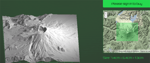
Terrafab allows you to select any area of Norway, preview the area as a 3D terrain map and then print out your selected area as a 3D model.Whether you believe the fjords were created by Slartibartfast, your favorite God or by glacial retreat the Norwegian coast certainly has some of the most beautiful landscapes in the world. Using Terrafab you can now create your own 3D model of a little piece of Norway.

Once you have used the interactive map to select your chosen area and previewed the area in 3D you can click through to actually order your model, which will be printed in full color sandstone. The cost of the model will depend on its size and complexity. Larger models can be very expensive but smaller models start from as little as $10.


Have you ever dreamed of owning your own 3D scale model of the Grand Canyon or the Matterhorn? Thanks to the Terrainator you now can. The Terrainator is a very similar to Terrafab. The main difference is that the Terrainator isn't limited to the terrain of Norway. In fact Terrainator even lets you print out 3D models of Lunar and Martian landscapes.

The Terrainator uses Google Maps to help you select your favorite area of terrain. It then creates an accurate scale model and uploads it to Shapeways, ready for 3D printing. The cost of the model depends on the volume of material required to make the model. Flatter models are therefore cheaper than mountainous areas, although they are much less fun. It is also possible to purchase the created STL files from Terrainator if you want to print out a terrain model for yourself. 

Ground Truth - Satellite Calibration Targets


At the end of the 1950's the CIA launched a series of strategic reconnaissance satellites in order to spy on the USSR. The satellites were used between 1959 and 1972 to carry out photographic surveillance of the Soviet Union, the People's Republic of China and other areas of interest to the United States.

In order to calibrate the cameras on board the reconnaissance satellites a series of calibration targets were built in the desert around Casa Grande, Arizona. These targets were used to test the focus and resolution of the imagery captured by the spy satellites.The calibration targets in Arizona consisted of 272 concrete markers arranged in a 16 by 16 mile square grid. Many of these calibration targets still exist today.

You can explore the remaining calibration targets in Arizona on a new art project called Ground Truth. For the project artists Julie Anand and Damon Sauer took photographs of the remaining calibration targets. On top of these photographs they have mapped the locations of present day satellites to 'emphasize the ubiquity of this contemporary technology encircling the globe'.

Ground Truth includes an interactive map which shows the locations of all the original 272 markers. On this map the lighter markers indicate the remaining calibration targets which have been photographed (click on the marker to view the photo). If you click on the darker markers you can view satellite imagery of the area where the original calibration target was located.

Monday, September 07, 2020

The Hong Kong Protests on Street View


Recently Google updated the Street View imagery on Google Maps in Hong Kong with panoramas captured in October 2019. Some of this new imagery clearly shows the graffiti, political posters and other physical evidence of the protest movement in Hong Kong. The result means that if you now explore Hong Kong on Street View you can see lots of pro-Democracy graffiti adorning the walls and roads of the city.

In June of 2019 wide-spread anti-government protests began in Hong Kong in reaction to a proposed new law which would allow China to extradite people in Hong Kong to the Chinese mainland. The bill was eventually withdrawn but by then the Chinese government's violent reaction to the demonstrations had turned the protests into a full-scale pro-democracy movement. Evidence of that protest movement can now be clearly seen on Google Maps Street View.

The Stand News has collected a number of examples of the pro-Democracy protests which can now be found on Hong Kong's Street View. In The Footprints of the 2019 Struggle on Street View the Stand News has embedded a number of these Street Views.

One example can be seen in the screenshot above which shows the new Street View for an exit of the Prince Edward Station. On the 31st August 2019 the Hong Kong police indiscriminately attacked passengers at this MTR station after a pro-democracy demonstration had been held elsewhere in the city. After the event this exit of Prince Edward Station was used as an unofficial memorial wall where citizens left flowers and messages of support for the victims of the attack. In the new Street View of the station exit you can clearly sees these messages and white flowers.

Google, like many other multi-national companies, doesn't have the best of records in standing up to Chinese censorship. It will be interesting to see how quickly China demands that this imagery is removed and whether Google will allow these images to remain on Google Maps. Please leave a comment below if you notice these Street View images being changed or being blanked out on Google Maps.

The Sounds of the Forest


The Sounds of the Forest is an interactive map which allows you to listen to sound recordings made in forests around the world. The map includes many different sound recordings from around the globe, including the calls of lemurs in the forests of Madagascar, the song of a Nightjar in Australia and the cascade of a waterfall in Chile.

The sound recordings featured on the Sounds of the Forest map are being collected for the 2021 Timber Festival. Artists will be using and responding to the sounds collected to create music and artwork which will then be showcased at the festival.

You don't need to wait for the Timber Festival to listen to the sound recordings. You can just click on the markers on the map to listen to the sounds of the forest recorded at that location. You can also submit your own recordings of forest aural landscapes by clicking on the 'Contribute' link above the map.


Another fantastic resource for those who love the sounds of nature is the 50 Birds Species and the Songs they Make.

This interactive visualization consists of pictures of 50 common backyard birds. If you click on a bird on the visualization you can listen to a recording of the bird's song. Using the images and the songs is a great way to identify birds that frequent your backyard. Each bird image also includes a little map which shows you the species' normal habitat.


From the insect chorus of the Borneo rainforests to the crooning baritone song of an Atlantic humpback whale, the Nature Soundmap can also serenade you with the sounds of nature. Nature Soundmap is a map featuring the sounds of nature captured by professional nature sound recordists around the world.

Maps have always been a fascinating way to explore the globe. Add in the sounds of the monsoon in Borneo or the soundscape of the Brazilian rain-forest and you can almost imagine that you really have been transported to the other side of the world.

If you want to explore more interactive maps featuring sound recordings made in different urban and rural landscapes around the world then have a look at the Maps Mania Sound Maps label.