Tuesday, January 12, 2021

The End of American Fossil Fuels


The incoming Biden administration has set a goal to decarbonize the U.S. power sector by 2035. Currently over 60% of electricity in the United States is generated from fossil fuels. Therefore if the new administration wants to meet its ambitious 2035 goal the government clearly has a lot to do.

Decarbonizing the U.S. energy sector will require the construction of new renewable power plants and the decommissioning of existing fossil fuel plants. This does sound like a huge task. However most fossil fuel power plants will complete their natural life-spans before 2035 and will need replacing regardless of the Biden decarbonizing goal.

You can observe the timeline of when fossil fuel power plants will reach the end of their planned lifespans on The future of United States fossil fuel-fired electricity interactive map. If you adjust the timeline on this map you can see how the total output of fossil fuel power plants will naturally drop from 820GW in 2018 to 200GW in 2035. Just by replacing these fossil fuel plants with renewable energy sources will go a long way to decarbonizing the U.S. power sector. 

On the interactive map the location of power plants are shown using colored dots. These dots disappear from the map based on the date when the power plant will come to the planned end of its lifespan.If you hover over a county on the map you can view the total number of jobs in the plant, coal and gas sectors for the selected year.

You can learn more about the natural obsolescence of the current fossil fueled power plants in the U.S. on a Georgia Tech School of Civil and Environmental Engineering research paper, Shuttering Fossil Fuel Power Plants May Cost Less Than Expected.

Global Vaccination Progress

The UK was the first country to approve the use of the Pfizer Covid-19 vaccination. Consequently the UK was able to start its vaccination programme early and has currently one of the highest rates of Covid-19 vaccinations. At the time of writing the UK has managed to vaccinate 4 doses per 100 people. However according to the Bloomberg Vaccine Tracker the UK is still a long way behind Israel (with 21 doses given per 100 people) and the U.A.E. (with 11 doses given per 100 people). The United States has so far administered 2.8 doses per 100 people.

Bloomberg's Covid-19 Vaccine Tracker uses data gathered from government websites and public statements to map the progress of the Covid-19 vaccination around the world. The global map shows that countries in the northern hemisphere in general are progressing much faster in rolling out vaccination programmes than countries in the southern hemisphere. This may because countries in the southern hemisphere are mostly enjoying lower rates of Covid-19 and because they are currently enjoying summer weather conditions feel less of an urgent need to fast-track vaccinations.


The Bloomberg Covid-19 Vaccine Tracker also includes an interactive map which shows the rate that individual states are administering the Covid-19 vaccination. North Dakota and South Dakota are currently leading the way with 5.42 and 5.45 doses administered per 100 people respectively. At the other end of the scale Alabama (with 1.56 doses given per 100 people) and Georgia (with 1.73 doses per 100 people) currently have the lowest rates.

Monday, January 11, 2021

Escaping Slavery

'Marronage' is a noun which describes the process of escaping slavery. The word derives from the 'Maroons', the name given to escaped slaves and the descendants of Africans in the Americas who created settlements away from slavery.

The Mapping Marronage website is creating interactive visualizations exploring the networks by which enslaved people in the 18th and 19th century attempted to move "beyond the reach of slavery’s oppression and dehumanization." Currently Mapping Marronage consists of two main interactive maps:

The Flights visualization maps out the travels of 11 individuals who managed to escape from slavery. If you select one of the 11 individuals you can view their 'trajectories' on the interactive map. Clicking on any of these trajectory dots on the map and you can view a tool-tip which provides more information about the individual's journey.Clicking on an individual's name in the map sidebar allows you to access a brief biography and links to original sources from the individual's life and history.

The Networks visualization maps out the networks created by five individuals (one of whom is Frederick Douglas). These networks are established from records of their correspondences to other individuals, newspapers or institutions. As with the Flights map you can click on the trajectory dots on the map to view tool-tips with explanatory information. You can also view a biography of one of the mapped individuals and original sources relating to their life by clicking on their name in the map sidebar.

cARTography

Interactive mapping libraries such as Leaflet.js are a fantastic, but still underused, resource for presenting and exploring works of art online.However some art galleries have begun to take advantage of the potential of JavaScript mapping libraries to provide interactive mediums for exploring artworks in close detail.

The J. Paul Getty Museum is using Leaflet.js to provide close analysis of some of the amazing paintings in its collection. In a series of essays exploring some of its most famous artworks the museum has used the popular Leaflet.js mapping library to present individual paintings as images which can be panned and zoomed (just like a Google Map). 

For example in this essay about Claude Monet's Sunrise (Marine) the museum discusses the beginnings of the Impressionist movement, paying close attention to the three Monet paintings 'Sunrise (Marine)', 'Impression, Sunrise' and 'Fishing Boats Leaving the Port of Le Havre'. You can view more of the Getty Museum's essays (featuring interactive paintings) on this PDF, Paintings, Scholarly Essays.


If you are familiar with the Leaflet.js mapping library then you can also create your own interactive painting critiques - using image tiles from paintings instead of the usual map tiles. Museums and art galleries around the world use the iiif format to present artworks as zoomable images. This means that for many works of art, if they have a iiif manifest, you don't even have to create the image tiles for yourself.

The fantastic leaflet-iiif plugin allows you to seamlessly use iiif manifests with the Leaflet mapping platform.This means that you can quickly turn any painting with a iiif manifest into an interactive Leaflet map. You can view a demo of this in action on my own The Drawing Lesson critique. In this scrollytelling examination of Jan Steen's painting (depicting an artist teaching two young pupils how to draw) I have used the Leaflet mapping library to take a close look at Steen's 17th century Dutch masterpiece.

Jason Farago of the New York Times has created some of the finest art critiques, illustrated with interactive paintings. Using scrollytelling interactive maps Farago has closely examined Katsushika Hokusai's "Thirty-Six Views of Mount Fuji" (in A Picture of Change for a World in Constant Motion), an Albrecht Dürer self portrait (in Seeing Our Own Reflection in the Birth of the Self-Portrait), Thomas Eakins' painting 'The Gross Clinic' (in Taking Lessons From a Bloody Masterpiece) and 'The Death of General Wolfe', painted by Benjamin West in 1770 (in The Myth of North America, in One Painting).

Saturday, January 09, 2021

2020 Police Killings

Police in the United States killed 1,114 people in 2020. Despite making up only 13% of the population 28% of those killed by the police were Black. There were only 18 days during the whole of 2020 when the police didn't kill someone.

Mapping Police Violence has released its 2020 report and interactive map of police killings during the whole of last year. The map shows the locations of all the police killings across the United States. If you click on a red marker on the map you can view details of the person(s) killed and a description of the incident.

According to the Mapping Police Violence data Black Americans are three times more likely to be killed by the police than White Americans. This is despite the fact that a White American is on average 1.3 times as likely to be armed as a Black American. The chances of being killed by the police if you are Black is much higher in some American cities than in others. For example, if you live in Chicago you are 22 times more likely to be killed by the police if you are Black than if you are White.

Friday, January 08, 2021

Global Warming in Your Town


In just the last 50 years global heating has caused the temperature in Rome to increase by 3.7°C. Over the same period of time the mean temperature in London rose by 2.8°C, Madrid has risen by 2.5°C, Berlin by 2.3°C and Paris has risen by 1.5°C.

The Global Climate Change map visualizes how mean temperature values of the 1960s compare with those of 2009-18. To create the map the climate data of 100,000 European municipalities was compared. Each of these 100,000 municipalities are shown on the map using a colored dot. The color of the dot reflects the degree to which temperatures have changed in the town or city since the 1960's. If you hover over a dot on the map a small information window opens showing how many degrees centigrade the temperature has risen. If you click on town's dot you can view an interactive graph which shows the mean temperature in the selected town from 1970 up to 2018.

The Global Climate Change interactive map was created by voxeurop. You can read more about the map on voxeurop's article How has global warming impacted your town?. The data for the map comes from climate records collected by Copernicus and by the European Centre for Medium-Range Weather Forecasts (ECMWF).

Thursday, January 07, 2021

Every Railway At Once


In January last year Andrei Kashcha released his very popular City Roads interactive map. City Roads is a fun online tool which can be used to create your very own road map for any city in the world. Enter a city name into City Roads and it will generate a map of the city using only the city's road network from OpenStreetMap.

One year later and we now have a rail version of City Roads. City Roads Railways is almost a direct clone of Andrei Kashcha's City Roads map, however where City Roads created a simple road map City Roads Railways can be used to create a simple railway map of your chosen city.

At the top of this post you can see a rail map of London which I made using the tool. Just enter a location into the map and you can make a similar simple rail map for any location on Earth.


The Arun Valley in the South Downs National Park, England

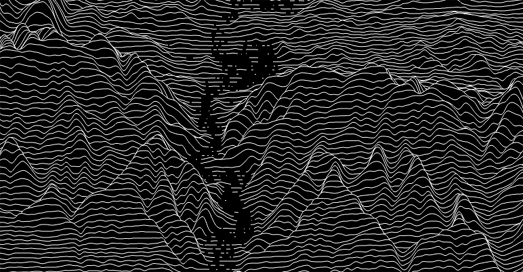
If you like playing with City Roads then you might also like Peak Map, which is from the same developer. Peak Map is a fantastic interactive map which can create a joy-plot elevation map for any location on Earth. To create your own joy-plot map you just need to center Peak Map on your chosen location.

Joy-plots (or ridgeline plots as they are sometimes called) are inspired by Joy Division's famous album cover for Unknown Pleasures. Peak Map includes a number of options which allow you to change the appearance of your generated joy-plot. The automatic setting draws black lines on a white background but you can choose your own background and line colors (my example above flips the default to show white lines on a black background). You can also change the height scale and smoothness of the elevation lines on your joy plot map and even reduce the joy plot map's opacity to reveal a labelled map beneath. 

Wednesday, January 06, 2021

America's Best Drives


Geotab has worked out the quietest route in every U.S. state. Using 2015 traffic count data Geotab has worked out which roads (interstates, US routes, and state routes over 10 miles long) have the least road traffic. 

America's Quietest Routes allows you to view the quietest route in every state simply by selecting the state on an interactive map. You can then explore the route for yourself using Google Maps' panoramic Street View imagery. America's Quietest Routes also includes a top 10 list of the quietest routes in the United States. Geotab has named Alaska's State Route 11 as America's quietest route. The route is 414 miles long, from Fairbanks to Deadhorse and includes glimpses of the Arctic Ocean and the Yukon River.

Of course just because a road doesn't have a lot of traffic doesn't necessarily make it fun to drive. I'm sure that many motorists would agree that the most interesting roads to drive on are those that curve and twist. Conversely the most boring roads to drive are often those which are long and straight and with very little deviation. If you want to know where the most curvy roads can be found near you then you need Curvature, an interactive map that color-codes the world's roads by how many curves they have. 

The amount of curvature of individual roads is determined using OpenStreetMap data. Individual roads are divided into sections and the radius of curvature at every segment of road is calculated. Then the lengths of the most curvy segments are added together to get a total distance spent cornering.

Georgia Senate Election Maps

The results of yesterday's two run-off elections in Georgia will determine which party controls the senate. At the time of writing Democrat Raphael Warnock has won his race against Kelly Loeffler. The other race is yet to be called but currently Democrat Jon Ossoff has a very small lead over Republican David Perdue.

Both The New York Times and The Guardian have published interactive choropleth maps of the two Georgia Senate run-off elections. Both newspapers color Georgia counties by the political party which has taken the most votes. Of the two newspapers the NYT's maps are better, mainly because they use color gradients (The Guardian uses solid red and blue) to help show the margin by which a candidate has won in each county. If you hover over a county on the NYT map you can view the total number of votes won by each candidate, the percentage of votes won and the percentage of votes so far reported in the state.

The Washington Post has also published similar choropleth maps for both of the Georgia run-off elections. The Post has also created three proportional symbol maps for each race which show the level of support for the Democrat and Republican candidates in Urban, Suburban and Rural counties. These proportional symbol maps show the Democratic candidates winning heavily in most Urban and Suburban counties and the Republican candidates winning heavily in most Rural counties.

If the Democratic Party wins both seats in Georgia then both parties will have 50 seats each in the Senate. However the Democrats would have effective control of the Senate. Kamala Harris (Democrat), the vice-president-elect, in her role as president of the Senate, would have the deciding vote in any votes which were tied.

Tuesday, January 05, 2021

The Interactive Geological of the World

William Smith is largely credited with creating the first nationwide geological map. Smith's beautiful 1815 map 'A Delineation of the Strata of England and Wales with Part of Scotland' visualized Britain's geological types using different colors for different types of geological feature. Smith's use of colors and many of his names for different strata are still used today.

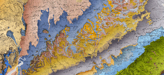
You can see William Smith's enduring influence for yourself on the Macrostrat interactive map. Macrostrat is a global map visualizing the world's geology. Using the map you can explore stratigraphic and lithological data for any location on Earth. For example if I click on my location on the map I discover that I live on top of the Thames Group, which has a lithology of clay, silt, sand and gravel.


The British Geological Survey is also upholding the tradition of beautiful geological maps with its own Geology of Britain interactive map. This interactive map follows the same methodology used by Smith in the 19th Century. On the map different colors are used to show different types of bedrock geology. If you click on the map you can learn more about the bedrock geology and superficial deposits at the selected location. The information provided includes details on when and how the displayed type of geology was originally formed.


You can even view interactive versions of William Smith's Maps online. These interactive maps allow you to explore Smith's original geological maps of England, Scotland & Wales in very close detail. The interactive map interface allows you to view geo-rectified overlays of a number of William Smith's maps including his original 1815 geological map and his 1828 New Geological Map of England and Wales.