Saturday, June 04, 2022

Where Cars Kill

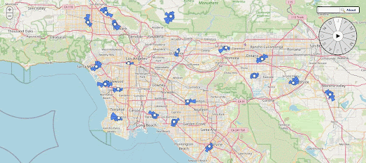
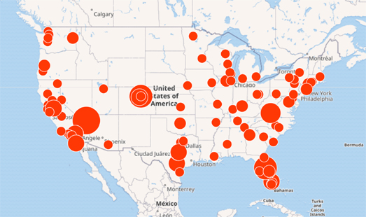
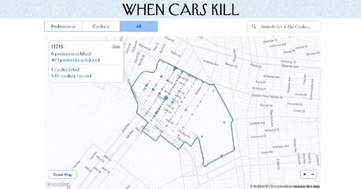
Every year tens of thousands of people are hit by cars in New York. The New Yorker has released an interactive map which allows you to see where cars have injured pedestrians or cyclists between 2013 and 2021.

Enter a New York zip-code into the When Cars Kill map and you can view the locations of all the car crashes in that neighborhood that resulted in injuries.The map uses data from the New York Police Department to show where the most dangerous accident hot-spots were between 2013 and 2021.Crashes that occurred between intersections are aggregated to the nearest one. Over half of New York City pedestrians killed were hit at an intersection.


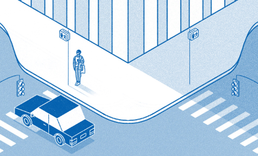
curb extensions - one of the many possible road safety features which can reduce injuries from cars

The New Yorker's article When Cars Kill also includes a number of graphical illustrations of road design safety measures which could be introduced to reduce the number of pedestrians and cyclists injured and killed by cars. These include curb extensions (to give pedestrians more space), speed bumps, s-curve chicanes (to slow cars), protected bike lanes, and safety islands (dividing crossings into shorter intervals).

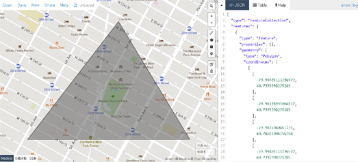
If you want to map traffic accidents in New York for yourself then you can use the NYPD Motor Vehicle Collisions data from NYC Open Data. In this data all collisions are geocoded with a longitude and latitude (to the nearest intersection). The data also includes the time of day of each incident (a factor not used in the New Yorker map).

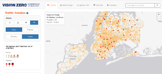
The time of day data is used in the Visions Zero View interactive map of New York City traffic crashes. This map also visualizes traffic injury and fatality crashes within New York. The map has two main views; a visualization of New York's traffic accidents and a visualization of the city's attempts to make the streets safer. 

The 'Crashes' view allows users to visualize the locations of pedestrian,cycling and car injuries and fatalities. This map view includes a graph showing the number of crashes by time of day. This graph is interactive, which means you can click on a time of day to view where accidents in the city occurred during the selected hours. 

The 'Street Design' view allows users to explore some of the Vision Zero initiatives which have been introduced on the city's streets, such as arterial slow zones, speed humps and other major safety projects designed to increase traffic safety in the city of New York.

Friday, June 03, 2022

Prevailing Winds & Runway Alignment

Wind History is a new interactive map which shows the prevailing wind directions around weather stations in the United States. Most of these weather stations are located at airports. 

On the map 2,500 wind rose diagrams show the normal wind direction at airports across the United States. A larger date control allows you to view the prevailing wind directions at all airports on the map for any month or for any combination of months. By selecting different months on this date control it is possible to view how the prevailing winds at any airport might change over the course of the year.

The orientation of runways at airports are normally determined by the prevailing wind directions. Aircraft find it easier to land without a crosswind and planes can more easily take-off and land upwind. Aircraft also need a lower ground speed at both landing and take-off when they are pointing into the wind. As a consequence runways are usually built to point in the prevailing wind direction. In fact compiling a wind rose showing local wind directions is often one of the first steps taken when building a new airport runway.


If you are interested in the orientation of airport runaways around the world then you can explore the beautiful interactive Trails of Wind map. This interactive map colors airport runways based on their orientation. 

Blue lines on the map show runways aligned on a predominantly north-south axis and yellow lines show runways on an east-west axis. Zoom in on any location in the world and you can get a good idea of the prevailing wind direction from the orientation of the airport runways on the map. If you zoom in on the central states in the USA you can clearly see a majority of runways have a north-south orientation. The UK, France and Germany seem dominated by east-west orientated runways, while around the Mediterranean runways appear to be constructed along a north-south axis.

Wednesday, June 01, 2022

What Matters in the Midterm Elections

In order to find out which issues voters care most about for the upcoming midterms, Axios analyzed which issues were being searched the most on Google in each congressional district. In Midterm elections 2022: The issues that matter to Americans Axios has mapped out the relative and absolute importance of different political issues in each district.

As you can see in the animated screenshot above the Axios map allows you to view the results in both a choropleth and cartogram view. If you select a political issue (by category and topic) you can see how much that issue has been searched in every congressional district. If you select a district on the map you can also view which issues are being searched the most in that district. In the cartogram view each district is shown as the same size which (as Axios says) makes it easier to compare the relative search interest of the selected topic across different districts. 

At the moment jobs and taxes seem to be two of the political issues which are seen as among the most important in nearly every congressional district. However the importance attached by voters to different issues can change over time. To account for this Axios says that the map will be regularly updated during the midterms.

Axios' cartogram view was inspired in part by Le Monde's cartogram map of the 2020 US Presidential Election. Le Monde's US election map represents each electoral college vote in each state at the same size. This cartogram view of the 2020 U.S. election provides an accurate picture of the electoral college votes won by both Biden and Trump across the country. It eradicates the distorted view which is given by a choropleth map of the results, which visually emphasizes the huge rural electoral districts usually won by the Republicans over the smaller but more densely populated electoral districts which tend to vote more Democrat.

Tuesday, May 31, 2022

Using Mapshaper to Shape Maps

I recently received a request to help design a triangular map to complement a company logo. Having only last week written about Microsoft's Building Footprints I decided that I would use a building footprint layer as my base-map, with the map clipped to only show those buildings within a triangular area. The objective being to create something like the map above.

Having downloaded the building footprint data for the required location using UCR-Star my initial plan was to use turf.js to clip the downloaded GeoJSON data into a triangular shape. However a quick search on Google for 'GeoJSON clipping' led me to Mapshaper.

Mapshaper is a free editing tool for geospatial files. You can use Mapshaper for simplifying shapes, editing attribute data, clipping, erasing, dissolving, filtering and much, much more.So perfect for my use case of clipping out a triangular area from a downloaded GeoJSON file of building footprint data. 

From UCR-Star I had downloaded the building footprints for a large rectangular area of New York. To create the map above I therefore needed another GeoJSON file of a triangular polygon around the Flat Iron building in New York. I created this triangle shape in geojson.io. Using the polygon drawing tool I simply drew a triangle around Madison Square park and downloaded the shape as another GeoJSON file.

I now had two files - map(5).geojson (building footprints) and map(7).geojson (triangular footprints). I uploaded both of these GeoJSON files to Mapshaper and then with the building footprints map active in the map window (map(5).geojson) I then entered a clipping command into the Mapshaper console window. 

The clipping command in my case was simply "-clip map(7)". With my building footprints data of New York active this command instructed Mapshaper to clip out only the data inside my triangle. You can see the result in the screenshot above which shows my New York building data clipped down to just a small triangular area around the Flat Iron building. All I then need to do was download the data as another GeoJSON file.

For the map at the top of this post I finessed the design a little by editing my triangular building footprint data in Mapbox Studio. The map above took me around 40 minutes to create in total, including downloading the building footprint data, creating a triangular polygon, clipping the building footprint data and finessing the design in Mapbox Studio. 

Obviously I spent much more time creating a triangular map for my client. In particular I was a lot more careful in creating an equilateral triangle by adding and subtracting latitude and longitude co-ordinates for the area required for the requested map.

You could of course use Mapshaper to clip geospatial data into even more complicated shapes. For example to create a map in the shape of a six pointed star you can simply create two separate triangle polygons in geojson.io and then merge the two separate polygons into one star shaped polygon in Mapshaper using the merge command.Once you have created a star shaped polygon you can then use Mapshaper to clip your building footprints data into a star shaped map.

Monday, May 30, 2022

Footways and Slow Ways

A new interactive map can help you navigate London on foot, showing you the quietest and most enjoyable routes for walking in the capital. The Footways map includes hundreds of kilometres of scenic, safe and pedestrian-friendly walking routes in central London.

The map includes hundreds of routes, spanning out from London's mainline stations, using the most low-traffic and low-pollution streets, and where possible completely car-free paths. The map includes a geolocation tool. So, if you share your location with the map, you can quickly zoom to your current location on the map and discover your closet recommended pedestrian-friendly routes

If you want to venture outside the capital then you can use the Slow Ways interactive map. Slow Ways is building a national network of walking routes across the whole of Great Britain. Using existing public footpaths, ancient foot ways and trails Slow Ways is designed to make it easier for people to plan hikes and walks in the UK.

The Slow Ways map includes over 7,000 walking routes stretching over 100,000km. Routes and footpaths which can help you walk (or cycle) off-road between UK towns and cities. If you create an account with Slow Ways you can also help to make the map better. If you have an account you can review and rate walking routes and suggest other slow way routes. User input helps Slow Ways to review and verify all of the suggested routes on the map. Which helps to make Slow Ways a more robust and reliable map of the UK's off-road paths and trails.

Saturday, May 28, 2022

The Highway Exits of Massachusetts

The animated GIF above shows aerial images of highway exits across Massachusetts. The images were taken from Bird's Eye Cards, a collection of categorized aerial observations of the Massachusetts landscape, created by the Leventhal Map & Education Center at the Boston Public Library.


Lots of round water bodies in Massachusetts

Bird's Eye Cards was created by Garrett Dash Nelson, who has developed some processing tricks for clipping out recognizable patterns in satellite imagery.Using these tools he has put together a number of different collections of these overhead views including the largest buildings in Massachusetts, US state capitol buildings, the roundest water bodies in Massachusetts and highway exits. 

Gerret's Bird's Eye Cards of each category are presented in a grid of images. He states in his write-up that this is a more interesting way to present the images (rather than using rapid animated GIF's which cycle through the images) because it "allows the viewer to identify and explore each one of the images". Perversely I immediately hacked Garret's highway exit images to create the GIF at the top of this post. If you do prefer your aerial images in GIF form Garrett Dash Nelson has actually created an animation of the largest 200 buildings in Massachusetts.

Friday, May 27, 2022

America's Mass Shooting Problem

School Shootings are an almost uniquely American problem. While it is true that school shootings have taken place in other countries around the world, as the map above shows no other country has experienced anywhere near the number of school shootings as the United States. 

This School Shootings by Country 2022 map claims that the USA has experienced 288 school shootings. The country with the next highest number of school shootings is Mexico, with 8. According to Everytown there has so far been 77 incidents of gunfire on school grounds in the United States in 2022, and it is still only May.

Mother Jones has been collecting data on all mass shootings in the USA since 1982 (this data is not confined to school shootings). The map above uses this data to show the location and scale of mass shootings across the country. According to Mother Jones' Guide to Mass Shootings in America in over three quarters of these incidents the guns involved were acquired legally. 

The Gun Violence Archive also collects data on gun-related violence in the USA. The Gun Violence Archive reports that there has been 214 mass shootings in the USA so far this year. So far 658 children have been killed by guns this year and 1,623 have been injured by guns. 

America's response to every mass shooting incident is to pray for the victims. Those prayers never work. Americans keep buying guns and Americans keep shooting each other. Do you want to know what does work - gun controls.

After a gunman killed 51 people in Christchurch in 2019 the New Zealand government banned most semiautomatic weapons. New Zealand also introduced a nationwide gun buyback scheme, which enabled gun owners to safely hand in their guns to the authorities. Since 2019 there have been no mass shootings in New Zealand.

In 1996 a gunman killed sixteen pupils and a teacher in Dunblane, Scotland. Following the incident the UK government outlawed the private ownership of handguns.There have been no school shootings in the UK since the private ownership of handguns was banned. 

It really isn't a difficult problem to solve. If people don't have guns they can't shoot people.

Thursday, May 26, 2022

Polluting the Poor in San Francisco


If you are on a low income in San Francisco then you are probably breathing polluted air. On average the poorest San Franciscans have a 30% higher exposure to nitrogen dioxide than other residents in the city. If you are poor and black then you are probably breathing in even more polluted air. Neighborhoods with high densities of Black, Latino and Asian residents have on average 55 percent more nitrogen dioxide than neighborhoods with mostly White residents.

The Bay Area Air Quality Management District (Air District) and the company Aclima have joined forces to map the air pollution levels in all nine counties of the Bay Area. To achieve this Aclima drove specialized sensor-equipped cars around the Bay Area, measuring the air quality on every public street. The result is air pollution data on more than 5,000 square miles in 101 cities. Providing air pollution data for nearly eight million people.

You can explore the results of Aclima and Air District's survey of air pollution levels on Air.Health, an interactive map which shows air pollution levels at the block level. Enter an address into Air.Health and you can view the individual air pollution levels for Nitrogen Dioxide (NO2), Fine Particulate Matter (PM2.5), Ozone (O3), Carbon Monoxide (CO) and Carbon Dioxide (CO2).

Tuesday, May 24, 2022

Australian Election Maps

Australia's conservative Coalition government has lost power for the first time in nearly a decade. The Labor Party is projected to win enough seats to form the new government and its leader, Anthony Albanese, will become the country's new Prime Minister. At the time of writing, while it is still not clear whether the Labor Party will reach the 76 seats it needs for an overall majority, it has won enough seats to ensure it will be the main party in any minority government. 


The Australian has published an interactive map of the Federal Election Results that is showing which party has won in each seat as the results are announced. One problem with visualizing the results of an election in Australia (as discussed by ABC's in The Australian election map has been lying to you) is the huge discrepancy in size between huge rural seats and more densely populated urban seats. This problem is clearly apparent in The Australian's map of the 2022 election (shown above).

A cursory glance of The Australian election map would probably leave you with the impression that the Liberal Party (blue) was the biggest winners in Saturday's election. Blue covers a huge percentage of the map of Australia - because the Liberal Party has won many of the huge (least densely populated rural seats). The Australian has partly overcome this problem by creating a number of smaller inset maps showing the results in the major cities of Brisbane, Sydney and Melbourne.

The Guardian has used a form of gridded cartogram in its Australian Election Results 2022 - Live Results page. Normally a gridded cartogram uses geometric shapes to represent equal units. In The Guardian's Australian election map the units don't appear to represent anything in themselves but have just been used to make the smallest electoral seats bigger so that they can be seen on the map. So, for example, the geographically small seat of Grayndler in Sydney is represented on the map by four hexagon units. The result is that you can actually find it on the zoomed out map of Australia (in comparison - it is almost impossible to find without zooming in on The Australian's election map).

One result of smaller urban seats appearing larger on the map than their actual geographical areas is that Labor's success in many of Australia's largest cities is a little more apparent on The Guardian map than on The Australian map (where their smaller geographical size undermines their visual impact). Of course The Australian has partly compensated for this by providing three zoomed-in inset maps for Brisbane, Melbourne and Sydney. 

Sydney before and after the 2022 election

ABC News has created a story map, How the Election Result Has Changed Our Cities, which does a very good job of explaining how the Liberal Coalition lost the election by being very unpopular in the largest cities. By comparing election maps from 2019 with the new 2022 results in each of the state capitals ABC is able to show how the Labor Party beat the Liberals in the suburbs, while the independents and the Greens beat the Liberals’ in their inner-city heartlands.


Perth before and after the 2022 election

After comparing the 2019 and 2022 maps in each of the state capitals ABC zooms out to explore the rural vote. Outside of the big cities the Liberal vote held up very well. The Nationals and the LNP in fact managed to retain all their seats in the regions. 

You can view another detailed analysis of How Labor Won in ABC news' cartogram story map, exploring the 2022 results in each state and major city.

Downloading Microsoft's Building Footprints

Microsoft's Building Footprints dataset now contains data on 777m buildings around the world. The data can be downloaded in GeoJSON format and can be used under a Open Data Commons Open Database License (ODbL).

The building footprint data is created by Microsoft by AI detection of buildings from satellite imagery. The map at the top of this post shows where building footprint data is currently available. However Microsoft also has other building datasets available for

Each country's complete building footprint data can be downloaded as a separate GeoJSON file. These individual country files, however, are still very large.Thanks to a Tweet thread by Alsidair Rae I've discovered that you can create custom downloads of smaller sized areas using the UCR-Star interactive map. For example in the screenshot above I have downloaded the building footprints for a small neighborhood in Rome. Instead of downloading the 1.1GB file of the whole of Italy's building footprints from Microsoft I was able to use the UCR-Star map to zoom in on just the area of Rome that I needed and download the visible area on the UCR-Star map. The result is a GeoJSON file size which is a much more manageable 319 KB.

The UCR-Star map also allows you to download Microsoft's building footprint data in other formats (CSV, KMZ, Shapefile and JSON+WKT).